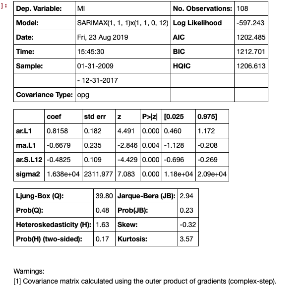
With time series results, you get a much smoother plot using the get_forecast() method. An example of time series is below:
# Seasonal Arima Modeling, no exogenous variable
model = SARIMAX(train['MI'], order=(1,1,1), seasonal_order=(1,1,0,12), enforce_invertibility=True)

results = model.fit()

results.summary()
![enter image description here]()
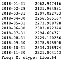
The next step is to make the predictions, this generates the confidence intervals.
# make the predictions for 11 steps ahead
predictions_int = results.get_forecast(steps=11)
predictions_int.predicted_mean
![enter image description here]()
These can be put in a data frame but need some cleaning up:
# get a better view
predictions_int.conf_int()
![enter image description here]()
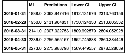
Concatenate the data frame, but clean up the headers
conf_df = pd.concat([test['MI'],predictions_int.predicted_mean, predictions_int.conf_int()], axis = 1)

conf_df.head()
![enter image description here]()
Then we rename the columns.
conf_df = conf_df.rename(columns={0: 'Predictions', 'lower MI': 'Lower CI', 'upper MI': 'Upper CI'})
conf_df.head()
![enter image description here]()
Make the plot.
# make a plot of model fit
# color = 'skyblue'

fig = plt.figure(figsize = (16,8))
ax1 = fig.add_subplot(111)


x = conf_df.index.values


upper = conf_df['Upper CI']
lower = conf_df['Lower CI']

conf_df['MI'].plot(color = 'blue', label = 'Actual')
conf_df['Predictions'].plot(color = 'orange',label = 'Predicted' )
upper.plot(color = 'grey', label = 'Upper CI')
lower.plot(color = 'grey', label = 'Lower CI')

# plot the legend for the first plot
plt.legend(loc = 'lower left', fontsize = 12)


# fill between the conf intervals
plt.fill_between(x, lower, upper, color='grey', alpha='0.2')

plt.ylim(1000,3500)

plt.show()
![enter image description here]()


