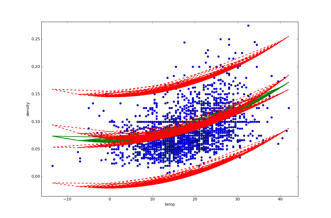
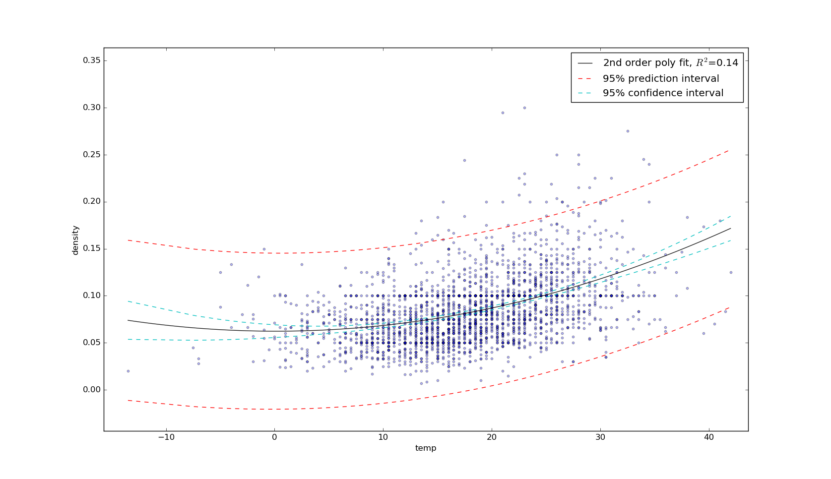
I have a correlation plot for two variables, the predictor variable (temperature) on the x-axis, and the response variable (density) on the y-axis. My best fit least squares regression line is a 2nd order polynomial. I would like to also plot confidence and prediction intervals. The method described in this answer seems perfect. However, my dataset (n=2340) has repeated entries for many (x,y) pairs. My resulting plot looks like this:

Here is my relevant code (slightly modified from linked answer above):
import numpy as np
import pandas as pd
import matplotlib.pyplot as plt
from statsmodels.sandbox.regression.predstd import wls_prediction_std
import statsmodels.formula.api as smf
from statsmodels.stats.outliers_influence import summary_table

d = {'temp': x, 'dens': y}
df = pd.DataFrame(data=d)

x = df.temp
y = df.dens

plt.figure(figsize=(6 * 1.618, 6))
plt.scatter(x,y, s=10, alpha=0.3)
plt.xlabel('temp')
plt.ylabel('density')

# points linearly spaced for predictor variable
x1 = pd.DataFrame({'temp': np.linspace(df.temp.min(), df.temp.max(), 100)})

# 2nd order polynomial
poly_2 = smf.ols(formula='dens ~ 1 + temp + I(temp ** 2.0)',   data=df).fit()

# this correctly plots my single 2nd-order poly best-fit line:
plt.plot(x1.temp, poly_2.predict(x1), 'g-', label='Poly n=2  $R^2$=%.2f' % poly_2.rsquared,
     alpha=0.9)

prstd, iv_l, iv_u = wls_prediction_std(poly_2)

st, data, ss2 = summary_table(poly_2, alpha=0.05)

fittedvalues = data[:,2]
predict_mean_se  = data[:,3]
predict_mean_ci_low, predict_mean_ci_upp = data[:,4:6].T
predict_ci_low, predict_ci_upp = data[:,6:8].T

# check we got the right things
print np.max(np.abs(poly_2.fittedvalues - fittedvalues))
print np.max(np.abs(iv_l - predict_ci_low))
print np.max(np.abs(iv_u - predict_ci_upp))

plt.plot(x, y, 'o')
plt.plot(x, fittedvalues, '-', lw=2)
plt.plot(x, predict_ci_low, 'r--', lw=2)
plt.plot(x, predict_ci_upp, 'r--', lw=2)
plt.plot(x, predict_mean_ci_low, 'r--', lw=2)
plt.plot(x, predict_mean_ci_upp, 'r--', lw=2)
The print statements evaluate to 0.0, as expected. However, I need single lines for the polynomial best fit line, and the confidence and prediction intervals (rather than the multiple lines I currently have in my plot). Any ideas?
Update: Following first answer from @kpie, I ordered my confidence and prediction interval arrays according to temperature:
data_intervals = {'temp': x, 'predict_low': predict_ci_low, 'predict_upp': predict_ci_upp, 'conf_low': predict_mean_ci_low, 'conf_high': predict_mean_ci_upp}

df_intervals = pd.DataFrame(data=data_intervals)

df_intervals_sort = df_intervals.sort(columns='temp')

