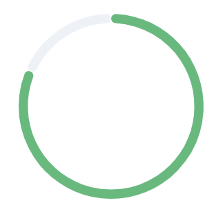
Chart.js Doughnut with rounded edges
Asked Answered
R

6

22

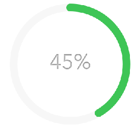
I created a donut chart with Chart.js and I want it to have rounded edges at both ends. I want it to be like this:

The way I want it

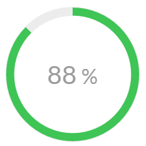
But I have it like this, with sharp edges:

I have this

The best I found was this answer: How to put rounded corners on a Chart.js Bar chart, but it is for bar charts, and I have no clue of how to adapt it for doughnuts..

Here is my code:

HTML

<div class="modal-div-canvas js-chart">
  <div class="chart-canvas">
     <canvas id="openedCanvas" width="1" height="1"></canvas>
        <div class="chart-background"></div>
            <span class="chart-unique-value">
                 <span class="js-count">
                    85
                 </span>
                 <span class="cuv-percent">%</span>
            </span>
        </div>
  </div>

JS

var deliveredData = {
        labels: [
            "Value"
        ],
        datasets: [
            {
                data: [85, 15)],
                backgroundColor: [
                    "#3ec556",
                    "rgba(0,0,0,0)"
                ],
                hoverBackgroundColor: [
                    "#3ec556",
                    "rgba(0,0,0,0)"
                ],
                borderWidth: [
                    0, 0
                ]
            }]
    };

    var deliveredOpt = {
        cutoutPercentage: 88,
        animation: {
            animationRotate: true,
            duration: 2000
        },
        legend: {
            display: false
        },
        tooltips: {
            enabled: false
        }
    };

   var chart = new Chart($('#openedCanvas'), {
        type: 'doughnut',
        data: deliveredData,
        options: deliveredOpt
    });
}};

Someone know how to do this?

Rooney answered 29/4, 2016 at 9:44 Comment(0)
K
16

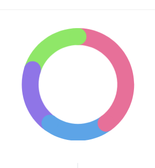
I made some changes in the @potatopeeling snippet, I made compatibility with the newer (2.9.x) version of chart.js also fixed where the "startArc" should be rendered and the color from the previous segment to match this "startArc", so we can have more than 2 segments. This is the result:

enter image description here

Chart.defaults.RoundedDoughnut    = Chart.helpers.clone(Chart.defaults.doughnut);
Chart.controllers.RoundedDoughnut = Chart.controllers.doughnut.extend({
    draw: function(ease) {
        var ctx           = this.chart.ctx;
        var easingDecimal = ease || 1;
        var arcs          = this.getMeta().data;
        Chart.helpers.each(arcs, function(arc, i) {
            arc.transition(easingDecimal).draw();

            var pArc   = arcs[i === 0 ? arcs.length - 1 : i - 1];
            var pColor = pArc._view.backgroundColor;

            var vm         = arc._view;
            var radius     = (vm.outerRadius + vm.innerRadius) / 2;
            var thickness  = (vm.outerRadius - vm.innerRadius) / 2;
            var startAngle = Math.PI - vm.startAngle - Math.PI / 2;
            var angle      = Math.PI - vm.endAngle - Math.PI / 2;

            ctx.save();
            ctx.translate(vm.x, vm.y);

            ctx.fillStyle = i === 0 ? vm.backgroundColor : pColor;
            ctx.beginPath();
            ctx.arc(radius * Math.sin(startAngle), radius * Math.cos(startAngle), thickness, 0, 2 * Math.PI);
            ctx.fill();

            ctx.fillStyle = vm.backgroundColor;
            ctx.beginPath();
            ctx.arc(radius * Math.sin(angle), radius * Math.cos(angle), thickness, 0, 2 * Math.PI);
            ctx.fill();

            ctx.restore();
        });
    }
});

window.onload = function() {
    new Chart(document.getElementById('usersChart'), {
        type   : 'RoundedDoughnut',
        data   : {
            datasets: [
                {
                    data           : [40, 20, 20, 20],
                    backgroundColor: [
                        '#e77099',
                        '#5da4e7',
                        '#8f75e7',
                        '#8fe768'
                    ],
                    borderWidth    : 0
                }]
        },
        options: {
            cutoutPercentage: 70
        }
    });
};
<script src="https://github.com/chartjs/Chart.js/releases/download/v2.9.3/Chart.min.js"></script>
<link rel="stylesheet" href="https://github.com/chartjs/Chart.js/releases/download/v2.9.3/Chart.min.css">
<div style="width: 200px; height: 200px;">
<canvas id="usersChart" width="1" height="1"></canvas>
</div>
Koheleth answered 2/4, 2020 at 13:58 Comment(7)
Really nice additions there, one thing you haven't fixed (which the old version suffered from too) is the arc/ball still appearing on charts where a data value might be 0. Apart from that, great work!Impressure
i would like to plot based on the values of the datasets.. like green pink and blue has 2 each. would like only that to come. and not the purple. with the abv code i get blue as one dot .Businesswoman
how would you add spacing between each one?Ciao
any way we can make this work with borderWidth also ?Exciter
any idea how to make this work with the latest v3 versions of chartjs ?Grivet
@AFriend simply replace Chart.helpers.each(arcs, function(arc, i) { with Chart.helpers.each(arcs.filter(item => item.$context.parsed > 0), function(arc, i) { to not render colors for 0 dataGrivet
@Grivet Haven't had to test it but this looks great. Appreciate the help!Impressure
H
19

You can extend the chart to do this


Preview

enter image description here


Script

Chart.defaults.RoundedDoughnut = Chart.helpers.clone(Chart.defaults.doughnut);
Chart.controllers.RoundedDoughnut = Chart.controllers.doughnut.extend({
    draw: function (ease) {
        var ctx = this.chart.chart.ctx;

        var easingDecimal = ease || 1;
        Chart.helpers.each(this.getDataset().metaData, function (arc, index) {
            arc.transition(easingDecimal).draw();

            var vm = arc._view;
            var radius = (vm.outerRadius + vm.innerRadius) / 2;
            var thickness = (vm.outerRadius - vm.innerRadius) / 2;
            var angle = Math.PI - vm.endAngle - Math.PI / 2;

            ctx.save();
            ctx.fillStyle = vm.backgroundColor;
            ctx.translate(vm.x, vm.y);
            ctx.beginPath();
            ctx.arc(radius * Math.sin(angle), radius * Math.cos(angle), thickness, 0, 2 * Math.PI);
            ctx.arc(radius * Math.sin(Math.PI), radius * Math.cos(Math.PI), thickness, 0, 2 * Math.PI);
            ctx.closePath();
            ctx.fill();
            ctx.restore();
        });
    },
});

and then

...
type: 'RoundedDoughnut',
...

Stack Snippet

Chart.defaults.RoundedDoughnut = Chart.helpers.clone(Chart.defaults.doughnut);
        Chart.controllers.RoundedDoughnut = Chart.controllers.doughnut.extend({
            draw: function (ease) {
            		var ctx = this.chart.chart.ctx;
                
                var easingDecimal = ease || 1;
                Chart.helpers.each(this.getDataset().metaData, function (arc, index) {
                    arc.transition(easingDecimal).draw();

                    var vm = arc._view;
                    var radius = (vm.outerRadius + vm.innerRadius) / 2;
                    var thickness = (vm.outerRadius - vm.innerRadius) / 2;
                    var angle = Math.PI - vm.endAngle - Math.PI / 2;
                    
                    ctx.save();
                    ctx.fillStyle = vm.backgroundColor;
                    ctx.translate(vm.x, vm.y);
                    ctx.beginPath();
                    ctx.arc(radius * Math.sin(angle), radius * Math.cos(angle), thickness, 0, 2 * Math.PI);
                    ctx.arc(radius * Math.sin(Math.PI), radius * Math.cos(Math.PI), thickness, 0, 2 * Math.PI);
                    ctx.closePath();
                    ctx.fill();
                    ctx.restore();
                });
            },
        });

        var deliveredData = {
            labels: [
                "Value"
            ],
            datasets: [
                {
                    data: [85, 15],
                    backgroundColor: [
                        "#3ec556",
                        "rgba(0,0,0,0)"
                    ],
                    hoverBackgroundColor: [
                        "#3ec556",
                        "rgba(0,0,0,0)"
                    ],
                    borderWidth: [
                        0, 0
                    ]
                }]
        };

        var deliveredOpt = {
            cutoutPercentage: 88,
            animation: {
                animationRotate: true,
                duration: 2000
            },
            legend: {
                display: false
            },
            tooltips: {
                enabled: false
            }
        };

        var chart = new Chart($('#openedCanvas'), {
            type: 'RoundedDoughnut',
            data: deliveredData,
            options: deliveredOpt
        });
<script src="https://ajax.googleapis.com/ajax/libs/jquery/2.1.1/jquery.min.js"></script>
<script src="https://cdnjs.cloudflare.com/ajax/libs/Chart.js/2.0.1/Chart.bundle.min.js"></script>

<canvas id="openedCanvas" height="230" width="680"></canvas>
Hosiery answered 1/5, 2016 at 9:0 Comment(9)
In fact, with value = 0, there is a green ball on the top of the graph, but it should show nothing. I solved it with a statement saying that if value == 0, then use 'doughnut', else 'RoundedDoughnut'. Again, thanks a lot!Rooney
Ah, I hadn't considered 0. Cheers!Hosiery
This is great. I would need such effect for more datasets. Let's take basic example of [300, 50, 100] they use on documentation page. I get something like this take.ms/JRqgh, any idea @Hosiery how to achieve that? My goal is something like this take.ms/thRIbCalycle
In typescript i get this error TS2339: Property 'helpers' does not exist on type 'typeof Chart'.Irenairene
Does this solution still work for the current version of chart.js?Rainy
This doesn't work in this new version. Does anyone knows how to achieve the same result?Mug
@GabrielBueno @jaminroe To get it working in the current version of chart.js: replace this.getDataset().metaData with this.getMeta().dataSulfide
any way we can make this work with borderWidth also ?Exciter
As of chartjs 3.x you can simply do: new Chart({ type: 'doughnut', options: { borderRadius: 10 } ... })Deragon
K
16

I made some changes in the @potatopeeling snippet, I made compatibility with the newer (2.9.x) version of chart.js also fixed where the "startArc" should be rendered and the color from the previous segment to match this "startArc", so we can have more than 2 segments. This is the result:

enter image description here

Chart.defaults.RoundedDoughnut    = Chart.helpers.clone(Chart.defaults.doughnut);
Chart.controllers.RoundedDoughnut = Chart.controllers.doughnut.extend({
    draw: function(ease) {
        var ctx           = this.chart.ctx;
        var easingDecimal = ease || 1;
        var arcs          = this.getMeta().data;
        Chart.helpers.each(arcs, function(arc, i) {
            arc.transition(easingDecimal).draw();

            var pArc   = arcs[i === 0 ? arcs.length - 1 : i - 1];
            var pColor = pArc._view.backgroundColor;

            var vm         = arc._view;
            var radius     = (vm.outerRadius + vm.innerRadius) / 2;
            var thickness  = (vm.outerRadius - vm.innerRadius) / 2;
            var startAngle = Math.PI - vm.startAngle - Math.PI / 2;
            var angle      = Math.PI - vm.endAngle - Math.PI / 2;

            ctx.save();
            ctx.translate(vm.x, vm.y);

            ctx.fillStyle = i === 0 ? vm.backgroundColor : pColor;
            ctx.beginPath();
            ctx.arc(radius * Math.sin(startAngle), radius * Math.cos(startAngle), thickness, 0, 2 * Math.PI);
            ctx.fill();

            ctx.fillStyle = vm.backgroundColor;
            ctx.beginPath();
            ctx.arc(radius * Math.sin(angle), radius * Math.cos(angle), thickness, 0, 2 * Math.PI);
            ctx.fill();

            ctx.restore();
        });
    }
});

window.onload = function() {
    new Chart(document.getElementById('usersChart'), {
        type   : 'RoundedDoughnut',
        data   : {
            datasets: [
                {
                    data           : [40, 20, 20, 20],
                    backgroundColor: [
                        '#e77099',
                        '#5da4e7',
                        '#8f75e7',
                        '#8fe768'
                    ],
                    borderWidth    : 0
                }]
        },
        options: {
            cutoutPercentage: 70
        }
    });
};
<script src="https://github.com/chartjs/Chart.js/releases/download/v2.9.3/Chart.min.js"></script>
<link rel="stylesheet" href="https://github.com/chartjs/Chart.js/releases/download/v2.9.3/Chart.min.css">
<div style="width: 200px; height: 200px;">
<canvas id="usersChart" width="1" height="1"></canvas>
</div>
Koheleth answered 2/4, 2020 at 13:58 Comment(7)
Really nice additions there, one thing you haven't fixed (which the old version suffered from too) is the arc/ball still appearing on charts where a data value might be 0. Apart from that, great work!Impressure
i would like to plot based on the values of the datasets.. like green pink and blue has 2 each. would like only that to come. and not the purple. with the abv code i get blue as one dot .Businesswoman
how would you add spacing between each one?Ciao
any way we can make this work with borderWidth also ?Exciter
any idea how to make this work with the latest v3 versions of chartjs ?Grivet
@AFriend simply replace Chart.helpers.each(arcs, function(arc, i) { with Chart.helpers.each(arcs.filter(item => item.$context.parsed > 0), function(arc, i) { to not render colors for 0 dataGrivet
@Grivet Haven't had to test it but this looks great. Appreciate the help!Impressure
G
4

V3 answer based on answer from wahab memon but edited so it applies to all elements:

Chart.defaults.elements.arc.borderWidth = 0;
Chart.defaults.datasets.doughnut.cutout = '85%';

var chartInstance = new Chart(document.getElementById("chartJSContainer"), {
  type: 'doughnut',
  data: {
    labels: [
      'Label 1',
      'Label 2',
      'Label 3',
      'Label 4'
    ],
    datasets: [{
      label: 'My First Dataset',
      data: [22, 31, 26, 19],
      backgroundColor: [
        '#000000',
        '#ffff00',
        '#aaaaaa',
        '#ff0000'
      ]
    }]
  },

  plugins: [{
    afterUpdate: function(chart) {
      const arcs = chart.getDatasetMeta(0).data;

      arcs.forEach(function(arc) {
        arc.round = {
          x: (chart.chartArea.left + chart.chartArea.right) / 2,
          y: (chart.chartArea.top + chart.chartArea.bottom) / 2,
          radius: (arc.outerRadius + arc.innerRadius) / 2,
          thickness: (arc.outerRadius - arc.innerRadius) / 2,
          backgroundColor: arc.options.backgroundColor
        }
      });
    },
    afterDraw: (chart) => {
      const {
        ctx,
        canvas
      } = chart;

      chart.getDatasetMeta(0).data.forEach(arc => {
        const startAngle = Math.PI / 2 - arc.startAngle;
        const endAngle = Math.PI / 2 - arc.endAngle;

        ctx.save();
        ctx.translate(arc.round.x, arc.round.y);
        ctx.fillStyle = arc.options.backgroundColor;
        ctx.beginPath();
        ctx.arc(arc.round.radius * Math.sin(endAngle), arc.round.radius * Math.cos(endAngle), arc.round.thickness, 0, 2 * Math.PI);
        ctx.closePath();
        ctx.fill();
        ctx.restore();
      });
    }
  }]
});
<script src="https://cdn.jsdelivr.net/npm/[email protected]/dist/chart.js"></script>

<body>
  <canvas id="chartJSContainer" width="200" height="200"></canvas>
</body>
Gradation answered 28/6, 2022 at 10:43 Comment(2)
If you're using Angular with ng2-charts, you can put the plugins array into a local variable plugins: Plugin[]; and add it as an input into the canvas: [plugins]="plugins". You need an id: String which is just a unique identifier for that pluginImpermanent
While using this plugin, you might encounter a problem where the tooltip hides behind a circle when you hover over an overcrowded graph. In such scenarios change the "afterdraw" keyword with "afterDatasetDraw". This will bring the tooltip ahead of dataset canvas.Ermentrude
E
3

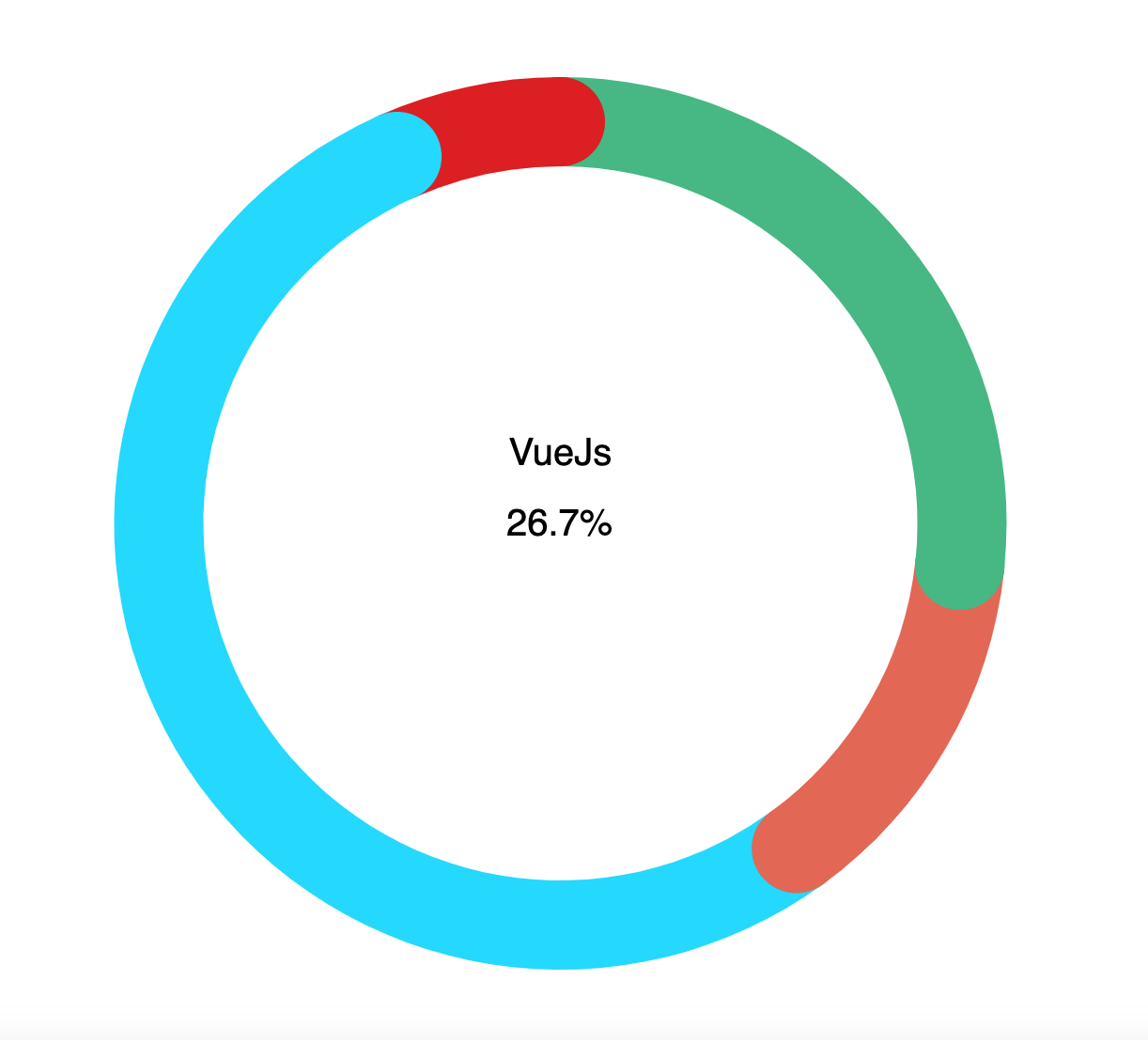
[Adapted for Vue] If you are using Vue, use the followings: enter image description here

<script>
import { generateChart, mixins } from 'vue-chartjs';
import Chart from 'chart.js';
import { doughnutChartOptions } from './config';
import { centerTextPlugin } from '@/utils/doughnut-chart';

const { reactiveProp } = mixins;

Chart.defaults.RoundedDoughnut = Chart.helpers.clone(Chart.defaults.doughnut);
Chart.controllers.RoundedDoughnut = Chart.controllers.doughnut.extend({
  draw(ease) {
    const { ctx } = this.chart;
    const easingDecimal = ease || 1;
    const arcs = this.getMeta().data;
    Chart.helpers.each(arcs, (arc, i) => {
      arc.transition(easingDecimal).draw();
      const pArc = arcs[i === 0 ? arcs.length - 1 : i - 1];
      const pColor = pArc._view.backgroundColor;
      const vm = arc._view;
      const radius = (vm.outerRadius + vm.innerRadius) / 2;
      const thickness = (vm.outerRadius - vm.innerRadius) / 2;
      const startAngle = Math.PI - vm.startAngle - Math.PI / 2;
      const angle = Math.PI - vm.endAngle - Math.PI / 2;
      ctx.save();
      ctx.translate(vm.x, vm.y);
      ctx.fillStyle = i === 0 ? vm.backgroundColor : pColor;
      ctx.beginPath();
      ctx.arc(radius * Math.sin(startAngle), radius * Math.cos(startAngle), thickness, 0, 2 * Math.PI);
      ctx.fill();
      ctx.fillStyle = vm.backgroundColor;
      ctx.beginPath();
      ctx.arc(radius * Math.sin(angle), radius * Math.cos(angle), thickness, 0, 2 * Math.PI);
      ctx.fill();
      ctx.restore();
    });
  },
});
const RoundedDoughnut = generateChart('custom-rounded-doughnut', 'RoundedDoughnut');

export default {
  extends: RoundedDoughnut,
  mixins: [reactiveProp],
  props: {
    data: {
      type: Object,
    },
  },
  data() {
    return {
      options: doughnutChartOptions,
    };
  },
  mounted() {
    this.addPlugin(centerTextPlugin);
    this.renderChart(this.data, this.options);
  },
};
</script>
Edge answered 6/4, 2022 at 10:32 Comment(0)
T
3

Since version 3 this is easily achievable via the borderRadius property on the dataset:

For example, this:

const data = {
  datasets: [
    {
      label: 'Response Rate',
      data: [completed, notCompleted],
      borderRadius: 10,
      backgroundColor: ['#48BB78', '#EDF2F7'],
      borderWidth: 0,
    },
  ],
};

Would produce this:

enter image description here

Trinette answered 10/3, 2023 at 8:9 Comment(0)
D
1

There are issues with rounding of edges of Doughnut in chart js. This package uses a Plugin to resolve the issue.

rounded-edge-donut https://www.npmjs.com/package/rounded-edge-donut

Usage https://codesandbox.io/s/uetg19?file=/src/App.js

Dahna answered 26/7, 2022 at 9:6 Comment(1)
Whilst this may theoretically answer the question, it would be preferable to include the essential parts of the answer here, and provide the link for reference. Please edit the answer with all relevant information.Kwashiorkor

© 2022 - 2024 — McMap. All rights reserved.