How to add a line of best fit to scatter plot
Asked Answered
R

5

23

I'm currently working with Pandas and matplotlib to perform some data visualization and I want to add a line of best fit to my scatter plot.

Here is my code:

import matplotlib
import matplotlib.pyplot as plt
import pandas as panda
import numpy as np

def PCA_scatter(filename):

   matplotlib.style.use('ggplot')

   data = panda.read_csv(filename)
   data_reduced = data[['2005', '2015']]

   data_reduced.plot(kind='scatter', x='2005', y='2015')
   plt.show()

PCA_scatter('file.csv')

How do I go about this?

Rinee answered 15/5, 2016 at 3:12 Comment(1)
Does this answer your question? Code for best fit straight line of a scatter plot in pythonPurnell
Y
39
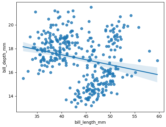
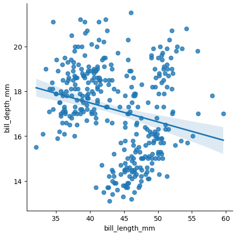
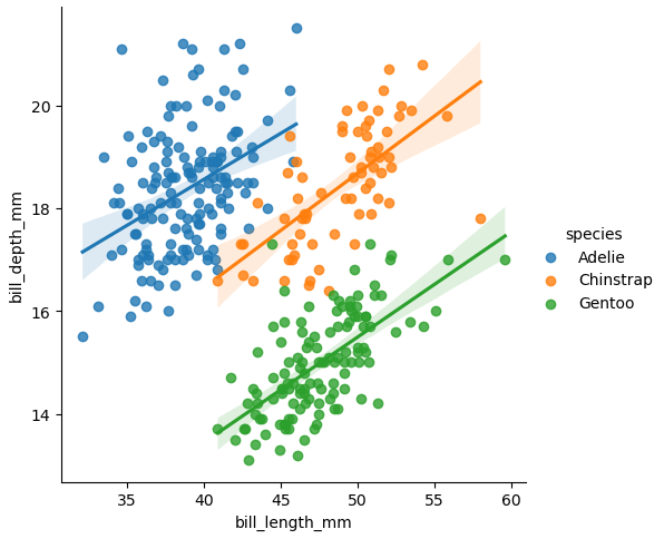
import seaborn as sns

# sample data
penguins = sns.load_dataset('penguins')

# plot 1 with axes level-plot
ax = sns.regplot(data=penguins, x="bill_length_mm", y="bill_depth_mm")

# plot 2 corresponding figure-level plot
g = sns.lmplot(data=penguins, x="bill_length_mm", y="bill_depth_mm")

# plot 3 figure-level plot separated by species
g = sns.lmplot(data=penguins, x="bill_length_mm", y="bill_depth_mm", hue="species")

Plot 1

enter image description here

Plot 2

enter image description here

Plot 3

enter image description here

Yclept answered 7/7, 2017 at 1:43 Comment(0)
M
17

You can use np.polyfit() and np.poly1d(). Estimate a first degree polynomial using the same x values, and add to the ax object created by the .scatter() plot. Using an example:

import numpy as np

     2005   2015
0   18882  21979
1    1161   1044
2     482    558
3    2105   2471
4     427   1467
5    2688   2964
6    1806   1865
7     711    738
8     928   1096
9    1084   1309
10    854    901
11    827   1210
12   5034   6253

Estimate first-degree polynomial:

z = np.polyfit(x=df.loc[:, 2005], y=df.loc[:, 2015], deg=1)
p = np.poly1d(z)
df['trendline'] = p(df.loc[:, 2005])

     2005   2015     trendline
0   18882  21979  21989.829486
1    1161   1044   1418.214712
2     482    558    629.990208
3    2105   2471   2514.067336
4     427   1467    566.142863
5    2688   2964   3190.849200
6    1806   1865   2166.969948
7     711    738    895.827339
8     928   1096   1147.734139
9    1084   1309   1328.828428
10    854    901   1061.830437
11    827   1210   1030.487195
12   5034   6253   5914.228708

and plot:

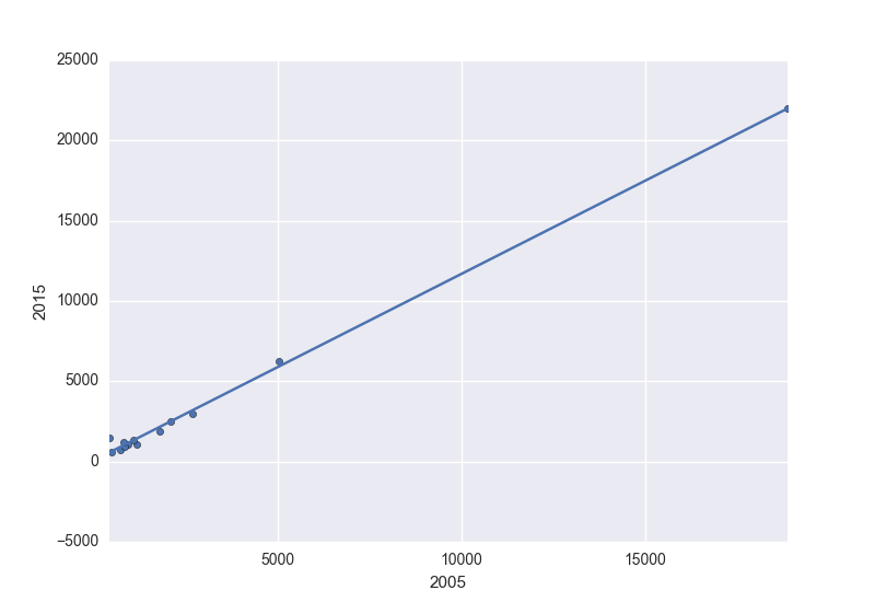
ax = df.plot.scatter(x=2005, y=2015)
df.set_index(2005, inplace=True)
df.trendline.sort_index(ascending=False).plot(ax=ax)
plt.gca().invert_xaxis()

To get:

enter image description here

Also provides the the line equation:

'y={0:.2f} x + {1:.2f}'.format(z[0],z[1])

y=1.16 x + 70.46
Mumford answered 15/5, 2016 at 3:32 Comment(9)
the line trendline.plot(ax=ax) gives me an invalid syntax errorRinee
the line z = np.polyfit(x=data_reduced[['2005']], y=data_reduced[['2015']], 1) gives me a "positional argument follows keyword argument" errorRinee
sorry, need to add deg for degree before =1, see update.Mumford
TypeError: expected 1D vector for x for the line z = np.polyfit(x=data_reduced[['2005']], y=data_reduced[['2015']], deg=1). is this a problem with my data or the code?Rinee
Needed to use .loc[] so single column becomes a pd.Series. Selecting with [[]] keeps a single column as DataFrame, hence the dimension warning. Updated, same applies to next line. My bad, it's getting late...Mumford
This is working well now except it's reversed the direction of the data... i.imgur.com/k2Wy9in.jpgRinee
Ok, there's .sort_values(ascending=True/False) at the appropriate spot for that.Mumford
Let us continue this discussion in chat.Rinee
I found that making the trendline using the two points from ax=get_xlim() keeps the nice default padding around the scatter points.Constantinople
A
5

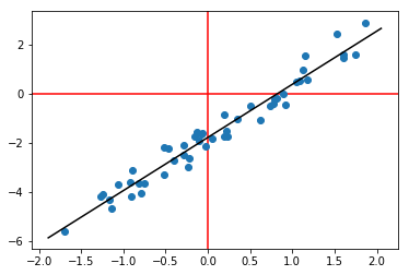
Another option (using np.linalg.lstsq):

# generate some fake data
N = 50
x = np.random.randn(N, 1)
y = x*2.2 + np.random.randn(N, 1)*0.4 - 1.8
plt.axhline(0, color='r', zorder=-1)
plt.axvline(0, color='r', zorder=-1)
plt.scatter(x, y)

# fit least-squares with an intercept
w = np.linalg.lstsq(np.hstack((x, np.ones((N,1)))), y)[0]
xx = np.linspace(*plt.gca().get_xlim()).T

# plot best-fit line
plt.plot(xx, w[0]*xx + w[1], '-k')

best-fit line

Azote answered 8/3, 2017 at 16:54 Comment(0)
P
2

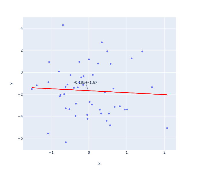
This is covering the plotly approach

#load the libraries

import pandas as pd
import numpy as np
import plotly.express as px
import plotly.graph_objects as go

# create the data
N = 50
x = pd.Series(np.random.randn(N))
y = x*2.2 - 1.8

# plot the data as a scatter plot
fig = px.scatter(x=x, y=y) 

# fit a linear model 
m, c = fit_line(x = x, 
                y = y)

# add the linear fit on top
fig.add_trace(
    go.Scatter(
        x=x,
        y=m*x + c,
        mode="lines",
        line=go.scatter.Line(color="red"),
        showlegend=False)
)
# optionally you can show the slop and the intercept 
mid_point = x.mean()

fig.update_layout(
    showlegend=False,
    annotations=[
        go.layout.Annotation(
            x=mid_point,
            y=m*mid_point + c,
            xref="x",
            yref="y",
            text=str(round(m, 2))+'x+'+str(round(c, 2)) ,
        )
    ]
)
fig.show()

where fit_line is

def fit_line(x, y):
    # given one dimensional x and y vectors - return x and y for fitting a line on top of the regression
    # inspired by the numpy manual - https://docs.scipy.org/doc/numpy/reference/generated/numpy.linalg.lstsq.html 
    x = x.to_numpy() # convert into numpy arrays
    y = y.to_numpy() # convert into numpy arrays

    A = np.vstack([x, np.ones(len(x))]).T # sent the design matrix using the intercepts
    m, c = np.linalg.lstsq(A, y, rcond=None)[0]

    return m, c

enter image description here

Pugging answered 30/10, 2019 at 12:43 Comment(0)
D
1

Best answer above is using seaborn. To add to above, if you are creating many plots with a loop, you can still use matplotlib

    import pandas as pd
    import seaborn as sns
    import matplotlib.pyplot as plt

    data_reduced= pd.read_csv('fake.txt',sep='\s+')
    for x in data_reduced.columns:
        sns.regplot(data_reduced[x],data_reduced['2015'])
        plt.show()

plt.show() will pause execution so you can view the plots one at a time

Document answered 18/9, 2020 at 5:18 Comment(0)

© 2022 - 2024 — McMap. All rights reserved.