Multi-coloured circular div using background colours?
Asked Answered
G

7

34

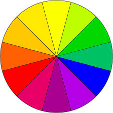
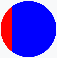
I'm trying to create a multi-coloured circle in CSS to simulate a wheel of fortune, I've tried using linear gradients but it just applies strips of colour running vertically through the circular div rather than being coloured areas as if you were cutting up a pizza if that makes sense?

This is the code I've tried:

background: -moz-linear-gradient(left, red, red 20%, blue 20%, blue);

Which results in:

Wheel-attempt

But I want it to look more like this?:

Coloured wheel

Is this possible in CSS or am I going to have to use a background image (I'd rather avoid this because it isn't as easy to scale as the page resizes etc..)?

Gal answered 13/12, 2017 at 9:13 Comment(10)
It could be possible, but it would be quite the long HTML/CSS. You will have to create many objects, then cut them using ::before and ::after statements. Wouldn't it be easier just to use a background image, and have 2 or 3 media queries to use different background for the different screen sizes?Vanadinite
Use html canvas to make a piechart that would be close enough to what you want to achieve I guess.Houseboat
..or use SVG much simpler.Clarence
#27943553Clarence
Woah.. I've been working all day on other code and just come back to see all the replies. I will check shortly and report back what works!Gal
Please check my answer. It is more appropriate to your question and I gave two versions. @GalDialogist
@Gal i elaborated more my answer to give more examples ;) I also implemented the wheel of fortune :)Punchball
@N.Ivanov the reason I want to avoid images is because it doesn't scale as well as pure CSS even using media queries.Gal
TemaniAfif @Gal said he was going to go with my updated version because it seemed to be the most concise and easy to modify, works perfectly with the element he already had. And my updates coming soon! :)Dialogist
@ElvinMammadov the OP choosed your answer because it was easy for him to handle so i think it's useless to update it with a copy of what i did as in this case the OP could simply pick up what i did ;)Punchball
D
22

You can make this with using borders:

.chart {
  position: absolute;
  width: 0;
  height: 0;
  border-radius: 60px;
  -moz-border-radius: 60px;
  -webkit-border-radius: 60px;
}

#chart1 {
  border-right: 60px solid red;
  border-top: 60px solid transparent;
  border-left: 60px solid transparent;
  border-bottom: 60px solid transparent;
}

#chart2 {
  border-right: 60px solid transparent;
  border-top: 60px solid green;
  border-left: 60px solid transparent;
  border-bottom: 60px solid transparent;
}

#chart3 {
  border-right: 60px solid transparent;
  border-top: 60px solid transparent;
  border-left: 60px solid blue;
  border-bottom: 60px solid transparent;
}

#chart4 {
  border-right: 60px solid transparent;
  border-top: 60px solid transparent;
  border-left: 60px solid transparent;
  border-bottom: 60px solid yellow;
}
<div id="chart1" class="chart"></div>
<div id="chart2" class="chart"></div>
<div id="chart3" class="chart"></div>
<div id="chart4" class="chart"></div>

UPDATE 1

.pizza {
width: 300px;
height: 300px;
border-radius: 100%;
background: linear-gradient(45deg, lightblue 50%, blue 0%), linear-gradient(-45deg, green 50%, darkgreen 0%), linear-gradient(-45deg, #E5E500 50%, yellow 0%), linear-gradient(45deg, tomato 50%, red 0%);
background-size: 50% 50%;
background-position: 0% 0%, 100% 0%, 0 100%, 100% 100%;
background-repeat: no-repeat;
}
<div class="pizza"></div>
Dialogist answered 13/12, 2017 at 9:30 Comment(2)
I think I'm going to go with your updated version because it seems to be the most concise and easy to modify, works perfectly with the element I already have, thank you!Gal
Chaps, let's not all argue, everyone gave a working answer for which I am grateful and I upvoted all working answers (I tested all of them) but this one seemed the most easy to modify and was a simple copy and paste with no other changes to my code; that's why I choose it as the accepted answer.Gal
P
43

One solution is to use multiple background layer considering rotated linear-gradient. We can also rely on pseudo-element and some transparent colors.

Then simply adjust the degrees, colors, opacity of colors and position of pseudo element to obtain any chart you want:

.circle {
  margin: 20px;
  width: 200px;
  height: 200px;
  border-radius: 50%;
  background: 
    linear-gradient(to right, rgba(255,0,0,0.5) 50%, yellow 0%), 
    linear-gradient(-110deg, black 50%, pink 0%);
  position: relative;
  overflow: hidden;
}

.circle:after,
.circle:before{
  content: "";
  position: absolute;
  top: 0;
  left: 0;
  bottom: 0;
  right: 0;
}
.circle:after {
  background: linear-gradient(-45deg, rgba(255, 180, 180, 0.5) 50%, transparent 0%);
    bottom: 50%;
    left: 50%;
}

.circle:before {
  background: 
    linear-gradient(0deg, rgba(128, 169, 170, 0.5) 50%, transparent 0%), 
    linear-gradient(50deg, rgba(0, 169, 170, 1) 50%, transparent 0%);
}
<div class="circle"></div>

Here is more example considering different configuration

  1. Using only one element and multiple gradient:

.circle {
  margin: 20px;
  width: 200px;
  height: 200px;
  border-radius: 50%;
  background: linear-gradient(0deg, rgba(0, 255, 217, 0.4) 50%, transparent 0%), 
              linear-gradient(45deg, rgba(0, 128, 0, 0.4) 50%, transparent 0%), 
              linear-gradient(90deg, rgba(11, 255, 0, 0.4) 50%, transparent 0%), 
              linear-gradient(135deg, pink 50%, transparent 0%), 
              linear-gradient(180deg, brown 50%, transparent 0%),
              linear-gradient(225deg, yellow 50%, transparent 0%),
              linear-gradient(270deg, red 50%, transparent 0%);
  position: relative;
  overflow: hidden;
}
<div class="circle"></div>
  1. Using multiple elements and one gradient per element :

.circle {
  margin: 20px;
  width: 200px;
  height: 200px;
  border-radius: 50%;
  background: linear-gradient(to right, red 50%, yellow 0%);
  position: relative;
  overflow: hidden;
}

.circle:after {
  content: "";
  position: absolute;
  top: 0;
  left: 0;
  bottom: 0;
  right: 0;
  background: linear-gradient(45deg, rgba(255, 180, 180, 0.5) 50%, transparent 0%);
}

.circle:before {
  content: "";
  position: absolute;
  top: 0;
  left: 0;
  bottom: 0;
  right: 0;
  background: linear-gradient(125deg, rgba(128, 169, 170, 0.5) 50%, transparent 0%);
}

.circle-alt {
  width: 200px;
  height: 200px;
  border-radius: 50%;
  background: linear-gradient(to bottom, rgba(0, 250, 0, 0.5) 50%, rgba(0, 250, 255, 0.5) 0%);
  position: absolute;
  overflow: hidden;
}
<div class="circle">
  <div class="circle-alt"></div>
</div>
  1. Using Multiple elements and multiple gradients per elements and only solid color (without changing background-position like the answer of @vals) :

.circle {
  margin: 20px;
  width: 200px;
  height: 200px;
  border-radius: 50%;
  background: linear-gradient(to right, red 50%, transparent 0%), 
              linear-gradient(225deg, transparent 50%, blue 0%),
              linear-gradient(0deg, green 50%, transparent 0%),
              linear-gradient(-45deg, black 50%, transparent 0%),
              linear-gradient(-90deg, yellow 50%, transparent 0%);
  position: relative;
  overflow: hidden;
}

.circle:before {
  content: "";
  position: absolute;
  top: 0;
  left: 0;
  bottom: 50%;
  right: 50%;
  background:linear-gradient(45deg,lightblue 50%, transparent 0%)
}
.circle:after {
  content: "";
  position: absolute;
  top: 50%;
  left: 0;
  bottom: 0;
  right: 50%;
  background:linear-gradient(135deg, brown 50%, pink 0%);
}
<div class="circle"></div>
  1. The wheel of fortune (With rotation !):

.circle {
  margin: 20px;
  width: 200px;
  height: 200px;
  border-radius: 50%;
  background: linear-gradient(to right, #06b51d 50%, transparent 0%), 
              linear-gradient(60deg, #7e00ff 50%, transparent 0%), 
              linear-gradient(30deg, #ff00bd 50%, transparent 0%), 
              linear-gradient(0deg, #ff0000 50%, transparent 0%), 
              linear-gradient(-30deg, #ff4700 50%, transparent 0%), 
              linear-gradient(-60deg, #ffa500 50%, transparent 0%), 
              linear-gradient(-90deg, #ffff00 50%, transparent 0%);
  position: relative;
  overflow: hidden;
  animation: rotate 6s linear infinite;
}
.circle:before {
  content: "";
  position: absolute;
  top: 0;
  left: 0;
  bottom: 50%;
  right: 50%;
  background: linear-gradient(210deg, transparent 64%, #09ffa5 0%),
              linear-gradient(240deg, transparent 37%, #34ff00 0%);
}

.circle:after {
  content: "";
  position: absolute;
  top: 50%;
  left: 0;
  bottom: 0;
  right: 50%;
  background:linear-gradient(150deg, #00acff 37%, transparent 0%),
             linear-gradient(120deg, #0075ff 63%, #1200ff 0%);
}
@keyframes rotate {
  from {
    transform: rotate(0deg);
  }
  to {
    transform: rotate(360deg);
  }
}
<div class="circle"></div>

Related question with a different way to achieve the same result: Sass/CSS color wheel

Punchball answered 13/12, 2017 at 9:23 Comment(5)
How did you make this wheel of colors? Was it yourself or some generator?Tiebold
@NevinMadhukarK it was myselfPunchball
I need to make something like this - imgur.com/a/MODPouI Any advice on which of your examples might help with that?Tiebold
@NevinMadhukarK you can check this question: https://mcmap.net/q/245271/-sass-css-multi-color-wheel I wrote a SASS code to easily control it.Punchball
I managed to get it on that answer. Although I was thinking of more of a linear gradient answer. That uses span if I am correct.Tiebold
D
22

You can make this with using borders:

.chart {
  position: absolute;
  width: 0;
  height: 0;
  border-radius: 60px;
  -moz-border-radius: 60px;
  -webkit-border-radius: 60px;
}

#chart1 {
  border-right: 60px solid red;
  border-top: 60px solid transparent;
  border-left: 60px solid transparent;
  border-bottom: 60px solid transparent;
}

#chart2 {
  border-right: 60px solid transparent;
  border-top: 60px solid green;
  border-left: 60px solid transparent;
  border-bottom: 60px solid transparent;
}

#chart3 {
  border-right: 60px solid transparent;
  border-top: 60px solid transparent;
  border-left: 60px solid blue;
  border-bottom: 60px solid transparent;
}

#chart4 {
  border-right: 60px solid transparent;
  border-top: 60px solid transparent;
  border-left: 60px solid transparent;
  border-bottom: 60px solid yellow;
}
<div id="chart1" class="chart"></div>
<div id="chart2" class="chart"></div>
<div id="chart3" class="chart"></div>
<div id="chart4" class="chart"></div>

UPDATE 1

.pizza {
width: 300px;
height: 300px;
border-radius: 100%;
background: linear-gradient(45deg, lightblue 50%, blue 0%), linear-gradient(-45deg, green 50%, darkgreen 0%), linear-gradient(-45deg, #E5E500 50%, yellow 0%), linear-gradient(45deg, tomato 50%, red 0%);
background-size: 50% 50%;
background-position: 0% 0%, 100% 0%, 0 100%, 100% 100%;
background-repeat: no-repeat;
}
<div class="pizza"></div>
Dialogist answered 13/12, 2017 at 9:30 Comment(2)
I think I'm going to go with your updated version because it seems to be the most concise and easy to modify, works perfectly with the element I already have, thank you!Gal
Chaps, let's not all argue, everyone gave a working answer for which I am grateful and I upvoted all working answers (I tested all of them) but this one seemed the most easy to modify and was a simple copy and paste with no other changes to my code; that's why I choose it as the accepted answer.Gal
F
17

It can be done using conic gradients.

.elem {
  width: 200px;
  height: 200px;
  background: conic-gradient(yellow 8.3%, greenyellow 0 16.6%, green 0 24.9%, darkgreen 0 33.2%, blue 0 41.5%, violet 0 49.8%, purple 0 58.1%, pink 0 66.4%, red 0 74.7%, orangered 0 83%, orange 0 91.3%, gold 0 100%);
  border-radius: 50%
}
<div class="elem"></div>
Fusible answered 13/12, 2017 at 9:26 Comment(2)
It's working (Chrome, FF and Safari), just not with the built-in "run code snippet" feature (presumably because it's including an external script?).Therm
Sorry, I've updated the snippet now and it should be working in all browsers. In Chrome it should have been working though, it was in the latest version for me. For some browsers it needs prefix free loading first.Fusible
F
10

Extending on the answer of @Temani Afif, but more similar to your request:

.test {
  width: 600px;
  height: 600px;
  border-radius: 50%;
  background-size: 50% 50%;
  background-repeat: no-repeat;
  background-image: linear-gradient(150deg, transparent 63%, tomato 63%),  
    linear-gradient(120deg, transparent 36.5%, red 36.5%),
    linear-gradient(fuchsia, fuchsia),
    linear-gradient(240deg, transparent 63%, green 63%),  
    linear-gradient(210deg, transparent 36.5%, lime 36.5%),
    linear-gradient(lightgreen, lightgreen),
    linear-gradient(330deg, transparent 63%, blue 63%),  
    linear-gradient(300deg, transparent 36.5%, lightblue 36.5%),
    linear-gradient(cyan, cyan),
    linear-gradient(60deg, transparent 63%, papayawhip 63%),  
    linear-gradient(30deg, transparent 36.5%, yellow 36.5%),
    linear-gradient(gold, gold);
  background-position: right top, right top, right top, 
        right bottom, right bottom, right bottom,
        left bottom, left bottom, left bottom,
        left top, left top, left top;
}
<div class="test"></div>
Fielding answered 13/12, 2017 at 22:11 Comment(0)
D
7

You could achieve this with css, but as you want 12 slices you will have to use a more complicated markup. If you only want to use 4 or 8, a much simpler solution using a multiple background would be possible.

  • Use the border-radius combined with a skew-trick to draw a slice of arbitratry angle
  • Use multiple wrapped slices, each rotated

Another idea which I would prefer: Use a svg graphic for it.

.container {
  position: absolute;
  left: 300px;
  top: 0;
}

.wrap {
  position: absolute;
  transform: rotate(30deg);
  transform-origin: 0% 100%;
}

.slice {
  height: 100px;
  width: 100px;
  overflow: hidden;
  transform-origin: 0% 100%;
  transform: skew(-60deg);
  position: relative;
}

.slice::before {
  height: inherit;
  width: inherit;
  position: absolute;
  content: "";
  border-radius: 0 100% 0 0;
  transform-origin: 0% 100%;
  transform: skew(60deg);
}

.wrap-0 {
  transform: rotate(0deg);
}

.wrap-0 .slice::before {
  background: hsl(0, 100%, 50%);
}

.wrap-1 {
  transform: rotate(30deg);
}

.wrap-1 .slice::before {
  background: hsl(30, 100%, 50%);
}

.wrap-2 {
  transform: rotate(60deg);
}

.wrap-2 .slice::before {
  background: hsl(60, 100%, 50%);
}

.wrap-3 {
  transform: rotate(90deg);
}

.wrap-3 .slice::before {
  background: hsl(90, 100%, 50%);
}

.wrap-4 {
  transform: rotate(120deg);
}

.wrap-4 .slice::before {
  background: hsl(120, 100%, 50%);
}

.wrap-5 {
  transform: rotate(150deg);
}

.wrap-5 .slice::before {
  background: hsl(150, 100%, 50%);
}

.wrap-6 {
  transform: rotate(180deg);
}

.wrap-6 .slice::before {
  background: hsl(180, 100%, 50%);
}

.wrap-7 {
  transform: rotate(210deg);
}

.wrap-7 .slice::before {
  background: hsl(210, 100%, 50%);
}

.wrap-8 {
  transform: rotate(240deg);
}

.wrap-8 .slice::before {
  background: hsl(240, 100%, 50%);
}

.wrap-9 {
  transform: rotate(270deg);
}

.wrap-9 .slice::before {
  background: hsl(270, 100%, 50%);
}

.wrap-10 {
  transform: rotate(300deg);
}

.wrap-10 .slice::before {
  background: hsl(300, 100%, 50%);
}

.wrap-11 {
  transform: rotate(330deg);
}

.wrap-11 .slice::before {
  background: hsl(330, 100%, 50%);
}
<div class="container">
  <div class="wrap wrap-0">
    <div class="slice"></div>
  </div>
  <div class="wrap wrap-1">
    <div class="slice"></div>
  </div>
  <div class="wrap wrap-2">
    <div class="slice"></div>
  </div>
  <div class="wrap wrap-3">
    <div class="slice"></div>
  </div>
  <div class="wrap wrap-4">
    <div class="slice"></div>
  </div>
  <div class="wrap wrap-5">
    <div class="slice"></div>
  </div>
  <div class="wrap wrap-6">
    <div class="slice"></div>
  </div>
  <div class="wrap wrap-7">
    <div class="slice"></div>
  </div>
  <div class="wrap wrap-8">
    <div class="slice"></div>
  </div>
  <div class="wrap wrap-9">
    <div class="slice"></div>
  </div>
  <div class="wrap wrap-10">
    <div class="slice"></div>
  </div>
  <div class="wrap wrap-11">
    <div class="slice"></div>
  </div>
</div>
Detradetract answered 13/12, 2017 at 10:22 Comment(0)
M
6

CSS Tricks has a post about conic gradients that describes the "colorful umbrella" as an intermediate step, which looks perfect for your use. I've put it together into a Code Pen for convenience.

HTML:

<div class="wheel">
  <ul class="umbrella">
    <li class="color"></li>
    <li class="color"></li>
    <li class="color"></li>
    <li class="color"></li>
    <li class="color"></li>
    <li class="color"></li>
    <li class="color"></li>
    <li class="color"></li>
    <li class="color"></li>
    <li class="color"></li>
    <li class="color"></li>
    <li class="color"></li>
  </ul>
</div>

SCSS:

@mixin circle($size) {
  content: "";
  position: absolute;
  border-radius: 50%;
  width: $size;
  height: $size;
  left: calc(50% - #{$size/2});
  top: calc(50% - #{$size/2});
}

$wheel: 15em;
.color {
  @include circle($wheel);
  clip: rect(0, $wheel, $wheel, #{$wheel/2});
  &:after {
    @include circle($wheel);
    background: blue;
    clip: rect(0, #{$wheel/2}, $wheel, 0);
    transform: rotate(45deg);
  }
}

.color, .color:nth-child(n+7):after {
  clip: rect(0, $wheel, $wheel, #{$wheel/2});
}
.color:after, .color:nth-child(n+7) {
  @include circle($wheel);
  clip: rect(0, #{$wheel/2}, $wheel, 0);
}

$colors: (#9ED110, #50B517, #179067, #476EAF, #9f49ac, #CC42A2, #FF3BA7, #FF5800, #FF8100, #FEAC00, #FFCC00, #EDE604);
@for $i from 0 to length($colors) {
  .color:nth-child(#{1+$i}):after {
    background-color: nth($colors, $i+1);
    @if $i < 6 {
      transform: rotate(#{30*(1+$i)}deg);
      z-index: #{length($colors)-$i};
    } @else {
      transform: rotate(#{-30+(30*(1+$i))}deg);
    }
  }
}

As a side note, if your only issue with background images is the scaling issue, keep in mind that SVG images scale smoothly, since they're basically vector graphics. (You'd have to draw that manually, but the image would scale.)

Mouldon answered 13/12, 2017 at 12:11 Comment(3)
I like the idea of conic gradients but I don't think using <li> tags to represent colour on a wheel is semantically correct. I'm also steering away from SVG to keep things simple as I'll be binding JavaScript events and manipulate the wheel from JavaScript too.Gal
The <ul> and <li> tags could just as easily be <div> or <span> tags (or something else) if the semantics bother you. (There's also an argument to be made that a color wheel is precisely a list of colors, but I don't feel the need to entrench myself on that point.) Needing to manipulate the colors from JS is a consideration you might want to add to your question up top.Mouldon
Aye, I understand it could be swapped out for more semantic tags but it's not as concise as the other choices, that's why I didn't accept it as the "accepted answer". I still upvoted it though as it's a valid solution, thank you!Gal
R
0
<div class="circle">
    <div class="table italy">
        <div class="table-cell green"></div>
        <div class="table-cell white"></div>
        <div class="table-cell red"></div>
    </div>
</div>
<div class="circle">
    <div class="table france">
        <div class="table-cell blue"></div>
        <div class="table-cell white"></div>
        <div class="table-cell red"></div>
    </div>
</div>
<div class="circle">
    <div class="table windows">
        <div class="table-cell red"></div>
        <div class="table-cell green"></div>
        <div class="table-cell yellow"></div>
        <div class="table-cell blue"></div>
    </div>
</div>
<div class="circle">
    <div class="table rainbow">
        <div class="table-cell red"></div>
        <div class="table-cell orange"></div>
        <div class="table-cell yellow"></div>
        <div class="table-cell green"></div>
        <div class="table-cell blue"></div>
        <div class="table-cell indigo"></div>
        <div class="table-cell violet"></div>
    </div>
</div>

There you have it: a reliable way to create multi-color circles. The great thing about this approach is that it doesn’t matter how many colors you have AND it works all the way back to IE.

Rickart answered 19/12, 2017 at 5:13 Comment(1)
just a question : how can this HTML works without any CSS with it ?Punchball

© 2022 - 2024 — McMap. All rights reserved.