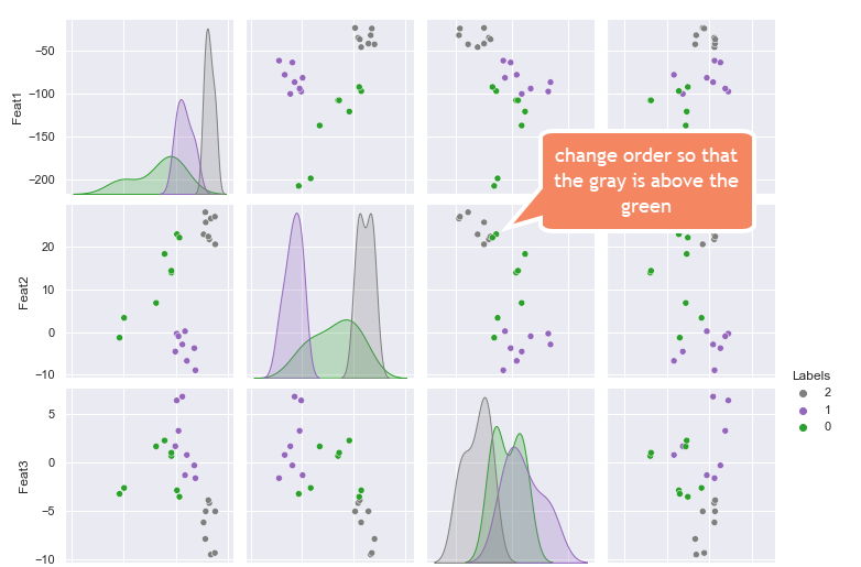
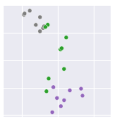
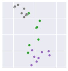
For the seaborn pairplot shown below, how to change the order of the Labels, so that hidden points can be viewed in subsequent plots?
Note that I looked at this link, but could not configure my code correctly to work.
Also, I tried changing the order of the labels, while keeping the color tied to the labels via the elegant solution provided here carried out by Trenton McKinney, but that did not change the order of how the points showed up on the plot.
Can you assist me in changing the order of the points being plotted so that hidden points can be viewed in subsequent plots.
Here is the original code:
import seaborn as sns
import pandas as pd

data = {'Feat1': [-46.220314, -23.80669, -42.092365, -35.29639, -37.075096, -42.8849, -32.3057, -24.469942, -97.89892, -81.96325, -78.41986, -100.68544, -87.05412, -64.121056, -94.504845, -61.951996, -108.19452, -97.4037, -92.641335, -199.18787, -137.5976, -208.0035, -108.225975, -121.29299],
        'Feat2': [22.862856, 20.536781, 25.680704, 21.709473, 22.347767, 28.03802, 26.568039, 27.005375, -0.38156664, 0.1821717, -6.766374, -4.5810957, -2.9231584, -3.7892206, -0.9999217, -8.960198, 13.909201, 22.897585, 22.10624, 3.3090565, 6.795896, -1.33229, 14.341716, 18.274035],
        'Feat3': [-6.1573067, -5.015675, -5.0092897, -4.160352, -3.860426, -7.8572545, -9.47018, -9.301921, 6.4163384, -1.2870358, 0.8001185, 1.6977689, 6.817379, -0.283514, 3.2884297, -1.5915259, 0.6966458, -2.8488266, -3.5110545, -2.5994794, 1.6793671, -3.2078092, 1.02891, 2.2891548],
        'Feat4': [5.6060414, 4.2216353, 5.665794, 5.578346, 5.6953945, 3.3361, 3.4532788, 4.3995037, 7.234347, 4.703838, 0.83444935, 1.8801615, 5.4460077, 6.3084154, 6.881124, 5.6160254, -1.956591, 1.4105041, 2.467166, 4.0802555, 2.2256763, 1.5177402, -1.8651972, 2.3360753],
        'Labels': [2, 2, 2, 2, 2, 2, 2, 2, 1, 1, 1, 1, 1, 1, 1, 1, 0, 0, 0, 0, 0, 0, 0, 0]}
df = pd.DataFrame(data)
df1 = df.copy()
df2 = df.copy()

df1['Labels'] = y_train.astype(str) #Make it string
df1.Labels = pd.Categorical(values=df1.Labels, categories=['0', '1', '2'], ordered=True)

sns.set(style='darkgrid', context='notebook')
colors = dict(zip(['2', '1', '0'], sns.color_palette('tab10_r', 3)))
sns.pairplot(df1, hue='Labels', palette=colors)

df2['Labels'] = df2['Labels'].astype(str) #Make it string

df2.Labels = pd.Categorical(values=df2.Labels, categories=['2', '1', '0'], ordered=True)
sns.pairplot(df2, hue='Labels', palette=colors)


