Solution with the new ViewPager2
Nowadays you should consider using ViewPager2 which "replaces ViewPager, addressing most of its predecessor’s pain-points":
- Based on RecyclerView
- RTL (right-to-left) layout support
- Vertical orientation support
- Reliable Fragment support (including handling changes to the underlying Fragment collection)
- Dataset change animations (including
DiffUtil support)
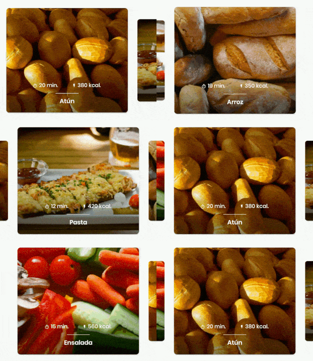
The result
![enter image description here]()
The code
In your Activity/Fragment, setup the ViewPager2:
// MyRecyclerViewAdapter is an standard RecyclerView.Adapter :)
viewPager2.adapter = MyRecyclerViewAdapter()

// You need to retain one page on each side so that the next and previous items are visible
viewPager2.offscreenPageLimit = 1

// Add a PageTransformer that translates the next and previous items horizontally
// towards the center of the screen, which makes them visible
val nextItemVisiblePx = resources.getDimension(R.dimen.viewpager_next_item_visible)
val currentItemHorizontalMarginPx = resources.getDimension(R.dimen.viewpager_current_item_horizontal_margin)
val pageTranslationX = nextItemVisiblePx + currentItemHorizontalMarginPx
val pageTransformer = ViewPager2.PageTransformer { page: View, position: Float ->
    page.translationX = -pageTranslationX * position
    // Next line scales the item's height. You can remove it if you don't want this effect
    page.scaleY = 1 - (0.25f * abs(position))
    // If you want a fading effect uncomment the next line:
    // page.alpha = 0.25f + (1 - abs(position))
}
viewPager2.setPageTransformer(pageTransformer)

// The ItemDecoration gives the current (centered) item horizontal margin so that
// it doesn't occupy the whole screen width. Without it the items overlap
val itemDecoration = HorizontalMarginItemDecoration(
    context,
    R.dimen.viewpager_current_item_horizontal_margin
)
viewPager2.addItemDecoration(itemDecoration)
Add the HorizontalMarginItemDecoration, which is a trivial ItemDecoration:
/**
 * Adds margin to the left and right sides of the RecyclerView item.
 * Adapted from https://mcmap.net/q/27078/-how-to-add-dividers-and-spaces-between-items-in-recyclerview
 * @param horizontalMarginInDp the margin resource, in dp.
 */
class HorizontalMarginItemDecoration(context: Context, @DimenRes horizontalMarginInDp: Int) :
    RecyclerView.ItemDecoration() {

    private val horizontalMarginInPx: Int =
        context.resources.getDimension(horizontalMarginInDp).toInt()

    override fun getItemOffsets(
        outRect: Rect, view: View, parent: RecyclerView, state: RecyclerView.State
    ) {
        outRect.right = horizontalMarginInPx
        outRect.left = horizontalMarginInPx
    }

}
Add the dimensions that control how much of the previous/next item is visible, and current item horizontal margin:
<dimen name="viewpager_next_item_visible">26dp</dimen>
<dimen name="viewpager_current_item_horizontal_margin">42dp</dimen>
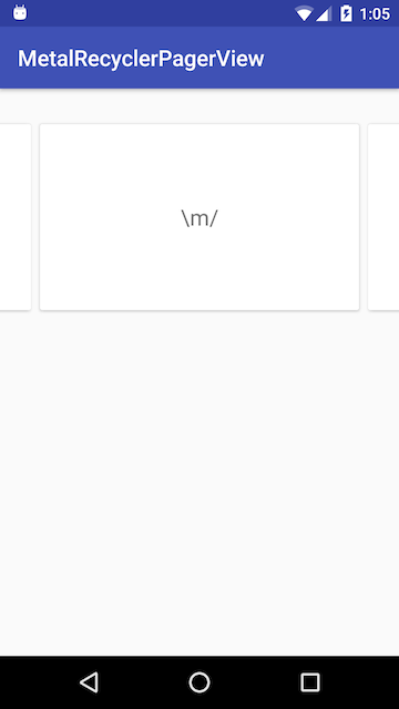
![enter image description here]()
Finally add the ViewPager2 to your layout:
<androidx.viewpager2.widget.ViewPager2
    android:id="@+id/viewPager"
    android:layout_width="match_parent"
    android:layout_height="wrap_content" />
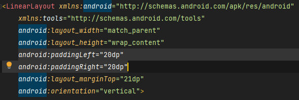
One important thing: a ViewPager2 item must have layout_height="match_parent" (otherwise it throws an IllegalStateException), so you should do something like:
<androidx.cardview.widget.CardView xmlns:android="http://schemas.android.com/apk/res/android"
    xmlns:app="http://schemas.android.com/apk/res-auto"
    android:layout_width="match_parent"
    android:layout_height="match_parent" <-- this!
    app:cardCornerRadius="8dp"
    app:cardUseCompatPadding="true">

    <androidx.constraintlayout.widget.ConstraintLayout
        android:layout_width="match_parent"
        android:layout_height="280dp">

        <!-- ... -->

    </androidx.constraintlayout.widget.ConstraintLayout>

</androidx.cardview.widget.CardView>
PageTransformer examples
Google has added a guide on ViewPager2 that has 2 PageTransformer implementations that you can use as an inspiration: https://developer.android.com/training/animation/screen-slide-2
About the new ViewPager2





setPageMargin(-100)work correctly? – ShariViewPager2then check this answer https://mcmap.net/q/57488/-view-pager-with-previous-and-next-item-smaller-in-size-with-infinite-scroll – Irretentive