Is there an official API for centered title on Toolbar like on popular Android apps, in the new material design?
Asked Answered
O

5

12

Background

In the past, Google always shown the toolbar to have the title aligned to the left:

https://material.io/develop/android/components/app-bar-layout/

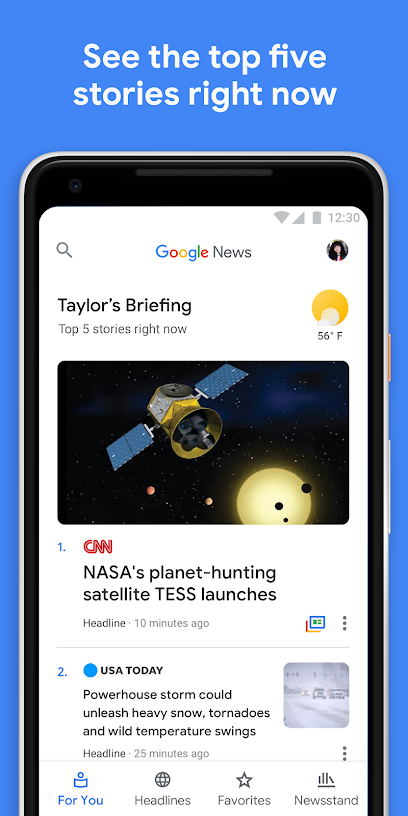
However, recently, it seems that on some of its apps, the title is centered, even if it doesn't have symmetric content on the left and right. Example is on "Messages" app:

enter image description here

And on "Google News" app :

enter image description here

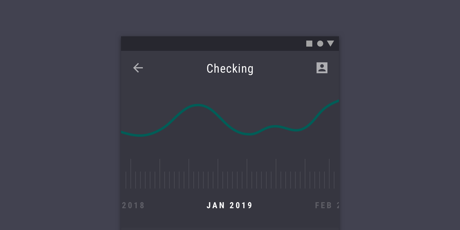
It also got updated on the material guidelines, here. Example:

enter image description here

Some people like to call it "material design 2.0", as it got various things updated.

The problem

While there are plenty of similar questions on StackOverflow from the time it was called "ActionBar" (example here ), here it's different, because it should have the support library (AKA "Android-X") have a way to handle it correctly, because things have changed, and now Google should support it as it's a part of the guidelines and part of various Android apps.

What I've tried

I tried to add a view within the toolbar, but even by coloring the view, you can see that it's not really centered, automatically, and that's before adding more action-items or up-button :

enter image description here

activity_main.xml

<androidx.coordinatorlayout.widget.CoordinatorLayout
        xmlns:android="http://schemas.android.com/apk/res/android"
        xmlns:app="http://schemas.android.com/apk/res-auto"
        xmlns:tools="http://schemas.android.com/tools"
        android:layout_width="match_parent"
        android:layout_height="match_parent"
        tools:context=".MainActivity">

    <com.google.android.material.appbar.AppBarLayout
            android:layout_height="wrap_content"
            android:layout_width="match_parent"
            android:theme="@style/AppTheme.AppBarOverlay">

        <androidx.appcompat.widget.Toolbar
                android:id="@+id/toolbar"
                android:layout_width="match_parent"
                android:layout_height="?attr/actionBarSize"
                android:background="?attr/colorPrimary"
                app:popupTheme="@style/AppTheme.PopupOverlay">

            <TextView android:layout_width="match_parent" android:layout_height="match_parent" android:text="title"
                      android:gravity="center" android:background="#33ff0000"
                      android:id="@+id/titleTextView"/>
        </androidx.appcompat.widget.Toolbar>

    </com.google.android.material.appbar.AppBarLayout>

</androidx.coordinatorlayout.widget.CoordinatorLayout>

This solution is similar to many others presented on other StackOverflow threads similar to this question, and just like there, it fails to really center the text, while on Google's attempt, it gets centered correctly, no matter the number of action items and other views around.

There is also a nicer workaround that I've come up with: have one toolbar on each side, and make the TextView have margin that is the max of both. There is even a library for this, "Toolbar-Center-Title"... But again, this is a workaround. Not what I'm asking about.

The question

Is there now an official way to have a centered title on the Toolbar, no matter how many action items there are, and no matter what's on the other side (up button, for example) ?

If so, how can this be done?

NOTE: Again, I'm not interested in workarounds. There are plenty of workarounds and I can think of such by myself.

Overnice answered 25/2, 2019 at 15:14 Comment(0)
J
2

Now We have an official way to center the title on a toolbar using Material Design 3

Using Material Design 3 we can align the title in the center without doing extra work or without adding text view in toolbar

To align the title in the center We need to use the below properly

 app:titleCentered="true"

To align subtitles in the center we need to use the below property

app:subtitleCentered="true"

Sample Code

<com.google.android.material.appbar.AppBarLayout
      android:layout_width="match_parent"
      android:layout_height="wrap_content">

    <com.google.android.material.appbar.MaterialToolbar
        android:id="@+id/topAppBar"
        android:layout_width="match_parent"
        android:layout_height="?attr/actionBarSize"
        app:title="Center Aligned title"
        app:subtitle="Sub title"
        app:subtitleCentered="true"
        app:menu="@menu/top_app_bar"
        app:titleCentered="true"
        app:navigationIcon="@drawable/ic_android_black_24dp" />

</com.google.android.material.appbar.AppBarLayout>

OUTPUT

enter image description here

Judaic answered 13/7, 2022 at 6:30 Comment(1)
Interesting. What would happen to the toolbar action items though? How would they exist while there is often on the other side, yet there is text in the middle? The text won't overlap them, right?Overnice
S
3

TL;DR: No, there's currently no official way to center the title on a toolbar.


I don't think there is an official way to do it, at least not yet. But I know that the Flutter framework supports it and it's pretty straight forward: you simply need to pass centerTitle: true to the appbar constructor, as described in this answer. And there's a good chance that the apps you've mentioned in your question were built with Flutter, since both are from Google.

I think the closest workaround to your expected layout is having the TextView on top of the Toolbar, as shown here:

<android.support.design.widget.AppBarLayout
    android:id="@+id/appbar_layout"
    android:layout_width="match_parent"
    android:layout_height="wrap_content">
    <RelativeLayout
        android:layout_width="match_parent"
        android:layout_height="wrap_content">

        <android.support.v7.widget.Toolbar
            android:id="@+id/toolbar"
            android:layout_width="match_parent"
            android:layout_height="wrap_content"
            android:theme="@style/ThemeOverlay.AppCompat.ActionBar">
        </android.support.v7.widget.Toolbar>

        <TextView
            android:layout_centerInParent="true"
            android:layout_width="wrap_content"
            android:layout_height="wrap_content"
            android:text="@string/app_name"/>

    </RelativeLayout>
</android.support.design.widget.AppBarLayout>

But it would be really nice if the official Android API could support this the same way flutter does. Maybe you'd like to send a feature request to the Material Components Android Issue Tracker?

Sprint answered 4/3, 2019 at 13:29 Comment(3)
Code you wrote is similar to other workarounds I've found. Won't work well as it might overlap on this case. If I wanted a workaround, I'd have one toolbar on each side, and make the TextView have margin that is the max of both. But I'm not interested in a workaround. I've updated the question.Overnice
Seems you are right. There is no official way to do it. Workarounds don't really matter. All of them probably won't work. There is even a library for this: github.com/RaviKoradiya/Toolbar-Center-Title . Not sure how well it works. I've found this on the issue tracker: issuetracker.google.com/issues/123303613Overnice
@androiddeveloper I twitted this question yesterday and Chris Banes, who worked on the Toolbar also mentioned overlaying it. Let's hope that Feature Request on the issue tracker becomes an actual feature.Reata
J
2

Now We have an official way to center the title on a toolbar using Material Design 3

Using Material Design 3 we can align the title in the center without doing extra work or without adding text view in toolbar

To align the title in the center We need to use the below properly

 app:titleCentered="true"

To align subtitles in the center we need to use the below property

app:subtitleCentered="true"

Sample Code

<com.google.android.material.appbar.AppBarLayout
      android:layout_width="match_parent"
      android:layout_height="wrap_content">

    <com.google.android.material.appbar.MaterialToolbar
        android:id="@+id/topAppBar"
        android:layout_width="match_parent"
        android:layout_height="?attr/actionBarSize"
        app:title="Center Aligned title"
        app:subtitle="Sub title"
        app:subtitleCentered="true"
        app:menu="@menu/top_app_bar"
        app:titleCentered="true"
        app:navigationIcon="@drawable/ic_android_black_24dp" />

</com.google.android.material.appbar.AppBarLayout>

OUTPUT

enter image description here

Judaic answered 13/7, 2022 at 6:30 Comment(1)
Interesting. What would happen to the toolbar action items though? How would they exist while there is often on the other side, yet there is text in the middle? The text won't overlap them, right?Overnice
E
1

How about textAlignment="center"? a RelativeLayout does the trick, when AppCompatTextView has set layout_width="match_parent"; for example:

<?xml version="1.0" encoding="utf-8"?>
<layout
    xmlns:android="http://schemas.android.com/apk/res/android">

    <androidx.appcompat.widget.LinearLayoutCompat
        android:id="@+id/customView"
        android:minHeight="?android:attr/actionBarSize"
        android:layout_height="wrap_content"
        android:layout_width="match_parent"
        android:orientation="vertical"
        android:gravity="top">

        <RelativeLayout
            android:layout_width="match_parent"
            android:layout_height="match_parent">

            <!-- Home Button -->
            <include
                layout="@layout/button_home_menu"
                android:layout_width="wrap_content"
                android:layout_height="wrap_content"
                android:layout_gravity="start"/>

            <androidx.appcompat.widget.LinearLayoutCompat
                android:layout_width="match_parent"
                android:layout_height="wrap_content"
                android:orientation="vertical"
                android:padding="8dp">

                <androidx.appcompat.widget.AppCompatTextView
                    android:id="@+id/title"
                    android:layout_width="match_parent"
                    android:layout_height="wrap_content"
                    android:text="@string/app_name"
                    android:textAlignment="center"
                    android:textAppearance="?android:attr/textAppearanceLarge"
                    android:textSize="18sp"
                    android:textStyle="bold"/>

                <androidx.appcompat.widget.AppCompatTextView
                    android:id="@+id/subtitle"
                    android:layout_width="match_parent"
                    android:layout_height="wrap_content"
                    android:text="@string/app_version"
                    android:textAlignment="center"
                    android:textAppearance="?android:attr/textAppearanceMedium"
                    android:textSize="12sp"
                    android:textStyle="bold"/>

            </androidx.appcompat.widget.LinearLayoutCompat>

        </RelativeLayout>

    </androidx.appcompat.widget.LinearLayoutCompat>

</layout>

the down-side is, that when showing several menu-items as action buttons - or when displaying extraordinary long strings as title, the title may overlap them - but when only showing one or two action buttons in combination with a title that fits the visually available width, this works just fine - that's because menu config ifRoom would always apply, because there is room. else one could only measure, which side of the toolbar has the most wide items' container - and then adjust the width on the other side's items' container. scaling the font-size depending on the available room might also be an option, to make it fit dynamically.

Efface answered 4/3, 2019 at 14:2 Comment(7)
So again, it's not official and won't always work as it should... If I wanted a workaround, I'd have one toolbar on each side, and make the TextView have margin that is the max of both. But I'm not interested in a workaround. I've updated the question.Overnice
@androiddeveloper the official way might be to use different menu.xml, depending on the screen-size and the layout orientation - or data-bind app:showAsAction always/ifRoom. while having a centered title which ends with ... due to lack of room, this wouldn't be too optimal either. the examples you've provided have at most one action-button. app:showAsAction is the only way to properly control the overlap.Efface
"the examples you've provided have at most one action-button" - Incorrect. First one (of Messages app) has at least 2 . The others are on the overflow menu item.Overnice
@androiddeveloper visually, that's still just one with app:showAsAction either always or ifRoom (plus the menu dots)... but to control this with XML markup is not exactly a dynamic layout. data-binding either the available width for the action buttons - or their visible count - still appears to be the most reliable. I'd assume, the reason why there is no default method to center the title is, because an ActionBar and a Menu are two independent components - and so one has to connect them.Efface
Again, this is incorrect. There are at least 2 action items . One with either always or ifRoom, and the rest could be never for all. To see the rest of the action items, you click on the overflow button. If there was just one action item, the overflow button wouldn't exist either, making the single action item to move a bit to the right.Overnice
@MartinZeitler why use androidx.appcompat.widget.LinearLayoutCompat and androidx.appcompat.widget.AppCompatTextView instead of LinearLayout and TextView?Annamarieannamese
developer.android.com/reference/android/support/v7/widget/… "This will automatically be used when you use TextView in your layouts and the top-level activity / dialog is provided by appcompat. You should only need to manually use this class when writing custom views."Annamarieannamese
S
1

No official way to do it but subclassing provides most coverage without crazy tricks.

https://gist.github.com/bmc08gt/40a151e93969f2633b9b92bca4b31e83

Sandeesandeep answered 9/3, 2019 at 2:52 Comment(2)
Nice of you to show it, but why not write the code here? It's not so long. In any case, I was asking for an official way. I mentioned even a library for this: github.com/RaviKoradiya/Toolbar-Center-TitleOvernice
Was mobile at the time of posting so will update my post to include the code snippet. Also, there is no need to add yet another dependency when you can include a single class to facilitate what is needed. This provides the same out of box exposed methods and "acts" as an official toolbar because it is.Sandeesandeep
H
0
  • app:contentInsetStart="@dimen/margin_64" //64dp
  • app:contentInsetEnd="@dimen/margin_64" // 64dp

toolabr section

 <com.google.android.material.appbar.AppBarLayout
        android:layout_width="match_parent"
        android:layout_height="wrap_content"
        app:layout_constraintEnd_toEndOf="parent"
        app:layout_constraintStart_toStartOf="parent"
        app:layout_constraintTop_toTopOf="parent">

        <com.google.android.material.appbar.MaterialToolbar
            android:layout_width="match_parent"
            android:layout_height="?attr/actionBarSize"
            android:gravity="center_horizontal"
            app:contentInsetEnd="@dimen/margin_64"
            app:contentInsetStart="@dimen/margin_64">
            <TextView
                android:layout_width="match_parent"
                android:layout_height="wrap_content"
                android:text="Create"
                android:gravity="center_horizontal"
                android:textColor="@color/white"
                android:textSize="18sp" />

        </com.google.android.material.appbar.MaterialToolbar>
  </com.google.android.material.appbar.AppBarLayout>
Hepner answered 9/4, 2021 at 10:37 Comment(1)
What's the "contentInsetStart" part above? And what is "margin_64" ?Overnice

© 2022 - 2024 — McMap. All rights reserved.