Draw Lines between Facets of facet_grid
Asked Answered
H

2

12

Intro

I want to draw lines between a faceted ggplot. The main goal is to connect those measurements with a line which we want to test against. So basically I want to insert some kind of significance bars inside and between the facets of a ggplot boxplot (or any kind of plot for that matter).

Research

ggsignif

I know that there is ggsignif package which does this for all non faceted plots. There are answers which try to circumvent this drawback Using ggsignif with grouped bar graphs and facet_wrap not working.

Using ggplot_build

There is an approach which could be modified for my purpose but a major drawback with the solution of this question ggplot, drawing line between points across facets that one has to specify the lparameter of gtable_add_grob manually. I was not able to figure out how one could automate the l parameter using only the name of the facet panel we want to start end end with. Since $layout$name only hold some arbitrary names like "panel-1-1" which is the actual panel name but how would one get from that to the l parameter which is needed to specify the start and end of the line

Background

I'd like to automate the process of drawing lines between faceted plots, for more insight see my post about Valid Comparisons of Multiple Grouping Variables. In the end I want to use this to automatically annotate plots to visualize which are valid comparisons and potentially also add significance bars to the plot likewise ggsignif but with faceted plots.

Examples

Create mockup data

So this is the data we are working on:

# Create a dummy dataframe
df <- expand.grid(
  St= 1:10,
  MAT= c("A", "B", "C"),
  TREAT= factor(1:2)
)
df$St<- rnorm(nrow(df))

df$OPERATOR<- rep(c("TM", "CX"), each = 5, length.out = nrow(df))

# numbers are randomly generated, so this is different each time
head(df)
St MAT TREAT OPERATOR
1 -0.488805635 A 1 TM
2 2.658658027 A 1 TM
3 1.680278205 A 1 TM
4 0.779584009 A 1 TM
5 0.713240520 A 1 TM
6 -0.542881937 A 1 CX
Example Plot

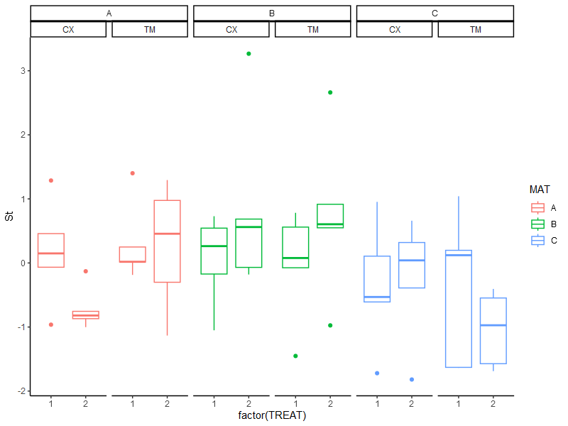
this results in the following plot:

# ggplot with multiple facets (nested)
p <- ggplot(data = df, 
            aes(x = TREAT,
                y = St,
                color = MAT))+
  geom_boxplot() +
  ggh4x::facet_nested(~ MAT + OPERATOR) +
  theme_classic()
p

plot without lines

What I like to have

I want to draw lines between the facets like this. With the ability to draw lines inside a facet (blue) or even subfacet (green) and between different facets (black). The y-Position is here arbetrary chosen but should be similar to the ordering here. The plot is made with inkscape.

Plot with lines between facets and inside facets or subfacets

As you can see we have a simple facet_nested boxplot with lines between some data points to demonstrate between what data I want to draw horizontal lines.

What I tried

Using google and some LLM (chatGPT or Bing) i was able to create some code to automatically select the facets and subfacets.

# Build the plot
gb <- ggplot_build(p)

# Get panel parameters
ranges <- gb$layout$panel_params

# Get npc position of a specific facet and subfacet
mat_name1 <- "A" # first facet
operator_name1 <- "TM" # first subfacet

# vs 
mat_name2 <- "B" # first facet
operator_name2 <- "TM" #first subfacet

# x axis name
x_name <- "1"

# Find the index of the panel that corresponds to the specified facet and subfacet
# TO DO change MAT and OPERATOR with strings so it is adaptable to the grouping column names
panel_index1 <- which(gb$layout$layout$MAT == mat_name1 & gb$layout$layout$OPERATOR == operator_name1)
panel_index2 <- which(gb$layout$layout$MAT == mat_name2 & gb$layout$layout$OPERATOR == operator_name2)

This returns the correct number of the facet or subfacet panel number (in this ca 1 and 3) . But I was not able to extract the exact coordinate of A-TM-1 vs B-TM-1 (especially the 1).

In addition I don't know how to use that information to to draw the lines on top of the plot.

Outro

I hope someone can grasp what I want to achieve and help me understand the logic of the ggplot_build information to extract the positions and how to use that info to draw lines ontop of the plot. Idealy I can write a function which takes a set of facet, subfacet(s) combinations including the x axis location (in this case 1 or 2 or any other x axis labels) to draw those lines between the boxes. ( e.g. c(c('A', 'TM','1'), c('B', 'TM','1')) But a more general understanding how to interpret the output of ggplot_build and the construction of those plot would be wonderfull.

Most promising looks the approach of ggplot, drawing line between points across facets but there I struggle in automatically selection the right l parameter.

It would be a great deal of help if someone can point me in the right direction since this kind of plots are day to day buisness and it would save a lot of time and errors if I could automate that process like ggsignif.

If you need any additional information, please don't hesitate to ask.

Best

TMC

Homestead answered 1/8, 2023 at 15:48 Comment(0)
B
13

It is possible to draw lines connecting facets; in fact, there are a few ways to do it, but none of them is easy. If I were doing this I would want the result to be a ggplot object, rather than a ggplot with lines drawn over it (this itself is also possible a couple of different ways).

Any method ending with a vanilla ggplot object must have clip = "off" set in its coordinates to allow lines to stretch between panels. Since facet panels are drawn sequentially onto the page, we must also turn the panel.background into an element_blank(). Any grid lines or vertical axis lines will be drawn over your facet-spanning lines, but fortunately your chosen theme is perfect for this.

Another issue is that you need to set hard co-ordinate limits, otherwise the co-ordinates will simply expand to accommodate your lines. This means in effect that you need to have all factor levels present in each facet, and can't use scales = "free_x". Again, this is not a problem with your set-up.

If you draw the lines with geom_segment, then it's easy to specify the starting point at the left of the line; the main difficulty comes in finding the x value on the right. This needs to be calculated for each line. Effectively, you need to ask "if this panel's x axis was numeric and extended indefinitely, at what x value would I want the line to end?".

You can specify a function to work this out for you, returning a data frame you can feed to geom_segment (or geom_textsegment if you want labels)

xpos <- function(data, fac1, fac2, xvar, yvals, labels) {

  get_xpos <- function(data, fac1, fac2, xvar) {
    datafac  <- list(xvar = data[[names(xvar)[1]]],
                     fac1 = data[[names(fac1)[1]]],
                     fac2 = data[[names(fac2)[1]]])
    datafac  <- lapply(datafac, as.factor)
    datalevs <- lapply(datafac, levels)
    datanum <- lapply(datalevs, function(x) as.numeric(factor(x)))
    datanum[-1] <- lapply(datanum[-1], function(x) x - 1)
    datanum$fac2 <- (max(datanum$xvar) + 1/3) * datanum$fac2
    datanum$fac1 <- (max(datanum$xvar + 1/3) + max(datanum$fac2)) * datanum$fac1
    levs <- Map(match, list(unlist(xvar), unlist(fac1), unlist(fac2)), datalevs)
    final_vals <- Map(function(x, i) x[i], datanum, levs)
    facet_add <- final_vals$fac1 + final_vals$fac2
    facet_add[2] - facet_add[1] + final_vals$xvar[2]
  }
  
  names(fac1[[1]]) <- rep(names(fac1), length(fac1[[1]]))
  names(fac2[[1]]) <- rep(names(fac2), length(fac2[[1]]))
  names(xvar[[1]]) <- rep(names(xvar), length(xvar[[1]]))
  
  x <- sapply(seq_along(xvar[[1]]), function(i) {
    get_xpos(data, fac1[[1]][i], fac2[[1]][i], xvar[[1]][i])
  })
  d <- data.frame(sapply(fac1[[1]], `[`, 1), sapply(fac2[[1]], `[`, 1),
                  sapply(xvar[[1]], `[`, 1), x, yvals[[1]], labels)
  setNames(d, c(names(fac1), names(fac2), names(xvar), 
                "xpos", names(yvals), "labels"))
}

It still takes a bit of work to call this function, because we need to feed it a list of the start and end levels of each of our faceting and x axis variables:

segs  <- xpos(data = df, 
           xvar = list(TREAT = list(c(1, 2), c(1, 1), 
                                    c(1, 1), c(1, 1))), 
           fac1 = list(MAT = list(c("A", "A"), c("A", "A"), 
                                  c("A", "B"), c("A", "C"))), 
           fac2 = list(OPERATOR = list(c("CX", "CX"), c("CX", "TM"), 
                                       c("CX", "CX"), c("TM", "TM"))),
           yvals = list(St = c(1.5, 1.8, 2.1, 2.4)),
           labels = c("Label 1", "Label 2", "Label 3", "Label 4"))

But at least our final plotting code is straightforward:

library(geomtextpath)

ggplot(data = df, aes(x = TREAT, y = St, color = MAT)) +
  geom_boxplot() +
  geom_textsegment(data = segs,
                   aes(xend = xpos, yend = St, group = MAT, label = labels), 
                   color = c("green4", "blue", "black", "black"),
                   linewidth = 1, vjust = -0.2) +
  ggh4x::facet_nested(~ MAT + OPERATOR) +
  coord_cartesian(clip = "off", xlim = c(1, 2)) +
  theme_classic() +
  theme(panel.background = element_blank())

enter image description here

Of course, this is all a bit cumbersome. It could be tweaked to have an easier interface to use, but all the above caveats make me wonder this is worth the effort. This really depends on how you plan to use it.

Barbarossa answered 8/8, 2023 at 11:22 Comment(1)
Thank you Allen, for this very helpfull example. I choose this to accept as answer since it is compatible with facet_grid/wrap. I think I will be able to adapt that to my needs to further streamline my analysis scripts. An I might be able to automate the function call of the segments and labes, depending on how the output of my statisitcal test might look.Homestead
T
5

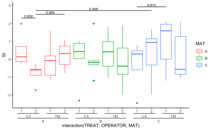
I am not sure if it is advisable to plot these groups in different facets while they are still in the same plot (given that you may have only performed one statistical test for all of the comparisons). Here is a slightly cleaner way to do a similar job but it does not involve separating data into facets.

The one obvious advantage of doing this is that it is all automatic (semi-automatic). I also provide a suggestion on how to get valid comparisons. (But it assumes the categorical names used in each grouping variable are distinct.)

Step 1 is to redo the sample data and load the necessary libraries:

library(tidyverse)
library(broom)
library(geomtextpath)
library(ggh4x) # I added this for nested axis label
# Create a dummy dataframe

set.seed(2)
df <- expand.grid(
  St= 1:10,
  MAT= c("A", "B", "C"),
  TREAT= factor(1:2)
)
df$St<- rnorm(nrow(df))

df$OPERATOR<- rep(c("TM", "CX"), each = 5, length.out = nrow(df))

Step 2, you will need to define the order for the grouping variables (you can play around with this.

current_scheme <- levels(interaction(unique(df$TREAT), unique(df$OPERATOR), unique(df$MAT)))

Step 3 is to do the statistical test. Here, I did an ANOVA as an example. Please use this with caution. e.g. statistician may advise you to do stepwise protected ANOVA before doing the Tukey test...

test_df <- df %>% 
  mutate(global_y_max = max(St)) %>% # this can be change to per group if desire, but would not automatically guarantee not to overlap the data
  ungroup() %>% ## make sure to get one tibble for ANOVA for each y max
  group_by(global_y_max) %>% 
  group_modify(~ broom::tidy(TukeyHSD(aov(St ~ as.factor(TREAT) * as.factor(OPERATOR) * as.factor(MAT), data = .x)))) %>% # the variable order should be the same as the current_scheme
  filter(str_count(term,":") == 2) %>% # only interested in pair-wise comparisons
  dplyr::select(contrast, p = adj.p.value) %>% 
  separate(contrast, into = c("first", "second"), sep = "-", remove = FALSE) %>% 
  rowwise() %>% 
  mutate(firstlist = strsplit(first, ":"),
         second_list = strsplit(second, ":")) %>% 
  mutate(valid_comparison = length(setdiff(unlist(firstlist), unlist(second_list))) == 1) %>% 
  filter(valid_comparison == TRUE) %>% 
  mutate(first_xpos = which(!!current_scheme == gsub(":", ".", first))) %>% 
  mutate(second_xpos = which(!!current_scheme == gsub(":", ".", second))) %>% 
  filter(p < 0.97) %>% # remove this line or change to p< 0.05?
  mutate(sig = signif(p, digits = 3)) %>% # can change to * if preferred
  ungroup() %>% 
  group_by(global_y_max) %>% 
  mutate(current_test = row_number())

Step 4 is to plot the result.

ggplot()+
  geom_boxplot(data = df, 
            aes(x = interaction(TREAT, OPERATOR, MAT), # need to be the same as current_scheme
                y = St,
                color = MAT)) +
  geom_textsegment(data = test_df, 
                   aes(x = second_xpos, 
                       xend = first_xpos, 
                       y = global_y_max + current_test*global_y_max/10, # the factor "10" can be change
                       yend = global_y_max + current_test*global_y_max/10, 
                       group = current_test, label = sig), 
                   vjust = -0.2, size = 3) + # adjust this when needed
  # facet_wrap(~ MAT + OPERATOR, nrow = 1) + ## Do not do facet here
  theme_classic() +
  guides(x = "axis_nested") # added this for nested axis label

enter image description here

Tracheo answered 9/8, 2023 at 17:25 Comment(1)
Thank you william, this is also a very clean way of implementing the labels, but I really have to look cloesely on how you coded the test. I think this is worthwile to create the plot without facets. Thank you for the hints and your effort. This is very much appreciated. But I will not accept this as the answer since It does not fwork with facets.Homestead

© 2022 - 2024 — McMap. All rights reserved.