Change ggplot bar chart fill colors
Asked Answered
M

2

4

With this data:

df <- data.frame(value =c(20, 50, 90), 
                 group = c(1, 2,3))

I can get a bar chart:

df %>% ggplot(aes(x = group, y = value, fill = value)) +
  geom_col() +
  coord_flip()+ 
  scale_fill_viridis_c(option = "C") +
  theme(legend.position = "none")

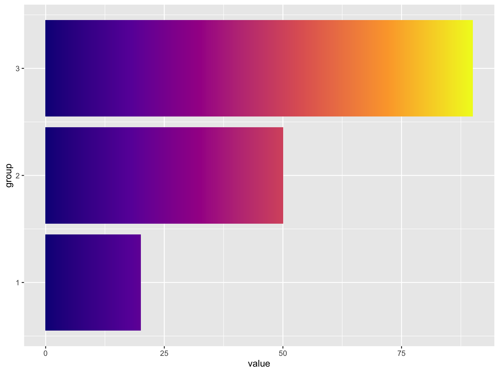
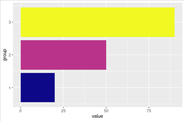
enter image description here

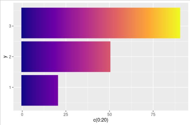
But I would like to have the colors of those bars to vary according to their corresponding values in value.

I have managed to change them using geom_raster:

ggplot() + 
  geom_raster(aes(x = c(0:20), y = .9, fill = c(0:20)),  
              interpolate = TRUE) +
  geom_raster(aes(x = c(0:50), y = 2, fill = c(0:50)), 
              interpolate = TRUE) +
  geom_raster(aes(x = c(0:90), y = 3.1, fill = c(0:90)),               
              interpolate = TRUE) +
  scale_fill_viridis_c(option = "C") +
  theme(legend.position = "none")

enter image description here

This approach is not efficient when I have many groups in real data. Any suggestions to get it done more efficiently would be appreciated.

I found the accepted answer to a previous similar question, but "These numbers needs to be adjusted depending on the number of x values and range of y". I was looking for an approach that I do not have to adjust numbers based on data. David Gibson's answer fits my purpose.

Mistiemistime answered 9/2, 2022 at 1:26 Comment(3)
Does this answer your question? Creating a vertical color gradient for a geom_bar plotSoddy
I'd ask whether you really want to do this as in my opinion, it is not best data visualisation practice. Bar charts are for showing one count of a discrete variable - so really it's only the value at the top of the bar that matters. A gradient is making a misleading suggestion of something that doesn't exist in the data, such as a density or a rate of change.Sweettalk
@Sweettalk I am actually making many graphs for values from 0 up to 100 for a video to show the change over time.Mistiemistime
S
7

It does not look like this is supported natively in ggplot. I was able to get something close by adding additional rows, ranging from 0 to value) to the data. Then use geom_tile and separating the tiles by specifying width.

library(tidyverse)

df <- data.frame(value = c(20, 50, 90),
                 group = c(1, 2, 3))

df_expanded <- df %>%
  rowwise() %>%
  summarise(group = group,
            value = list(0:value)) %>%
  unnest(cols = value)

df_expanded %>%
  ggplot() +
  geom_tile(aes(
    x = group,
    y = value,
    fill = value,
    width = 0.9
  )) +
  coord_flip() +
  scale_fill_viridis_c(option = "C") +
  theme(legend.position = "none")

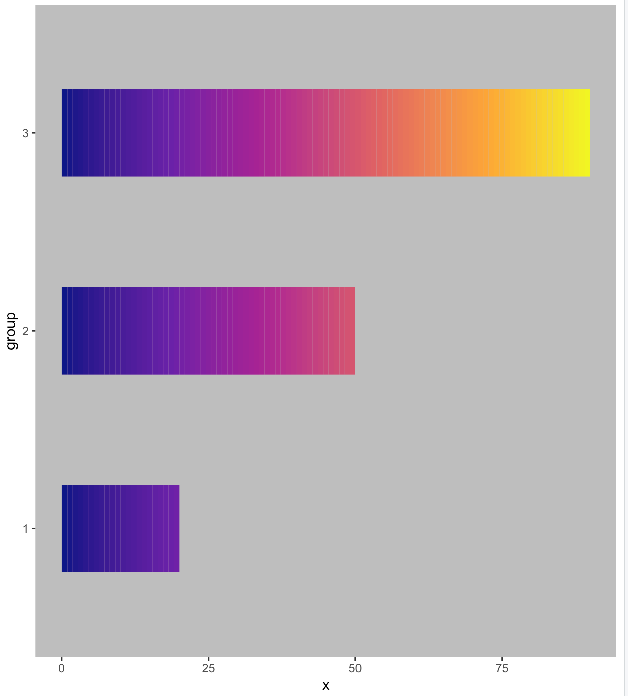
enter image description here

If this is too pixilated you can increase the number of rows generated by replacing list(0:value) with seq(0, value, by = 0.1).

enter image description here

Supercool answered 9/2, 2022 at 2:35 Comment(1)
Great! Thank you. It is good enough for my purpose.Mistiemistime
B
1

This is a real hack using ggforce. This package has a geom that can take color gradients but it is for a line segment. I've just increased the size to make the line segment look like a bar. I made all the bars the same length to get the correct gradient, then covered a portion of each bar over with the same color as the background color to make them appear to be the correct length. Had to hide the grid lines, however. :-)

df %>% 
    ggplot() + 
    geom_link(aes(x = 0, xend = max(value), y = group, yend = group, color = stat(index)), size = 30) +
    geom_link(aes(x = value, xend = max(value), y = group, yend = group), color = "grey", size = 31) +
    scale_color_viridis_c(option = "C") +
    theme(legend.position = "none", panel.background = element_rect(fill = "grey"), 
          panel.grid = element_blank()) +
    ylim(0.5, max(df$group)+0.5 )

enter image description here

Bab answered 9/2, 2022 at 2:38 Comment(0)

© 2022 - 2024 — McMap. All rights reserved.