Creating a vertical color gradient for a geom_bar plot
Asked Answered
S

4

14

I have searched and searched, but I cant seem to find an elegant way of doing this!

I have a dataset Data consisting of Data$x (dates) and Data$y (numbers from 0 to 1)

I want to plot them in a bar-chart:

ggplot(Data) + geom_bar(aes(x = x, y = y, fill = y, stat = "identity")) +
   scale_fill_gradient2(low = "red", high = "green", mid = "yellow", midpoint = 0.90)

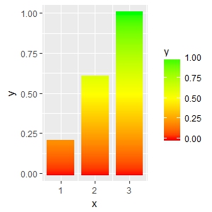
The result looks like this

Click to view image

However, I wanted to give each bar a gradient in the vertical direction ranging from 0 (red) to y (greener depending on y). Is there any way of doing this smoothly?

I have tried to see if I could impose a picture on the graph as a hack, but I can't impose it on the bars only except in a super super ugly way.

Saddlebacked answered 11/1, 2018 at 15:11 Comment(1)
still waiting this feature comes with ggplot packageRovit
B
10

Another, not very pretty, hack using geom_segment. The x start and end positions (x and xend) are hardcoded (- 0.4; + 0.4), so is the size. These numbers needs to be adjusted depending on the number of x values and range of y.

# some toy data
d <- data.frame(x = 1:3, y = 1:3)

# interpolate values from zero to y and create corresponding number of x values
vals <- lapply(d$y, function(y) seq(0, y, by = 0.01))
y <- unlist(vals)
mid <- rep(d$x, lengths(vals))
d2 <- data.frame(x = mid - 0.4,
                 xend = mid + 0.4,
                 y = y,
                 yend = y)

ggplot(data = d2, aes(x = x, xend = xend, y = y, yend = yend, color = y)) +
  geom_segment(size = 2) +
  scale_color_gradient2(low = "red", mid = "yellow", high = "green", 
                        midpoint = max(d2$y)/2) 

enter image description here


A somewhat related question which may give you some other ideas: How to make gradient color filled timeseries plot in R

Butterwort answered 13/1, 2018 at 0:46 Comment(2)
Hi, this is very useful, thanks. Is it possible to set the limits for the range of colours manually? For example, I want to show something similar where there is a biological stress threshold at a certain value (red). So my bars will appear red as they reach that threshold, rather than the upper limit of Y.Disbud
Hi @Disbud If I understand you correctly, you may have a look at scale_fill_gradientn and its values argument. The doc is a bit terse but there are several nice posts on SO. Good luck!Butterwort
U
5

Doesn't exist as far as I know, but you can manipulate your data to produce it.

library(ggplot2)

df = data.frame(x=c(1:10),y=runif(10))

prepGradient <- function(x,y,spacing=max(y)/100){
  stopifnot(length(x)==length(y))
  df <- data.frame(x=x,y=y)
  newDf = data.frame(x=NULL,y=NULL,z=NULL)
  for (r in 1:nrow(df)){
    n <- floor(df[r,"y"]/spacing)
    for (s in c(1:n)){
      tmp <- data.frame(x=df[r,"x"],y=spacing,z=s*spacing)
      newDf <- rbind(newDf,tmp)
    }
    tmp <- data.frame(x=df[r,"x"],y=df[r,"y"]%%spacing,z=df[r,"y"])
    newDf <- rbind(newDf,tmp)
  }
  return(newDf)
}

df2 <- prepGradient(df$x,df$y)

ggplot(df2,aes(x=x,y=y,fill=z)) + 
  geom_bar(stat="identity") + 
  scale_fill_gradient2(low="red", high="green", mid="yellow",midpoint=median(df$y))+
  ggtitle('Vertical Gradient Example') +
  theme_minimal()

enter image description here

Uhf answered 11/1, 2018 at 22:16 Comment(0)
A
1

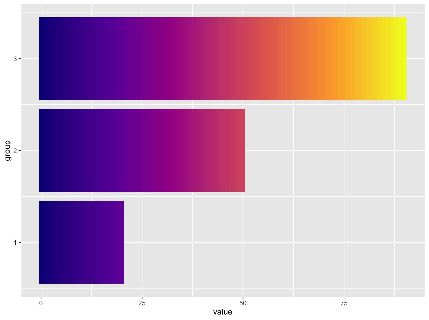
Found a less hacky way to do this when answering Change ggplot bar chart fill colors

library(tidyverse)

df <- data.frame(value = c(20, 50, 90),
                 group = c(1, 2, 3))

df_expanded <- df %>%
  rowwise() %>%
  summarise(group = group,
            value = list(0:value)) %>%
  unnest(cols = value)

df_expanded %>%
  ggplot() +
  geom_tile(aes(
    x = group,
    y = value,
    fill = value,
    width = 0.9
  )) +
  coord_flip() +
  scale_fill_viridis_c(option = "C") +
  theme(legend.position = "none")

enter image description here

Archivist answered 9/2, 2022 at 3:11 Comment(0)
B
0

Because this did not explicitly ask for divergent / multi-hue scales (in the title), here a simple hack for a single-hue gradient. This is very much the approach like suggested for a gradient fill under a curve as seen here

library(ggplot2)
d <- data.frame(x = 1:3, y = 1:3)
n_grad <- 1000
grad_df <- data.frame(yintercept = seq(0, 3, len = 200), 
                      alpha = seq(0.3, 0, len = 200))
ggplot(d ) +
geom_col(aes(x, y), fill = "darkblue") +
  geom_hline(data = grad_df, aes(yintercept = yintercept, alpha = alpha), 
             size = 1, colour = "white", show.legend = FALSE) + 
## white background looks nicer then 
theme_minimal()

enter image description here

Blinni answered 11/6, 2022 at 12:34 Comment(0)

© 2022 - 2024 — McMap. All rights reserved.