For the Flutter people who end up here, this is my solution based on the accepted answer and its padding formula... and it works as of November 2023 based on the official badges provided by these platforms.
See the "Further read" section at the end to understand why there is a padding of ~6% on width for App Store badge.
But first, let me clarify one thing:
the badges APPLE APP STORE and GOOGLE PLAY STORE will have the same size aspect ratio.
Those images cannot be same aspect ratio, simply because they're not (unless you modify, crop and/or distort one of them, which is against the terms of use and not allowed legally). However they can be either same width or same height, which the accepted answer offers solution only for same width.
So, you have to decide whether you want to display them same width (such as in a Column):
![same width]()
or same height (such as in a Row):
![same height]()
Now, chuck this function somewhere in your project (in your widget class or in a separate .dart file):
  Widget _downloadButton(String assetPath,
      {double? width, double? height, required bool isAppStore}) {
    assert(width == null || height == null, 'Cannot set both width and height');
    assert(width != null || height != null, 'Must set either width or height');

    // Apply padding only to App Store button; see "Further read" for details
    double wPadding = width != null && isAppStore ? width * 0.0627 : 0;
    double hPadding = height != null && isAppStore ? height * 0.16 : 0;
    // debugPrint('isAppStore=$isAppStore wPadding=$wPadding hPadding=$hPadding');

    return SizedBox(
      width: width,
      height: height,
      child: IconButton(
        padding: EdgeInsets.symmetric(horizontal: wPadding, vertical: hPadding),
        color: Colors.transparent,
        highlightColor: Colors.transparent,
        hoverColor: Colors.transparent,
        focusColor: Colors.transparent,
        splashColor: Colors.transparent,
        icon: Image.asset(assetPath),
        onPressed: () {
          debugPrint('Download button pressed: isAppStore=$isAppStore');
        },
      ),
    );
  }
and use it like below by giving only the width parameter or the height one. You cannot have the both worlds unfortunately :/
    Column(
      children: [
        _downloadButton(
          'assets/images/google-play-badge.png',
          width: 200,
          // height: 100,
          isAppStore: false,
        ),
        _downloadButton(
          'assets/images/app-store-badge.png',
          width: 200,
          // height: 100,
          isAppStore: true,
        ),
      ],
    );
Simply replace the Column with a Row and switch to height parameter if you like to display them next to each other, instead of underneath. Adjust to your needs and layout as necessary. You do need to handle your onPressed event in the function that will likely open up an external link to your app URL..
Known bug: If you want to display them with a larger width than actual App Store's asset file (that is 498px as of writing), they will not display the same width anymore as the App Store asset badge will display only at its maximum size and padding will start applying incorrectly. This shouldn't be any concern for the 99% of the use cases but be aware.
Further read; what are these magical padding numbers (6.27% for width and 16% for height) and why do we have to apply them only to App Store badge?
I've spent one whole night to understand what's going on and why the accepted answer works for same width solution only, so here is the background information for the obsessed people like myself, if you don't want to waste your time to figure out why do we have to do things this way.
Currently (November 2023), the official badge file resolutions are below:
Google Play: Width=646px, Height=250px
App Store: Width=498px, Height=167px
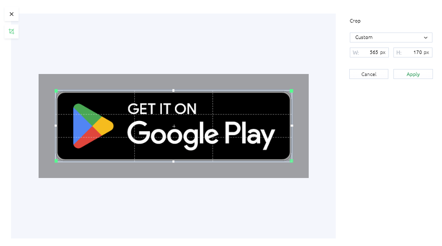
The misconception starts with these file resolutions, because the App Store badge doesn't have any outer transparent padding but Google Play badge does!
![Google Play badge actual resolution]()
Therefore, the actual visible button resolution for Google Play badge is:
- Width = 565px
- Height = 170px
with some transparent outer padding, within the .png file itself. You can probably guess the rest of the story but let me continue, if the light bulb didn't turn on yet.
This means Google Play badge has already some padding whether you like it or not, and thanks to my maths classes that I didn't ignore in school, I can calculate it precisely:
Equal width calculation:
- 646px (file width) - 565px (visible width) = 81px total transparent padding horizontally, within the Google Play asset file.
- If 81px for 646px, what's the percentage padding of Google Play badge? (8100 / 646 = 12.53869969040248%), the answer is ~12.54% for total padding; left and right.
- This is why the accepted answer suggests to apply 6% width padding but it's actually more accurate if you go with 6.27% padding horizontally on the App Store badge to match Google Play implicit padding for the equal width display.
Equal height calculation:
- 250px (file height) - 170px (visible height) = 80px total transparent padding vertically, within the Google Play asset file.
- If 80px for 250px, the percentage is (8000 / 250 =) 32% for total padding; top and bottom.
- So, you need to apply 16% padding vertically on App Store badge in order to match Google Play implicit padding for the equal height display.
Cheers!


