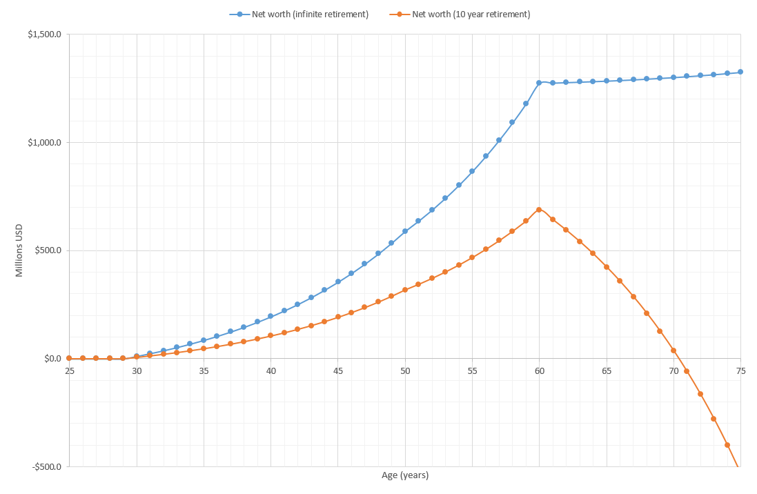
I made the following plot in Excel:
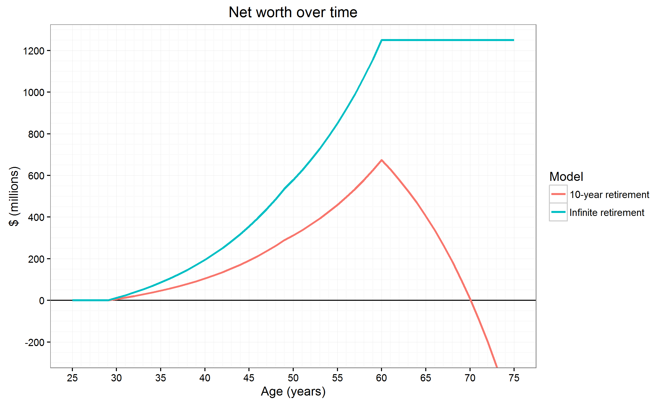
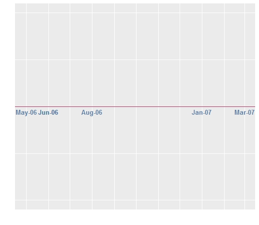
But then I thought I would make it prettier by using ggplot. I got this far:
If you're curious, the data is based on my answer here, although it doesn't really matter. The plot is a standard ggplot2 construct with some prettification, and the thick line for the x-axis through the middle is achieved with p + geom_hline(aes(yintercept=0)) (p is the ggplot object).
I feel that the axis configuration in the Excel plot is better. It emphasizes the 0 line (important when the data is money) and finding intercepts is much easier since you don't have to follow lines from all the way at the bottom. This is also how people draw axes when plotting on paper or boards.
Can the axis be moved like this in ggplot as well? I want not just the line, but the tick labels as well moved. If yes, how? If no, is the reason technical or by design? If by design, why was the decision made?

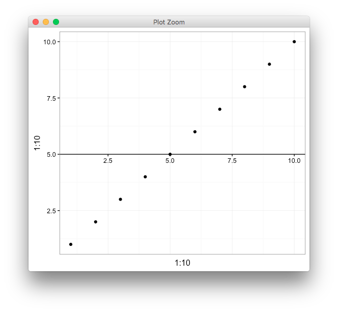
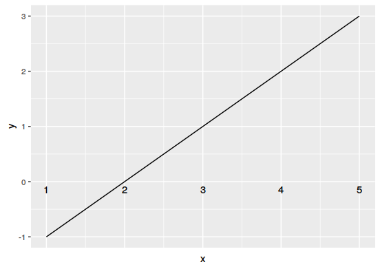
geom_hline,geom_text, andgeom_segment. Also, if I need USD $700 million to retire, I should give up now. – Spaceship