ggplot2: Adding secondary transformed x-axis on top of plot
Asked Answered
T

2

13

[ Edit April 2016: the solution in this thread no longer displays the added axis correctly - a new thread on this issue has been opened at ggplot2 2.1.0 broke my code? Secondary transformed axis now appears incorrectly ]

I am working with scaled x data, and need to add an unscaled x axis to the top of the plot for easier interpretation. I've come across an approach for adding a secondary a y-axis at How can I put a transformed scale on the right side of a ggplot2?. However, I can't get it to work properly for the x-axis. I'm sure i'm not understanding some part of the code, but I can't seem to figure out what it is. I've tried looking in the ggplot2 help files, and also the Wickham book ggplot2: Elegant Graphics For Data Analysis, but if anyone can point me towards some relevant documentation I would really appreciate it!

I am working with temperature data, but I will use the lake data from the link above as the code was written for that. Here is the orignal code from that link:

library(ggplot2)
library(gtable)
library(grid)
LakeLevels<-data.frame(Day=c(1:365),Elevation=sin(seq(0,2*pi,2*pi/364))*10+100)
p1 <- ggplot(data=LakeLevels) + geom_line(aes(x=Day,y=Elevation)) + 
      scale_y_continuous(name="Elevation (m)",limits=c(75,125))

p2<-ggplot(data=LakeLevels)+geom_line(aes(x=Day, y=Elevation))+
    scale_y_continuous(name="Elevation (ft)", limits=c(75,125),           
    breaks=c(80,90,100,110,120),
             labels=c("262", "295", "328", "361", "394"))

#extract gtable
g1<-ggplot_gtable(ggplot_build(p1))
g2<-ggplot_gtable(ggplot_build(p2))

#overlap the panel of the 2nd plot on that of the 1st plot

pp<-c(subset(g1$layout, name=="panel", se=t:r))
g<-gtable_add_grob(g1, g2$grobs[[which(g2$layout$name=="panel")]], pp$t, pp$l, pp$b, 
                   pp$l)

ia <- which(g2$layout$name == "axis-l")
ga <- g2$grobs[[ia]]
ax <- ga$children[[2]]
ax$widths <- rev(ax$widths)
ax$grobs <- rev(ax$grobs)
ax$grobs[[1]]$x <- ax$grobs[[1]]$x - unit(1, "npc") + unit(0.15, "cm")
g <- gtable_add_cols(g, g2$widths[g2$layout[ia, ]$l], length(g$widths) - 1)
g <- gtable_add_grob(g, ax, pp$t, length(g$widths) - 1, pp$b)

# draw it
grid.draw(g)

To test a method for adding an x-axis instead of y-axis, I switched the x and y axes and changed axis-l to axis-b to give:

library(ggplot2)
library(gtable)
library(grid)
LakeLevels<-data.frame(Day=c(1:365),Elevation=sin(seq(0,2*pi,2*pi/364))*10+100)
p1 <- ggplot(data=LakeLevels) + geom_line(aes(x=Elevation,y=Day)) + 
scale_x_continuous(name="Elevation (m)",limits=c(75,125))

p2<-ggplot(data=LakeLevels)+geom_line(aes(x=Elevation, y=Day))+
scale_x_continuous(name="Elevation (ft)", limits=c(75,125),           
                   breaks=c(80,90,100,110,120),
                   labels=c("262", "295", "328", "361", "394"))

#extract gtable
g1<-ggplot_gtable(ggplot_build(p1))
g2<-ggplot_gtable(ggplot_build(p2))

#overlap the panel of the 2nd plot on that of the 1st plot

pp<-c(subset(g1$layout, name=="panel", se=t:r))
g<-gtable_add_grob(g1, g2$grobs[[which(g2$layout$name=="panel")]], pp$t, pp$l, pp$b, 
               pp$l)

ia <- which(g2$layout$name == "axis-b")
ga <- g2$grobs[[ia]]
ax <- ga$children[[2]]
ax$widths <- rev(ax$widths)
ax$grobs <- rev(ax$grobs)
ax$grobs[[1]]$x <- ax$grobs[[1]]$x - unit(1, "npc") + unit(0.15, "cm")
g <- gtable_add_cols(g, g2$widths[g2$layout[ia, ]$l], length(g$widths) - 1)
g <- gtable_add_grob(g, ax, pp$t, length(g$widths) - 1, pp$b)

# draw it
grid.draw(g)

This produces a new x-axis, but there are a couple of problems: 1) it is in the middle of the plot 2) it does not produce a new x-label for "Elevation (ft)"

I need the axis to appear at the top of the plot, and I need an associated axis label. Can anyone tell me what I am doing wrong?

Also, as mentioned above, I am working with scaled temperature data, so ideally the ticks would not align on the top and bottom axes as they do in this example. Is there any way to do this in ggplot2? An arbitrary example from the web is this:

Two x axes with different scales

Tithable answered 9/1, 2014 at 17:2 Comment(0)
F
16

The root of your problem is that you are modifying columns and not rows.

The setup, with scaled labels on the X-axis of the second plot:

## 'base' plot
p1 <- ggplot(data=LakeLevels) + geom_line(aes(x=Elevation,y=Day)) + 
    scale_x_continuous(name="Elevation (m)",limits=c(75,125))

## plot with "transformed" axis
p2<-ggplot(data=LakeLevels)+geom_line(aes(x=Elevation, y=Day))+
    scale_x_continuous(name="Elevation (ft)", limits=c(75,125),
                   breaks=c(90,101,120),
                   labels=round(c(90,101,120)*3.24084) ## labels convert to feet
                   )

## extract gtable
g1 <- ggplot_gtable(ggplot_build(p1))
g2 <- ggplot_gtable(ggplot_build(p2))

## overlap the panel of the 2nd plot on that of the 1st plot
pp <- c(subset(g1$layout, name=="panel", se=t:r))

g <- gtable_add_grob(g1, g2$grobs[[which(g2$layout$name=="panel")]], pp$t, pp$l, pp$b, 
               pp$l)

EDIT to have the grid lines align with the lower axis ticks, replace the above line with: g <- gtable_add_grob(g1, g1$grobs[[which(g1$layout$name=="panel")]], pp$t, pp$l, pp$b, pp$l)

## steal axis from second plot and modify
ia <- which(g2$layout$name == "axis-b")
ga <- g2$grobs[[ia]]
ax <- ga$children[[2]]

Now, you need to make sure you are modifying the correct dimension. Because the new axis is horizontal (a row and not a column), whatever_grob$heights is the vector to modify to change the amount of vertical space in a given row. If you want to add new space, make sure to add a row and not a column (ie. use gtable_add_rows()).

If you are modifying grobs themselves (in this case we are changing the vertical justification of the ticks), be sure to modify the y (vertical position) rather than x (horizontal position).

## switch position of ticks and labels
ax$heights <- rev(ax$heights)
ax$grobs <- rev(ax$grobs)
ax$grobs[[2]]$y <- ax$grobs[[2]]$y - unit(1, "npc") + unit(0.15, "cm")

## modify existing row to be tall enough for axis
g$heights[[2]] <- g$heights[g2$layout[ia,]$t]

## add new axis
g <- gtable_add_grob(g, ax, 2, 4, 2, 4)

## add new row for upper axis label
g <- gtable_add_rows(g, g2$heights[1], 1)
g <- gtable_add_grob(g, g2$grob[[6]], 2, 4, 2, 4)

# draw it
grid.draw(g)

I'll note in passing that gtable_show_layout() is a very, very handy function for figuring out what is going on.

Flashlight answered 9/1, 2014 at 18:57 Comment(6)
Nate Pope, your solution worked perfectly, but in my real data, the two axes are scaled differently so that the data on each plot does not overlap properly. This means that the scales are off a bit when I plot them together. Do you know of any way to address this issue?Tithable
I was able to address the issue of scale mismatch between axes by first calculating the appropriate range for each axis, and setting is using +scale_x_continuous(limits = c(x1, x2)). Hopefully this is of use to someone.Tithable
I've noticed that the grid lines and data in the resulting plot are from the new top axis, not the bottom axis. Is there a way to use the grid lines and data from the bottom axis?Tithable
@Tithable Yes you just need to change which of the plots you superimpose. So change the line g <- gtable_add_grob(g1, g2$grobs[[which(g2$layout$name=="panel")]], pp$t, pp$l, pp$b, pp$l) to: g <- gtable_add_grob(g1, g1$grobs[[which(g1$layout$name=="panel")]], pp$t, pp$l, pp$b, pp$l)Flashlight
Hello Nate Pope, I returned to this code using the current version of ggplot2, but the axis label for the top x-axis is now clipping (almost as if the white background height isn't being adjusted). Further, the tick labels are overlapping the ticks. I suspect there is some problem with "heights"... any chance you might be able to shed some light on this problem? I opened a new question at #36487783Tithable
See here and here for code that works with ggplot v2.1.0. But no guarantees that they will work with future versions of ggplot.Gasoline
Z
4

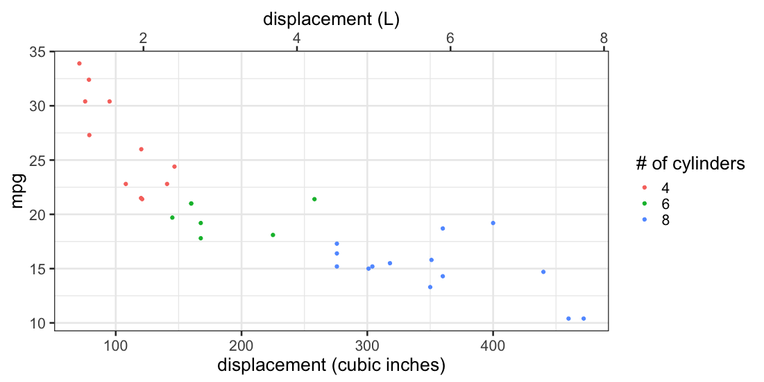
You can use sec_axis or dup_axis.

library(ggplot2)

ggplot(mtcars, aes(x=disp, y=mpg, color=as.factor(cyl))) +
  geom_point() +
  labs(x="displacement (cubic inches)", col="# of cylinders") +
  scale_x_continuous(sec.axis=sec_axis(trans=~ . * 0.0163871, name="displacement (L)"))

enter image description here

ggplot2 version 3.1.1

Ziguard answered 9/5, 2019 at 15:7 Comment(0)

© 2022 - 2024 — McMap. All rights reserved.