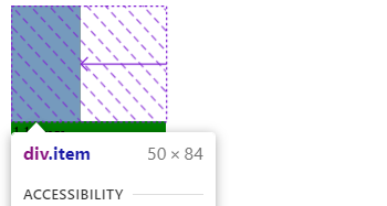
The arrow simply shows when there is no space for an item to take it's full size in a flex layout in the direction of the main axis. It will show horizontally if the flex-direction was set to row and vertically if it is set to column.
It doesn't show in your example by default because there is enough space for the item to take its full size, but if we set the width of the container's to a lower value than its children, then this arrow will show up to tell us that this item is supposed to be in a certain size but there is no space. Here is an updated version of your example that shows the arrows in both directions, when the container's width and height are lower than its children's. I also added another container as a ruler to see that it does match the arrow.
![enter image description here]()
here is the updated code:
.container {
display: flex;
flex-direction: row;
flex-wrap: nowrap;
background-color: grey;
width:50px;
}
.item {
height: 84px;
width: 112px;
}
.container2{
width:1000px;
}
.ruler{
width:112px;
background:green;
}
<div class="container">
    <div class="item"></div>
</div>
<div class="container2 c2">
<div class="item ruler">112px</div>
</div>
This arrow can be shown when working with flex-basis which is used to set the initial main size of a flex item, before any remaining space is distributed among the flex items according to their flex-grow and flex-shrink values.If the flex-basis property is not specified, it is set to auto by default.
See the MDN documentation illustration, when the flex item is set to a value by either (flex-basis or width or height) but it doesn't take flex-size completely.
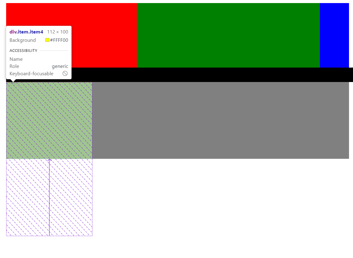
This happens when the container's size along the main axis is not sufficient for the flex items in it, so this arrow appears to show the complete size of a flex item if there were a space for it.
And here is an example that shows that
![enter image description here]()
and here the container is set to flex-column and its height is 100px, but its child item is set to flex-basis is set to 200px which means that the item needs additional 100px.
![enter image description here]()
The code for the above images
    .container {
        display: flex;
        /* flex-direction: row; */
        flex-direction: row;
        flex-wrap: nowrap;
        background-color: grey;
    }

    .item {
        height: 84px;
        width: 112px;

    }

    .i1 {
        background-color: red;
        flex-basis: 500px;
    }

    .i2 {
        background-color: green;
        flex-basis: 700px;
    }

    .i3 {
        background-color: blue;
        flex-basis: 800ox;
    }

    .ruler {
        width: 500px;
        background-color: black;
    }

    .c2 {
        flex-direction: column;
        height: 100px;
    }

    .item4 {
        background-color: yellow;
        flex-basis: 200px;
    }
<div class="container">
    <div class="item i1"></div>
    <div class="item i2"></div>
    <div class="item i3"></div>
</div>
<div class="ruler">
    a
</div>

<div class="container c2">
    <div class="item item4"></div>
</div>


display: flex; flex-flow: row nowrap; background: gray. – Firooc