How to get an icon to show up next to text in Android Material Buttons?
Asked Answered
S

7

16

I'm trying to use the Material Button as developed by google. Due to a third party dependency I cannot use the androidx repository, so I'm currently using the android support library (v28.0.0-alpha1, alpha3 did not allow me to use the material button)

I'm trying to achieve this a wide button with centered text + icon next to text:

Material Button, icon next to text.

But all I can get is this, centered text with icon on the edge of the button:

Material Button, icon next to button border

This is the same as the original android button, which suffered from the same problem. The idea was that the Material Button would solve this issue, but it doesn't seem to work for me on 28.0.0-alpha1

There are solutions involving making a textview with compounddrawables and drawing a frame around it, but I'd like to stick to the material button if possible.

Anyone got a clue on how to fix this?

Stu answered 20/7, 2018 at 7:40 Comment(3)
https://mcmap.net/q/57851/-is-it-possible-to-use-vectordrawable-in-buttons-and-textviews-using-android-drawablerightHeliport
This has nothing to do with my question? And the solution offered for the problem in that post uses extra views. I explicitly stated I wanted to use Google's Material Button solution, which they recently developed. See: material.io/develop/android/components/material-buttonStu
https://mcmap.net/q/245195/-how-to-get-material-icon-button-in-android/7254873Branscum
G
41

I'm having this issue too. Did a bit of digging around, and found this.

There's an attribute called app:iconGravity which has two options namely start and textStart which doesn't seem to work for me, but maybe try it - that is from the GitHub repo for the Material Button.

<com.google.android.material.button.MaterialButton
    android:id="@+id/material_icon_button"
    style="@style/Widget.MaterialComponents.Button.Icon"
    android:layout_width="wrap_content"
    android:layout_height="wrap_content"
    android:text="@string/icon_button_label_enabled"
    app:icon="@drawable/icon_24px"
    app:iconGravity="textStart"/>

https://github.com/material-components/material-components-android/blob/master/lib/java/com/google/android/material/button/MaterialButton.java (search for definition of iconGravity, it's in the beginning of the class)

Gamboa answered 24/7, 2018 at 7:28 Comment(3)
First answer that actually uses the MaterialButton and a general solution as well! Thanks for the suggestion, it doesn't seem to work in the current support library that I'm using, but it might work if building from their source.Stu
My answer below uses the Material button as well just in case you missed it.Equi
I mentioned 'general solution' as well. The hardcoded paddings are a no no as they look different on different screen sizes. (Eg.: Tablet landscape, Phone portrait) Hence why I picked this solution and not yours.Stu
H
2

Anyone got a clue on how to fix this?
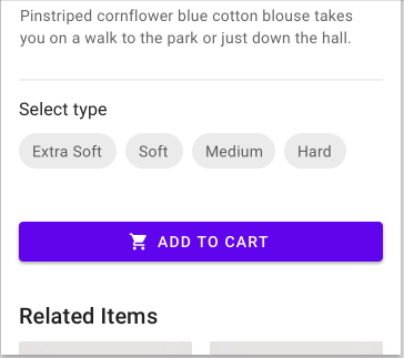
Button widget is extended from TextView. So you can use ImageSpan in your case.

    <Button
        android:id="@+id/button"
        android:layout_width="match_parent"
        android:layout_height="wrap_content"
        style="@style/Widget.AppCompat.Button.Colored"
        />

    Button button = findViewById(R.id.button);
    SpannableString ss = new SpannableString("  CART".toUpperCase(Locale.US));
    Drawable d = VectorDrawableCompat.create(getResources(), R.drawable.ic_shopping_cart_white_24dp, getTheme());

    d.setBounds(0, 0, (int) button.getTextSize(), (int) button.getTextSize());    //to make it square
    ImageSpan span = new ImageSpan(d, ImageSpan.ALIGN_BASELINE);
    ss.setSpan(span, 0, 1, Spannable.SPAN_INCLUSIVE_EXCLUSIVE);
    button.setTransformationMethod(null);
    button.setText(ss);

Result : enter image description here

Heliport answered 20/7, 2018 at 11:48 Comment(1)
Still not utilizing Google's new Material Button component through the Support Design Library v28.0.0-alpha1, but a pretty smart solution. :) Thanks for the suggestion.Stu
E
1

You can use app:iconGravity="textStart" in MaterialButton

<com.google.android.material.button.MaterialButton
    android:id="@+id/btn_start"
    android:layout_height="wrap_content"
    android:layout_width="match_parent"
    android:text="@string/start"
    app:iconGravity="textStart"
    app:icon="@drawable/ic_play" />

Here is the result:

enter image description here

Happy coding!

Elastin answered 24/4 at 8:0 Comment(0)
M
0

you can do customization also:

                 <RelativeLayout
                        android:layout_width="match_parent"
                        android:layout_height="match_parent"
                        android:gravity="center">

                        <ImageView
                            android:id="@+id/icon"
                            android:layout_width="wrap_content"
                            android:layout_height="match_parent"
                            android:gravity="center_vertical"
                            android:layout_marginRight="5dp"
                            android:layout_marginEnd="5dp"
                            android:src="@android:drawable/ic_media_play" />

                        <TextView
                            android:id="@+id/search"
                            android:layout_width="wrap_content"
                            android:layout_height="match_parent"
                            android:gravity="center_vertical"
                            android:lines="1"
                            android:maxLines="1"
                            android:layout_toRightOf="@id/icon"
                            android:layout_toEndOf="@id/icon"
                            android:text="search"
                            android:textColor="@color/white"
                            android:textSize="16sp" />


                    </RelativeLayout>
Molecular answered 20/7, 2018 at 7:52 Comment(1)
Thanks, but I explicitly asked for a solution not wrapping textviews, but instead utilizing Google's Material Button implementation, as they claim to have fixed the use case in my original question. See: material.io/develop/android/components/material-buttonStu
B
0
<RelativeLayout
    android:id="@+id/callButton"
    style="?android:attr/buttonStyle"
    android:layout_width="match_parent"
    android:layout_height="40dp"
    android:layout_alignParentBottom="true"
    android:layout_marginBottom="10dp"
    android:layout_marginLeft="18dp"
    android:layout_marginRight="18dp"
    android:background="@color/colorPrimaryDark">

    <ImageView
        android:layout_width="wrap_content"
        android:layout_height="wrap_content"
        android:src="@drawable/icon_call"/>

    <TextView
        android:layout_width="wrap_content"
        android:layout_height="wrap_content"
        android:layout_marginLeft="25dp"
        android:layout_marginTop="3dp"
        android:text="@string/callCentralDesk"
        android:textColor="@android:color/white" />
</RelativeLayout>


Butters answered 20/7, 2018 at 8:0 Comment(1)
Thanks, but I explicitly asked for a solution not wrapping textviews, but instead utilizing Google's Material Button implementation, as they claim to have fixed the use case in my original question. See: material.io/develop/android/components/material-buttonStu
K
0

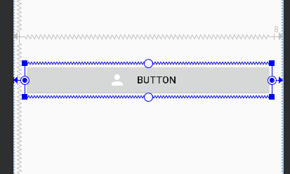
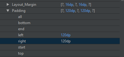
Maybe not the best solution but you can add padding on the left and right side of the button. If you add the same value to both sides it will center see example images:

Images

Button
Button

Button padding
Button padding image

Code

 <Button
    android:id="@+id/button2"
    android:layout_width="0dp"
    android:layout_height="wrap_content"
    android:layout_marginEnd="16dp"
    android:layout_marginStart="16dp"
    android:drawableStart="@drawable/account"
    android:paddingLeft="120dp"
    android:paddingRight="120dp"
    android:text="Button"
    app:layout_constraintEnd_toEndOf="parent"
    app:layout_constraintStart_toStartOf="parent"
    tools:layout_editor_absoluteY="266dp" />

Hope it helps

Kibitzer answered 20/7, 2018 at 10:16 Comment(1)
It seems to have issues with different paddings based on screensize. A pixel C landscape with a full width button will not center properly with 120dp, but needs more like 580dp or something. There's probably a formula to center it based on button width, but it seems like a bit of a hassle. Still, a solution closer to my original request than the others, so thanks for the suggestion.Stu
E
-1

Had this issue myself too.

Using Google's Material Components library, I'm currently on using androidX dependencies but from the documentation it appears you may be able to pull of the same with the support library version as well.

At first I played around with the app namespace attribute of app:iconPadding adding a negative dp amount and it appears to pull the text to the drawable and then adding a positive value of the absolute value of the icon padding (app:iconPadding=-72dp with android:paddingStart=72 this all seemed a little hacky to me so I stuck with simply adjusting paddingStart and paddingEnd until the desired result appeared.

End Result

<!--Padding Start and End Method-->
<!--This is inside a constraint layout with width being match_constraints-->
<com.google.android.material.button.MaterialButton
    android:id="@+id/buttonFoo"
    style="@style/Widget.MaterialComponents.Button.IconButton"
    android:layout_width="0dp"
    android:layout_height="wrap_content"
    app:icon="@drawable/ic_my_button_icon"
    android:text="@string/my_button_text"
    android:paddingStart="72dp"
    android:paddingEnd="72dp"/>

I'm not exactly sure that the Button.IconButton style does very much but set padding start to a system hard coded val of 12dp. But this overrides that value anyways so oh well. Your mileage may vary, but hope this helps!

Equi answered 20/7, 2018 at 14:38 Comment(0)

© 2022 - 2024 — McMap. All rights reserved.