How expand ggplot bar scale on one side but not the other without manual limits
Asked Answered
D

2

19

The goal is to get rid of the space between the tick marks and the base of the bars without cutting off any of the percentage labels beyond the other end of the bars.

I am running dozens of bar graphs using R's ggplot2 and trying to follow our organizational style guide, which was developed using Excel manually for each graph. The maximum length bars are of different lengths in the different graphs and could change as the source data changes, so I don't want to manually set limits. [Perhaps there is a workaround here: is there a way to automatically adjust limits depending on the input?]

I have already consulted:

Removing negative plot area in ggplot2

How to remove space between axis & area-plot in ggplot2?

Force the origin to start at 0 in ggplot2 (R)

http://docs.ggplot2.org/dev/vignettes/themes.html

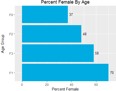
A graph which almost works is generated from the following code. For public purposes I'm using the "quine" dataset from the MASS package. First I find percentages female by age grouping. Then I order the age groups by percentage female.

require(MASS)
attach(quine)
p.SexAge <- prop.table(table(Sex, Age), 2)
perc.SexAge <- round(p.SexAge * 100)

perc.SexAge.flattened <- as.data.frame(perc.SexAge)
perc.SexAge.flattened.F <- subset(perc.SexAge.flattened, Sex == "F")
require(ggplot2)

ggplot(data=perc.SexAge.flattened.F, aes(x=reorder(Age, -Freq), y=Freq))  + 
geom_bar(stat="identity", fill = "#00ABE1") +
scale_x_discrete(expand = c(0, 0)) +
scale_y_continuous(expand = c(0,6)) +
ggtitle("Percent Female By Age") +
ylab("Percent Female") +
xlab("Age Group\n") +
#theme_classic() +  
theme(plot.margin = unit(c(0,0,0,0), "in")) +
coord_flip() +
geom_text(aes(label = Freq), vjust = 0.4, hjust = - 0.4, size = 3.5)

default theme

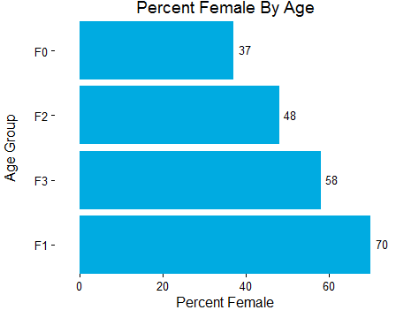
When theme_classic() is uncommented to create empty white space to satisfy our style guide, it is clear that there is excessive space between the vertical axis tick marks and the base of the bars. This problem gets much worse if there are more bars (not shown).

class theme

If I change scale_y_continuous(expand = c(0,6)) to scale_y_continuous(expand = c(0,0)), the label gets chopped off on the longest bar, violating the organizational style guide.

chopped off label

Daredevil answered 11/4, 2016 at 23:27 Comment(0)
R
20

NOTE: The implementation of expand will change with the upcoming release of ggplot2 version 2.3.0, and flexibility will be available at both ends. The below answer will continue to work, but be no longer necessary. See ?expand_scale.

expand isn't going to be your friend, as the two arguments are multiplicative and additive expansion constants for both sides. So c(0, 6) will always add 6 units on each side. The default for continuous data is c(0.05, 0) which is 5% range increase on either end.

We can pre-calculate the required range instead. The left boundary should always be set to 0, the right one we set to max + 6. (You could also use a multiplicative factor if the range is very variable between plots.)

lim <- c(0, max(perc.SexAge.flattened.F$Freq) + 6)
#lim <- c(0, max(perc.SexAge.flattened.F$Freq) * 1.1) # 10% increase

ggplot(data=perc.SexAge.flattened.F, aes(x=reorder(Age, -Freq), y=Freq))  + 
  geom_bar(stat="identity", fill = "#00ABE1") +
  scale_x_discrete(expand = c(0, 0)) +
  scale_y_continuous(expand = c(0, 0), limits = lim) +               #This changed!
  ggtitle("Percent Female By Age") +
  ylab("Percent Female") +
  xlab("Age Group\n") +
  theme_classic() +  
  theme(plot.margin = unit(c(0,0,0,0), "in")) +
  coord_flip() +
  geom_text(aes(label = Freq), vjust = 0.4, hjust = - 0.4, size = 3.5)

enter image description here

p.s. Please don't use attach, especially on code that others load into their environments.

Rearm answered 12/4, 2016 at 7:5 Comment(0)
S
28

In ggplot2 version 3.3.3, scale_y_continuous(expand = expansion(mult = c(0, .1))) does the job. This will extend only the right end of your Y-axis by 10% (.1). You can also extend that end by a fixed amount: for instance, scale_y_continuous(expand = expansion(add = c(0, 5))) extends it by 5 units of space.

Scalable answered 10/3, 2021 at 20:57 Comment(0)
R
20

NOTE: The implementation of expand will change with the upcoming release of ggplot2 version 2.3.0, and flexibility will be available at both ends. The below answer will continue to work, but be no longer necessary. See ?expand_scale.

expand isn't going to be your friend, as the two arguments are multiplicative and additive expansion constants for both sides. So c(0, 6) will always add 6 units on each side. The default for continuous data is c(0.05, 0) which is 5% range increase on either end.

We can pre-calculate the required range instead. The left boundary should always be set to 0, the right one we set to max + 6. (You could also use a multiplicative factor if the range is very variable between plots.)

lim <- c(0, max(perc.SexAge.flattened.F$Freq) + 6)
#lim <- c(0, max(perc.SexAge.flattened.F$Freq) * 1.1) # 10% increase

ggplot(data=perc.SexAge.flattened.F, aes(x=reorder(Age, -Freq), y=Freq))  + 
  geom_bar(stat="identity", fill = "#00ABE1") +
  scale_x_discrete(expand = c(0, 0)) +
  scale_y_continuous(expand = c(0, 0), limits = lim) +               #This changed!
  ggtitle("Percent Female By Age") +
  ylab("Percent Female") +
  xlab("Age Group\n") +
  theme_classic() +  
  theme(plot.margin = unit(c(0,0,0,0), "in")) +
  coord_flip() +
  geom_text(aes(label = Freq), vjust = 0.4, hjust = - 0.4, size = 3.5)

enter image description here

p.s. Please don't use attach, especially on code that others load into their environments.

Rearm answered 12/4, 2016 at 7:5 Comment(0)

© 2022 - 2024 — McMap. All rights reserved.