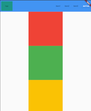
I'm trying to implement a simple web page view, with an appbar, a content and a footer. I'm struggling with the position of the footer.
What I want:
- if the content does not fill the whole screen, the footer shall be sticked to the bottom
- if the content is larger than the screen, the footer is not displayed until we scroll down to the bottom
- if the content does not fill the whole screen, the content shall be displayed at the center, between the appbar and footer.
I saw several answers that helped me for the 2 first requirements (for instance How to create a scroll view with fixed footer with Flutter?), but not for the 3rd one: in the answers I found, the content does not take the whole available space, and sticks to the top.
The solution I found so far works: it has the behavior I want. But is not very elegant.
I used the following structure:
Scaffold(
    body: Column(
      mainAxisAlignment: MainAxisAlignment.center,
      children: <Widget>[
        SizedBox(
          height: 100,
          child: MyAppBar(),
        ),
        Expanded(
          child: SingleChildScrollView(
            child: Column(
              children: [
                SizedBox(height: bottomSizedBoxHeight),
                Column(
                  key: childrenColumnKey,
                  children: [
                    Container(color: Colors.red, width: 300, height: 300),
                    Container(color: Colors.green, width: 300, height: 300),
                    Container(color: Colors.amber, width: 300, height: 300),
                  ],
                ),
                SizedBox(height: bottomSizedBoxHeight),
                const SizedBox(
                  height: 150,
                  child: MyFooter(),
                ),
              ],
            ),
          ),
        ),
      ],
    ),
  );
Here you can see 2 SizedBox, with a height, computed at Runtime.
Here is the calculation:
@override
void didChangeDependencies() {
  super.didChangeDependencies();
  scheduleMicrotask(() {
    double pageWidgetsHeight = childrenColumnKey.currentContext?.size?.height ?? 0;

    // Total height of space available is screen height - appBar (100) - footer (150)
    double totalHeight = max(0, MediaQuery.of(context).size.height - pageWidgetsHeight - 100 - 150);

    setState(() {
      topSizedBoxHeight = totalHeight / 2;
      bottomSizedBoxHeight = totalHeight / 2;
    });
  });
}
As you can see, not very elegant. I compute the total left space after the widgets have been built, to create 2 Boxes with the left amount space.
This gives me this result with only 1 red square:
And this is when I add the other squares, the footer is correctly hidden:
But I don't like the way I achieved this. If anyone has an idea on how to implement this!
Thanks!


