How to center a "position: absolute" element
Asked Answered
T

32

974

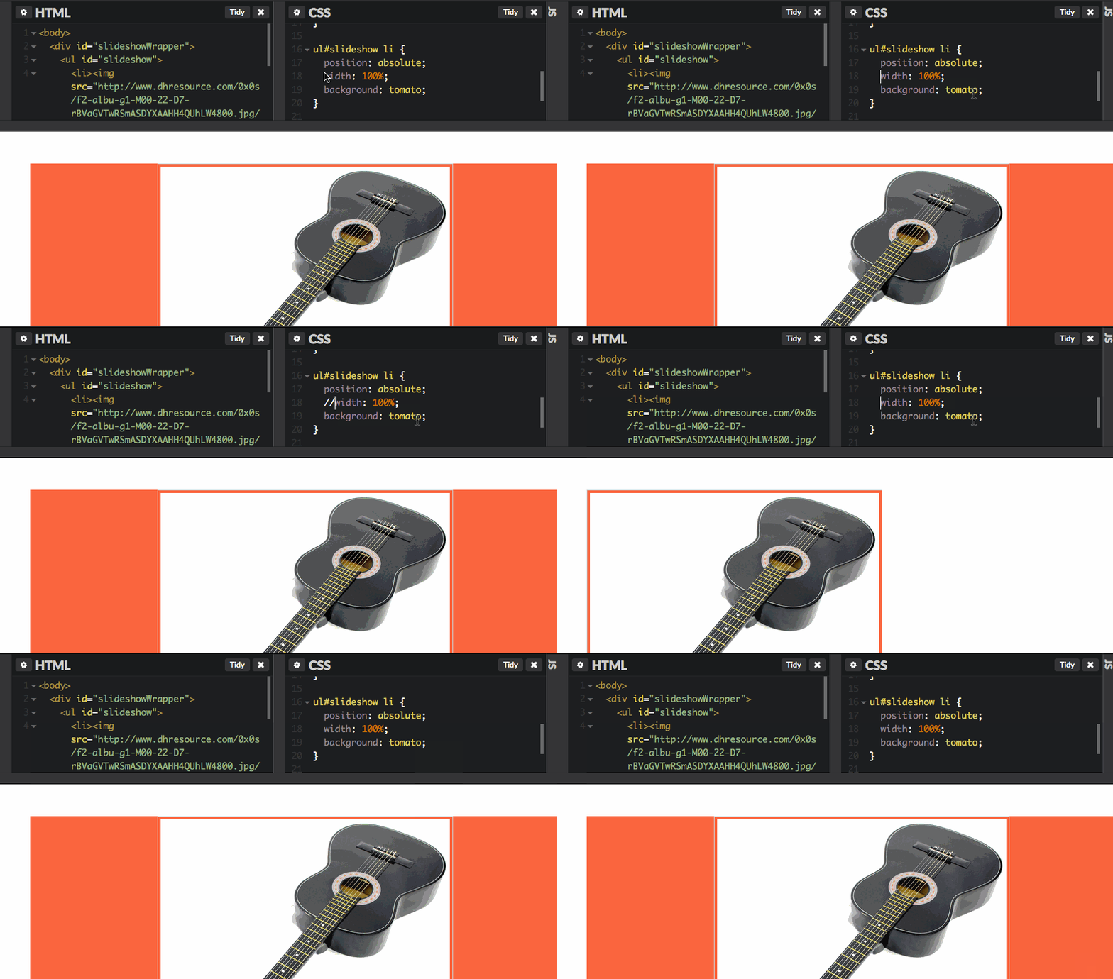
I'm having a problem centering an element that has the attribute position set to absolute. Does anyone know why the images are not centered?

body {
  text-align: center;
}

#slideshowWrapper {
  margin-top: 50px;
  text-align: center;
}

ul#slideshow {
  list-style: none;
  position: relative;
  margin: auto;
}

ul#slideshow li {
  position: absolute;
}

ul#slideshow li img {
  border: 1px solid #ccc;
  padding: 4px;
  height: 450px;
}
<body>
  <div id="slideshowWrapper">
    <ul id="slideshow">
      <li><img src="https://source.unsplash.com/random/300*300?technology" alt="Dummy 1" /></li>
      <li><img src="https://source.unsplash.com/random/301*301?technology" alt="Dummy 2" /></li>
    </ul>
  </div>
</body>
Tamelatameless answered 14/12, 2011 at 16:47 Comment(1)
you need to give ul#slideshow a fixed width...Sexy
T
1700

If you have set a width you may use:

position: absolute;
margin-left: auto;
margin-right: auto;
left: 0;
right: 0;
text-align: center;
Trucking answered 28/8, 2013 at 11:17 Comment(20)
This is a much cleaner answer than the rest! Are there any caveats?Aranda
Smartest answer. I have just checked it and it works on all browsers. It does not work on IE8 but it works on IE>=9Pledge
Be sure to test in IE, this trick does not work if the element has a 'max-width' set in IE9Ghiselin
I personally prefer the syntax "margin: 0 auto; left: 0; right: 0;"Nutation
If not applying to a block element, may need to also give some widthHitt
@HectorOrdonez: Is all about to save 1 css line? o.OTumor
@TomSarduy Call me crazy but yea, I prefer one line rather than two.Nutation
Every time I encounter centering problem I saw this answer, however it never worked for meModernize
Does not work! It doesn't work without width. DownvoteBascio
I would at least have margin: 0 auto; is 15 chars as opposed to something like 65Smalley
@Jackie, margin:0 auto; do not work for position absolute.Genealogy
This quite simply does not work, unless a width is set. It might APPEAR to work if you have text-align:center on the parent and don't have a background on the absolute-positioned element, but put a background on it and you'll see it's actually taking the full width. The translateX(-50%) answer is the correct one.Florella
@Florella - translateX(-50%) isn't the only solution though, if width (W) is known calc(100% - W/2) also works, see my answer below.Trying
Of course, if the width was set, then the original CSS would have worked, so never-mind, the translate option is probably best.Trying
For text set the width to fit-contentTrachoma
What if there is no set width, or better said, the width is more dynamic based on what the user chooses it to be?Probation
Only works for horizontal centering. Vertical is not centered.Laconia
This solution is very clean, thanks for it. If you are using TailwinCSS you can reproduce this by using inset-x-0 mx-auto.Deckert
Watning! Can confirm does not work on my Samsung SmartFridge. Please provide updated answer.Emmi
worked in the problem i had, replaced the margin et left / right with width 100% with the text align center and it worked. Also worked if i had either or both left and/or right. Defining any form of width should do the trick apparentlyFennelflower
F
921

Without knowing the width/height of the positioned1 element, it is still possible to align it as follows:

EXAMPLE HERE

.child {
    position: absolute;
    top: 50%;  /* position the top  edge of the element at the middle of the parent */
    left: 50%; /* position the left edge of the element at the middle of the parent */

    transform: translate(-50%, -50%); /* This is a shorthand of
                                         translateX(-50%) and translateY(-50%) */
}

It's worth noting that CSS Transform is supported in IE9 and above. (Vendor prefixes omitted for brevity)


Explanation

Adding top/left of 50% moves the top/left margin edge of the element to the middle of the parent, and translate() function with the (negative) value of -50% moves the element by the half of its size. Hence the element will be positioned at the middle.

This is because a percentage value on top/left properties is relative to the height/width of the parent element (which is creating a containing block).

While a percentage value on translate() transform function is relative to width/height of the element itself (Actually it refers to the size of bounding box).

For unidirectional alignment, go with translateX(-50%) or translateY(-50%) instead.


1. An element with a position other than static. I.e. relative, absolute, fixed values.

Flied answered 10/9, 2014 at 22:48 Comment(11)
This should be the top answer!!Legumin
@Hashem Qolami A little off topic of the original question but using this method it works nicely. However, if I change the position to "fixed" when the window get too narrow, the left of the element gets pushed off the left of the screen. Is there a way to stop this happening with fixed elements?Moncrief
@Moncrief Does this help? In this demo the fixed positioned element has a max-width of 100% of its containing block i.e. the viewport (actually, the initial containing block).Flied
Horizontal centering: position: absolute; left: 50%; transform: translateX(-50%);, vertical centering: position: absolute; top: 50%; transform: translateY(-50%);.Occupy
This solution also works when the centered element is wider than the container (cases where you are hiding the overflowing part)Metacenter
Just now i found that translate property, translate the element by the size of itself, No matter size of its parent.Sylvanite
This is a very good answer. This should be the top answer, it's agnostic to width and it's robust.Hippy
Use this with a padding in ::after if you want to increase a touch area of element! Best answer because it places ::after correctly in the center of each element regardless of its size.Shilohshim
Nice! Thank you @HashemQolami a lot for this example! Modified a bit for my needs (center only horizontally): { width: fit-content; left: 50%; transform: translateX(-50%); } Had to use witdh: fit-content because items where not fitting in one line.Schrader
This method breaks down badly if you are designing with an eye toward accessibility needs. High levels of zoom cause the position of the element to start off-screen.Emeric
Can you explain a little more on why just using the "absolute" part is not enough and requires the transform?Euphorbia
E
198

Centering something absolutely positioned is rather convoluted in CSS.

ul#slideshow li {
    position: absolute;
    left:50%;
    margin-left:-20px;

}

Change margin-left to (negative) half the width of the element you are trying to center.

Emeryemesis answered 14/12, 2011 at 16:52 Comment(10)
When testing this it doesn't work when images are different sizes, and they still stack up on one anotherTenatenable
Too hack-ish (as it almost always turns out with css). But awesome! :-)Zeist
I was tempted by the cleverness of some other answers, but only this one was reliable for me.Trochelminth
I had the same issue like Ryan, so I tried the second answer suggested by "baaroz" and it worked for me!!! and it support different resolutions also, since my main DIV have width in % and not PXFavour
This isn't actually centered. This is more positioned to the rightAbalone
@Abalone that's because the needed offset wasn't 20px --- left: calc(50% - Wpx/2) from my answer works, but requires width to be known - at which point the original css could have worked.Trying
I wasted many hours searching for this answer. It worked for me. Thanks a lot, you saved my dayTalkingto
This is not the recommended solution. Instead do this: margin: 0 auto; left: 0; right: 0;Jihad
margin: 0 auto; won't work if it's absolute will it?Nasser
bull-crap, it's not convoluted, accepted answer shows one way, another way would be with position 50% + transform, so at least 2 very simple waysMckamey
W
104

Div vertically and horizontally aligned center

top: 0;
bottom: 0;
margin: auto;
position: absolute;
left: 0;
right: 0;

Note : Elements should have width and height to be set

Wenn answered 28/1, 2014 at 10:22 Comment(6)
I don't know why this doesn't get more up voted. Works in all browsers including mobile browsers as far as I can tell. Seams more reliable in terms of support. It's simple, easy and clean...Aerometeorograph
This is a better answer. It only requires one div to make and has more use cases than calling left:50%;, top:50%; like the solution with 69+ votesJihad
the best answer so far, any one coming here should check it !Exsanguine
The element also needs a height set for this to work.Renferd
this is perfect! in addition, simply add height: fit-content or width: fit-content to make it sizes according to its elementsIndicator
It helped me a lot. I think this is the easiest way to make an item center.Bionics
A
74

If you want to center an absolute element

#div {
    position:absolute;
    top:0;
    bottom:0;
    left:0;
    right:0;
    width:300px; /* Assign a value */
    height:500px; /* Assign a value */
    margin:auto;
}

If you want a container to be centered left to right, but not with top to bottom

#div {
    position:absolute;
    left:0;
    right:0;
    width:300px; /* Assign a value */
    height:500px; /* Assign a value */
    margin:auto;
}

If you want a container to be centered top to bottom, regardless of being left to right

#div {
    position:absolute;
    top:0;
    bottom:0;
    width:300px; /* Assign a value */
    height:500px; /* Assign a value */
    margin:auto;
}

Update as of December 15, 2015

Well I learnt this another new trick few months ago. Assuming that you have a relative parent element.

Here goes your absolute element.

.absolute-element { 
    position:absolute; 
    top:50%; 
    left:50%; 
    transform:translate(-50%, -50%); 
    width:50%; /* You can specify ANY width values here */ 
}

With this, I think it's a better answer than my old solution. Since you don't have to specify width AND height. This one it adapts the content of the element itself.

Update as of April 23, 2021

It does not answer to OP's question about position absolute, but if you want alternative solution, there's this called flexbox. Here's an example.

#parent {
    display:flex;
    align-items:center;
    justify-content:center;
}

What it does is the container is converted to flex and to align child items to center on horizontal is by using justify-content:center and vertical is to use align-items:center. It does support modern browsers too, so it's safe to use.

Though, be sure to read how flexbox work first.

https://developer.mozilla.org/en-US/docs/Learn/CSS/CSS_layout/Flexbox

Flexbox supported browsers

https://caniuse.com/flexbox

Affective answered 24/5, 2014 at 1:55 Comment(2)
using flexbox fixed that issue for meAdjourn
You can use the top option in this list by setting a max-height to something reasonable such as fit-content, and this behaves far better in regards to accessibility at high zoom levels than the other options. The transform: translate(-50%, -50%) option in particular pushes your content off-screen at high zoom.Emeric
E
66

A simple CSS trick, just add:

width: 100%;
text-align: center;

This works on both images and text.

Eustacia answered 29/10, 2012 at 15:49 Comment(0)
H
46

This worked for me:

position: absolute;
left: 50%;
transform: translateX(-50%);
Hurricane answered 6/9, 2017 at 14:53 Comment(0)
M
43

To center a “position: absolute” element.

.your-element {
  position: absolute;
  left: 0;
  right: 0;
  text-align: center; // or this ->  margin: 0 auto;
}
Merill answered 8/4, 2018 at 23:35 Comment(1)
This is the best solution. Setting left and right to 0.Mecham
D
30

to center a a position:absolute attribute you need to set left:50% and margin-left: -50% of the width of the div.

<!-- for horizontal -->
<style>
div.center{
 width:200px;
 left:50%;
 margin-left:-100px;
 position:absolute;
}
</style>


<body>
 <div class='center'>
  should be centered horizontaly
 </div>
</body>

for vertical center absolute you need to do the same thing bud not with left just with top. ( NOTE: html and body must have min-height 100%; )

<!-- for vertical -->
<style>
 body,html{
  min-height:100%;
 }
 div.center{
  height:200px;
  top:50%;
  margin-top:-100px;
  position:absolute;
 }
</style>

<body>
 <div class='center'>
  should be centered verticaly
 </div>
</body>

and can be combined for both

   <!-- for both -->
 <style>
 body,html{
  min-height:100%;
 }
 div.center{
  width:200px;
  height:50px
  left:50%;
  top:50%;
  margin-left:-100px;
  margin-top:-25px;
  position:absolute;
 }
</style>


<body>
 <div class='center'>
  should be centered
 </div>
</body>
Dickerson answered 14/12, 2011 at 17:2 Comment(0)
P
25

You can use the "transform" attribute:

position: absolute;
top: 50%;
left: 50%;
-webkit-transform: translateX(-50%) translateY(-50%);
transform: translateX(-50%) translateY(-50%);
Protostele answered 11/7, 2021 at 12:15 Comment(0)
C
22

Or you can now use flex box with postion absolute:

.parent {
    position: relative;
    display: flex;
    justify-content: center;
}

.child {
    position: absolute;
}
Cornucopia answered 14/11, 2019 at 14:17 Comment(2)
this is so underrated.Respectful
This is only correct if you want to align ALL of the items. If you have more and you want to differentiate, it will not work.Organicism
S
18
    <div class="centered_content"> content </div>
    <style type="text/css">
    .centered_content {
       text-align: center;
       position: absolute;
       left: 0;
       right: 0;
    }
    </style>

see demo on: http://jsfiddle.net/MohammadDayeh/HrZLC/

text-align: center; works with a position: absolute element when adding left: 0; right: 0;

Sair answered 24/5, 2014 at 1:49 Comment(1)
Please provide some sort of commentary or rationale behind why this code works. Code answers themselves will inevitably get flagged for deletion.Helvellyn
W
15

The simpler, the best:

img {
            top: 0;
            bottom: 0;
            left: 0;
            right: 0;
            margin: auto auto;
            position: absolute;
}

Then you need to insert your img tag into a tag that sports position:relative property, as follows:

<div style="width:256px; height: 256px; position:relative;">
      <img src="photo.jpg"/>
</div>
Whitver answered 14/2, 2014 at 15:32 Comment(0)
A
10

as many others said this ⬇️

.element {
  position: absolute;
  left: 0;
  top: 0;
  transform: translate(-50%, -50%);
}

should work. But be aware, that the .element must be in a wrapper that has position: relative; (in case you don't want to make it in the center of the whole HTML page)

FYI: I've made a pseudo-library for CSS centering. I needed it for my dev juniors. So, feel free to check it out. http://dev.solcode.net/centercss/

About answered 15/12, 2021 at 14:40 Comment(0)
M
9

If you don't know the width of the element you can use this code:

<body>
<div style="position: absolute; left: 50%;">
    <div style="position: relative; left: -50%; border: dotted red 1px;">
        I am some centered shrink-to-fit content! <br />
        tum te tum
    </div>
</div>

Demo at fiddle: http://jsfiddle.net/wrh7a21r/

Source: https://mcmap.net/q/45196/-how-can-i-center-an-absolutely-positioned-element-in-a-div

Magree answered 30/12, 2014 at 18:32 Comment(1)
@NabiK.A.Z. this example is useful if you don't know the width of the element. In your example you set a width to the div.Magree
L
9

probably the shortest

position:absolute;
left:0;right:0;top:0;bottom:0;
margin:0 auto;
Lectra answered 19/11, 2018 at 0:15 Comment(1)
This is quite awesome but just to center vertically and horizontally we need to make margin auto onlyPsychosomatic
T
7

Using left: calc(50% - Wpx/2); where W is the width of the element works for me.

Trying answered 9/1, 2017 at 6:59 Comment(3)
How do you determine W?Scholz
He said "an image" - ideally when doing images for the web you're supposed to make the image in the size that you're going to use it (rather than resize it) to avoid unnecessary weight (if you make a large image small) or fuzziness (if you make a small image big). - You can use "imageElement.naturalHeight" and "imageElement.naturalWidth" if you're using jQuery and then style dynamically too, but that's getting a bit complicated. To be fair, many of the other answers also require you to know the width of the image for their technique to work.Trying
if you are actually unclear on how to get W though, in Chrome you can use CTRL+Shift+i (developer tools), then CTRL+Shift+C (inspect mode) to hover over elements and see how wide things are. You can also just decide how wide you want it to be and add "width: Wpx" to your css.Trying
B
6

Your images are not centered because your list items are not centered; only their text is centered. You can achieve the positioning you want by either centering the entire list or centering the images within the list.

A revised version of your code can be found at the bottom. In my revision I center both the list and the images within it.

The truth is you cannot center an element that has a position set to absolute.

But this behavior can be imitated!

Note: These instructions will work with any DOM block element, not just img.

  1. Surround your image with a div or other tag (in your case a li).

    <div class="absolute-div">
      <img alt="my-image" src="#">
    </div>
    

    Note: The names given to these elements are not special.

  2. Alter your css or scss to give the div absolute positioning and your image centered.

    .absolute-div {
      position: absolute;
    
      width: 100%; 
      // Range to be centered over. 
    
      // If this element's parent is the body then 100% = the window's width
    
      // Note: You can apply additional top/bottom and left/right attributes
      // i.e. - top: 200px; left: 200px;
    
      // Test for desired positioning.
    }
    
    .absolute-div img {
      width: 500px;
      // Note: Setting a width is crucial for margin: auto to work.
    
      margin: 0 auto;
    }
    

And there you have it! Your img should be centered!

Your code:

Try this out:

body
{
  text-align : center;
}

#slideshow
{
  list-style : none;
  width      : 800px;
  // alter to taste

  margin     : 50px auto 0;
}

#slideshow li
{
  position : absolute;
}

#slideshow img
{
  border  : 1px solid #CCC;
  padding : 4px;
  height  : 500px;
  width   : auto;
  // This sets the width relative to your set height.

  // Setting a width is required for the margin auto attribute below. 

  margin  : 0 auto;
}
<ul id="slideshow">
    <li><img src="http://lorempixel.com/500/500/nature/" alt="Dummy 1" /></li>
    <li><img src="http://lorempixel.com/500/500/nature/" alt="Dummy 2" /></li>
</ul>

I hope this was helpful. Good luck!

Bituminize answered 14/12, 2013 at 1:31 Comment(0)
M
6

enter image description here

I'm not sure what you want to accomplish, but in this case just adding width: 100%; to your ul#slideshow li will do the trick.

Explanation

The img tags are inline-block elements. This means that they flow inline like text, but also have a width and height like block elements. In your css there are two text-align: center; rules applied to the <body> and to the #slideshowWrapper (which is redundant btw) this makes all inline and inline-block child elements to be centered in their closest block elements, in your code these are li tags. All block elements have width: 100% if they are the static flow (position: static;), which is default. The problem is that when you tell li tags to be position: absolute;, you take them out of normal static flow, and this causes them to shrink their size to just fit their inner content, in other words they kind of "lose" their width: 100% property.

Maverick answered 25/1, 2016 at 19:41 Comment(0)
E
4

An absolute object inside a relative object is relative to its parent, the problem here is that you need a static width for the container #slideshowWrapper , and the rest of the solution is like the other users says

body {
    text-align: center;
}

#slideshowWrapper {
    margin-top: 50px;
    text-align:center;
    width: 500px;
}

ul#slideshow {
    list-style: none;
    position: relative;
    margin: auto;
}

ul#slideshow li {
    position: relative;
    left: 50%;
}

ul#slideshow li img {
    border: 1px solid #ccc;
    padding: 4px;
    height: 450px;
}

http://jsfiddle.net/ejRTU/10/

Emanuelemanuela answered 14/12, 2011 at 17:6 Comment(1)
Your fiddle as the two images stacking up one one another.Tenatenable
V
4

Here is easy and best solution for center element with “position: absolute”

 body,html{
  min-height:100%;
 }
 
 div.center{
 width:200px;
 left:50%;
 margin-left:-100px;/*this is 50% value for width of the element*/
 position:absolute;
 background:#ddd;
 border:1px solid #999;
 height:100px;
 text-align:center
 }
 
 
<style>

</style>

<body>
 <div class='center'>
  should be centered verticaly
 </div>
</body>
Verruca answered 29/3, 2017 at 9:32 Comment(0)
B
4

Just use display: flex and justify-content: center on the parent element

body {
    text-align: center;
}

#slideshowWrapper {
    margin-top: 50px;
    text-align: center;
}

ul#slideshow {
    list-style: none;
    position: relative;
    margin: auto;
    display: flex;
    justify-content: center;
}

ul#slideshow li {
    position: absolute;
}

ul#slideshow li img {
    border: 1px solid #ccc;
    padding: 4px;
    height: 100px;
}
<body>
   <div id="slideshowWrapper">
      <ul id="slideshow">
         <li><img src="https://source.unsplash.com/random/300*300?technology" alt="Dummy 1" /></li>
         <li><img src="https://source.unsplash.com/random/301*301?technology" alt="Dummy 2" /></li>
      </ul>
   </div>
</body>

<!-- Images from Unsplash-->

You can find this solution in JSFIDDLE

Bellanca answered 26/8, 2020 at 17:11 Comment(0)
S
4

My favorite method to absolute center any element or group of elements is to absolute position their container, make it the height and width of the relative container, then use flex to align the elements within.

In this specific case:

body {
  position: relative; /* OPTIONAL */
}

#slideshowWrapper {
  position: absolute;
  top: 0;
  left: 0;
  width: 100%;
  height: 100%;
  display: flex;
  flex-direction: row; /* OPTIONAL IF ONLY ONE ELEMENT */
  justify-content: center;
  align-items: center;
}

Hope that helps, cheers.

Scherer answered 25/5, 2021 at 16:30 Comment(0)
W
3

You can try this way :

* { margin: 0px; padding: 0px; }
#body { height: 100vh; width: 100vw; position: relative; 
        text-align: center; 
        background-image: url('https://s-media-cache-ak0.pinimg.com/originals/96/2d/ff/962dff2247ad680c542622e20f44a645.jpg'); 
         background-size: cover; background-repeat: no-repeat; }
.text { position: absolute; top: 0; bottom: 0; left: 0; right: 0; height:100px; 
        display: inline-block; margin: auto; z-index: 999999; }
<html>
<body>
	<div id="body" class="container-fluid">
	  <!--Background-->
	    <!--Text-->
		  <div class="text">
		    <p>Random</p>
		  </div>	  
	</div>
</body>
</html>
Woodnote answered 5/1, 2018 at 11:29 Comment(0)
E
3

1- when you know the width of the absolutely positioned element.

width: 200px;
position: absolute;
left: 50%;
margin-left: -100px

2- when you don’t know the width of the absolutely positioned element. Excellent for responsiveness but is CSS3 older browsers may have an issue.

position: absolute;
left: 50%;
-webkit-transform: translateX(-50%);
transform: translateX(-50%)

3- when you don’t know the width of the absolutely positioned element but makes it 100% wide of it’s parent which might not fit the design.

position: absolute;
left: 0;
right: 0;
margin: auto

If you do know the width, you can use the third option as well and it will center.

Electromechanical answered 16/4, 2021 at 8:0 Comment(0)
E
3

For this case, I think the code as below is enough:

    ul#slideshow li {
      position: absolute;
      left: 0;
      right: 0;
    }
Engedus answered 4/9, 2021 at 1:8 Comment(0)
R
2
#parent
{
    position : relative;
    height: 0;
    overflow: hidden;
    padding-bottom: 56.25% /* images with aspect ratio: 16:9  */
}

img 
{
    height: auto!important;
    width: auto!important;
    min-height: 100%;
    min-width: 100%;
    position: absolute;
    display: block;
    /*  */
    top: -9999px;
    bottom: -9999px;
    left: -9999px;
    right: -9999px;
    margin: auto;
}

I don't remember where I saw the centering method listed above, using negative top, right, bottom, left values. For me, this tehnique is the best, in most situations.

When I use the combination from above, the image behaves like a background-image with the following settings:

background-position: 50% 50%;
background-repeat: no-repeat;
background-size: cover;

More details about the first example can be found here:
Maintain the aspect ratio of a div with CSS

Rentfree answered 25/1, 2016 at 18:54 Comment(0)
T
1

Position absolute takes it out of the flow, and places it at 0x0 to the parent ( Last block element to have a position absolute or position relative ).

I'm not sure what exactly you what you are trying to accomplish, It might be best to set the li to a position:relative and that will center them. Given your current CSS

Check out http://jsfiddle.net/rtgibbons/ejRTU/ to play with it

Tenatenable answered 14/12, 2011 at 16:59 Comment(1)
:/ at the end is almost the same solution as yours... < Up voteEmanuelemanuela
A
1

Use margin-left: x%; where x is the half of the width of the element.

Attenuant answered 11/7, 2013 at 6:43 Comment(0)
A
1

What seems to be happening is there are two solutions; centered using margins and centered using position. Both work fine, but if you want to absolute position an element relative to this centered element, you need to use the absolute position method, because the absolute position of the second element defaults to the first parent that is positioned. Like so:

<!-- CENTERED USING MARGIN -->
<div style="width:300px; height:100px; border: 1px solid #000; margin:20px auto; text- align:center;">
    <p style="line-height:4;">width: 300 px; margin: 0 auto</p>
    <div style="position:absolute; width:100px; height:100px; background-color:#ff0000; top:-20px; left:0px;">
        <p style="line-height:4;">Absolute</p>
    </div>
</div>

<!-- CENTERED USING POSITION -->
<div style="position:absolute; left:50%; width:300px; height:100px; border: 1px solid #000; margin:20px 0 20px -150px; text-align:center;">
    <p style="line-height:2;">width:300px; position: absolute; left: 50%; margin-left:-150px;</p>
    <div style="position:absolute; width:100px; height:100px; background-color:#ff0000; top:0px; left:-105px;">
        <p style="line-height:4;">Absolute</p>
    </div>
</div>

Until I'd read this posting, using the margin:0 auto technique, to build a menu to the left of my content I had to build a same-width column to the right to balance it out. Not pretty. Thanks!

Alitaalitha answered 23/8, 2014 at 23:34 Comment(0)
Y
1

html, body, ul, li, img {
  box-sizing: border-box;
  margin: 0px;  
  padding: 0px;  
}

#slideshowWrapper {
  width: 25rem;
  height: auto;
  position: relative;
  
  margin-top: 50px;
  border: 3px solid black;
}

ul {
  list-style: none;
  border: 3px solid blue;  
}

li {
  /* center horizontal */
  position: relative;
  left: 0;
  top: 50%;
  width: 100%;
  text-align: center;
  font-size: 18px;
  /* center horizontal */
  
  border: 3px solid red; 
}

img {
  border: 1px solid #ccc;
  padding: 4px;
  //width: 200px;
  height: 100px;
}
<body>
  <div id="slideshowWrapper">
    <ul id="slideshow">
      <li><img src="http://via.placeholder.com/350x150" alt="Dummy 1" /></li>
      <li><img src="http://via.placeholder.com/140x100" alt="Dummy 2" /></li>
      <li><img src="http://via.placeholder.com/200x100" alt="Dummy 3" /></li>      
    </ul>
  </div>
</body>
Yardarm answered 27/9, 2017 at 7:0 Comment(1)
This answer only has code. While it may be correct, it should have an accompanying explanation as to why the code answers the OP's question. Code is not "self explanitory" on Stack Exchnge.Bakker
B
0

Using Tailwind Css you can use

<div class="relative">
<div class="absolute -top-4 left-1/2 -translate-x-1/2 text- 
  center isolate inline-flex ">
   Your content here
</div>
</div>
Beamer answered 15/4 at 12:11 Comment(0)

© 2022 - 2024 — McMap. All rights reserved.