How can I center an absolutely positioned element in a div?
Asked Answered
B

39

1544

I want to place a div (with position:absolute;) element in the center of the window. But I'm having problems doing so, because the width is unknown.

I tried the following CSS code, but it needs to be adjusted because the width is responsive.

.center {
  left: 50%;
  bottom: 5px;
}

How can I achieve this?

Beguine answered 21/11, 2009 at 21:56 Comment(1)
You have an example in Absolute center examples that can be generalized in different situations.Wooer
I
1528

<body>
  <div style="position: absolute; left: 50%;">
    <div style="position: relative; left: -50%; border: dotted red 1px;">
      I am some centered shrink-to-fit content! <br />
      tum te tum
    </div>
  </div>
</body>
Improvvisatore answered 22/11, 2009 at 0:21 Comment(5)
Awesome. Worked for me! One problem I had: The image I was centering was quite big, this caused the outer div to go beyond the right edge of the page and cause horizontal scrolling. I swapped out the "left" css property for "right", and so far it works better since going over the left edge of the screen doesnt cause scrollingTaneshatang
what if user has scrolled the page down, overylay appears on the top, do you think it will be a good idea to use jquery to fix scroll issueEmaemaciate
one solution for scroll issue can be position: fixed but what if height is unknown of overlay, scroll bars for overlay will have to be implementedEmaemaciate
Solution for scrolling can be this, did not test it enough though, wht do you guys think of this solution? var scrolled =$(window).scrollTop(); if(scrolled>0) { var offset = $('#containerOverlay').offset(); $('#containerOverlay').css('top',($(window).height() * 0.05) + scrolled); }Emaemaciate
The problem with this is that it causes text to be broken at 50% of the viewport's width, because the wrapper div can only take up 50% of the viewport starting in the middle. If you want the text to break at 100% viewport width this isn't gonna work.Anhanhalt
C
2273

This works for me:

#content {
  position: absolute; 
  left: 0; 
  right: 0; 
  margin-left: auto; 
  margin-right: auto; 
  width: 100px; /* Need a specific value to work */
}
<body>
  <div>
    <div id="content">
      I'm the content
    </div>
  </div>
</body>
Conrad answered 25/11, 2011 at 20:7 Comment(29)
I just want to get across that negative margins are perfectly valid CSS and should not be viewed as a "dirty hack". Negative margins are mentioned in the W3C box model specification. Some individuals seem to arbitrarily decide it is a hack because they a) are ignorant to them, or b) are using them to fix their bad CSS.Context
@JosephJaber: Thanks. I didn't do a lot of CSS and I'm not qualified to rate other solutions. It did just "seemed like a dirty hack" from my layman point-of-view. I'll edit my answer.Conrad
Ok, the answer works, but if you could take some time to explain why it works, that would make this a very good answer.Seventy
the width of the div to be centered has to be set - won't work automagically with, say, a button with text on it.Headcheese
@Joshua This will only center horizontally, not vertically like the other answer.Xerophagy
I prefer this solution as it doesn't increase the viewport size.Joleen
This is not a good solution for all cases. See my comment in the accepted answer. This is normally a very good method, and have used it a lot. But it specifically stopped working when I was trying to hover elements over a google map, and the "invisible" full width container prevented click-throughs to the map controls underneath. So, in summary, this works and is the preferred method in some cases to prevent extra markup, but be aware of limitations and other solutions.Careful
@Careful - Keep an eye on the pointer-events CSS value. It's not official yet, but it may be in CSS 4. Using jQuery (or JS) you can capture the click, send it on down to the "lower" element. pointer-events: css-tricks.com/almanac/properties/p/pointer-events jQuery "hacky" way: $(".parentElement").bind("click", function(){ $(".parentElement").find("a").trigger("click"); }); Might be considered hacky, but it works for me in a production environment. Might have to trigger a google.maps.events("click") in your case or some other combination of events.Tannin
For me it fills the full widthValgus
thank you so much, struggle with this for 2 hours wondering why margin: 0 auto; wouldn't center my div. I was missing the left: 0 and right: 0!Adactylous
For cross-browser support: width should be set to a specific value for this to work. auto and 100% will not center the element. display: block; is a must. position: absolute; is NOT a must. All values will work. Parent element's position should be set to something other than static. Setting left and right to 0 is unnecessary. margin-left: auto; margin-right: auto; will do the work.Michael
@OnurYıldırım THANKS for your elaborate comment. I'm curious about the 'why' behind every aspect of your answer. Would you mind elaborating on it in a separate answer? It seems to be quite a complex issue and your reasoning could be very valuable for everybody who finds this page. ( BTW, The answer we comment on right now, does work for me, in Chrome and IE. )Freeness
I tried doing it this way but ie10 is not liking this ... :( had to go accepted oneGarnishee
if the width of div to be centered has to be set then we do not need position absoluteGoldberg
This does not work in all cases, specially with responsive frameworks. Unless the parent container's width is defined explicitly, this will likely to fail.Talipes
Just found out that adding text-align:center; would do the trick if this div has children, as children will center aligned.Talipes
Worked for me. Just make sure the div you are centering has a set width.Kirsch
This is fine if the width is known. However, as the questions states, the width is not known. Therefore, the accepted solution is the only one that worked for me.Systematics
agreed with other coders, this will work if you set the widthEmpson
Try to use: margin: 0 auto;Poseidon
To horizontally & vertically center, you can also add a top: 0; bottom: 0; and use the shorthand margin: auto.Omsk
It isn't work in Google Chrome with table element and width:auto . Today better the varriant with left: 50%; transform: translate(-50%, 0); I think.Gildus
This doesn't answer the original question, which states the solution must work for a container of unknown/variable width.Hessian
In this example, you can remove the margin and width styles and use text-align center instead. The width should automatically be the width of the relative parent element.Sustainer
it works with 100% width for me. you just need to width the main wrapper. thats all.Allergic
Also you don't need a specific pixel value for width - you can use max-content and min-content as well in most browsers.Al
You could also use width: fit-content and this will work with itNitrosyl
Yes, the width of the inner div has to be set, but you can also use width: auto to allow it to size to its contents, and it still works. Great solution!Haitian
the width could be set to fit-content;Baronetcy
I
1528

<body>
  <div style="position: absolute; left: 50%;">
    <div style="position: relative; left: -50%; border: dotted red 1px;">
      I am some centered shrink-to-fit content! <br />
      tum te tum
    </div>
  </div>
</body>
Improvvisatore answered 22/11, 2009 at 0:21 Comment(5)
Awesome. Worked for me! One problem I had: The image I was centering was quite big, this caused the outer div to go beyond the right edge of the page and cause horizontal scrolling. I swapped out the "left" css property for "right", and so far it works better since going over the left edge of the screen doesnt cause scrollingTaneshatang
what if user has scrolled the page down, overylay appears on the top, do you think it will be a good idea to use jquery to fix scroll issueEmaemaciate
one solution for scroll issue can be position: fixed but what if height is unknown of overlay, scroll bars for overlay will have to be implementedEmaemaciate
Solution for scrolling can be this, did not test it enough though, wht do you guys think of this solution? var scrolled =$(window).scrollTop(); if(scrolled>0) { var offset = $('#containerOverlay').offset(); $('#containerOverlay').css('top',($(window).height() * 0.05) + scrolled); }Emaemaciate
The problem with this is that it causes text to be broken at 50% of the viewport's width, because the wrapper div can only take up 50% of the viewport starting in the middle. If you want the text to break at 100% viewport width this isn't gonna work.Anhanhalt
C
1361

Responsive Solution

Here is a good solution for responsive design or unknown dimensions in general if you don't need to support IE8 and lower.

.centered-axis-x {
    position: absolute;
    left: 50%;
    transform: translate(-50%, 0);
}

.outer {
    position: relative; /* or absolute */
    
    /* unnecessary styling properties */
    margin: 5%;
    width: 80%;
    height: 500px;
    border: 1px solid red;
}

.inner {
    position: absolute;
    left: 50%;
    top: 50%;
    transform: translate(-50%, -50%);
    
    /* unnecessary styling properties */
    max-width: 50%;
    text-align: center;
    border: 1px solid blue;
}
<div class="outer">
    <div class="inner">I'm always centered<br/>doesn't matter how much text, height or width i have.<br/>The dimensions or my parent are irrelevant as well</div>
</div>

Here is a JS Fiddle

The clue is, that left: 50% is relative to the parent while the translate transform is relative to the elements width/height.

This way you have a perfectly centered element, with a flexible width on both child and parent. Bonus: this works even if the child is bigger than the parent.

You can also center it vertically with this (and again, width and height of parent and child can be totally flexible (and/or unknown)):

.centered-axis-xy {
    position: absolute;
    left: 50%;
    top: 50%;
    transform: translate(-50%,-50%);
}

Keep in mind that you might need transform vendor prefixed as well. For example -webkit-transform: translate(-50%,-50%);

Contradistinction answered 30/4, 2014 at 9:54 Comment(32)
With IE7 support no longer necessary, this should be the de facto solution. This solution is better than the left:0/right:0 technique since that makes the elements full width while this retains the width and works on elements of unknown widths.Bier
By far the best answer, this works if the box the div is contained in is smaller than the child.Enduring
Once IE8 support isn't required, this should be the solution, but IE8 support hasn't been dropped by most sites just yet.Wiggler
@Wiggler build via progressive enhancement! Build an IE8 solution and use this one for newer browsers defined by feature detection (modernizr).Contradistinction
@ChadJohnson of course it does. Try it with the webkit- prefix as I suggested.Contradistinction
Is there a pretty solution for IE8 without JS? I found this, workin with filter, but it requires margin-left and margin-right to set the transform-origin to the middle...Genvieve
@Chris yes, work with feature detection (modernizr for example). Then, you can use the margin: 0 auto solution for IE8 and the transform solution for modern browsers. That of course works only for centering the x-axis.Contradistinction
I wanted floated content elements (of any width) inside .inner to sum to the calculated inner div width. jsfiddle.net/b1tav6xx/6 However, when the screen width is small, the inputs wrap under the buttons.Rubber
@Rubber that's a totally different problem. You need to use flexbox, tables or javascript.Contradistinction
Thanks Sumit! :) You're right. jsfiddle.net/b1tav6xx/11 in case anyone's interested.Rubber
transform: translate seems to make position: fixed unusable in children. The accepted answer works better in this case.Swagsman
@Swagsman yes, all transform properties will change behaviour for fixed children. That is a much discussed behaviour but easy to work around.Contradistinction
Is the accepted answer the recommended workaround, or can you point me in the right direction?Swagsman
@Swagsman well you could use another way to center your elements BUT I'd suggest you re-think the HTML structure so you don't have a nested fixed element.Contradistinction
try this if you have sass/compass @include vendor(transform, translate(-50%, -50%));Meldon
This is exactly what I'm looking for. It handle the element which are not equal to the width of his parent ! Thanks dude !Cotquean
Links (anchors) don't work for me if i do it this way, i can't click on them.Manzanilla
I had to handle multiple absolutely positioned and different sized modals all being centered with different viewports, and this worked so beautifully! cheers!Saxton
liked the "only one element modified" approachPoree
Great solution, the best of it is that you don't need to nest unnecessary DIVs!Murraymurre
I would change this to use right: 50%; transform: translate(50%, 0);. If the pre-transform div goes over the right edge of the page, it can cause a horizontal scrollbar to appear, but it does not make a scrollbar appear if it goes over the left edge of the page.Loredo
Thanks to nowadays CSS3, it's possible without width specified!!Recife
This will unintentionally set the maximum size of the inner element to 50% of the parent.Cysticercoid
@AnnevanRossum no it won't. As I wrote, this works even when the child is bigger than the parent.Contradistinction
@Contradistinction Correction. It's limited to 50% of the viewport.Cysticercoid
@AnnevanRossum no it's not. There is no limit in anything. jsfiddle.net/x8pugz9aContradistinction
@AnnevanRossum your parent was missing position: relative; jsfiddle.net/8z9a3fbr If you are refering to the text wrapping behaviour, that is no limit. Here's the text in one line: jsfiddle.net/8z9a3fbr/1 You can also give the child any witdth or min-width. As I said, there is no limiting factor here.Contradistinction
This works great with normal tags but, when applying css animations, it breaks. The tag is shifted to the right and downwards by half of its width and height, respectively.Applesauce
@Contradistinction with hardcoding "nowrap" you will have suddenly different wrapping behavior overflowing the parent/viewport, jsfiddle.net/b4esa580 In other words you have artifacts due to the shifting to the right half of the viewport and shifting back with half of the component's calculated size.Cysticercoid
@AnnevanRossum it was an example to show you that there are no limitations by using this technique. Wrapping behaviour depends on your contents flow and the available space, as usual.Contradistinction
Least hacky solution. IE10 let alone IE8 needs to stop being supported nowadays.Paulownia
If you're applying this CSS to a draggable element, in your mousemove handler you'll need to set draggableElement.style.transform = 'initial';.Stereochrome
S
117

<div style='position:absolute; left:50%; top:50%; transform: translate(-50%, -50%)'>
  This text is centered.
</div>

This will center all the objects inside div with position type static or relative.

Statampere answered 20/6, 2020 at 9:57 Comment(3)
Re "059%": Do you mean "50%"? If so, please respond by editing your answer, not here in comments.Mcmorris
I have a slightly different case and I'm very glad about your hint to transform: translate()!Reductive
We should limit the usage of transform because this is conflicting with animations.Richierichlad
T
53

Responsive solution

Assuming the element in the div, is another div...

This solution works fine:

<div class="container">
  <div class="center"></div>
</div>

The container can be any size (must be position relative):

.container {
    position: relative; /* Important */
    width: 200px; /* Any width */
    height: 200px; /* Any height */
    background: red;
}

The element (div) can also be any size (must be smaller than the container):

.center {
    position: absolute; /* Important */
    top: 50%; /* Position Y halfway in */
    left: 50%; /* Position X halfway in */
    transform: translate(-50%,-50%); /* Move it halfway back(x,y) */
    width: 100px; /* Any width */
    height: 100px; /* Any height */
    background: blue;
}

The result will look like this. Run the code snippet:

.container {
    position: relative;
    width: 200px;
    height: 200px;
    background: red;
}

.center {
    position: absolute;
    top: 50%;
    left: 50%;
    transform: translate(-50%, -50%);
    width: 100px;
    height: 100px;
    background: blue;
}
<div class="container">
    <div class="center"></div>
</div>

I found it very helpful.

Ternion answered 26/9, 2019 at 19:1 Comment(0)
Q
50

I just wanted to add if someone wants to do it with a single div tag then here is the way out:

Taking width as 900px.

#styleName {
    position: absolute;
    left: 50%;
    width: 900px;
    margin-left: -450px;
}

In this case one should know the width beforehand.

Quimper answered 31/8, 2012 at 9:56 Comment(3)
"because the width is unknown" ... this doesn't answer the questionAgglomerate
hi @Michel actually when you google search for something related to centering the absolute div, this link comes as the first link. That's why I added this solution, in case someone like me is in search for the above solution.. :)Quimper
Not very useful for responsive design, but it worked for me until I started doing responsive designs. This is a valid answer for centering absolutely positioned known width elements.Tannin
B
39

Absolute Centre

HTML:

<div class="parent">
  <div class="child">
    <!-- content -->
  </div>
</div>

CSS:

.parent {
  position: relative;
}

.child {
  position: absolute;
  
  top: 0;
  right: 0;
  bottom: 0;
  left: 0;

  margin: auto;
}

Demo: http://jsbin.com/rexuk/2/

It was tested in Google Chrome, Firefox, and Internet Explorer 8.

Backspace answered 30/1, 2014 at 2:29 Comment(3)
This doesn't work, please check the following codepen codepen.io/anon/pen/YqWxjJKym
Sorry I think this will work but you need to include a fixed height and width codepen.io/anon/pen/WwxEYQKym
I don't understand why setting left and right to 0 means in this context when it's used with margin auto. Care to explain?Hurlbut
A
37

This works for vertical and horizontal:

#myContent{
    position: absolute;
    left: 0;
    right: 0;
    top: 0;
    bottom: 0;
    margin: auto;
}

And if you want make an element center of the parent, set the position of the parent relative:

#parentElement{
    position: relative
}
  • For vertical center align, set the height to your element. Thanks to Raul.

  • If you want make an element center of the parent, set the position of the parent to relative

Angell answered 7/12, 2014 at 9:26 Comment(3)
I think you need to add height for vertical to work.Nadbus
Looks like this positions in the center of the page, not the center of another element.Masorete
@GünterZöchbauer yes, if you want make element center of parent, set position of parent relative.Angell
O
29

If you need to center horizontally and vertically too:

left: 50%;
top: 50%;
transform: translate(-50%, -50%);
Overflight answered 15/2, 2019 at 8:50 Comment(0)
E
28

Searching for a solution, I got the previous answers and could make content centered with Matthias Weiler's answer, but using text-align:

#content{
  position: absolute;
  left: 0;
  right: 0;
  text-align: center;
}

It worked with Google Chrome and Firefox.

Engdahl answered 29/5, 2013 at 1:36 Comment(2)
I think you don't need the "text-align: center"Simonasimonds
I needed the "text-align: center", and this worked where the solution suggested by @Contradistinction didn't work as it made my text wrap.Embryologist
M
17

I understand this question already has a few answers, but I've never found a solution that would work in almost all classes that also makes sense and is elegant, so here's my take after tweaking a bunch:

.container {
    position: relative;
}

.container .cat-link {
    position: absolute;
    left: 50%;
    top: 50%;
    transform: translate3d(-50%,-50%,0);
    z-index: 100;
    text-transform: uppercase; /* Forces CSS to treat this as text, not a texture, so no more blurry bugs */
    background-color: white;
}

.color-block {
  height: 250px;
  width: 100%;
  background-color: green;
}
<div class="container">
  <a class="cat-link" href="">Category</a>
  <div class="color-block"></div>
</div>

It is saying give me a top: 50% and a left: 50%, then transform (create space) on both the X/Y axis to the -50% value, in a sense "create a mirror space".

As such, this creates an equal space on all the four points of a div, which is always a box (has four sides).

This will:

  1. Work without having to know the parent's height / width.
  2. Work on responsive.
  3. Work on either X or Y axis. Or both, as in my example.
  4. I can't come up with a situation where it doesn't work.
Marinate answered 26/11, 2017 at 18:22 Comment(3)
Please do let me know if you find a situation where this doesn't work so I could edit the question with your input.Marinate
transform / translate will causes safari to render text blurred on certain scaleOccasion
@DanielMoss any reason to not use translate(-50%,-50%);?Rawson
G
17

Flexbox can be used to center an absolute positioned div.

display: flex;
align-items: center;
justify-content: center;

.relative {
  width: 275px;
  height: 200px;
  background: royalblue;
  color: white;
  margin: auto;
  position: relative;
}

.absolute-block {
  position: absolute;
  height: 36px;
  background: orange;
  padding: 0px 10px;
  bottom: -5%;
  border: 1px solid black;
}

.center-text {
  display: flex;
  justify-content: center;
  align-items: center;
  box-shadow: 1px 2px 10px 2px rgba(0, 0, 0, 0.3);
}
<div class="relative center-text">
  Relative Block
  <div class="absolute-block center-text">Absolute Block</div>
</div>
Glycerin answered 3/2, 2019 at 2:20 Comment(3)
on my screen -Firefox 68.x, it just doesn't align, the absolute block appears at the bottom of the relative blockCreon
Can you try this display: -webkit-flex;?Glycerin
It'll not work for absolute positioned itemsDissociate
I
16

This works on any random unknown width of the absolute positioned element you want to have in the centre of your container element:

Demo

<div class="container">
  <div class="box">
    <img src="https://picsum.photos/200/300/?random" alt="">
  </div>
</div>

.container {
  position: relative;
  width: 100%;
}

.box {
  position: absolute;
  top: 0;
  left: 0;
  right: 0;
  bottom: 0;
  display: flex;
  justify-content: center;
  align-items: center;
}
Imphal answered 10/4, 2018 at 0:49 Comment(0)
A
16

This is a mix of other answers, which worked for us:

.el {
   position: absolute;
   top: 50%;
   margin: auto;
   transform: translate(-50%, -50%);
}
Ambi answered 29/5, 2019 at 23:25 Comment(1)
for more details see this link: medium.com/front-end-weekly/…Cachexia
W
16

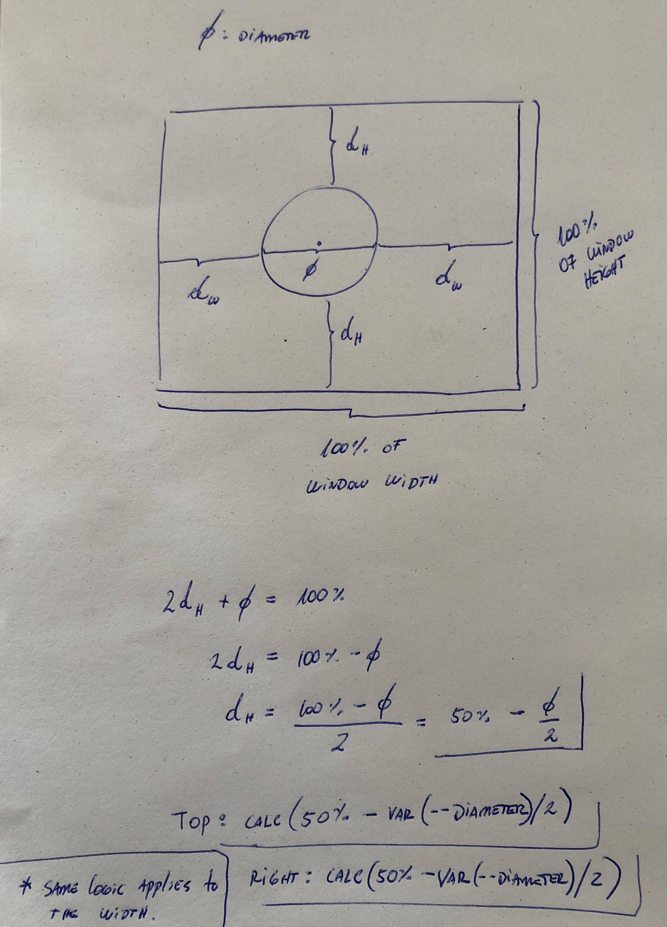
It's possible to center an element that has aspect-ratio:1 with position absolute by using calc()

In the following example I'm using a circle because it's easier to explain and understand, but the same concept can be applied to any shape with aspect-ratio:1 meaning that the width and height are equal. (about aspect-ratio)

:root{
  --diameter: 80px;
}
div{
  position:absolute;
  top: calc(50% - var(--diameter)/2);
  right:calc(50% - var(--diameter)/2);
  aspect-ratio:1;
  width:var(--diameter);
  border-radius:100%;
  background:blue;
}
<div/>

Explanation

enter image description here

Whereof answered 25/7, 2022 at 10:25 Comment(4)
This only applies for elements of knows sizeParotic
@RokoC.Buljan what do you mean ? can you expand on that ?Whereof
They meant that ø or --diameter should be know in order for this method to work. Sometimes we work with elements with auto/fit-content dimensionsChumley
@Chumley well, yes.. this doesn't apply to all cases. ø is a variable, meaning it can be any value and it will work okay, only if the aspect-ratio equals 1. I was having fun doing this and I didn't intend it to work for all cases.Whereof
A
7

As far as I know, this is impossible to achieve for an unknown width.

You could - if that works in your scenario - absolutely position an invisible element with 100% width and height, and have the element centered in there using margin: auto and possibly vertical-align. Otherwise, you'll need JavaScript to do that.

Azaria answered 21/11, 2009 at 22:0 Comment(2)
+1 for the "margin: auto" thing. I've tried this before to horizontally centre a div using the line "margin: 0 auto" - the "0" applying to the vertical margins and the "auto" the horizontal. I think this is what StackOverflow uses for the very top level div to get the 2 thick white borders down the sides of the page. However, the W3Schools page on CSS margin states for the auto value that "The result of this is dependant of the browser" - I've not personally tried it across many different browsers, so I can't really comment on this point (but it obviously does the trick in some of them)Milkandwater
it is possible for an unknown width (and height) if IE8 isn't an issue. See my answer for details.Contradistinction
T
7

I'd like to add on to bobince's answer:

<body>
    <div style="position: absolute; left: 50%;">
        <div style="position: relative; left: -50%; border: dotted red 1px;">
            I am some centered shrink-to-fit content! <br />
            tum te tum
        </div>
    </div>
</body>

Improved: /// This makes the horizontal scrollbar not appear with large elements in the centered div.

<body>
    <div style="width:100%; position: absolute; overflow:hidden;">
        <div style="position:fixed; left: 50%;">
            <div style="position: relative; left: -50%; border: dotted red 1px;">
                I am some centered shrink-to-fit content! <br />
                tum te tum
            </div>
        </div>
    </div>
</body>
Torin answered 28/1, 2013 at 18:58 Comment(0)
D
7

Just wrap your content with a new div and use display flex and then use align-items: center; and justify-content: center; take a look...

<div class="firstPageContainer">
  <div class="firstPageContainer__center"></div>
</div>
.firstPageContainer{
  display: flex;
  width: 1000px;
  height: 1000px;
  justify-content: center;
  align-items: center;
  background-color: #FF8527;
}

.firstPageContainer__center{
  position:absolute;
  width: 50px;
  height: 50px;
  background-color: #3A4147;
}
Danielson answered 21/9, 2021 at 17:6 Comment(0)
A
6

This worked for me:

.container{
    position: absolute;
    left: 0;
    right: 0;
    margin-left: auto;
    margin-right: auto;
}
<div class="container"><p>My text</p></div>
Antoniettaantonin answered 24/5, 2016 at 12:25 Comment(2)
It's @Matthias Weiler answer 5 years later.Component
Even after fixing the typo, this doesn't even work as answered. On top of trying to copy Matthias Weiler's solution.Cauliflower
M
5

Sass/Compass version of a previous responsive solution:

#content {
  position: absolute;
  left: 50%;
  top: 50%;
  @include vendor(transform, translate(-50%, -50%));
}
Meldon answered 1/4, 2015 at 11:9 Comment(2)
transform: translate(-50%, -50%) makes text and all other content blurry on OS X using webkit browsers. keithclark.co.uk/articles/gpu-text-rendering-in-webkitNurseryman
Just use the type of antialiasing that you like -webkit-font-smoothing: antialiased; I've gleaned that from the article you posted btw!Meldon
H
4

My preferred centering method:

position: absolute;
margin: auto;
width: x%
  • absolute block element positioning
  • margin auto
  • same left/right, top/bottom

A JSFiddle is here.

Heaver answered 27/3, 2014 at 21:15 Comment(0)
O
3

Here's a useful jQuery plugin to do this. I found it here. I don't think it's possible purely with CSS.

/**
 * @author: Suissa
 * @name: Absolute Center
 * @date: 2007-10-09
 */
jQuery.fn.center = function() {
    return this.each(function(){
            var el = $(this);
            var h = el.height();
            var w = el.width();
            var w_box = $(window).width();
            var h_box = $(window).height();
            var w_total = (w_box - w)/2; //400
            var h_total = (h_box - h)/2;
            var css = {"position": 'absolute', "left": w_total + "px", "top":
h_total + "px"};
            el.css(css)
    });
};
Oocyte answered 21/11, 2009 at 22:5 Comment(4)
this is the better way, and especially with repsonsive design.Kokand
Would be trivial if jQuery was used in any caseUnfinished
this is NOT the better way. It's always better to use CSS whenever possible. Centering a DIV is possible with CSS in every axis and also for responsive pages. There is no need for JavaScript!Contradistinction
@yckart and in this case the tool is CSS.Contradistinction
S
3
#container
{
  position: relative;
  width: 100%;
  float: left
}

#container .item
{
  width: 50%;
  position: absolute;
  margin: auto;
  left: 0;
  right: 0;
}
Serranid answered 23/5, 2014 at 9:35 Comment(0)
A
3

HTML:

<div id='parent'>
  <div id='child'></div>
</div>

CSS:

#parent {
  display: table;
}
#child {
  display: table-cell;
  vertical-align: middle;
}

I know I already provided an answer, and my previous answer, along with others given, work just fine. But I have used this in the past and it works better on certain browsers and in certain situations. So I thought I'd give this answer as well. I did not "Edit" my previous answer and add it because I feel this is an entirely separate answer and the two I have provided are not related.

Angevin answered 8/1, 2015 at 19:29 Comment(0)
S
3

The accepted solution of this question didn't work for my case...

I'm doing a caption for some images and I solved it using this:

top: 0;
left: 0;
right: 0;
margin-left: auto;
margin-right: auto;

display: flex;
align-items: center;

figure {
    position: relative;
    width: 325px;
    display: block
}


figcaption{
    position: absolute;
    background: #FFF;
    width: 120px;
    padding: 20px;

    -webkit-box-shadow: 0 0 30px grey;
    box-shadow: 0 0 30px grey;
    border-radius: 3px;
    display: block;

    top: 0;
    left: 0;
    right: 0;
    margin-left: auto;
    margin-right: auto;

    display: flex;
    align-items: center;
}
<figure>
    <img  src="https://picsum.photos/325/600">
    <figcaption>
        But as much
    </figcaption>
</figure>
Stonedeaf answered 14/11, 2018 at 10:52 Comment(0)
A
2

HTML

<div id='parent'>
  <div id='centered-child'></div>
</div>

CSS

#parent {
  position: relative;
}
#centered-child {
  position: absolute;
  left: 0;
  right: 0;
  top: 0;
  bottom: 0;
  margin: auto auto;
}

http://jsfiddle.net/f51rptfy/

Angevin answered 16/10, 2014 at 0:9 Comment(0)
R
1

This is a trick I figured out for getting a DIV to float exactly in the center of a page. It is really ugly of course, but it works in all browsers.

Dots and Dashes

<div style="border: 5 dashed red;position:fixed;top:0;bottom:0;left:0;right:0;padding:5">
    <table style="position:fixed;" width="100%" height="100%">
        <tr>
            <td style="width:50%"></td>
            <td style="text-align:center">
                <div style="width:200;border: 5 dashed green;padding:10">
                    Perfectly Centered Content
                </div>
            </td>
            <td style="width:50%"></td>
        </tr>
    </table>
</div>

Cleaner

Wow, those five years just flew by, didn't they?

<div style="position:fixed;top:0px;bottom:0px;left:0px;right:0px;padding:5px">
    <table style="position:fixed" width="100%" height="100%">
        <tr>
            <td style="width:50%"></td>
            <td style="text-align:center">
                <div style="padding:10px">
                    <img src="Happy.PM.png">
                    <h2>Stays in the Middle</h2>
                </div>
            </td>
            <td style="width:50%"></td>
        </tr>
    </table>
</div>
Raveaux answered 24/9, 2013 at 3:52 Comment(0)
S
1

HTML:

<div class="wrapper">
    <div class="inner">
        content
    </div>
</div>

CSS:

.wrapper {
    position: relative;

    width: 200px;
    height: 200px;

    background: #ddd;
}

.inner {
    position: absolute;
    top: 0; bottom: 0;
    left: 0; right: 0;
    margin: auto;

    width: 100px;
    height: 100px;

    background: #ccc;
}

This and more examples here.

Signorelli answered 14/12, 2013 at 13:2 Comment(0)
B
1

A simple approach that worked for me to horizontally center a block of unknown width:

<div id="wrapper">
  <div id="block"></div>
</div>

#wrapper {
    position: absolute;
    width: 100%;
    text-align: center;
}

#block {
    display: inline-block;
}

A text-align property may be added to the #block ruleset to align its content independently of the alignment of the block.

This worked on recent versions of Firefox, Chrome, Internet Explorer, Edge and Safari.

Bruiser answered 20/2, 2018 at 4:17 Comment(0)
V
1

This solution works if the element has width and height

.wrapper {
  width: 300px;
  height: 200px;
  background-color: tomato;
  position: relative;
}

.content {
  width: 100px;
  height: 100px;
  background-color: deepskyblue;
  position: absolute;
  top: 0;
  right: 0;
  bottom: 0;
  left: 0;
  margin: auto;
}
<div class="wrapper">
  <div class="content"></div>
</div>
Vinasse answered 6/9, 2018 at 8:32 Comment(0)
U
1
.center {
  position: absolute
  left: 50%;
  bottom: 5px;
}

.center:before {
    content: '';
    display: inline-block;
    margin-left: -50%;
}
Unattached answered 24/1, 2019 at 10:34 Comment(0)
L
1

If you're using TailwindCSS - It's 2023!

Based on the top trending answer: https://mcmap.net/q/45196/-how-can-i-center-an-absolutely-positioned-element-in-a-div

<div className="relative">
   <div className="absolute left-1/2 -translate-x-1/2">I AM CENTERED</div>
</div>
Lexington answered 28/11, 2023 at 20:10 Comment(0)
M
0

#content { margin:0 auto; display:table; float:none;}
<body>
  <div>
    <div id="content">
      I'm the content
    </div>
  </div>
</body>
Miscarriage answered 2/1, 2017 at 5:58 Comment(0)
W
0

You can also create the middleware div#centered box centered with absolute, left and right properties and without width property and then set the main content div as its child with display:inline-block box and center it with text-align:center set for its middleware parent box

#container {
  position: relative;
  width: 300px;
  height: 300px;
  border: solid 1px blue;
  color: #DDDDDD;
}

#centered {
  position: absolute;
  text-align: center;
  margin: auto;
  top: 20px;
  left: 0;
  right: 0;
  border: dotted 1px red;
  padding: 10px 0px;
}

#centered>div {
  border: solid 1px red;
  display: inline-block;
  color: black;
}
<div id="container">
  hello world hello world
  hello world hello world
  hello world hello world
  hello world hello world
  hello world hello world
  hello world hello world
  hello world hello world
  hello world hello world

  <div id="centered">
    <div>
      hello world <br/>
      I don't know my width<br/>
      but I'm still absolute!
    </div>
  </div>
</div>
Wilk answered 3/5, 2019 at 9:34 Comment(0)
N
0

None of the solutions worked for me since I didn't want to change the styling of the container/wrapper element. This code worked for me:

position: absolute;
left: 50%;
margin-left: -50px;
top: 50%;
margin-top: -50px;
Nevers answered 23/1, 2020 at 19:35 Comment(0)
S
-1

You can place the image in a div and add a div id and have the CSS for that div have a text-align:center:

HTML:

<div id="intro_img">

    <img src="???" alt="???">

</div>

CSS:

#intro_img {
    text-align: center;
}
Singlephase answered 28/11, 2013 at 14:45 Comment(0)
A
-1

There Are Multiple Ways To Align Element Center Using CSS, (Using Position, Using FlexBox Using Grid). You can use as per as your choice. THANKS.

.parent.position{
  position :relative;
  height:100vh;
}
.parent.position .child{
  position:absolute;
  top:50%;
  left:50%;
  translate: -50% -50%;
}


.flexbox {
    display: flex;
    justify-content: center;
    height: 100vh;
}
.flex-child {
    align-self: center;
}

.grid{
  display:grid;
  height: 100vh;
}

.grid-child{
  align-self:center;
  justify-self:center;
}
<div class="parent position">
  <div class="child">
    Using Position
  </div>
</div>

<div class="flexbox">
  <div class="flex-child">
    Using FlexBox
  </div>
</div>

<div class="grid">
  <div class="grid-child">
    Using Grid
  </div>
</div>
Anear answered 18/10, 2023 at 6:13 Comment(0)
B
-4

I have used a similar solution:

#styleName {
    position: absolute;
    margin-left: -"X"px;
}

Where "X" is half of the width of a div I want to display. It works fine for me in all browsers.

Bidding answered 4/2, 2013 at 17:29 Comment(1)
You need a "left:50%" in there too to make this work.Skipjack
M
-5

Try not to use the dark side of the CSS. Avoid using negative values for margins. I know that sometimes you are forced to do awful things like a margin-left: -450px, but probably you could do something like right: 450px. It's just my way to work.

Marchak answered 28/11, 2013 at 14:34 Comment(1)
negative values are no "dark side" of CSS. They're just as valid as positive values. And your suggestion of swapping margin-left with right doesn't make any sense if the goal is to center an element.Contradistinction

© 2022 - 2024 — McMap. All rights reserved.