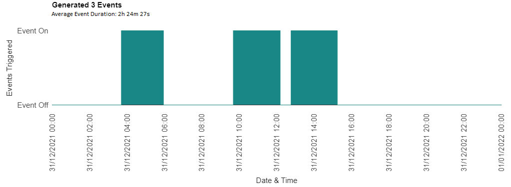
I am using Google Chart API to create a time-line graph and want to modify the title of the graph into two lines.
Question:
How would I be able display the two lined chart title, with different font sizes.
Current Output:
Ideal Output:
Relevant Research:
The only thing I could find was was someone trying to do this with a pie chart, but I tried and couldn't make it work.
MWE:
google.charts.load('current', {'packages':['corechart']})
google.charts.setOnLoadCallback(drawChart);

function drawChart() {
var data = new google.visualization.DataTable();
data.addColumn('date', 'Date \& Time');
data.addColumn('number', "Triggered Events");
data.addColumn({type: 'string', role: 'tooltip'});
data.addRows([
	[new Date(2021, 11, 31, 0, 0, 0), 0, ''],


	[new Date(2021, 11, 31, 3, 41, 44), 0, ''],
	[new Date(2021, 11, 31, 3, 41, 44), 1, 'Event Duration: 2h 14m 57s\nMax Val: XYZ °C\nStart Time: 03:41:44\nEnd Time: 05:56:41'],

	[new Date(2021, 11, 31, 5, 56, 41), 1, 'Event Duration: 2h 14m 57s\nMax Val: XYZ °C\nStart Time: 03:41:44\nEnd Time: 05:56:41'],
	[new Date(2021, 11, 31, 5, 56, 41), 0, ''],

	[new Date(2021, 11, 31, 9, 40, 48), 0, ''],
	[new Date(2021, 11, 31, 9, 40, 48), 1, 'Event Duration: 2h 30m 17s\nMax Val: XYZ °C\nStart Time: 09:40:48\nEnd Time: 12:11:05'],

	[new Date(2021, 11, 31, 12, 11, 5), 1, 'Event Duration: 2h 30m 17s\nMax Val: XYZ °C\nStart Time: 09:40:48\nEnd Time: 12:11:05'],
	[new Date(2021, 11, 31, 12, 11, 5), 0, ''],

	[new Date(2021, 11, 31, 12, 45, 57), 0, ''],
	[new Date(2021, 11, 31, 12, 45, 57), 1, 'Event Duration: 2h 28m 9s\nMax Val: XYZ °C\nStart Time: 12:45:57\nEnd Time: 15:14:06'],

	[new Date(2021, 11, 31, 15, 14, 6), 1, 'Event Duration: 2h 28m 9s\nMax Val: XYZ °C\nStart Time: 12:45:57\nEnd Time: 15:14:06'],
	[new Date(2021, 11, 31, 15, 14, 6), 0, ''],

	[new Date(2022, 0, 1, 0, 0, 0), 0, '']
]);   //End data.addRows([])

var options = {
	title:'Generated 3 Events\nAverage Event Duration: 2h 24m 27s',
	tooltip: {textStyle: {fontName: 'Lucida Console', fontSize: 12} },
	width: 1100,
	height: 500,
	lineWidth: 1,
	chartArea:{width: 900, height:150 },
	series: { 0: { color: '#188785', areaOpacity: 1.0}},
	legend: {position: 'none'},
	enableInteractivity: true,

	hAxis: {
		title: 'Date \& Time',
		titleTextStyle: {bold: false, italic: false},
		format: 'dd/MM/yyyy HH:mm',
		slantedText:true,
		slantedTextAngle:90,
		gridlines: {color: 'none'},
		},  //End hAxis

	vAxis: {
		title: 'Events Triggered',
		titleTextStyle: {bold: false, italic: false},
		viewWindow: {min: 0, max: 1},
		ticks: [{ v: 0, f: 'Event Off'}, {v: 1, f: 'Event On'}],
		gridlines: { color: 'transparent' }
		},  //End vAxis

	};  //End var options

var chart = new google.visualization.AreaChart(document.getElementById('chart_div'));
chart.draw(data, options);

}   //End drawChart()
<script type="text/javascript" src="https://www.gstatic.com/charts/loader.js"></script>
<div id="chart_div"></div> 

