How do I style a <select> dropdown with only CSS?
Asked Answered
L

26

1645

Is there a CSS-only way to style a <select> dropdown?

I need to style a <select> form as much as humanly possible, without any JavaScript. What are the properties I can use to do so in CSS?

This code needs to be compatible with all major browsers:

  • Internet Explorer 6, 7, and 8
  • Firefox
  • Safari

I know I can make it with JavaScript: Example.

And I'm not talking about simple styling. I want to know, what the best we can do with CSS only.

I found similar questions on Stack Overflow.

And this one on Doctype.com.

Linzy answered 13/12, 2009 at 3:33 Comment(4)
I feel it's a legitimate question, but the answer is "no, not really" or "not the way you want it". But no one (neither me) is 100% sure about it, this feeling of ambiguity crawls underneath reader's skin and the legitimacy of the question gets questioned.Belding
@jeremyosborne - Thanks for reply. I know i can make it with javascript . your eaxmple link is based on JS. Why i asked this question because i wanted to know, is anybody's there knows about what best we can do with css onlyLinzy
@Jitendra Thanks for updating your question. The best you can reliably do with the constraints you have (CSS only and no JS) is modify the typeface (font), background and foreground (text) colors, border size, appearance and colors, placement, and size (usually via the type setting through font). Even then, you'll probably need to do a few tweaks to make sure things look the same across all browsers. I wish I knew of a better answer than that, and perhaps there is one that I've missed, but i don't think so.Pout
"But no one (neither me) is 100% sure about it" This is THE reason that this is a great question! We should be sure of things like this. They are fundamental.Purvey
W
1218

Here are three solutions:

Solution #1 - appearance: none - with Internet Explorer 10 - 11 workaround (Demo)

--

To hide the default arrow set appearance: none on the select element, then add your own custom arrow with background-image

select {
    -webkit-appearance: none;
    -moz-appearance: none;
    appearance: none;
    /* Remove default arrow */
    background-image: url(...);
    /* Add custom arrow */
}

Browser Support:

appearance: none has very good browser support (caniuse) - except for Internet Explorer.

We can improve this technique and add support for Internet Explorer 10 and Internet Explorer 11 by adding

select::-ms-expand {
    display: none; /* Hide the default arrow in Internet Explorer 10 and Internet Explorer 11 */
}

If Internet Explorer 9 is a concern, we have no way of removing the default arrow (which would mean that we would now have two arrows), but, we could use a funky Internet Explorer 9 selector.

To at least undo our custom arrow - leaving the default select arrow intact.

/* Target Internet Explorer 9 to undo the custom arrow */
@media screen and (min-width:0\0) {
    select {
        background-image:none\9;
        padding: 5px\9;
    }
}

All together:

select {
  margin: 50px;
  width: 150px;
  padding: 5px 35px 5px 5px;
  font-size: 16px;
  border: 1px solid #CCC;
  height: 34px;
  -webkit-appearance: none;
  -moz-appearance: none;
  appearance: none;
  background: url(https://stackoverflow.com/favicon.ico) 96% / 15% no-repeat #EEE;
}


/* CAUTION: Internet Explorer hackery ahead */


select::-ms-expand {
    display: none; /* Remove default arrow in Internet Explorer 10 and 11 */
}

/* Target Internet Explorer 9 to undo the custom arrow */
@media screen and (min-width:0\0) {
    select {
        background: none\9;
        padding: 5px\9;
    }
}
<select>
  <option>Apples</option>
  <option selected>Pineapples</option>
  <option>Chocklate</option>
  <option>Pancakes</option>
</select>

This solution is easy and has good browser support - it should generally suffice.


If browser support for Internet Explorer is needed, read ahead.

Solution #2 Truncate the select element to hide the default arrow (demo)

--

(Read more here)

Wrap the select element in a div with a fixed width and overflow:hidden.

Then give the select element a width of about 20 pixels greater than the div.

The result is that the default drop-down arrow of the select element will be hidden (due to the overflow:hidden on the container), and you can place any background image you want on the right-hand-side of the div.

The advantage of this approach is that it is cross-browser (Internet Explorer 8 and later, WebKit, and Gecko). However, the disadvantage of this approach is that the options drop-down juts out on the right-hand-side (by the 20 pixels which we hid... because the option elements take the width of the select element).

Enter image description here

[It should be noted, however, that if the custom select element is necessary only for mobile devices - then the above problem doesn't apply - because of the way each phone natively opens the select element. So for mobile, this may be the best solution.]

.styled select {
  background: transparent;
  width: 150px;
  font-size: 16px;
  border: 1px solid #CCC;
  height: 34px;
}
.styled {
  margin: 50px;
  width: 120px;
  height: 34px;
  border: 1px solid #111;
  border-radius: 3px;
  overflow: hidden;
  background: url(https://stackoverflow.com/favicon.ico) 96% / 20% no-repeat #EEE;
}
<div class="styled">
  <select>
    <option>Pineapples</option>
    <option selected>Apples</option>
    <option>Chocklate</option>
    <option>Pancakes</option>
  </select>
</div>

If the custom arrow is necessary on Firefox - prior to Version 35 - but you don't need to support old versions of Internet Explorer - then keep reading...

Solution #3 - Use the pointer-events property (demo)

--

(Read more here)

The idea here is to overlay an element over the native drop down arrow (to create our custom one) and then disallow pointer events on it.

Advantage: It works well in WebKit and Gecko. It looks good too (no jutting out option elements).

Disadvantage: Internet Explorer (Internet Explorer 10 and down) doesn't support pointer-events, which means you can't click the custom arrow. Also, another (obvious) disadvantage with this method is that you can't target your new arrow image with a hover effect or hand cursor, because we have just disabled pointer events on them!

However, with this method you can use Modernizer or conditional comments to make Internet Explorer revert to the standard built in arrow.

NB: Being that Internet Explorer 10 doesn't support conditional comments anymore: If you want to use this approach, you should probably use Modernizr. However, it is still possible to exclude the pointer-events CSS from Internet Explorer 10 with a CSS hack described here.

.notIE {
  position: relative;
  display: inline-block;
}
select {
  display: inline-block;
  height: 30px;
  width: 150px;
  outline: none;
  color: #74646E;
  border: 1px solid #C8BFC4;
  border-radius: 4px;
  box-shadow: inset 1px 1px 2px #DDD8DC;
  background: #FFF;
}
/* Select arrow styling */

.notIE .fancyArrow {
  width: 23px;
  height: 28px;
  position: absolute;
  display: inline-block;
  top: 1px;
  right: 3px;
  background: url(https://stackoverflow.com/favicon.ico) right / 90% no-repeat #FFF;
  pointer-events: none;
}
/*target Internet Explorer 9 and Internet Explorer 10:*/

@media screen and (min-width: 0\0) {
  .notIE .fancyArrow {
    display: none;
  }
}
<!--[if !IE]> -->
<div class="notIE">
  <!-- <![endif]-->
  <span class="fancyArrow"></span>
  <select>
    <option>Apples</option>
    <option selected>Pineapples</option>
    <option>Chocklate</option>
    <option>Pancakes</option>
  </select>
  <!--[if !IE]> -->
</div>
<!-- <![endif]-->
Whitleywhitlock answered 20/12, 2012 at 9:27 Comment(2)
IE deaded so maybe refactor this?Ess
All the code snippets in this answer still produce a shadow on the dropdownMaki
T
260

It is possible, but unfortunately mostly in WebKit-based browsers to the extent we, as developers require. Here is the example of CSS styling gathered from Chrome options panel via built-in developer tools inspector, improved to match currently supported CSS properties in most modern browsers:

select {
  -webkit-appearance: button;
  -moz-appearance: button;
  -webkit-user-select: none;
  -moz-user-select: none;
  -webkit-padding-end: 20px;
  -moz-padding-end: 20px;
  -webkit-padding-start: 2px;
  -moz-padding-start: 2px;
  background-color: #F07575; /* Fallback color if gradients are not supported */
  background-image: url(../images/select-arrow.png), -webkit-linear-gradient(top, #E5E5E5, #F4F4F4); /* For Chrome and Safari */
  background-image: url(../images/select-arrow.png), -moz-linear-gradient(top, #E5E5E5, #F4F4F4); /* For old Firefox (3.6 to 15) */
  background-image: url(../images/select-arrow.png), -ms-linear-gradient(top, #E5E5E5, #F4F4F4); /* For pre-releases of Internet Explorer  10*/
  background-image: url(../images/select-arrow.png), -o-linear-gradient(top, #E5E5E5, #F4F4F4); /* For old Opera (11.1 to 12.0) */
  background-image: url(../images/select-arrow.png), linear-gradient(to bottom, #E5E5E5, #F4F4F4); /* Standard syntax; must be last */
  background-position: center right;
  background-repeat: no-repeat;
  border: 1px solid #AAA;
  border-radius: 2px;
  box-shadow: 0px 1px 3px rgba(0, 0, 0, 0.1);
  color: #555;
  font-size: inherit;
  margin: 0;
  overflow: hidden;
  padding-top: 2px;
  padding-bottom: 2px;
  text-overflow: ellipsis;
  white-space: nowrap;
}

When you run this code on any page within a WebKit-based browser it should change the appearance of the select box, remove standard OS-arrow and add a PNG-arrow, put some spacing before and after the label, almost anything you want.

The most important part is the appearance property, which changes how the element behaves.

It works perfectly in almost all WebKit-based browsers, including mobile ones, though Gecko doesn't support appearance as well as WebKit, it seems.

Tyson answered 27/4, 2011 at 19:5 Comment(1)
A codepen would have been nice. Also: doesn't workMaki
P
75

I had this exact problem, except I couldn't use images and was not limited by browser support. This should be «on spec» and with luck start working everywhere eventually.

It uses layered rotated background layers to «cut out» a dropdown arrow, as pseudo-elements wouldn't work for the select element.

Edit: In this updated version I am using CSS variables and a tiny theming system.

:root {
  --radius: 2px;
  --baseFg: dimgray;
  --baseBg: white;
  --accentFg: #006fc2;
  --accentBg: #bae1ff;
}

.theme-pink {
  --radius: 2em;
  --baseFg: #c70062;
  --baseBg: #ffe3f1;
  --accentFg: #c70062;
  --accentBg: #ffaad4;
}

.theme-construction {
  --radius: 0;
  --baseFg: white;
  --baseBg: black;
  --accentFg: black;
  --accentBg: orange;
}

select {
  font: 400 12px/1.3 sans-serif;
  -webkit-appearance: none;
  appearance: none;
  color: var(--baseFg);
  border: 1px solid var(--baseFg);
  line-height: 1;
  outline: 0;
  padding: 0.65em 2.5em 0.55em 0.75em;
  border-radius: var(--radius);
  background-color: var(--baseBg);
  background-image: linear-gradient(var(--baseFg), var(--baseFg)),
    linear-gradient(-135deg, transparent 50%, var(--accentBg) 50%),
    linear-gradient(-225deg, transparent 50%, var(--accentBg) 50%),
    linear-gradient(var(--accentBg) 42%, var(--accentFg) 42%);
  background-repeat: no-repeat, no-repeat, no-repeat, no-repeat;
  background-size: 1px 100%, 20px 22px, 20px 22px, 20px 100%;
  background-position: right 20px center, right bottom, right bottom, right bottom;   
}

select:hover {
  background-image: linear-gradient(var(--accentFg), var(--accentFg)),
    linear-gradient(-135deg, transparent 50%, var(--accentFg) 50%),
    linear-gradient(-225deg, transparent 50%, var(--accentFg) 50%),
    linear-gradient(var(--accentFg) 42%, var(--accentBg) 42%);
}

select:active {
  background-image: linear-gradient(var(--accentFg), var(--accentFg)),
    linear-gradient(-135deg, transparent 50%, var(--accentFg) 50%),
    linear-gradient(-225deg, transparent 50%, var(--accentFg) 50%),
    linear-gradient(var(--accentFg) 42%, var(--accentBg) 42%);
  color: var(--accentBg);
  border-color: var(--accentFg);
  background-color: var(--accentFg);
}
<select>
  <option>So many options</option>
  <option>...</option>
</select>

<select class="theme-pink">
  <option>So many options</option>
  <option>...</option>
</select>

<select class="theme-construction">
  <option>So many options</option>
  <option>...</option>
</select>
Pensive answered 10/7, 2014 at 8:35 Comment(1)
Hello @Henrik, For the pink one, how would I make the main part (so many options part) linear-gradient changed color? I want that big part also to have a multiple colors like this: background-image: linear-gradient(to right, #a1c4fd 0%, #c2e9fb 51%, #a1c4fd 100%); }Sweetbrier
E
73

The select element and its dropdown feature are difficult to style.

style attributes for select element by Chris Heilmann confirms what Ryan Dohery said in a comment to the first answer:

"The select element is part of the operating system, not the browser chrome. Therefore, it is very unreliable to style, and it does not necessarily make sense to try anyway."

Everyplace answered 13/12, 2009 at 3:43 Comment(0)
O
46

The largest inconsistency I've noticed when styling select dropdowns is Safari and Google Chrome rendering (Firefox is fully customizable through CSS). After some searching through obscure depths of the Internet I came across the following, which nearly completely resolves my qualms with WebKit:

Safari and Google Chrome fix:

select {
  -webkit-appearance: none;
}

This does, however, remove the dropdown arrow. You can add a dropdown arrow using a nearby div with a background, negative margin or absolutely positioned over the select dropdown.

*More information and other variables are available in CSS property: -webkit-appearance.

Outandout answered 15/3, 2011 at 22:34 Comment(0)
P
37

<select> tags can be styled through CSS just like any other HTML element on an HTML page rendered in a browser. Below is an (overly simple) example that will position a select element on the page and render the text of the options in blue.

Example HTML file (selectExample.html):

<!DOCTYPE HTML PUBLIC "-//W3C//DTD HTML 4.01//EN" "http://www.w3.org/TR/html4/strict.dtd">
<html>
<head>
  <title>Select Styling</title>
  <link href="selectExample.css" rel="stylesheet">
</head>
<body>
<select id="styledSelect" class="blueText">
  <option value="apple">Apple</option>
  <option value="orange">Orange</option>
  <option value="cherry">Cherry</option>
</select>
</body>
</html>

Example CSS file (selectExample.css):

/* All select elements on page */
select {
  position: relative;
}

/* Style by class. Effects the text of the contained options. */
.blueText {
  color: #0000FF;
}

/* Style by id. Effects position of the select drop down. */
#styledSelect {
  left: 100px;
}
Pout answered 13/12, 2009 at 3:48 Comment(2)
Amazing, first time I saw "mothers" involved on the Internet without it being rude. +1 for that !Ghana
I know you posted that comment literally 12 years ago but, what do you mean by "mothers"? I don't see that word anywhere in this answer.Ahouh
C
26

Custom Select CSS styles

Tested in Internet Explorer (10 and 11), Edge, Firefox, and Chrome

select::-ms-expand {
  display: none;
}
select {
  display: inline-block;
  box-sizing: border-box;
  padding: 0.5em 2em 0.5em 0.5em;
  border: 1px solid #eee;
  font: inherit;
  line-height: inherit;
  -webkit-appearance: none;
  -moz-appearance: none;
  -ms-appearance: none;
  appearance: none;
  background-repeat: no-repeat;
  background-image: linear-gradient(45deg, transparent 50%, currentColor 50%), linear-gradient(135deg, currentColor 50%, transparent 50%);
  background-position: right 15px top 1em, right 10px top 1em;
  background-size: 5px 5px, 5px 5px;
}
<select name="">
  <option value="">Lorem</option>
  <option value="">Lorem Ipsum</option>
</select>

<select name="" disabled>
  <option value="">Disabled</option>
</select>

<select name="" style="color:red;">
  <option value="">Color!</option>
  <option value="">Lorem Ipsum</option>
</select>
Counteraccusation answered 12/6, 2019 at 11:20 Comment(0)
S
25

Here is a version that works in all modern browsers. The key is using appearance:none which removes the default formatting. Since all of the formatting is gone, you have to add back in the arrow that visually differentiates the select from the input.

Working example: https://jsfiddle.net/gs2q1c7p/

select:not([multiple]) {
    -webkit-appearance: none;
    -moz-appearance: none;
    background-position: right 50%;
    background-repeat: no-repeat;
    background-image: url(data:image/png;base64,iVBORw0KGgoAAAANSUhEUgAAAA4AAAAMCAYAAABSgIzaAAAAGXRFWHRTb2Z0d2FyZQBBZG9iZSBJbWFnZVJlYWR5ccllPAAAAyJpVFh0WE1MOmNvbS5hZG9iZS54bXAAAAAAADw/eHBhY2tldCBiZWdpbj0i77u/IiBpZD0iVzVNME1wQ2VoaUh6cmVTek5UY3prYzlkIj8+IDx4OnhtcG1ldGEgeG1sbnM6eD0iYWRvYmU6bnM6bWV0YS8iIHg6eG1wdGs9IkFkb2JlIFhNUCBDb3JlIDUuMC1jMDYwIDYxLjEzNDc3NywgMjAxMC8wMi8xMi0xNzozMjowMCAgICAgICAgIj4gPHJkZjpSREYgeG1sbnM6cmRmPSJodHRwOi8vd3d3LnczLm9yZy8xOTk5LzAyLzIyLXJkZi1zeW50YXgtbnMjIj4gPHJkZjpEZXNjcmlwdGlvbiByZGY6YWJvdXQ9IiIgeG1sbnM6eG1wPSJodHRwOi8vbnMuYWRvYmUuY29tL3hhcC8xLjAvIiB4bWxuczp4bXBNTT0iaHR0cDovL25zLmFkb2JlLmNvbS94YXAvMS4wL21tLyIgeG1sbnM6c3RSZWY9Imh0dHA6Ly9ucy5hZG9iZS5jb20veGFwLzEuMC9zVHlwZS9SZXNvdXJjZVJlZiMiIHhtcDpDcmVhdG9yVG9vbD0iQWRvYmUgUGhvdG9zaG9wIENTNSBNYWNpbnRvc2giIHhtcE1NOkluc3RhbmNlSUQ9InhtcC5paWQ6NDZFNDEwNjlGNzFEMTFFMkJEQ0VDRTM1N0RCMzMyMkIiIHhtcE1NOkRvY3VtZW50SUQ9InhtcC5kaWQ6NDZFNDEwNkFGNzFEMTFFMkJEQ0VDRTM1N0RCMzMyMkIiPiA8eG1wTU06RGVyaXZlZEZyb20gc3RSZWY6aW5zdGFuY2VJRD0ieG1wLmlpZDo0NkU0MTA2N0Y3MUQxMUUyQkRDRUNFMzU3REIzMzIyQiIgc3RSZWY6ZG9jdW1lbnRJRD0ieG1wLmRpZDo0NkU0MTA2OEY3MUQxMUUyQkRDRUNFMzU3REIzMzIyQiIvPiA8L3JkZjpEZXNjcmlwdGlvbj4gPC9yZGY6UkRGPiA8L3g6eG1wbWV0YT4gPD94cGFja2V0IGVuZD0iciI/PuGsgwQAAAA5SURBVHjaYvz//z8DOYCJgUxAf42MQIzTk0D/M+KzkRGPoQSdykiKJrBGpOhgJFYTWNEIiEeAAAMAzNENEOH+do8AAAAASUVORK5CYII=);
    padding: .5em;
    padding-right: 1.5em
}

#mySelect {
    border-radius: 0
}
<select id="mySelect">
    <option>Option 1</option>
    <option>Option 2</option>
</select>
Semifluid answered 2/11, 2015 at 12:54 Comment(1)
I love self-contained answers like this which work out of the box! Thanks.Charissecharita
A
20

The blog post How to CSS form drop down style no JavaScript works for me, but it fails in Opera though:

select {
  border: 0 none;
  color: #FFFFFF;
  background: transparent;
  font-size: 20px;
  font-weight: bold;
  padding: 2px 10px;
  width: 378px;
  *width: 350px;
  *background: #58B14C;
}

#mainselection {
  overflow: hidden;
  width: 350px;
  -moz-border-radius: 9px 9px 9px 9px;
  -webkit-border-radius: 9px 9px 9px 9px;
  border-radius: 9px 9px 9px 9px;
  box-shadow: 1px 1px 11px #330033;
  background: url("arrow.gif") no-repeat scroll 319px 5px #58B14C;
}
<div id="mainselection">
  <select>
    <option>Select an Option</option>
    <option>Option 1</option>
    <option>Option 2</option>
  </select>
</div>
Alibi answered 5/1, 2011 at 7:13 Comment(0)
U
20

A native solution

Here's a simple HTML/CSS example:
https://jsfiddle.net/dkellner/e1jdspvb/

The trick: for some reason, when you give a size property to a select tag, it will suddenly understand CSS. Normally this property is for creating fixed-height lists that are always visible, but as a side effect, you can now style the hell out of it. So all we do is give it a size, and then implement the show/hide mechanism it to give back the dropdown feeling.

Minimal version, not as stylish as the example but easier to understand:

<style>

    .stylish > span {position:relative;}
    .stylish select {position:absolute;left:0px;transform:scaleY(0);transform-origin:top center;}
    .stylish.dropped-down select {transform:scaleY(1);}

</style>
...
<div class="stylish">
    <label> Choose your superhero: </label>
    <span>
        <input   onclick  = "this.closest('div').classList.toggle('dropped-down');"><br>
        <select  onclick  = "this.closest('div').classList.remove('dropped-down');"
                 onchange = "this.closest('div').querySelector('input').value=this.value;"
                 size=9
        >
            <optgroup label="Fantasy"></optgroup>

            <option value="gandalf">  Gandalf       </option>
            <option value="harry">    Harry Potter  </option>
            <option value="jon">      Jon Snow      </option>

            ...                
            
        </select>
    </span>
</div>

Side notes

  • This actually implements an editable dropdown; use readonly to avoid editing
  • The <optgroup> tags are empty (not around the option tags), it's more stylable this way
Usia answered 12/6, 2016 at 11:11 Comment(4)
Whoa, this looks like the real answer. Why not more comments / upvotes?Contrivance
"A just question, my liege", to quote a classic.Usia
THANK YOU so much. I don't understand why this comment isn't repeated on all of the similar issues (or why wasn't it accepted as accepted answer) because it works . @UsiaAtrophied
Well, if you give me some links, I point them in the right direction. And thank you!Usia
M
20

I got to your case using Bootstrap. This is the simplest solution that works:

select.form-control {
    -moz-appearance: none;
    -webkit-appearance: none;
    appearance: none;
    background-position: right center;
    background-repeat: no-repeat;
    background-size: 1ex;
    background-origin: content-box;
    background-image: url("data:image/svg+xml;base64,PD94bWwgdmVyc2lvbj0iMS4wIiBlbmNvZGluZz0iVVRGLTgiIHN0YW5kYWxvbmU9Im5vIj8+CjxzdmcKICAgeG1sbnM6ZGM9Imh0dHA6Ly9wdXJsLm9yZy9kYy9lbGVtZW50cy8xLjEvIgogICB4bWxuczpjYz0iaHR0cDovL2NyZWF0aXZlY29tbW9ucy5vcmcvbnMjIgogICB4bWxuczpyZGY9Imh0dHA6Ly93d3cudzMub3JnLzE5OTkvMDIvMjItcmRmLXN5bnRheC1ucyMiCiAgIHhtbG5zOnN2Zz0iaHR0cDovL3d3dy53My5vcmcvMjAwMC9zdmciCiAgIHhtbG5zPSJodHRwOi8vd3d3LnczLm9yZy8yMDAwL3N2ZyIKICAgdmVyc2lvbj0iMS4xIgogICBpZD0ic3ZnMiIKICAgdmlld0JveD0iMCAwIDM1Ljk3MDk4MyAyMy4wOTE1MTgiCiAgIGhlaWdodD0iNi41MTY5Mzk2bW0iCiAgIHdpZHRoPSIxMC4xNTE4MTFtbSI+CiAgPGRlZnMKICAgICBpZD0iZGVmczQiIC8+CiAgPG1ldGFkYXRhCiAgICAgaWQ9Im1ldGFkYXRhNyI+CiAgICA8cmRmOlJERj4KICAgICAgPGNjOldvcmsKICAgICAgICAgcmRmOmFib3V0PSIiPgogICAgICAgIDxkYzpmb3JtYXQ+aW1hZ2Uvc3ZnK3htbDwvZGM6Zm9ybWF0PgogICAgICAgIDxkYzp0eXBlCiAgICAgICAgICAgcmRmOnJlc291cmNlPSJodHRwOi8vcHVybC5vcmcvZGMvZGNtaXR5cGUvU3RpbGxJbWFnZSIgLz4KICAgICAgICA8ZGM6dGl0bGU+PC9kYzp0aXRsZT4KICAgICAgPC9jYzpXb3JrPgogICAgPC9yZGY6UkRGPgogIDwvbWV0YWRhdGE+CiAgPGcKICAgICB0cmFuc2Zvcm09InRyYW5zbGF0ZSgtMjAyLjAxNDUxLC00MDcuMTIyMjUpIgogICAgIGlkPSJsYXllcjEiPgogICAgPHRleHQKICAgICAgIGlkPSJ0ZXh0MzMzNiIKICAgICAgIHk9IjYyOS41MDUwNyIKICAgICAgIHg9IjI5MS40Mjg1NiIKICAgICAgIHN0eWxlPSJmb250LXN0eWxlOm5vcm1hbDtmb250LXdlaWdodDpub3JtYWw7Zm9udC1zaXplOjQwcHg7bGluZS1oZWlnaHQ6MTI1JTtmb250LWZhbWlseTpzYW5zLXNlcmlmO2xldHRlci1zcGFjaW5nOjBweDt3b3JkLXNwYWNpbmc6MHB4O2ZpbGw6IzAwMDAwMDtmaWxsLW9wYWNpdHk6MTtzdHJva2U6bm9uZTtzdHJva2Utd2lkdGg6MXB4O3N0cm9rZS1saW5lY2FwOmJ1dHQ7c3Ryb2tlLWxpbmVqb2luOm1pdGVyO3N0cm9rZS1vcGFjaXR5OjEiCiAgICAgICB4bWw6c3BhY2U9InByZXNlcnZlIj48dHNwYW4KICAgICAgICAgeT0iNjI5LjUwNTA3IgogICAgICAgICB4PSIyOTEuNDI4NTYiCiAgICAgICAgIGlkPSJ0c3BhbjMzMzgiPjwvdHNwYW4+PC90ZXh0PgogICAgPGcKICAgICAgIGlkPSJ0ZXh0MzM0MCIKICAgICAgIHN0eWxlPSJmb250LXN0eWxlOm5vcm1hbDtmb250LXZhcmlhbnQ6bm9ybWFsO2ZvbnQtd2VpZ2h0Om5vcm1hbDtmb250LXN0cmV0Y2g6bm9ybWFsO2ZvbnQtc2l6ZTo0MHB4O2xpbmUtaGVpZ2h0OjEyNSU7Zm9udC1mYW1pbHk6Rm9udEF3ZXNvbWU7LWlua3NjYXBlLWZvbnQtc3BlY2lmaWNhdGlvbjpGb250QXdlc29tZTtsZXR0ZXItc3BhY2luZzowcHg7d29yZC1zcGFjaW5nOjBweDtmaWxsOiMwMDAwMDA7ZmlsbC1vcGFjaXR5OjE7c3Ryb2tlOm5vbmU7c3Ryb2tlLXdpZHRoOjFweDtzdHJva2UtbGluZWNhcDpidXR0O3N0cm9rZS1saW5lam9pbjptaXRlcjtzdHJva2Utb3BhY2l0eToxIj4KICAgICAgPHBhdGgKICAgICAgICAgaWQ9InBhdGgzMzQ1IgogICAgICAgICBzdHlsZT0iZmlsbDojMzMzMzMzO2ZpbGwtb3BhY2l0eToxIgogICAgICAgICBkPSJtIDIzNy41NjY5Niw0MTMuMjU1MDcgYyAwLjU1ODA0LC0wLjU1ODA0IDAuNTU4MDQsLTEuNDczMjIgMCwtMi4wMzEyNSBsIC0zLjcwNTM1LC0zLjY4MzA0IGMgLTAuNTU4MDQsLTAuNTU4MDQgLTEuNDUwOSwtMC41NTgwNCAtMi4wMDg5MywwIEwgMjIwLDQxOS4zOTM0NiAyMDguMTQ3MzIsNDA3LjU0MDc4IGMgLTAuNTU4MDMsLTAuNTU4MDQgLTEuNDUwODksLTAuNTU4MDQgLTIuMDA4OTMsMCBsIC0zLjcwNTM1LDMuNjgzMDQgYyAtMC41NTgwNCwwLjU1ODAzIC0wLjU1ODA0LDEuNDczMjEgMCwyLjAzMTI1IGwgMTYuNTYyNSwxNi41NDAxNyBjIDAuNTU4MDMsMC41NTgwNCAxLjQ1MDg5LDAuNTU4MDQgMi4wMDg5MiwwIGwgMTYuNTYyNSwtMTYuNTQwMTcgeiIgLz4KICAgIDwvZz4KICA8L2c+Cjwvc3ZnPgo=");
}
<link href="https://maxcdn.bootstrapcdn.com/bootstrap/3.3.6/css/bootstrap.min.css" rel="stylesheet" />
<section class="container">
  <form class="form-horizontal">
    <select class="form-control">
      <option>One</option>
      <option>Two</option>
    </select>
  </form>
</section>

Note: the base64 stuff is fa-chevron-down in SVG.

Mut answered 14/7, 2016 at 16:7 Comment(0)
W
15

In modern browsers it's relatively painless to style the <select> in CSS. With appearance: none the only tricky part is replacing the arrow (if that's what you want). Here's a solution that uses an inline data: URI with plain-text SVG:

select {
  -moz-appearance: none;
  -webkit-appearance: none;
  appearance: none;
  
  background-repeat: no-repeat;
  background-size: 0.5em auto;
  background-position: right 0.25em center;
  padding-right: 1em;
  
  background-image: url("data:image/svg+xml;charset=utf-8, \
    <svg xmlns='http://www.w3.org/2000/svg' viewBox='0 0 60 40'> \
      <polygon points='0,0 60,0 30,40' style='fill:black;'/> \
    </svg>");
}
<select>
  <option>Option 1</option>
  <option>Option 2</option>
</select>

<select style="font-size: 2rem;">
  <option>Option 1</option>
  <option>Option 2</option>
</select>

The rest of the styling (borders, padding, colors, etc.) is fairly straightforward.

This works in all the browsers I just tried (Firefox 50, Chrome 55, Edge 38, and Safari 10). One note about Firefox is that if you want to use the # character in the data URI (e.g. fill: #000) you need to escape it (fill: %23000).

Wentworth answered 13/1, 2017 at 19:3 Comment(0)
E
12
select  {
    outline: 0;
    overflow: hidden;
    height: 30px;
    background: #2c343c;
    color: #747a80;
    border: #2c343c;
    padding: 5px 3px 5px 10px;
    -moz-border-radius: 6px;
    -webkit-border-radius: 6px;
    border-radius: 10px;
}

select option {border: 1px solid #000; background: #010;}
Eliott answered 1/9, 2010 at 15:13 Comment(0)
M
10

Edit this element is not recommended, but if you want to try it's like any other HTML element.

Edit example:

/* Edit select */
select {
    /* CSS style here */
}

/* Edit option */
option {
    /* CSS style here */
}

/* Edit selected option */
/* element  attr    attr value */
option[selected="selected"] {
    /* CSS style here */
}
<select>
    <option >Something #1</option>
    <option selected="selected">Something #2</option>
    <option >Something #3</option>
</select>
Madisonmadlen answered 20/9, 2012 at 21:53 Comment(3)
@MikkoP: when suggesting edits, would you please provide a more descriptive edit summary? "Improved the message" isn't very helpful as a high-level summary for us reviewers. Thanks.Dar
@Jean-FrançoisCorbett I'll try to be more specific :)Clearway
you can't style option elements (see this SO answer: https://mcmap.net/q/46012/-how-to-style-the-option-of-an-html-select-element )Whitleywhitlock
S
9

Use the clip property to crop the borders and the arrow of the select element, then add your own replacement styles to the wrapper:

    <!DOCTYPE html>
    <html>
      <head>
        <style>
          select { position: absolute; clip:rect(2px 49px 19px 2px); z-index:2; }
          body > span { display:block; position: relative; width: 64px; height: 21px; border: 2px solid green;  background: url(http://www.stackoverflow.com/favicon.ico) right 1px no-repeat; }
        </style>
      </head>
      <span>
        <select>
          <option value="">Alpha</option>
          <option value="">Beta</option>
          <option value="">Charlie</option>
        </select>
      </span>
    </html>

Use a second select with zero opacity to make the button clickable:

    <!DOCTYPE html>
    <html>
      <head>
        <style>
          #real { position: absolute; clip:rect(2px 51px 19px 2px); z-index:2; }
          #fake { position: absolute; opacity: 0; }
    
          body > span { display:block; position: relative; width: 64px; height: 21px; background: url(http://www.stackoverflow.com/favicon.ico) right 1px no-repeat; }
        </style>
      </head>
      <span>
        <select id="real">
          <option value="">Alpha</option>
          <option value="">Beta</option>
          <option value="">Charlie</option>
        </select>
        <select id="fake">
          <option value="">Alpha</option>
          <option value="">Beta</option>
          <option value="">Charlie</option>
        </select>
      </span>
    </html>

Coordinates differ between Webkit and other browsers, but a @media query can cover that.

References

Slivovitz answered 7/1, 2012 at 1:33 Comment(2)
Working well for me, at least in chrome: position: absolute; clip: rect(2px 85px 128px 2px); z-index: 2; padding-left: 18px; padding-right: 18px; margin: 7px auto; color: #555; font-size: inherit; background-color: transparent;Libenson
I found cropping off the arrow only half works in IE7 as you have no control over the border of the select.Merozoite
W
7

Yes. You may style any HTML element by its tag name, like this:

select {
  font-weight: bold;
}

Of course, you can also use a CSS class to style it, like any other element:

<select class="important">
  <option>Important Option</option>
  <option>Another Important Option</option>
</select>

<style type="text/css">
  .important {
    font-weight: bold;
  }
</style>
Waste answered 13/12, 2009 at 3:36 Comment(3)
i'm not talking about like this i want to change dropdown arrow to something elseLinzy
You can't style the dropdown arrow to another image, it's controlled by the OS. If you really need to, your best bet is to use a DHTML dropdown widget.Artist
You can only change CSS properties through CSS. You can change its margin, padding, font properties, background-color, etc. If you want to make it look completely different, you basically have to replace it with graphics at runtime via JavaScript (which isn't a terrible solution if done well).Waste
B
7

A very nice example that uses :after and :before to do the trick is in Styling Select Box with CSS3 | CSSDeck

Barbicel answered 28/4, 2013 at 11:31 Comment(2)
Yes but requirement in question was should compatible to Internet Explorer 6,7 and 8Linzy
Yes It's not compatible with IE but I loved to share for any one looking for a modern solution as I was looking for.Barbicel
C
5
label {
    position: relative;
    display: inline-block;
}
select {
    display: inline-block;
    padding: 4px 3px 5px 5px;
    width: 150px;
    outline: none;
    color: black;
    border: 1px solid #C8BFC4;
    border-radius: 4px;
    box-shadow: inset 1px 1px 2px #ddd8dc;
    background-color: lightblue;
}

This uses a background color for select elements and I removed the image..

Cheboksary answered 15/1, 2013 at 6:57 Comment(0)
P
5

Here's a solution based on my favorite ideas from this discussion. This allows styling a <select> element directly without any additional markup.

It works Internet Explorer 10 (and later) with a safe fallback for Internet Explorer 8/9. One caveat for these browsers is that the background image must be positioned and be small enough to hide behind the native expand control.

HTML

<select name='options'>
  <option value='option-1'>Option 1</option>
  <option value='option-2'>Option 2</option>
  <option value='option-3'>Option 3</option>
</select>

SCSS

body {
  padding: 4em 40%;
  text-align: center;
}

select {
  $bg-color: lightcyan;
  $text-color: black;
  appearance: none; // Using -prefix-free http://leaverou.github.io/prefixfree/
  background: {
    color: $bg-color;
    image: url("https://s3-us-west-2.amazonaws.com/s.cdpn.io/1255/caret--down-15.png");
    position: right;
    repeat: no-repeat;
  }
  border: {
    color: mix($bg-color, black, 80%);
    radius: .2em;
    style: solid;
    width: 1px;
    right-color: mix($bg-color, black, 60%);
    bottom-color: mix($bg-color, black, 60%);
  }
  color: $text-color;
  padding: .33em .5em;
  width: 100%;
}

// Removes default arrow for Internet Explorer 10 (and later)
// Internet Explorer 8/9 gets the default arrow which covers the caret
// image as long as the caret image is smaller than and positioned
// behind the default arrow
select::-ms-expand {
    display: none;
}

CodePen

http://codepen.io/ralgh/pen/gpgbGx

Pragmatic answered 29/5, 2015 at 13:50 Comment(0)
S
4

You definitely should do it like in Styling select, optgroup and options with CSS. In many ways, background-color and color are just what you would typically need to style options, not the entire select.

Stereogram answered 16/7, 2012 at 22:28 Comment(0)
P
4

As of Internet Explorer 10, you can use the ::-ms-expand pseudo element selector to style, and hide, the drop down arrow element.

select::-ms-expand {
    display:none;
    /* or visibility: hidden; to keep it's space/hitbox */
}

The remaining styling should be similar to other browsers.

Here is a basic fork of Danield's jsfiddle that applies support for IE10

Plumbaginaceous answered 9/12, 2013 at 21:50 Comment(0)
G
4

The third method in Danield's answer can be improved to work with hover-effects and other mouse events. Just make sure that the "button"-element comes right after the select element in the markup. Then target it using the + CSS selector:

HTML:

<select class="select-input">...</select>
<div class="select-button"></div>

CSS:

.select-input:hover+.select-button {
    <Hover styles here>
}

This will, however, show the hover effect when hovering anywhere over the select-element, not just over the "button".

I'm using this method in combination with Angular (since my project happens to be an Angular application anyway), to cover the whole select-element, and let Angular display the text of the selected option in the "button"-element. In this case it makes perfect sense that the hover-effect applies when hovering anywhere over the select.

It doesn't work without JavaScript though, so if you want to do this, and your site has to work without JavaScript, you should make sure that your script adds the elements and classes necessary for the enhancement. That way, a browser without JavaScript will simply get a normal, unstyled, select, instead of a styled badge that doesn't update correctly.

Ginoginsberg answered 4/9, 2014 at 8:48 Comment(1)
I'd love to know the reason for any downvotes, so I can know how to improve! 🙂Ginoginsberg
A
4

You can also add a hover style to the dropdown.

select {position:relative; float:left; width:21.4%; height:34px; background:#f9f9e0; border:1px solid #41533f; padding:0px 10px 0px 10px; color:#41533f; margin:-10px 0px 0px 20px; background: transparent; font-size: 12px; -webkit-appearance: none; -moz-appearance: none; appearance: none; background: url(https://alt-fit.com/images/global/select-button.png) 100% / 15% no-repeat #f9f9e0;}
select:hover {background: url(https://alt-fit.com/images/global/select-button.png) 100% / 15% no-repeat #fff;}
<html>
<head>
</head>
<body>
<select name="type" class="select"><option style="color:#41533f;" value="Select option">Select option</option>
<option value="Option 1">Option 1</option>
<option value="Option 2">Option 2</option>
<option value="Option 3">Option 3</option>
</select>
</body>
</html>
Anthemion answered 2/12, 2017 at 11:2 Comment(1)
perfect answer.Boabdil
B
3

A CSS and HTML only solution

It seems compatible with Chrome, Firefox, and Internet Explorer 11. But please leave your feedback regarding other web browsers.

As suggested by Danield's answer, I wrap my select in a div (even two divs for x-browser compatibility) to get the expected behavior.

See http://jsfiddle.net/bjap2/

HTML:

<div class="sort-options-wrapper">
    <div class="sort-options-wrapper-2">
        <select class="sort-options">
                <option value="choiceOne">choiceOne</option>
                <option value="choiceOne">choiceThree</option>
                <option value="choiceOne">choiceFour</option>
                <option value="choiceFiveLongTestPurpose">choiceFiveLongTestPurpose</option>
        </select>
    </div>
    <div class="search-select-arrow-down"></div>
</div>

Notice the two div wrappers.

Also notice the extra div added to place the arrow-down button wherever you like (positioned absolutely), here we put it on the left.

CSS

.sort-options-wrapper {
    display: inline-block;
    position: relative;
    border: 1px solid #83837F;
}

/* This second wrapper is needed for x-browser compatibility */
.sort-options-wrapper-2 {
    overflow: hidden;
}

select {
    margin-right: -19px; /* That's what is hiding the default-provided browser arrow */
    padding-left: 13px;
    margin-left: 0;
    border: none;
    background: none;

    /* margin-top & margin-bottom must be set since some
       browsers have default values for select elements */
    margin-bottom: 1px;
    margin-top: 1px;
}

select:focus {
    outline: none; /* Removing default browsers outline on focus */
}
.search-select-arrow-down {
    position: absolute;
    height: 10px;
    width: 12px;
    background: url(http://i.imgur.com/pHIYN06.png) scroll no-repeat 2px 0px;
    left: 1px;
    top: 5px;
}
Boomerang answered 7/2, 2014 at 8:47 Comment(0)
B
1

Pure Cross-Browsers CSS Select Control Style

Rule #1 : NEVER USE JAVASCRIPT to style HTML elements!

If JS is disabled or blocked, your CSS would crash and burn. Always start with pure CSS, then layer over any extra 'scripting glue' you prefer. REMEMBER! <select> controls like all form fields in HTML are replaced elements, meaning the browsers and OS on the device have some control over the design and layout of the control. This is why Windows, Apple, and mobile device controls all look different! It is that way for a reason.

Do NOT hijack the control design with JavaScript or CSS hacks unless you feel the UI must be modified for some reason (like removing the arrow on the select control). This CSS below does not do that. It accepts the core limitations in what it can redesign in the select form control. I would still start with my clean CSS solution, then layer over any custom "hacks" on top. Should they fail, then your CSS drops back gracefully to a global CSS design that always works in 20+ years of browsers...plus future ones!

This CSS code below works cross-browsers (1990's to Present) and aligns all the browsers, past and present, to the same basic CSS design. You can customize this code as needed. You can test this in very old browsers and it should give you a decent look-and-feel that matches modern HTML5 browsers, which should always be the goal.

/* This CSS works in 20+ years of browsers without hacks, scripts, or tricks. */

body optgroup,
body optgroup:visited,
body optgroup:hover,
body optgroup:focus,
body optgroup:active {
    margin: 0;
    padding: 0;
    font-style: inherit;
    font-weight: bold;
    cursor: pointer;
    background: #fff;
    border: none;
}

body optgroup:visited,
body optgroup:hover,
body optgroup:focus,
body optgroup:active {
    background: #f9f9ff;
}

body option,
body option:visited,
body option:hover,
body option:focus,
body option:active {
    margin: 0;
    padding: 0;
    cursor: pointer;
    background: #fff;
    border: none;
}
body option:visited,
body option:hover,
body option:focus,
body option:active {
    background: #f9f9ff;
}

body select,
body select:visited,
body select:hover,
body select:focus,
body select:active {
    display: inline-block;
    width: auto;
    height: auto;
    min-width: 0;
    max-width: none;
    padding: .17em .17em;
    margin: 0;
    text-transform: none;
    border-radius: .2em;
    border: 2px solid #bbb;
    background: #fff;
    cursor: pointer;
    -webkit-appearance: listbox;
    -moz-appearance: listbox;
    line-height: normal;
}

body select:visited,
body select:hover,
body select:focus,
body select:active {
    background: #f9f9ff;
    border: 2px solid #999;
}
body select:focus {
    background: #fff;
    border: 2px solid #999;
}

body select:required:visited:valid,
body select:required:valid {
    background: #fff;
    border: 2px solid #7fbe96;
}

body select:required:hover:valid {
    background: #f9f9ff;
    border: 2px solid #278b3d;
}

body select:required:focus:valid {
    background: #fff;
    border: 2px solid #278b3d;
}

body select:required:visited:invalid,
body select:required:invalid {
    background: #fff;
    border: 2px solid #ff6565;
}

body select:required:hover:invalid {
    background: #f9f9ff;
    border: 2px solid #ce2f2f;
}

body select:required:focus:invalid {
    background: #fff;
    border: 2px solid #ce2f2f;
}

body select[disabled],
body select[readonly],
body select[disabled="disabled"],
body select[readonly="readonly"],
body select[disabled]:visited,
body select[readonly]:visited,
body select[disabled="disabled"]:visited,
body select[readonly="readonly"]:visited,
body select[disabled]:hover,
body select[readonly]:hover,
body select[disabled="disabled"]:hover,
body select[readonly="readonly"]:hover,
body select[disabled]:focus,
body select[readonly]:focus,
body select[disabled="disabled"]:focus,
body select[readonly="readonly"]:focus,
body select[disabled]:active,
body select[readonly]:active,
body select[disabled="disabled"]:active,
body select[readonly="readonly"]:active {
    border: 2px solid #bbb;
    background: #f0f0f0;
    color: #999;
    cursor: default !important;
}
Bernetta answered 29/12, 2022 at 20:35 Comment(1)
Rule #2: See Rule #1.Venture
R
-1

As of 2024:

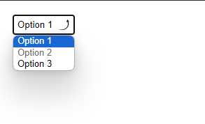
You can achieve it by using -webkit-apperarance and the background-image property:

<select>
    <option selected>Option 1</option>
    <option disabled>Option 2</option>
    <option>Option 3</option>       
</select>
select {
    -webkit-appearance: none;
    appearance: none;
    background-image: url('https://i.imgur.com/lqNaWae.png');
    background-repeat: no-repeat;
    background-position: right;
    border: 1px solid #AAA;
    padding: 4px;
    -webkit-padding-end: 30px;
}

Workaround for padding in the dropdown image:

As far as I searched, I didn't find any straightforward solution to provide some space to make the custom arrow icon padded, but I found a workaround for the same, that is using background-position-x to move it away from edges. Here is an implementation:

select {
    -webkit-appearance: none;
    appearance: none;
    background-image: url('https://i.imgur.com/lqNaWae.png');
    background-repeat: no-repeat;
    background-position: right;
    border: 1px solid #AAA;
    padding: 6px;
    background-position-x: 90%
    -webkit-padding-end: 20px;
}

View:

enter image description here

Recipe answered 6/3 at 9:1 Comment(0)

© 2022 - 2024 — McMap. All rights reserved.