Align grid() to plot ticks
Asked Answered
R

4

7

When adding ticks to a plot (more ticks than default), how does one get the grid() to align the grid to the ticks?

plot(1:10,las=1,xaxp  = c(0, 10, 10),xlim=c(0,10), ylim=c(0,10))
grid(lwd=2, nx=10, ny=10)

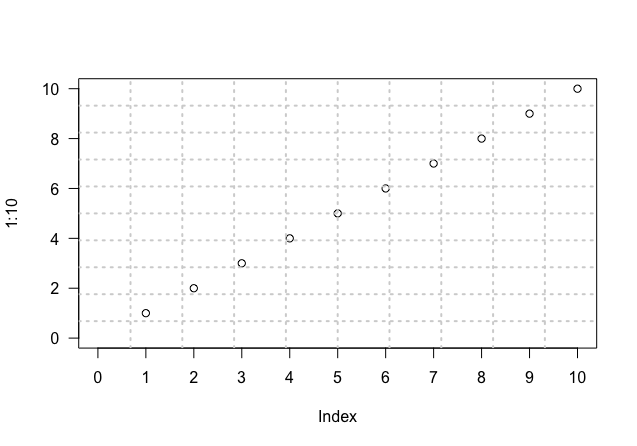
enter image description here

Tried changed the xlim and different numbers for the nx arg in grid (number of cells), but the grid simply doesn't line up.

Related, but doesn't answer question: Aligning grid lines in R, bReeze package

Related, and uses workaround: Align grid with ticks

Is the workaround the most efficient option?

Rhinarium answered 2/2, 2017 at 18:55 Comment(0)
C
8

You could use abline to draw grids. You can specify where the grids should be with h (for horizontal lines) and v (for vertical lines)

#Plot
plot(1:10,las=1,xaxp  = c(0, 10, 10),xlim=c(0,10), ylim=c(0,10))
#Add horizontal grid  
abline(h = c(0,2,4,6,8,10), lty = 2, col = "grey")
#Add vertical grid
abline(v = 1:10,  lty = 2, col = "grey")

Another workaround is to use axis where tck value is 1. With axis, you can specify where the grids should be with at

#Plot
plot(1:10,las=1,xaxp  = c(0, 10, 10),xlim=c(0,10), ylim=c(0,10))

#Add horizontal grid  
axis(2, at = c(0,2,4,6,8,10), tck = 1, lty = 2, col = "grey", labels = NA)

#Add vertical grid
axis(1, at = 1:10, tck = 1, lty = 2, col = "grey", labels = NA)

#Add box around plot
box()

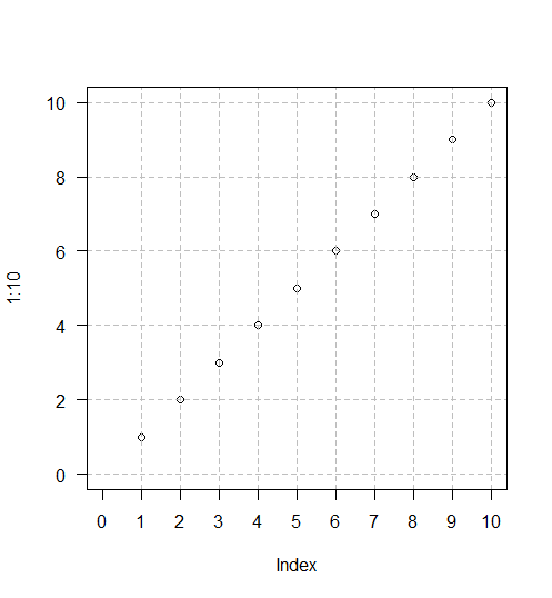
enter image description here

Comrade answered 2/2, 2017 at 20:22 Comment(1)
And for xts data you can use the following code: abline(v=index(my.xts.data)[endpoints(my.xts.data, "days")]). In this way R makes grid lines for daily time steps. Endpoints can be used for other time steps as well.Rooted
R
7

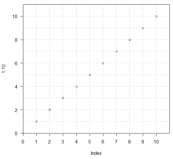
The problem is that grid is putting nx grid lines in the user space, but plot is adding 4% extra space on each side. You can take control of this. Adding xaxs="i", yaxs="i" to your plot will turn off the extra space. But then your upper right point will be cut off, so you need to change the xlim and ylim values and change nx to match. Final code is:

plot(1:10,las=1,xaxp  = c(0, 10, 10),xlim=c(0,11), ylim=c(0,11),
    xaxs="i", yaxs="i")
grid(lwd=2, nx=11, ny=11)

Gridded plot

Radiochemical answered 2/2, 2017 at 20:26 Comment(1)
This is a better solution than using abline(). abline() puts the gridlines over the top of the original plot and looks bad.Florrieflorry
B
2

The answer to your question

When adding ticks to a plot (more ticks than default), how does one get the grid() to align the grid to the ticks?

is:

Using function axis to obtain the x axis tick locations created by plot function in combination with abline

Concretely, you substitute the line

grid(lwd=2, nx=10, ny=10)

by the following three lines

x_ticks <- axis(1, 0:10, labels = FALSE)
grid(lwd = 2, ny = NULL, nx = NA)
abline(v = x_ticks, lwd = 2, lty = 3, col = "lightgray")

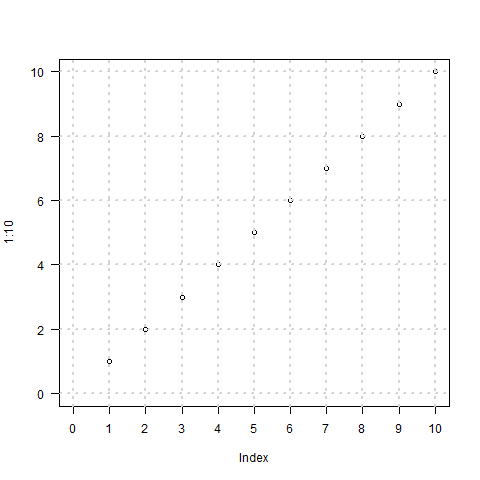
and the result will be

enter image description here

You can control both x ticks and y ticks and get rid of the grid function. In this case the 3 lines would be

x_ticks <- axis(1, 0:10, labels = FALSE)
y_ticks <- axis(2, labels = FALSE)
abline(v = x_ticks, h = y_ticks, lwd = 2, lty = 3, col = "lightgray")
Bioplasm answered 4/4, 2020 at 22:49 Comment(1)
Where in the standard ggplot coding would you put something like this?Helle
S
1

I would vote for the workaround. Because if you look at manual from ?grid, it has this statement,

"Note: If more fine tuning is required, use ‘abline(h = ., v = .)’ directly."

Subalternate answered 2/2, 2017 at 19:23 Comment(0)

© 2022 - 2024 — McMap. All rights reserved.