ggplot barplot : How to display small positive numbers with log scaled y-axis
Asked Answered
S

1

0

Main issue: I want to display the data from 0 to 1.0 as an upward bar (starting from 0) but do not want the intervals to be equally spaced but log spaced.

I am trying to display the column labeled "mean" in the dataset below as a bar plot in ggplot but as the numbers are very small, I would like to show the y-axis on a log scale rather than log transform the data itself. In other words, I want to have upright bars with y-axis labels as 0, 1e-8, 1e-6 1e-4 1e-2 and 1e-0 (i.e. from 0 to 1.0 but the intervals are log scaled).

The solution below does not work as the bars are inverted.

> print(df)
        type         mean           sd           se snp
V7    outer 1.596946e-07 2.967432e-06 1.009740e-08   A
V8    outer 7.472417e-07 6.598652e-06 2.245349e-08   B
V9    outer 1.352327e-07 2.515771e-06 8.560512e-09   C
V10   outer 2.307726e-07 3.235821e-06 1.101065e-08   D
V11   outer 4.598375e-06 1.653457e-05 5.626284e-08   E
V12   outer 5.963164e-07 5.372226e-06 1.828028e-08   F
V71  middle 2.035414e-07 3.246161e-06 1.104584e-08   A
V81  middle 9.000131e-07 7.261463e-06 2.470886e-08   B
V91  middle 1.647716e-07 2.875840e-06 9.785733e-09   C
V101 middle 3.290817e-07 3.886779e-06 1.322569e-08   D
V111 middle 6.371170e-06 1.986268e-05 6.758752e-08   E
V121 middle 8.312429e-07 6.329386e-06 2.153725e-08   F

The code below properly generates the grouped barplot with error bars

ggplot(data=df, aes(x=snp,y=mean,fill=type))+
  geom_bar(stat="identity",position=position_dodge(),width=0.5) + 
  geom_errorbar(aes(ymin=mean-se, ymax=mean+se),width=.3, position=position_dodge(.45)) 

However, I want to make the y-axis log scaled and so I add in scale_y_log10() as follows:

 ggplot(data=df, aes(x=snp,y=mean,fill=type))+
  geom_bar(stat="identity",position=position_dodge(),width=0.5) + scale_y_log10() +
  geom_errorbar(aes(ymin=mean-se, ymax=mean+se),width=.3, position=position_dodge(.45)) 

But strangely the bars are falling from above but I simply want them to be going up (as normally) and don't know what I am doing wrong.

Thank you

Squirrel answered 8/12, 2016 at 20:7 Comment(9)
barplots are defined in terms of zero. You have very small numbers. The log of very small numbers is negative. The bar goes from zero down to your negative numbers.Brownley
I am slightly confused because I am not log transforming the data itself so the numbers are still positive. Moreover, if you plot the data you will see that the y-axis units are still from 1e-6 (bottom) increasing up to 1e-3 but strangely the bars are "falling" from the top to the bottom i.e. from larger numbers to smaller numbers. I just want to view the data on a log scale but not transform the data itself. I hope I am making senseSquirrel
You are absolutely log transforming the data. scale_y_log10() log transforms the data before plotting it.Forensic
OK, there there must be a bug in ggplot because the y-tick labels are positive numbers (same values as I see when I don't use the scale_y_log10()).Squirrel
Nope, it reverse transforms the data for the tick labels. Definitely not a bug.Forensic
I'm also really concerned about you doing this. Bar charts are absolutely supposed to start at 0 but they can't with a log 10 scale (log10(0) == -Inf) and most folks will make very bad conclusions since they'll be comparing the bars linearly in their heads and will have to constantly remember it's a log scale and try to compensate for it. If the issue is the YUGE difference between E and the other bar pairs you could use faceting with a free Y scale to compensate for that and still make it compact.Forensic
From the comments, it appears that I was unclear, so I have added more information and changed the title. I want to display the data from 0 to 1.0 as an upward bar (starting from 0) but do not want the intervals to be equally spaced but log spaced. I hope my explanation is clear now.Squirrel
But as @Forensic already pointed out, log10(0) is -Inf. So you're asking for a plot in which the bars extend from negative infinity up to the logged values of your data.Starks
You might find this SO answer helpful.Starks
S
5

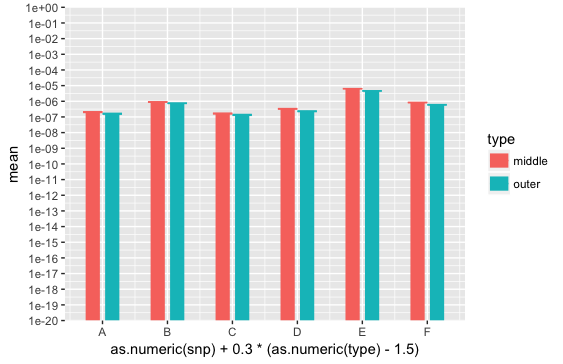
Here's a bit of hacking to show what happens if you try to get bars that start at zero on a log scale. I've used geom_segment for illustration, so that I can create "bars" (wide line segments, actually) extending over arbitrary ranges. To make this work, I've also had to do all the dodging manually, which is why the x mapping looks weird.

In the example below, the scale goes from y=1e-20 to y=1. The y-axis intervals are log scaled, meaning that the physical distance from, say 1e-20 to 1e-19 is the same as the physical distance from, say, 1e-8 to 1e-7, even though the magnitudes of those intervals differ by a factor of one trillion.

Bars that go down to zero can't be displayed, because zero on the log scale is an infinite distance below the bottom of the graph. We could get closer to zero by, for example, changing 1e-20 to 1e-100 in the code below. But that will just make the already-small physical distances between the data values even smaller and thus even harder to distinguish.

The bars are also misleading in another way, because, as @hrbrmstr pointed out, our brains treat distance along the bar linearly, but the magnitude represented by each increment of distance along the bar changes by a factor of 10 about every few millimeters in the example below. The bars simply aren't encoding meaningful information about the data.

ggplot(data=df, aes(x=as.numeric(snp) + 0.3*(as.numeric(type) - 1.5), 
                    y=mean, colour=type)) +
  geom_errorbar(aes(ymin=mean-se, ymax=mean+se), width=.3) +
  geom_segment(aes(xend=as.numeric(snp) + 0.3*(as.numeric(type) - 1.5),
                   y=1e-20, yend=mean), size=5) +
  scale_y_log10(limits=c(1e-20, 1), breaks=10^(-100:0), expand=c(0,0)) +
  scale_x_continuous(breaks=1:6, labels=LETTERS[1:6])

enter image description here

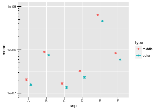
If you want to stick with a log scale, maybe plotting points would be a better approach:

pd = position=position_dodge(.5)
ggplot(data=df, aes(x=snp,y=mean,fill=type))+
  geom_errorbar(aes(ymin=mean-se, ymax=mean+se, colour=type), width=.3, position=pd) +
  geom_point(aes(colour=type), position=pd) +
  scale_y_log10(limits=c(1e-7, 1e-5), breaks=10^(-10:0)) +
  annotation_logticks(sides="l")

enter image description here

Starks answered 9/12, 2016 at 3:9 Comment(4)
Hey, how does as.numeric([char vector]) work? Or do you perform some transformation outside the given code so that the strings are converted into numbers?Turpin
Ah, I see - you probably either convert them to factors with as.factor or they are already stored as factors in the given dataframe.Turpin
Okay, there's one more question: why did you have to specify x as as.numeric(...) in ggplot and geom_segment, but did not have to do that in geom_errorbar?Turpin
As you surmised, snp is a factor, which is why as.numeric converts snp to numbers. The numeric conversion is so that I could put the segments and x-axis ticks exactly where I wanted them along the x-axis (that's the hacky part). Then I just set the x-axis labels manually in scale_x_continuous. Without this hack, the x-axis would be discrete. No numeric conversion is necessary in geom_errorbar because we're plotting the y-values, which are already numeric.Starks

© 2022 - 2024 — McMap. All rights reserved.