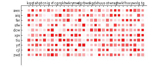
Does anyone have an idea how is this kind of chart plotted? It seems like heat map. However, instead of using color, size of each cell is used to indicate the magnitude. I want to plot a figure like this but I don't know how to realize it. Can this be done in R or Matlab?

Try scatter:
scatter(x,y,sz,c,'s','filled');
where x and y are the positions of each square, sz is the size (must be a vector of the same length as x and y), and c is a 3xlength(x) matrix with the color value for each entry. The labels for the plot can be input with set(gcf,properties) or xticklabels:
X=30;
Y=10;
[x,y]=meshgrid(1:X,1:Y);
x=reshape(x,[size(x,1)*size(x,2) 1]);
y=reshape(y,[size(y,1)*size(y,2) 1]);

sz=50;
sz=sz*(1+rand(size(x)));
c=[1*ones(length(x),1) repmat(rand(size(x)),[1 2])];
scatter(x,y,sz,c,'s','filled');

xlab={'ACC';'BLCA';etc}
xticks(1:X)
xticklabels(xlab)
set(get(gca,'XLabel'),'Rotation',90);
ylab={'RAPGEB6';etc}
yticks(1:Y)
yticklabels(ylab)
EDIT: yticks & co are only available for >R2016b, if you don't have a newer version you should use set instead:
set(gca,'XTick',1:X,'XTickLabel',xlab,'XTickLabelRotation',90) %rotation only available for >R2014b
set(gca,'YTick',1:Y,'YTickLabel',ylab)
xticks, xticklabels, yticks, yticklabels with set or HG2 commands (i.e. ax = gca, ax.XTick and so on...), as this code results in an error. –
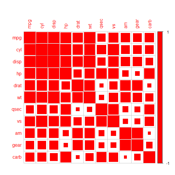
Dwanadwane In R, corrplotpackage can be used. Specifically, you have to use method = 'square' when creating the plot.
Try this as an example:
library(corrplot)
corrplot(cor(mtcars), method = 'square', col = 'red')
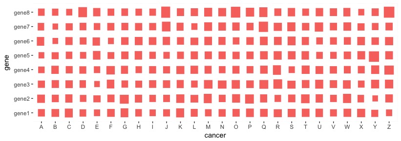
in R, you should use ggplot2 that allows you to map your values (gene expression in your case?) onto the size variable. Here, I did a simulation that resembles your data structure:
my_data <- matrix(rnorm(8*26,mean=0,sd=1), nrow=8, ncol=26,
                  dimnames = list(paste0("gene",1:8), LETTERS))
Then, you can process the data frame to be ready for ggplot2 data visualization:
library(reshape)
dat_m <- melt(my_data, varnames = c("gene", "cancer"))
Now, use ggplot2::geom_tile() to map the values onto the size variable. You may update additional features of the plot.
library(ggplot2)
ggplot(data=dat_m, aes(cancer, gene)) +
  geom_tile(aes(size=value, fill="red"), color="white") +
  scale_fill_discrete(guide=FALSE) + ##hide scale
  scale_size_continuous(guide=FALSE) ##hide another scale
© 2022 - 2024 — McMap. All rights reserved.


