MATLAB: How to draw a multiple horizontal bar plot with different scales and different sets of data?
Asked Answered
R

2

5

I would like to plot a bar chart exactly like the on in the picture below.

enter image description here

What I am not able to do is to plot 2 sets of data, one on the left-hand side of the "0" and the one on the right-hand side respectively, using each one a different scale on the x-axis. Using the function barh there are instructions about how to move the baseline, but in this case there are 2 sets of different data with different scales.

As example, I am trying to plot the following arrays:

left = [.1; .5; .4; .6; .3]; % Scale 0-1, grows leftwards
right = [24; 17; 41; 25; 34]; % Scale 0-35, grows rightwards

Any hints please?

Remembrancer answered 22/7, 2016 at 11:8 Comment(0)
C
5

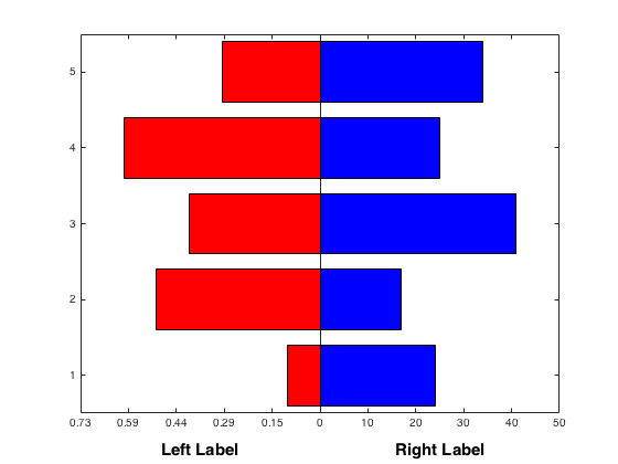
To handle the different scaling, you could manually multiply the values in left to be scaled, then modify the tick marks on that side.

% Automatically determine the scaling factor using the data itself
scale = max(right) / max(left);

% Create the left bar by scaling the magnitude
barh(1:numel(left), -left * scale, 'r');

hold on
barh(1:numel(right), right, 'b')    

% Now alter the ticks.
xticks = get(gca, 'xtick')

% Get the current labels
labels = get(gca, 'xtickLabel'); 

if ischar(labels); 
    labels = cellstr(labels); 
end

% Figure out which ones we need to change
toscale = xticks < 0;

% Replace the text for the ones < 0
labels(toscale) = arrayfun(@(x)sprintf('%0.2f', x), ...
                           abs(xticks(toscale) / scale), 'uniformoutput', false);

% Update the tick locations and the labels
set(gca, 'xtick', xticks, 'xticklabel', labels)

% Now add a different label for each side of the x axis
xmax = max(get(gca, 'xlim'));
label(1) = text(xmax / 2, 0, 'Right Label');
label(2) = text(-xmax/ 2, 0, 'Left Label');

set(label, 'HorizontalAlignment', 'center', 'FontWeight', 'bold', 'FontSize', 15) 

enter image description here

Cryptanalysis answered 22/7, 2016 at 11:12 Comment(2)
Thanks a lot, this looks almost identical to the one in the example! I have two further questions to make it even more similar if you don't mind. Since I am using only positive values, would you know if there is a way of obtaining a positive scale on both axes? Also, would you know if it is possible to add two separate labels on the x-axes, one for each set of data?Remembrancer
@Remembrancer UpdatedCryptanalysis
P
4

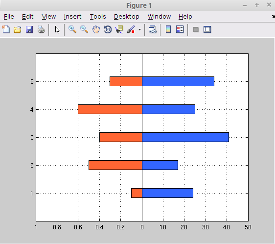
Here's an example:

left = [.1; .5; .4; .6; .3]; % Scale 0-1, grows leftwards
right = [24; 17; 41; 25; 34]; % Scale 0-35, grows rightwards

ax_front = axes;
b_front = barh(right,0.35);
set(b_front,'facecolor',[0.2,0.4,1])
axis([-50,50,0,6])
axis off

ax_back = axes; 
b_back = barh(-left,0.35)
axis([-1,1,0,6])
set(b_back,'facecolor',[1,0.4,0.2])
set(gca, 'xtick', [-1:0.2:1])
set(gca, 'xticklabel', [[1:-0.2:0],[10:10:50]])
grid on

axes(ax_front) % bring back to front

Result:

enter image description here

Politian answered 22/7, 2016 at 11:41 Comment(0)

© 2022 - 2024 — McMap. All rights reserved.