You can get to the category labels the following way:
from pptx import Presentation
from pptx.shapes.graphfrm import GraphicFrame

prs = Presentation('chart-01.pptx')

for slide in prs.slides:
    for shape in slide.shapes:
        print("slide: %s, id: %s, index: %s, type: %s" % (slide.slide_id, shape.shape_id, slide.shapes.index(shape), shape.shape_type))
        if isinstance(shape, GraphicFrame) and shape.has_chart:
            plotIndex = 0
            for plot in shape.chart.plots:
                catIndex = 0
                for cat in plot.categories:
                    print("  plot %s, category %s, category label: %s" % (plotIndex, catIndex, cat.label))
                    catIndex += 1
                plotIndex += 1
which will put out something like that:
slide: 256, id: 2, index: 0, type: PLACEHOLDER (14)
slide: 256, id: 3, index: 1, type: CHART (3)
  plot 0, category 0, category label: East
  plot 0, category 1, category label: West
  plot 0, category 2, category label: Midwest
Unfortunately you can not change the category label, because it is stored in the embedded Excel. The only way to change those is to replace the chart data by using the chart.replace_data() method.
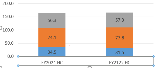
Recreating the ChartData object you need for the call to replace_data based on the existing chart is a bit more involved, but here is my go at it based on a chart that I created with the following code:
from pptx import Presentation
from pptx.chart.data import CategoryChartData
from pptx.enum.chart import XL_CHART_TYPE,XL_LABEL_POSITION
from pptx.util import Inches, Pt
from pptx.dml.color import RGBColor

# create presentation with 1 slide ------
prs = Presentation()
slide = prs.slides.add_slide(prs.slide_layouts[5])

# define chart data ---------------------
chart_data = CategoryChartData()
chart_data.categories = ['FY2021 HC', 'FY2122 HC']
chart_data.add_series('blue', (34.5, 31.5))
chart_data.add_series('orange', (74.1, 77.8))
chart_data.add_series('grey', (56.3, 57.3))

# add chart to slide --------------------
x, y, cx, cy = Inches(2), Inches(2), Inches(6), Inches(4.5)
gframe = slide.shapes.add_chart(
    XL_CHART_TYPE.COLUMN_STACKED, x, y, cx, cy, chart_data
)
chart = gframe.chart
plot = chart.plots[0]
plot.has_data_labels = True
data_labels = plot.data_labels
data_labels.font.size = Pt(13)
data_labels.font.color.rgb = RGBColor(0x0A, 0x42, 0x80)
data_labels.position = XL_LABEL_POSITION.INSIDE_END

prs.save('chart-01.pptx')
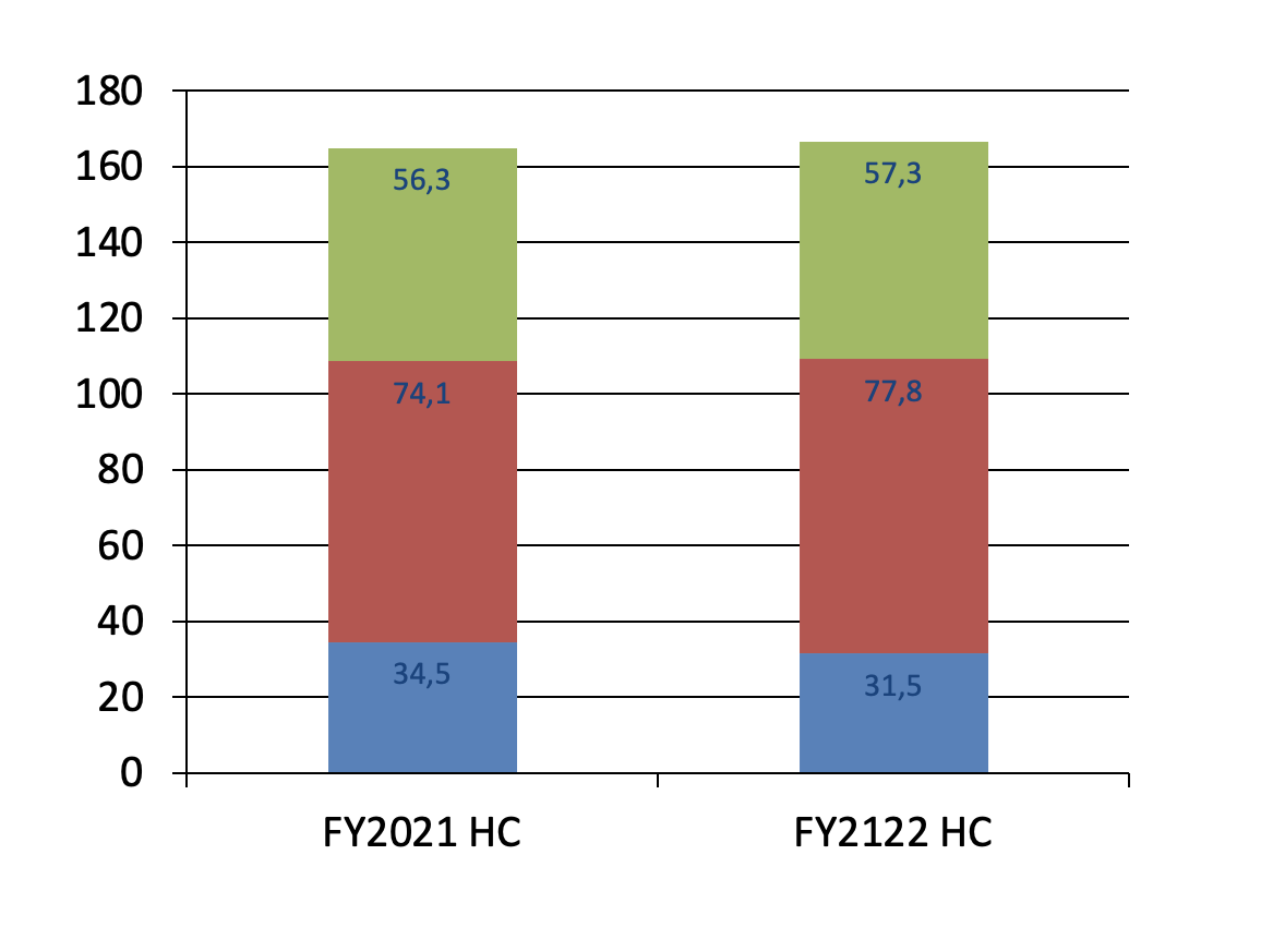
and that looks almost identical to your picture in the question:
![The view inside PowerPoint of the file chart-01.pptx]()
The following code will change the category labels in that chart:
from pptx import Presentation
from pptx.chart.data import CategoryChartData
from pptx.shapes.graphfrm import GraphicFrame
from pptx.enum.chart import XL_CHART_TYPE
from pptx.util import Inches

# read presentation from file
prs = Presentation('chart-01.pptx')

# find the first chart object in the presentation
slideIdx = 0
for slide in prs.slides:
    for shape in slide.shapes:
        if shape.has_chart:
            chart = shape.chart
            print("Chart of type %s found in slide[%s, id=%s] shape[%s, id=%s, type=%s]"
                    % (chart.chart_type, slideIdx, slide.slide_id,
                       slide.shapes.index(shape), shape.shape_id, shape.shape_type ))
            break
    slideIdx += 1

# create list with changed category names
categorie_map = { 'FY2021 HC': 'FY1918 HC', 'FY2122 HC': 'FY1718 HC' }
new_categories = list(categorie_map[c] for c in chart.plots[0].categories)

# build new chart data with new category names and old data values
new_chart_data = CategoryChartData()
new_chart_data.categories = new_categories
for series in chart.series:
    new_chart_data.add_series(series.name,series.values)

# write the new chart data to the chart
chart.replace_data(new_chart_data)

# save everything in a new file
prs.save('chart-02.pptx')
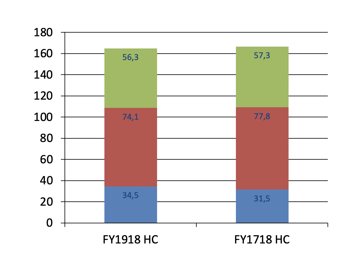
The comments should explain what is going on and if you open chart-02.pptx with PowerPoint, this is what you will see:
![The view inside PowerPoint of the file chart-02.pptx]()
Hope that solves your problem!


