Custom React Component styles being overwritten by Material-UI style
Asked Answered
H

2

0

RELATED QUESTION OVER AT: Styles being overwritten by Material-UI style

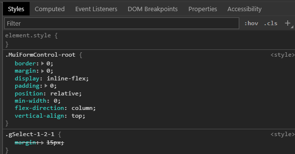
I am create a component library on top of Material UI. Using JSS I'd like to be able to pass in styles to my custom components. However, I'm having issues with material-ui's root styles having higher specificity than what I'm passing in. I have tried overwriting the material-ui components default styles with the classes syntax but it simply creates another class with a similar name and higher specificity (makeStyles-root-51).

Chrome Dev Tools

Consuming Custom Component:

import React from 'react';
import {gSelect} from 'g-react-component-library/dist'
import {createUseStyles} from 'react-jss'

const useStyles = createUseStyles({
    gSelect: {margin: "15px"},
    example: {float: "left", display: "inline-block", whiteSpace: 'nowrap', verticalAlign: 'top'}
});

function App() {

    const classes = useStyles();
    return (
        <div className={classes.example}>
            <div className={classes.separator}>
                <div>Selects:</div>
                <gSelect default={1} classes={{gSelect: classes.gSelect}} callback={(e)=>{console.log(`${e} selected`)}} options={[1,2,3,4]}/>
                <gSelect default={'One'} classes={{gSelect: classes.gSelect}} callback={(e)=>{console.log(`${e} selected`)}} options={["One", "Two", "Three", "Four"]}/>
            </div>
        </div>
    );
}

export default App;

The Actual Custom Component:

import React, {useState} from 'react';
import {Button, Select, FormControl, MenuItem, InputLabel} from '@material-ui/core'
import {makeStyles} from '@material-ui/styles'
import PropTypes from 'prop-types'

const gSelect = (props) => {

    const [value, setValue] = useState();

    const handleChange = event => {
        props.callback(event.target.value);
        setValue(event.target.value);
    };

    const useStyles = makeStyles({
        select: {
            border: 'solid #33333366 1px',
            color: 'rgba(51, 51, 51, 0.66)',
            fontWeight: '700',
            backgroundColor: 'white',
            outline: 'none',
            borderRadius: '5px',
            textAlign: 'left',
            width: '300px',
            position: 'relative',
        },
        root: {

        }
    });

    const classes = useStyles(props);
    return (
        <FormControl classes={{root: classes.gSelect}}>
        <InputLabel id="demo-simple-select-label">{props.default}</InputLabel>
        <Select value={value} onChange={handleChange} className={classes.select}>
            {props.options.map((option, index) => {
                return <MenuItem key={`${option}_${index}`} value={option}>{option}</MenuItem>
            })}
        </Select>
        </FormControl>
    )
};

gSelect.propTypes = {
    callback: PropTypes.func.isRequired,
    options: PropTypes.array.isRequired,
    default: PropTypes.oneOfType([
        PropTypes.string,
        PropTypes.number
    ]).isRequired,
    disabled: PropTypes.bool,
    width: PropTypes.string
};

module.exports = {
    gSelect
};
Hackney answered 7/2, 2020 at 18:51 Comment(9)
You shouldn't be creating the useStyles hook inside the component, defeats the purpose.Hakeem
How so? If I want to create a custom component library on top of material-UI you have to give it custom styles somehow.Hackney
I've explained in my answer below - the crux of the matter is that classes should come through props and you should pass those props to your hook - material UI does all the magic of concatenating passed in classes to your own. I personally prefer the withStyles hoc because all of this logic is handled automagically for you and you don't have to worry about forgetting to pass your props to your useStyles hook.Hakeem
@Adam, I've made the changes you suggested. However, I'm still running into the issue where MUI's root class has higher specificity and is overwriting my margin. Also, I have cut down the code a lot from it's source for this question and so if there are some glaring issues that probably is what you are seeing. In my original question I realized that the style I was passing into the component was the same as the style it was using internally to customize the select. This was just a mistake in me editing things down for the question. I should have fixed it in the updated question.Hackney
If you could post a codepen/stackblitz demonstrating an issue (doesn't have to be this exact code, just something similar) it'd go a long way.Hakeem
Don’t try and use your existing code, make a small repro that uses a material ui and a couple of dummy components, while you’re doing it you might even solve your issue!Hakeem
It's tough to explain, check the diff between yours and what I did here: codesandbox.io/s/material-demo-so5yk. Ask whatever questions you like. I spent some time learning material-ui's styling solution a few months ago, it's amazing, but until you really grok it, you're going to struggle with it. (EDIT: added extensive commenting, hopefully to make it clear what's going on).Hakeem
Those aren't errors, those are warnings displayed with a console.error. As a matter of fact, they are this warning. Material UI is providing those warnings because they think that it's caused by devs not knowing what they are doing (most of the time they are correct). But if you know how the merging of classes works, they are honestly safe to ignore. By the way, this sandbox should show you how to "fix" it: codesandbox.io/s/material-demo-udlfhHakeem
@Adam, I've updated my code sandbox example to use className and that worked. I tried this originally but I think because I was using the createUseStyles instead of makeStyles it was not working. However, your help was really invaluable to getting to that solution, thanks! Also, I've run into a very similar but different issue and created another question. By no means do I expect your help but if you wanted to take a crack at it be my guest. Thanks again! #60180084Hackney
H
1

You're doing it wrong. GSelect should receive classes like this:

In App:

<GSelect default={1} classes={{gSelect:classes.gSelect}} callback={(e)=>{console.log(`${e} selected`)}} options={[1,2,3,4]}/>

Then in GSelect:

const useStyles = createStyles(...your styles); // call this hook factory outside your render

const GSelect = props => {
   const classes = useStyles(props) <- props contains an object called classes with a property gselect that gets merged into yours

   <Select value={value} onChange={handleChange} classes={{root:classes.gSelect}}>
}

EDIT: As for my original comment about creating your hook outside of your component, I meant do this:


// move this outside of your render
    const useStyles = createUseStyles({
        gSelect: {margin: "15px"},
        separator: {marginTop: "15px"},
        example: {float: "left", display: "inline-block", whiteSpace: 'nowrap', verticalAlign: 'top'}
    });

function App() {
    // use it inside of your render
    const classes = useStyles();
    ...
}

Read through this section and the following two, after a while, it'll click: https://material-ui.com/styles/advanced/#overriding-styles-classes-prop

Hakeem answered 7/2, 2020 at 19:19 Comment(0)
H
0

The solution to passing in styles to a custom component in the end was very simple. While @Adam answered my question the way it was worded, the solution I ended up with is as follows:

Consuming Custom Component:

import React from 'react';
import {gSelect} from 'g-react-component-library/dist'
import { makeStyles } from "@material-ui/core/styles";

const useStyles = makeStyles ({
    gSelect: {margin: "15px"},
    example: {float: "left", display: "inline-block", whiteSpace: 'nowrap', verticalAlign: 'top'}
});

function App() {

    const classes = useStyles();
    return (
        <div className={classes.example}>
            <div className={classes.separator}>
                <div>Selects:</div>
                <gSelect default={1} className={classes.gSelect} callback={(e)=>{console.log(`${e} selected`)}} options={[1,2,3,4]}/>
                <gSelect default={'One'} className={classes.gSelect} callback={(e)=>{console.log(`${e} selected`)}} options={["One", "Two", "Three", "Four"]}/>
            </div>
        </div>
    );
}

export default App;

Fixes Above Include :

  • switched createUseStyles to makeStyles from @material-ui/core/styles
  • used className={classes.gSelect} instead of classes={{root: ...}}

The Actual Custom Component:

import React, {useState} from 'react';
import {Button, Select, FormControl, MenuItem, InputLabel} from '@material-ui/core'
import {makeStyles} from '@material-ui/styles'
import PropTypes from 'prop-types'

const gSelect = (props) => {

const [value, setValue] = useState();

const handleChange = event => {
    props.callback(event.target.value);
    setValue(event.target.value);
};

const useStyles = makeStyles({
    select: {
        border: 'solid #33333366 1px',
        color: 'rgba(51, 51, 51, 0.66)',
        fontWeight: '700',
        backgroundColor: 'white',
        outline: 'none',
        borderRadius: '5px',
        textAlign: 'left',
        width: '300px',
        position: 'relative',
    }
});

const classes = useStyles();
return (
    <FormControl className={props.className}>
    <InputLabel id="demo-simple-select-label">{props.default}</InputLabel>
    <Select value={value} onChange={handleChange} className={classes.select}>
        {props.options.map((option, index) => {
            return <MenuItem key={`${option}_${index}`} value={option}>{option}</MenuItem>
        })}
    </Select>
    </FormControl>
)
};

gSelect.propTypes = {
    callback: PropTypes.func.isRequired,
    options: PropTypes.array.isRequired,
    default: PropTypes.oneOfType([
        PropTypes.string,
        PropTypes.number
    ]).isRequired,
    disabled: PropTypes.bool,
    width: PropTypes.string
};

module.exports = {
    gSelect
};
Fixes Above Include :

  • used className={props.className} on <FormControl>
Hackney answered 12/2, 2020 at 0:19 Comment(0)

© 2022 - 2024 — McMap. All rights reserved.