Styles being overwritten by Material-UI style
Asked Answered
O

2

6

Preface

I asked a similar question to this several days back and while related in nature I believe the solution will ultimately be different, so I am asking again in a different thread.

CodeSanbox Example (Has Been updated to reflect the accepted answer)

The issue:

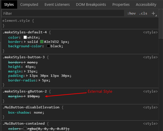
I'd like any external styles passed in with the className prop to have higher specificity than my custom components internal style. That way someone using it can adjust margins and padding. However, my components default internal style is overwriting my external style and I would like it to be the other way around.

You can see my external style is lower speceficity

The Details:

I am creating a custom component library built on top of material-ui. I'd like to make the custom components api similar to @material-ui so that our devs will find them easier to use. Each component I am building has it's own internal style overwriting the default material-ui styles in this case it is defined as class button. Additionally, like @material-ui I am accepting a color prop <TestButton color={'default'}/>. Finally, I'd like my custom button to be allowed to be overwritten with external styles if the need ever arises. I am using the clsx library to build the className strings.

The Code:

import React, { useState } from "react";
import { makeStyles } from "@material-ui/styles";
import InputLabel from "@material-ui/core/InputLabel";
import MenuItem from "@material-ui/core/MenuItem";
import FormControl from "@material-ui/core/FormControl";
import { Button } from "@material-ui/core";
import clsx from "clsx";

const useAppStyles = makeStyles({
  gButton: { margin: "150px" }
});

export default function App() {
  const classes = useAppStyles();

  return (
    <div className={classes.example}>
      <div className={classes.separator}>
        <div>Buttons:</div>
        <TestButton
          className={classes.gButton}
          color={"default"}
        >
          Default
        </TestButton>
        <TestButton
          className={classes.gButton}
          color={"primary"}
        >
          Primary
        </TestButton>
    </div>
  );
}

function TestButton(props) {

  const classes = GrangeButtonStyles();
  let color = props.color === 'default' ? classes.default : classes.primary 

  const GrangeButtonStyles = makeStyles({
    button: {
     height: "45px",
     padding: "13px 30px 13px 30px",
     borderRadius: "5px",
     border: "none",
     margin: "15px",
    },
    default: {
     backgroundColor: "black",
     border: 'solid #2e7d32 1px',
     color: "white",
    },
    primary: {
     backgroundColor: 'white',
     color: 'black',
     fontFamily: 'Montserrat, sans-serif',
     border: 'solid black 1px',
    }
  });

  return (
    <Button
      className={clsx(classes.button, color, props.className)}
      variant="contained"
      disabled={props.disabled}
      disableElevation
    >
      {props.children}
    </Button>
  );
}

NOTE:

I have simplified the code greatly for space in this question and in the code sandbox example. Please don't comment that you think what I'm doing doesn't make sense because of the example.

Orgel answered 12/2, 2020 at 0:55 Comment(17)
Check out the drastic difference by the few changes I made here: codesandbox.io/s/material-demo-l0hn1Pomiculture
The difference in specificity between the styles from different makeStyles calls is dependent on the order of the style sheets in the <head>. This is determined by the order in which makeStyles is called. Later calls will be later in the <head> and thus have higher specificity. If you put your custom components in files of their own, their makeStyles will generally be called first due to importing them before using them and the specificity should be as desired.Forecast
You can find related information here and here.Forecast
@Adam, Your changes just look like they completely blow away the internal styles of the select. I'm not sure of the point though. Sorry.Orgel
@RyanCogswell, only in the codesandbox are they together. In reality I am importing them as a library and then using them in a react app. The dev tools screen shot from above is actually captured using that setup.Orgel
Yeah, I moved some styles around from the FormControl that broke stuff - I'm not trying to make it look pretty, I'm trying to illustrate the concept of material-ui's very scalable and flexible styling solution - you generate classes in a parent component and merge those classes in a child component. A lot of people throw around "className" and include clsx when material-ui already handles all that stuff correctly if you use it properly.Pomiculture
Material-ui is smart enough to know that if they change their HTML structure it may break people's styles, which is why they came up with this solution. You want to style the container element inside a ListItem component? If you use a nested selector it might work for now, but it might break in the next release. If you pass in classes.container with a jss generated class name it will "always" work.Pomiculture
@Adam, from what I get from their documentation. classes is only to be used if you need to override some of the deeper elements within a component. className seems to be how you would change something simple like margins and padding. I don't mean to appear as stubborn. I'm just really trying to understand all of this.Orgel
@JonnyB Please create a sandbox that more accurately reflects how the components are structured and being used and that still reproduces the problem. Simpler is better -- TestButton and an example of its use with external styles should be sufficient to show the problem.Forecast
But what if the component is complex like material-ui.com/api/autocomplete where there are lots of nested elements? classes is how you surgically target stuff in a way that won't break tomorrow. If you're building a component library, understanding this should be high priority - passing className around won't cut it.Pomiculture
@Adam Most styling of Material-UI components happens at the root level (via classes.root or other classes that are conditionally applied to the same element as classes.root). When trying to customize styles at the root level doesn't work, then you can dig into whether specifying one of the nested classes instead might help. If it works to customize at the root level via className it isn't going to be any more fragile than doing the same customizations using classes.Forecast
root: { '& > p > span:first-child': { ... some jss } } might work.... fragility? From the OPs own question: I'd like to make the custom components api similar to @material-ui so that our devs will find them easier to use Just use classes the way they were intended rather than trying to avoid understanding them.Pomiculture
@Adam But in v5 Material-UI is moving to styled-components as the default styling solution in which case the primary way of overriding styles will be via className since that is what styled-components injects to the styled component. So targeting nested classes would then be done via something like & > .MuiButton-label { ...css }.Forecast
@RyanCogswell, well damn. Splitting it into a new file worked. Now I have to figure out why it isn't working in my library.Orgel
@RyanCogswell, your solution of splitting it up was the correct solution. Further, the reason it wasn't working in my library was that I was calling makeStyles from within the button component itself. Seems that it would then call the internal makeStyles after the internal component makeStyles. I appreciate your help and you input on the load order of makeStyles. Would submit that advise as an answer? I'd like to give you the credit for it.Orgel
@JonnyB Could you update the code in your question to reflect the actual cause of your problem (show the content of two separate files). Then it will be easier for me to write an answer that directly addresses your question and will be helpful to future developers who come across this without having to read 20 comments to understand the scenario.Forecast
@RyanCogswell, the solution to my question as asked would actually be to split them into seperate files. So I think it is good in the one file format. However, I will include the mistake of putting the makeStyles in the component so you can point that out.Orgel
F
3

From https://developer.mozilla.org/en-US/docs/Web/CSS/Specificity:

When multiple declarations have equal specificity, the last declaration found in the CSS is applied to the element.

So in your case where you are defining CSS classes in your custom component (e.g. TestButton) and in the code that uses that component, the specificity is determined by the order in which those CSS classes appear within the <head> element. This order is determined by an index that is set when makeStyles is called, so classes defined by later calls to makeStyles will appear later in the <head> element and thus have greater specificity.

There are two issues then in your example:

  1. TestButton is defined after the code that uses it and therefore after the makeStyles call that is defining styles intended to override styles in TestButton. Since the makeStyles call for gButton occurs first, the corresponding CSS class will be first in the <head> element. In real-world usage though, TestButton (your custom component) would be defined in a separate file and be imported. Since imports have to be at the top, any makeStyles calls at the top level of the imported file will be executed before any makeStyles calls in the file using the imported component.

  2. The makeStyles call for TestButton is not being done at the top level. Instead it is being done inside the TestButton function which means it will be executed when TestButton is rendered instead of when TestButton is imported. Calls to makeStyles should always be at the top level rather than nested within a component function. One other minor issue is the name of the variable returned from makeStyles (i.e. GrangeButtonStyles in your example). Since makeStyles returns a custom hook, you should always have a name that starts with "use" (e.g. useGrangeButtonStyles). This will ensure that the eslint rules for hooks recognize it as a hook and warn you of any hook misuse.

Related answers and references:

Forecast answered 12/2, 2020 at 15:46 Comment(2)
What about external css files that may be applied. I was testing out my component and I noticed that if I consume it and apply a class from a css style sheet that I'm importing it is the first <style> in <head>. I'd prefer to allow this type of styling and not make the library have too many opinions on styling.Orgel
The app using the custom components can wrap everything in a StylesProvider element using the injectFirst option to have all the styles from makeStyles at the beginning of the <head> element instead of the end.Forecast
P
-1
<TestButton className={classes.gButton} color={"default"}>

// should be

<TestButton classes={{button:classes.gButton}} color={"default"}>

// and

<TestSelect className={classes.gSelect}

// should be

<TestSelect className={{dropdown:classes.gSelect}}

^ when dealing with material-ui's styling solution, don't pass "className" to components (only put this prop on DOM elements!!!!)

and

function TestButton(props) {
  const classes = GrangeButtonStyles();
  ...

// should be


function TestButton(props) {
  const classes = GrangeButtonStyles(props);
  ...


^ This will cause the prop classes.button (which will look like jss-1233) to be merged with the button class that comes out of GrangeButtonStyles so classes will now look like this:

{
  button: 'jss-7382 jss-1233' <- jss-1233 is the classname that got generated in the previous component
}

and

    <Button
      className={clsx(classes.button, color, props.className)}

// should be

    <Button
      classes={{root:classes.button)}

^ See material-ui docs for button

It's actually unfortunate that material-ui forwards it's refs to the DOM element without checking for className because this allows people to put className on material-ui components and it "kind of" work. They should really add warnings to use classes instead. Thanks for a commentor for correcting my mistake, I still like the verbosity of passing classes instead of className as mixing the two can result in confusion!

EDIT:

I also noticed you're messing up the styles in TestSelect - always keep this in mind - don't pass className as props to material-ui components, only pass classes. If you want to pass styles from a parent component to a child component then you've got to use the same key:

Let's try an example, I know, this stuff is hard to grok but eventually it will "click":

const useParentStyles = makeStyles({
   childStyles: { ... some jss }
   childStyles2: { ... some jss }
});

const Parent = props => {
   const classes = useParentStyles(props);
   return <Child classes={{root:classes.childStyles,someOtherKey:classes.childStyles2}}/> <- object with a keys of "root" and "someOtherKey"
}

const useChildStyles = makeStyles({
  root: { ... some jss } <- root
  someOtherKey: { ... some jss } <- someOtherKey 
});

const Child = props => {
   const classes = useChildStyles(props); <- classes have been merged together
   return <div className={classes.root}>...</div>
}
Pomiculture answered 12/2, 2020 at 1:2 Comment(4)
Passing className to Material-UI components is completely fine and is equivalent to specifying the root class in the classes prop. Material-UI always merges className and classes.root into the className prop. For instance, you can see this here for Button.Forecast
Not totally sure I follow only using className on DOM elements. Material-ui's Customization documentation references using it on their own components.Orgel
@RyanCogswell - very good point, thanks for catching my mistake. I still like the verbosity of passing classes rather than classNamePomiculture
"messing up the styles in TestSelect". TestSelect is working exactly how I was expecting it to work. Also, since that's not a part of this question and only in the sandbox it might be confusing to others.Orgel

© 2022 - 2024 — McMap. All rights reserved.