3D graphs of probability density functions in MATLAB
Asked Answered
R

1

6

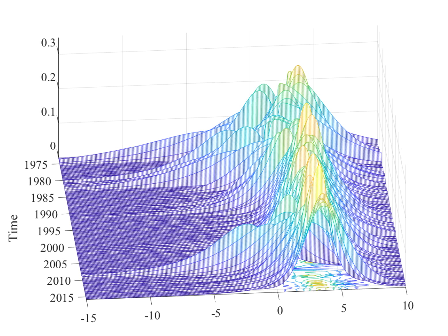
I want to create the 3D plot of the probability density functions of my variable. I have a matrix with dimensions 189x10000, where rows correspond to the time and columns are results of the simulation. Can somebody help me to create a density plot over time? I want my plot to look like this: enter image description here
    A = [1:185]';  % substitute for date vector
    K = linspace( -20, 20, 100);
    f = zeros(185,100);
    xi = zeros(185,100);
    r = normrnd(0,1,[185,10000]);
     for i=1:185

        [f(i,:),xi(i,:)] = ksdensity(r(I,:));

     end
    a = figure;
    meshc(A, K', f')
    datetick('x', 'yyyy')
    view(85, 50)
    set(gca, 'YLim', [-15, 10])
    set(gca, 'XLim', [A(1), A(end)])
    xlabel('Time')

With this code I get this:

enter image description here

Racemic answered 2/7, 2020 at 16:44 Comment(4)
each row of my Y_pred follows a different distribution for different time periods, and I want to show that evolution of density via 3D plot. The main issue is I don't get the density when I plot like this, but rather kind of uniformly scattered points in 3D form.Racemic
Using random data you'd get random distributions of course. What is the problem in that plot? As mentioned, it looks like you actually want a waterfall() with a contour on the bottom, rather than a meshc which does both at once, but lashes the different distributions together along the y-axis.Rustice
My bad, I was not plotting the density, just random numbers. I fixed it, but I still get this weird looking plot, its not as "refined " as the first one, I think the issue lies with the number of gridpoints I choose for ksdensity, Im not sure how to fix that.Racemic
The plot actually looks fine. If you want a finer grid, i.e. more points, then use more points. Your actual data has 10-times as much, right? Otherwise this is as good as it gets; "improving" your plot to e.g. smooth over your data or something is more data-doctoring than science.Rustice
M
2
  1. Replace random numbers with density distribution.

  2. If you want a finer grid, then use more points. Your actual data has 10-times as much, right? Otherwise this is as good as it gets; "improving" your plot, e.g. smooth over your data, is more data-doctoring than science.

Solution provided by Adriaan.

Mungo answered 2/7, 2020 at 16:44 Comment(0)

© 2022 - 2024 — McMap. All rights reserved.