Vertically aligning custom svg list item bullet points with text
Asked Answered
C

1

6

I have created a custom SVG bullet point icon per the suggested answer in this stackoverflow post and now I am trying to "vertically align" the li bullet point such that it is vertically centered with the item text.

Here is the current outcome displaying the list with the custom svg bullet points:

bullet points are way too high up

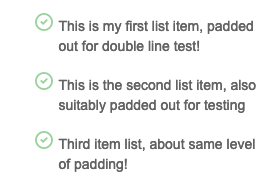
Expected outcome: bullet point icons are "middle aligned" with each li's text

I have tried multiple permutations of how to do this, notably referencing code from here, here, and here and in each attempted case, when I refresh the page (local file) for the changes, the SVG bullets are no longer visible in the list. (they're not visible anywhere on the page)

Here is a sample of what I have tried:

HTML layout:

<div class="main-container">
<div class = "list-section">
<ul>
    <li>This is my first list item, padded out for double line test!</li>
    <li>This is the second list item, also suitably padded out for testing</li>
    <li>Third item list, about same level of padding!</li>
</ul>
</div>
</div>

Attempt 1

li.list-section:before{
    content: url("data:image/svg+xml, %3Csvg width='20' height='20' viewBox='0 0 20 20' fill='none' xmlns='http://www.w3.org/2000/svg'%3E%3Cpath d='M7 10L9 12L13 8M19 10C19 14.9706 14.9706 19 10 19C5.02944 19 1 14.9706 1 10C1 5.02944 5.02944 1 10 1C14.9706 1 19 5.02944 19 10Z' stroke='%2396D8A0' stroke-width='2' stroke-linecap='round' stroke-linejoin='round'/%3E%3C/svg%3E");
    position:relative;
    top:10px;
    left:-10px;
}

.list-section li{
    font-size: 14px;
    color: #6D6D6D;
    margin: 16px 0px;

Attempt 2

.list-section li{
    list-style-image: url("data:image/svg+xml, %3Csvg width='18' height='18' viewBox='0 0 20 20' fill='none' xmlns='http://www.w3.org/2000/svg'%3E%3Cpath d='M7 10L9 12L13 8M19 10C19 14.9706 14.9706 19 10 19C5.02944 19 1 14.9706 1 10C1 5.02944 5.02944 1 10 1C14.9706 1 19 5.02944 19 10Z' stroke='%2396D8A0' stroke-width='2' stroke-linecap='round' stroke-linejoin='round'/%3E%3C/svg%3E");
    font-size: 14px;
    color: #6D6D6D;
    margin: 16px 0px;
    position: relative;
    display:flex;
    align-items: center;
}
Carnap answered 24/7, 2021 at 4:55 Comment(0)
R
3

Your train of thought is correct. Only the code contains typos.

If I understand correctly, then the result should be as follows (run the snippet and resize the block by grabbing it by the lower right corner):

  • With flex and transform

.main-container {
/* For example only */ resize: both; overflow: scroll; min-height: 100px; min-width: 100px;
}

.list-section ul {
  list-style-type: none;
  margin: 0;
}

.list-section ul li {
  position: relative;
  margin: 1em 0;
  display: flex;
  align-items: center;
  font-size: 14px;
  color: #6D6D6D;
}
.list-section ul li::before {
  content: url("data:image/svg+xml, %3Csvg fill='none' xmlns='http://www.w3.org/2000/svg'%3E%3Cpath d='M7 10L9 12L13 8M19 10C19 15 15 19 10 19C5 19 1 15 1 10C1 5 5 1 10 1C15 1 19 5 19 10Z' stroke='%2396D8A0' stroke-width='2' stroke-linecap='round' stroke-linejoin='round'/%3E%3C/svg%3E");
  height: 20px; width: 20px;
  transform: translatex(-50%);
}
<div class="main-container">
  <div class="list-section">
    <ul>
      <li>This is my first list item, padded out for double line test!</li>
      <li>This is the second list item, also suitably padded out for testing</li>
      <li>Third item list, about same level of padding!</li>
    </ul>
  </div>
</div>
  • With position and transform

.main-container { /* For example only */ resize: both; overflow: scroll; min-height: 100px; min-width: 100px; }

.list-section ul {
  list-style-type: none;
  margin: 0;
}

.list-section ul li {
  position: relative;
  margin: 1em 0;
  font-size: 14px;
  color: #6D6D6D;
}
.list-section ul li::before {
  content: url("data:image/svg+xml, %3Csvg fill='none' xmlns='http://www.w3.org/2000/svg'%3E%3Cpath d='M7 10L9 12L13 8M19 10C19 15 15 19 10 19C5 19 1 15 1 10C1 5 5 1 10 1C15 1 19 5 19 10Z' stroke='%2396D8A0' stroke-width='2' stroke-linecap='round' stroke-linejoin='round'/%3E%3C/svg%3E");
  position: absolute;
  top: 50%; left: 0;
  height: 20px; width: 20px;
  transform: translate(-150%, -50%);
}
<div class="main-container">
  <div class="list-section">
    <ul>
      <li>This is my first list item, padded out for double line test!</li>
      <li>This is the second list item, also suitably padded out for testing</li>
      <li>Third item list, about same level of padding!</li>
    </ul>
  </div>
</div>
Remonstrance answered 24/7, 2021 at 8:48 Comment(5)
legend! This was exactly what I needed, thanks! I'm trying to form a mental model around this: does the ul li{} property margin need a value in em units? Why assign the margin property a 0 value?Carnap
@GPP: The amount of indentation between list items specified in "em" allows them to change proportionally, depending on the font size. The list box <ul> has margins by default, so we set them to zero (optional).Remonstrance
got it thanks! So what would you say are the "crucial" properties that produced the expected outcome of the vertically centered svg bullet points?Carnap
If you look carefully this doesn't align vertically center; more pronounced with larger font sizesRedan
@alias51: Corrected.Remonstrance

© 2022 - 2024 — McMap. All rights reserved.