Adding seaborn clustermap to figure with other plots
Asked Answered
C

2

6

I am trying to put the following two plots onto the same figure:

import seaborn as sns; sns.set(color_codes=True)
import matplotlib.pyplot as plt
f, (ax1, ax2) = plt.subplots(1, 2, sharey=True)
iris = sns.load_dataset("iris")
sns.boxplot(data=iris, orient="h", palette="Set2", ax = ax1)
species = iris.pop("species")
lut = dict(zip(species.unique(), "rbg"))
row_colors = species.map(lut)
sns.clustermap(iris, row_colors=row_colors, ax = ax2)

I understand that clustermap returns a figure, so this doesn't work. However, I still need a way to present these plots next to each other (horizontal). sns.heatmap returns an axes, but it does not support clustering or color annotation .

What is the best way to do this ?

Countermine answered 12/8, 2018 at 19:5 Comment(0)
V
10

Indeed, clustermap, as some other seaborn functions, creates its own figure. There is nothing you can do about that but as long as all other content you want to have in the final figure can be created inside axes, like in this case the boxplot, the solution is relatively easy.

You can simply work with the figure that clustermap has created for you. The idea would then be to manipulate the gridspec of the axes such that there is some place left for the other axes.

import seaborn as sns; sns.set(color_codes=True)
import matplotlib.pyplot as plt
import matplotlib.gridspec

iris = sns.load_dataset("iris")
species = iris.pop("species")

lut = dict(zip(species.unique(), "rbg"))
row_colors = species.map(lut)

#First create the clustermap figure
g = sns.clustermap(iris, row_colors=row_colors, figsize=(13,8))
# set the gridspec to only cover half of the figure
g.gs.update(left=0.05, right=0.45)

#create new gridspec for the right part
gs2 = matplotlib.gridspec.GridSpec(1,1, left=0.6)
# create axes within this new gridspec
ax2 = g.fig.add_subplot(gs2[0])
# plot boxplot in the new axes
sns.boxplot(data=iris, orient="h", palette="Set2", ax = ax2)
plt.show()

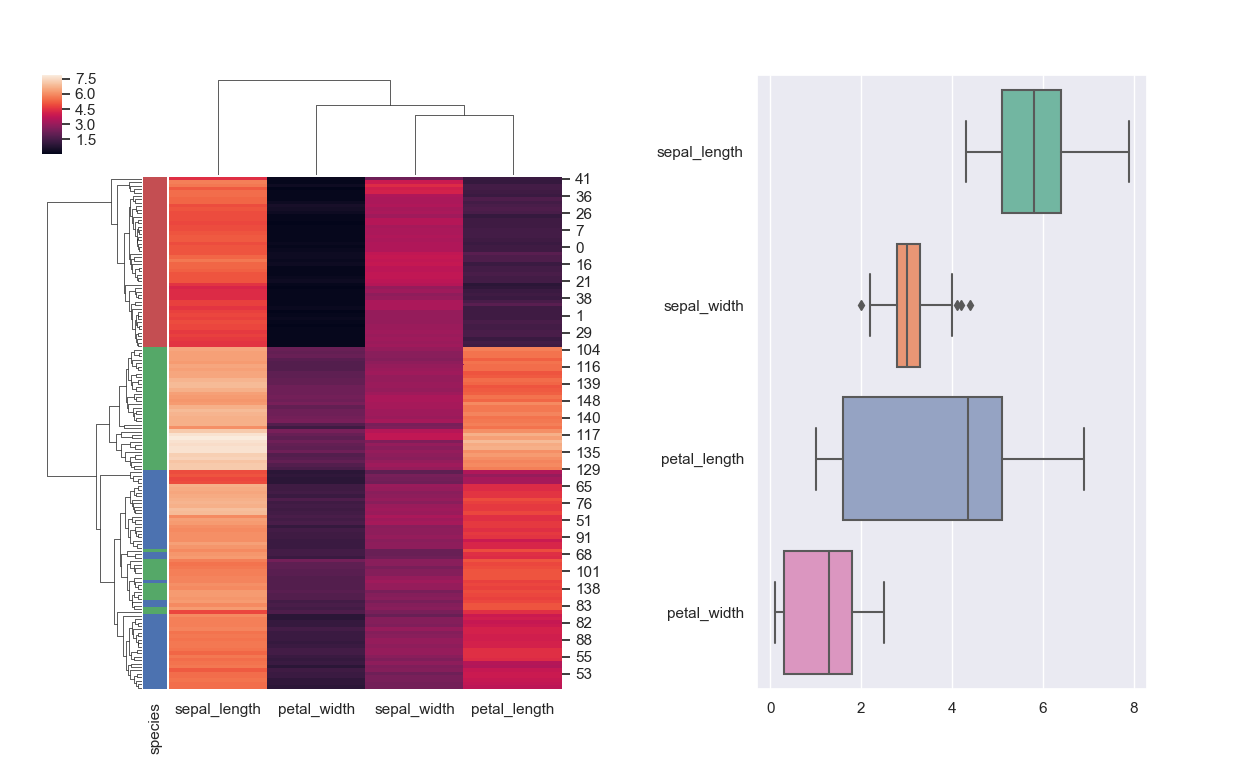
enter image description here

For the case when having multiple figure-level functions to combine the solution is much more complicated, as seen e.g. in this question.

Vishinsky answered 12/8, 2018 at 23:5 Comment(0)
H
0

If heatmap and ax2 should be aligned, do this:

import seaborn as sns; sns.set(color_codes=True)
import matplotlib.pyplot as plt
import matplotlib.gridspec

iris = sns.load_dataset("iris")
species = iris.pop("species")

lut = dict(zip(species.unique(), "rbg"))
row_colors = species.map(lut)

#First create the clustermap figure
g = sns.clustermap(iris, row_colors=row_colors, figsize=(13,8))
# set the gridspec to only cover half of the figure
g.gs.update(left=0.05, right=0.45)

#create new gridspec for the right part
gs2 = matplotlib.gridspec.GridSpec(1, 1)
# create axes within this new gridspec
ax2 = g.fig.add_subplot(gs2[0])

# get position of heatmap
heatmap_bbox = g.ax_heatmap.get_position()
ax2.set_position([0.6, heatmap_bbox.y0, .35, heatmap_bbox.height])

# plot boxplot in the new axes
sns.boxplot(data=iris, orient="h", palette="Set2", ax = ax2)
plt.savefig('stack.svg')

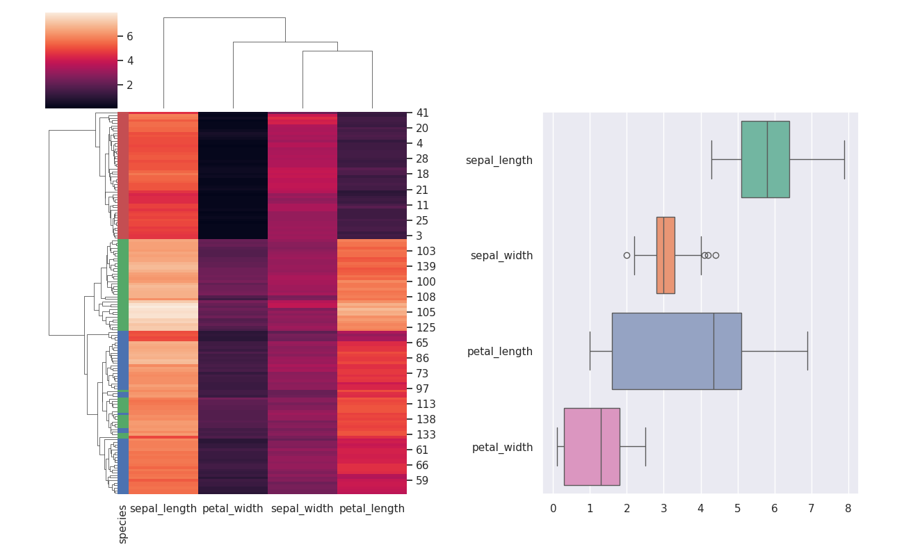
Second plot is vertically aligned to heatmap

Harilda answered 9/4 at 21:45 Comment(0)

© 2022 - 2024 — McMap. All rights reserved.