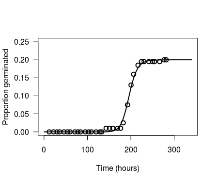
NB, you can skip to the final paragraph for the simple answer. The rest of this answer documents how I arrived at that solution
Looking at the code for drc:::plot.drc, we can see that the final line invisibly returns a data.frame retData
function (x, ..., add = FALSE, level = NULL, type = c("average",
                                                      "all", "bars", "none", "obs", "confidence"), broken = FALSE,
          bp, bcontrol = NULL, conName = NULL, axes = TRUE, gridsize = 100,
          log = "x", xtsty, xttrim = TRUE, xt = NULL, xtlab = NULL,
          xlab, xlim, yt = NULL, ytlab = NULL, ylab, ylim, cex, cex.axis = 1,
          col = FALSE, lty, pch, legend, legendText, legendPos, cex.legend = 1,
          normal = FALSE, normRef = 1, confidence.level = 0.95)
{
  # ...lot of lines omitted...
  invisible(retData)
}
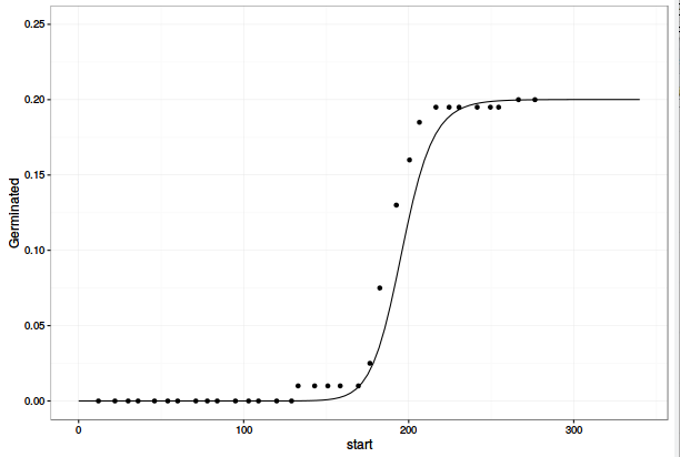
retData contains the coordinates for the fitted model line, so we can use this to ggplot the same model that plot.drc uses
pl <- plot(chickweed.m1, xlab = "Time (hours)", ylab = "Proportion germinated",
        xlim=c(0, 340), ylim=c(0, 0.25), log="", lwd=2, cex=1.2)
names(pl) <- c("x", "y")
ggplot(data= dt1Means, mapping=aes(x=start, y=Germinated)) +
  geom_point() +
  geom_line(data=pl, aes(x=x, y = y)) +
  lims(y=c(0, 0.25)) +
  theme_bw()
![enter image description here]()
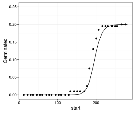
Which is the same as the version you created in ggplot using predict(object=chickweed.m1). So, the difference is not in the model lines, but in where the data points are plotted. We can export the data point from drc:::plot.drc by changing the last line of the function from invisible(retData) to list(retData, plotPoints). For convenience, I copied the entire code of drc:::plot.drc into a new function. Note that if you wish to replicate this step, there are a few functions called by drcplot that are not exported in the drc namespace, so drc::: needs to be prepended to all calls to the functions parFct, addAxes, brokenAxis, and makeLegend.
drcplot <- function (x, ..., add = FALSE, level = NULL, type = c("average",
                                                      "all", "bars", "none", "obs", "confidence"), broken = FALSE,
          bp, bcontrol = NULL, conName = NULL, axes = TRUE, gridsize = 100,
          log = "x", xtsty, xttrim = TRUE, xt = NULL, xtlab = NULL,
          xlab, xlim, yt = NULL, ytlab = NULL, ylab, ylim, cex, cex.axis = 1,
          col = FALSE, lty, pch, legend, legendText, legendPos, cex.legend = 1,
          normal = FALSE, normRef = 1, confidence.level = 0.95)
{
  # ...lot of lines omitted...
  list(retData, plotPoints)
}
and run this with your data
pl <- drcplot(chickweed.m1, xlab = "Time (hours)", ylab = "Proportion germinated",
          xlim=c(0, 340), ylim=c(0, 0.25), log="", lwd=2, cex=1.2)

germ.points <- as.data.frame(pl[[2]])
drc.fit <- as.data.frame(pl[[1]])
names(germ.points) <- c("x", "y")
names(drc.fit) <- c("x", "y")
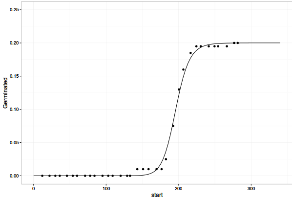
Now, plotting these with ggplot2 gets what you were looking for
ggplot(data= dt1Means, mapping=aes(x=start, y=Germinated)) +
  geom_point(data=germ.points, aes(x=x, y = y)) +
  geom_line(data=drc.fit, aes(x=x, y = y)) +
  lims(y=c(0, 0.25)) +
  theme_bw()
![enter image description here]()
Finally, comparing the data point values of this plot (germ.points) with those in your original ggplot (dt1Means), shows the reason for the discrepancy. Your calculated points in dt1Means are shifted one time period earlier relative to those in plot.drc. In other words, plot.drc is assigning the events to the end time of the period in which they occur, whereas you are assigning germination events to the start of the time interval in which they occur. You can simply adjust this by, for example, using
dt1 <- data.table(chickweed)
dt1[, Germinated := mean(count)/200, by=start]
dt1[, cum_Germinated := cumsum(Germinated)]
dt1[, Pred := c(predict(object=chickweed.m1), NA)]  # Note that the final time period which ends at `Inf` can not be predicted by the model, therefore added `NA` in the final row

ggplot(data= dt1, mapping=aes(x=end, y=cum_Germinated)) +
  geom_point() +
  geom_line(aes(y = Pred)) +
  lims(y=c(0, 0.25)) +
  theme_bw()


getAnywhere(plot.drc)to see how the data is calculated in the base plot. – Stationary