Plotting dose response curves with ggplot2 and drc
Asked Answered
P

4

11

In biology we often want to plot dose response curves. The R package 'drc' is really useful and base graphics can easily handle 'drm models'. However, I would like to add my drm curves to a ggplot2.

My dataset:

 library("drc")
 library("reshape2")
 library("ggplot2")
 demo=structure(list(X = c(0, 1e-08, 3e-08, 1e-07, 3e-07, 1e-06, 3e-06, 
 1e-05, 3e-05, 1e-04, 3e-04), Y1 = c(0, 1, 12, 19, 28, 32, 35, 
 39, NA, 39, NA), Y2 = c(0, 0, 10, 18, 30, 35, 41, 43, NA, 43, 
 NA), Y3 = c(0, 4, 15, 22, 28, 35, 38, 44, NA, 44, NA)), .Names = c("X", 
"Y1", "Y2", "Y3"), class = "data.frame", row.names = c(NA, -11L
))

Using base graphics:

plot(drm(data = reshape2::melt(demo,id.vars = "X"),value~X,fct=LL.4(),na.action = na.omit),type="bars")

produces a nice 4-parameter dose response plot.

Trying to plot the same plot in ggplot2, I stumble upon 2 issues.

  1. There is no way of directly adding the drm model curve. I need to rewrite the 4-PL as a function and add it in the form of a stat_function, which is cumbersome to say the least.

    ggplot(reshape2::melt(demo,id.vars = "X"),aes(X,value)) + 
      geom_point() + 
      stat_function(fun = function(x){
        drm_y=function(x, drm){
          coef(drm)[2]+((coef(drm)[3]-coef(drm)[2])/(1+exp((coef(drm)[1]*(log(x)-log(coef(drm)[4]))))))
        }
    + drm_y(x,drm = drm(data = reshape2::melt(demo,id.vars = "X"), value~X, fct=LL.4(), na.action = na.omit))
     })
    
  2. If that wasn't enough it only works if scale_x is continuous. If I want to add scale_x_log10(), I get: Warning message: In log(x): NaNs produced.

I realise that log10(0) = -Inf but there are ways of handling this. Either (as is the case with plot.drc) the x=0 value is plotted on the x-axis essentially as 1/100 of the pre-lowest x-value. (demo$X[which.min(demo$X)+1]/100) or as in GraphPad Prism, the 0s are omitted from the dose response curve entirely.

My questions are:

  1. Is there a way of plotting drm models in ggplot2 directly?

  2. How can I link a dataset with its corresponding 4-PL curvefit so that they will be plotted in the same colour?

Pademelon answered 21/4, 2016 at 20:59 Comment(1)
I would be very tempted to make the calculations for drm outside of ggplot, put the result into a data.frame, and give this to ggplotParallel
I
19

A recent paper from the authors of the drc package included instructions for extracting parameters for use by ggplot2. They don't work within ggplot2 but extract data from the model. This is their solution applied to your data.

demo1 <- reshape2::melt(demo,id.vars = "X") # get numbers ready for use.
demo.LL.4 <- drm(data = demo1,value~X,fct=LL.4(),na.action = na.omit) # run model.

The predict function can extract the parameters from drm models. It isn't compatible with multiple curves that were fit using curveid.

# predictions and confidence intervals.
demo.fits <- expand.grid(conc=exp(seq(log(1.00e-04), log(1.00e-09), length=100))) 
# new data with predictions
pm <- predict(demo.LL.4, newdata=demo.fits, interval="confidence") 
    demo.fits$p <- pm[,1]
    demo.fits$pmin <- pm[,2]
    demo.fits$pmax <- pm[,3]

They advise shifting the zero concentration to avoid issues with coord_trans.

demo1$XX <- demo1$X
demo1$XX[demo1$XX == 0] <- 1.00e-09

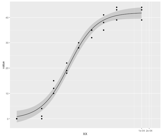
Then comes plotting the curve, omitting geom_ribbon stops the errors from being drawn.

ggplot(demo1, aes(x = XX, y = value)) +
  geom_point() +
  geom_ribbon(data=demo.fits, aes(x=conc, y=p, ymin=pmin, ymax=pmax), alpha=0.2) +
  geom_line(data=demo.fits, aes(x=conc, y=p)) +
  coord_trans(x="log") 

enter image description here

To graph multiple curves together the process can be repeated. Add IDs to each set.

demo.fits_1 <- data.frame(label = "curve1", demo.fits)

Then use rbind to combine all the extracted parameters. From there ggplot can handle colours.

Ivette answered 5/5, 2016 at 6:21 Comment(0)
P
7

I am going to answer my own question and hopefully this will help others facing the same problem.

It is of course possible to plot dose response curves with ggplot2 and the drc package with the simple addition of either geom_ or stat_smooth (method=drm, fct=LL.4(),se=FALSE) if plotting on a linear scale or geom_ or stat_smooth (method=drm, fct=L.4(),se=FALSE) if scale_x_log10() is added.

In order to be able to use a log10 scale I've transformed my data to:

demo <- demo %>% 
      mutate(X = 
       ifelse(X == 0, 
              yes = (sort(demo$X[which.min(sort(demo$X)) + 1]/100)),
              no = X
              )
            )         #looks for the pre-lowest value in X and divides it by 100

In this case, I've replaced the X = 0 value by X = 1/100th of the pre-last X-value (in this case 1e-10). You can, however, easily drop the 0 value that messes up the logarithmic plotting by omitting it from the dataset entirely, like Prism does. One thing to note, as I've found out, is that ggplot scales the axes first and then adds the data, which is why the code breaks as it tries to log10(0).

The other subtlety is that the stat_smooth function is perfectly capable of handling drm models using method = drm but it doesn't know how to fit the 'SE' confidence intervals. Selecting se = FALSE thus enables plotting and in my humble opinion makes for a less messy plot anyway - just add the error bars.

And finally, changing the fct = LL.4() to fct = L.4() allows plotting on a log10 scale, because again the scale is selected first and the fit is done after. So, even though the axis values are non-logarithmic, ggplot has actually transformed the dataset into log10, therefore the fitting function now needs to be just logit-4P (i.e. L.4()) instead of log-logit-4P (LL.4()).

The geom_smooth() and stat_smooth() functions will naturally adopt the same colour as the dataset, eliminating the need to adjust the colour of the fitted function to correspond with the colour of the data points.

In summary:

demo <- demo %>% 
      mutate(X = 
       ifelse(X == 0, 
              yes = (sort(demo$X[which.min(sort(demo$X)) + 1]/100)),
              no = X
              )
            )
demo.long <- reshape2::melt(demo,id.vars = "X") #reshapes the demo dataset to long format
ggplot(data = demo.long,
       aes(x = X, y = value, col = variable)
      ) + 
   geom_point() + 
   geom_smooth(method = drm, fct = L.4(), se = FALSE) +
   scale_x_log10() #plots out the dataset with the corresponding 4-parameter log-logit dose response curves
Pademelon answered 29/4, 2016 at 20:34 Comment(1)
With R version 3.6.2, ggplot2_3.2.1, drc_3.0-1, this only works when "fct" is wrapped into method.args = list() i.e. geom_smooth(method = drm, method.args = list(fct = L.4()), se = FALSE)Offoffbroadway
A
4

The updated answer: geom_smooth(method = drm, method.args = list(fct = L.4()), se = FALSE) was super helpful!

Aeolotropic answered 7/1, 2022 at 19:27 Comment(1)
Please don't add "thank you" as an answer. Once you have sufficient reputation, you will be able to vote up questions and answers that you found helpful. - From ReviewKickoff
K
1

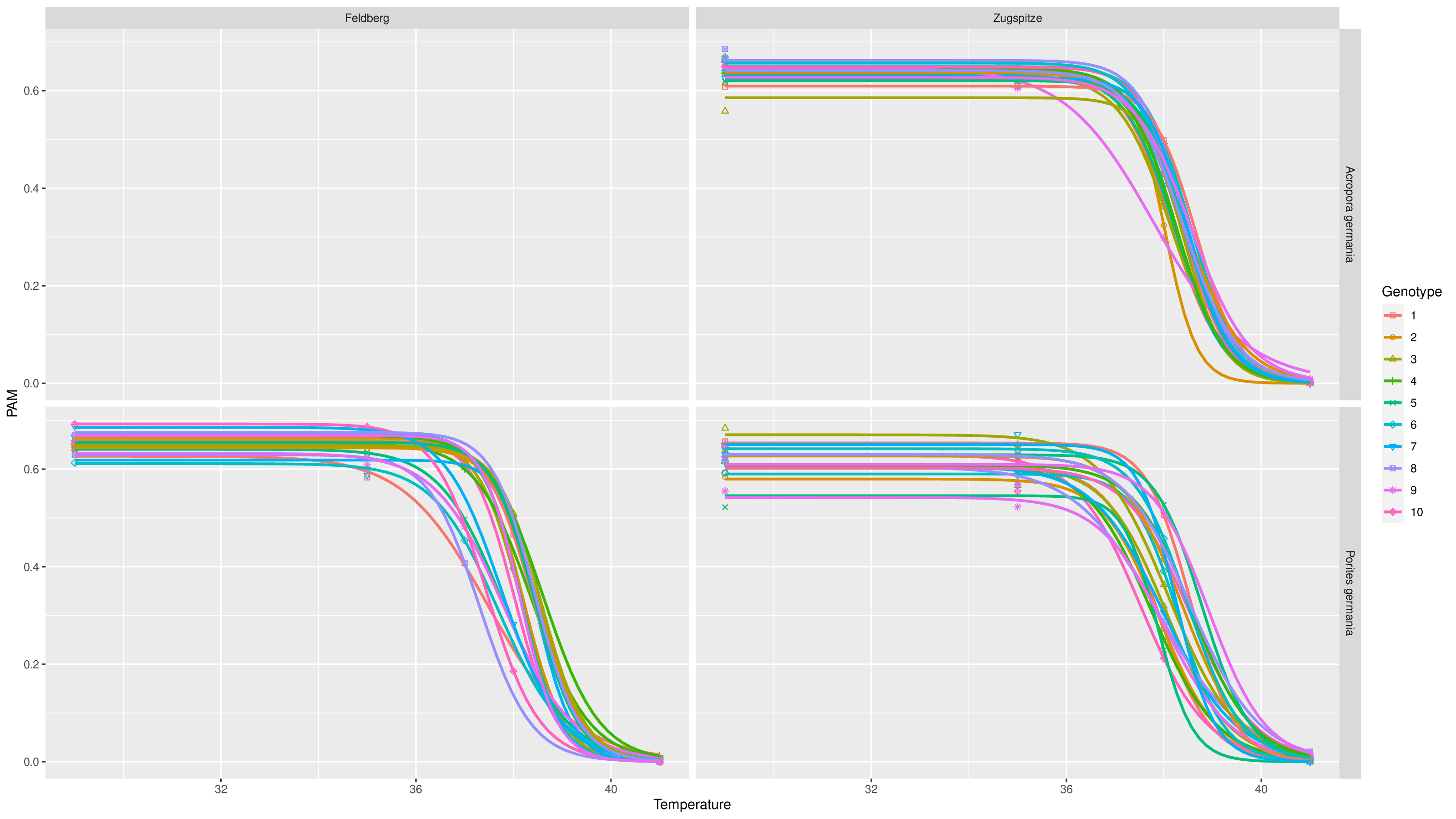
I'm adding this example because it might be useful for someone else. You can easily specify group in aes to fit models according to specified groups. I also found it useful to combine with facet_grid if you have several Species, Conditions, Sites or whatever.

library(ggplot2)
library(drc)
# For colorblind-friendly palette
library(RColorBrewer)

exploratory_curve <-
      ggplot(data = df,
           aes(
             x = Temperature,
             y = PAM,
             # You can play aroung the group value
             group = GroupingProperty,
             color = Genotype,
             shape = Genotype)) +
      geom_point() +
      geom_smooth(
        method = drm,
        method.args = list(
          fct = LL.3()),
        se = FALSE
      ) +
      facet_grid(Species ~ Site) +
      scale_color_brewer(palette = "Paired") # Colorblind-friendly palette

The result is attached :)

enter image description here

Kiker answered 4/12, 2023 at 13:20 Comment(0)

© 2022 - 2024 — McMap. All rights reserved.