Before we start let me mention that matplotlib requires the errors to be relative to the data, not absolute boundaries. We would hence modify the dataframe to account for that by subtracting the respective columns.
u = u"""grp1 grp2 variables  lb     m       ub
A   A1      V1     1.00   1.50    2.5
A   A2      V2     1.50   2.50    3.5
B   A1      V1     7.50   14.50   20.5
B   A2      V2     0.25   0.75    1.0
A   A2      V1     1.00   6.50    8.5
A   A1      V2     1.50   3.50    6.5
B   A2      V1     3.50   4.50   15.5
B   A1      V2     8.25   12.75  13.9"""

import io
import pandas as pd

df = pd.read_csv(io.StringIO(u), delim_whitespace=True)
# errors must be relative to data (not absolute bounds)
df["lb"] = df["m"]-df["lb"]
df["ub"] = df["ub"]-df["m"]
Now there are two solutions, which are essentially the same. Let's start with a solution which does not use seaborn, but the pandas plotting wrapper (the reason will become clear later).
Not using Seaborn
Pandas allows to plot grouped barplots by using dataframes where each column belongs to or constitutes one group.
The steps to take are therefore
- create a number of subplots according to the number of different
variables.
groupby the dateframe by variables- for each group, create a pivoted dataframe, which has the values of
grp1 as columns and the m as values. Do the same for the two error columns.
- Apply the solution from How add asymmetric errorbars to Pandas grouped barplot?
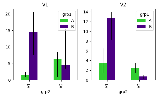
The code would then look like:
import io
import numpy as np
import pandas as pd
import matplotlib.pyplot as plt

df = pd.read_csv(io.StringIO(u), delim_whitespace=True)
# errors must be relative to data (not absolute bounds)
df["lb"] = df["m"]-df["lb"]
df["ub"] = df["ub"]-df["m"]

def func(x,y,h,lb,ub, **kwargs):
    data = kwargs.pop("data")
    # from https://mcmap.net/q/1000029/-how-add-asymmetric-errorbars-to-pandas-grouped-barplot
    errLo = data.pivot(index=x, columns=h, values=lb)
    errHi = data.pivot(index=x, columns=h, values=ub)
    err = []
    for col in errLo:
        err.append([errLo[col].values, errHi[col].values])
    err = np.abs(err)
    p = data.pivot(index=x, columns=h, values=y)
    p.plot(kind='bar',yerr=err,ax=plt.gca(), **kwargs)

fig, axes = plt.subplots(ncols=len(df.variables.unique()))
for ax, (name, group) in zip(axes,df.groupby("variables")):
    plt.sca(ax)
    func("grp2", "m", "grp1", "lb", "ub", data=group, color=["limegreen", "indigo"])
    plt.title(name)

plt.show()
![enter image description here]()
using Seaborn
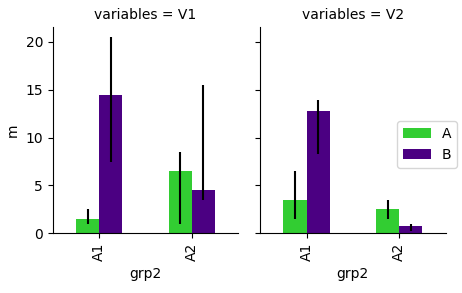
Seaborn factorplot does not allow for custom errorbars. One would therefore need to use the FaceGrid approach. In order not to have the bars stacked, one would put the hue argument in the map call. The following is thus the equivalent of the sns.factorplot call from the question.
g = sns.FacetGrid(data=df, col="variables", size=4, aspect=.7 )
g.map(sns.barplot, "grp2", "m", "grp1", order=["A1","A2"] )
Now the problem is, we cannot get the errorbars into the barplot from the outside or more importantly, we cannot give the errors for a grouped barchart to seaborn.barplot. For a non grouped barplot one would be able to supply the error via the yerr argument, which is passed onto the matplotlib plt.bar plot. This concept is shown in this question. However, since seaborn.barplot calls plt.bar several times, once for each hue, the errors in each call would be the same (or their dimension wouldn't match).
The only option I see is hence to use a FacetGrid and map exactly the same function as used above to it. This somehow renders the use of seaborn obsolete, but for completeness, here is the FacetGrid solution.
import io
import numpy as np
import pandas as pd
import seaborn as sns
import matplotlib.pyplot as plt

df = pd.read_csv(io.StringIO(u), delim_whitespace=True)
# errors must be relative to data (not absolute bounds)
df["lb"] = df["m"]-df["lb"]
df["ub"] = df["ub"]-df["m"]

def func(x,y,h,lb,ub, **kwargs):
    data = kwargs.pop("data")
    # from https://mcmap.net/q/1000029/-how-add-asymmetric-errorbars-to-pandas-grouped-barplot
    errLo = data.pivot(index=x, columns=h, values=lb)
    errHi = data.pivot(index=x, columns=h, values=ub)
    err = []
    for col in errLo:
        err.append([errLo[col].values, errHi[col].values])
    err = np.abs(err)
    p = data.pivot(index=x, columns=h, values=y)
    p.plot(kind='bar',yerr=err,ax=plt.gca(), **kwargs)

g = sns.FacetGrid(df, col="variables", size=4, aspect=.7,  )
g.map_dataframe(func, "grp2", "m", "grp1", "lb", "ub" , color=["limegreen", "indigo"])
g.add_legend()

plt.show()
![enter image description here]()


