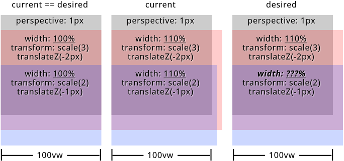
formular to calculate width/height (relative to parent) of container with translateZ inside of parent container with perspective
Asked Answered
S

3

14

What is the formular to calculate the widths/heights of child elements with translateZ inside of parent container with set perspective (keyword: "parallax") relative to its parents width/height?

I'd like to create a site with parallax effect on both axis. I was able to figure out everything i need for my mockup except one thing. How to calculate the childrens widths/heights when its above 100%. Because of parents perspective and childrens translateZ the childrens widths/heights visually don't align with parents width/height anymore.

The formular to scale the child elements is: 1 + (translateZ * -1) / perspective. But i was not able to find a formular for width/height. BTW: When childrens widths/heights <= 100% everything works fine.
But see the result on the image below when width >= 100% (containers have top offset to make things visible).

enter image description here

To be correct the approach in my particular case is to let all child elements have visually the same widths/heights.


in SASS (preferred): PEN or SassMeister
in CSS: PEN


links from the specs that could help:
https://www.w3.org/TR/css-transforms-1/#recomposing-to-a-3d-matrix
https://www.w3.org/TR/css-transforms-1/#mathematical-description


"Googled" a lot but didn't find anything pointing me to the right direction. Thanks in advance...

html, body {
  height: 100%;
  overflow: hidden;
  width: 100%;
}

#projection {
  perspective: 1px;
  perspective-origin: 0 0;
  height: 100%;
  overflow: auto;
  width: 100%;
}

.pro {
  transform: scale(1) translate(0px, 0px) translateZ(0px);
  height: 100%;
  position: absolute;
  transform-origin: 0 0;
  transform-style: preserve-3d;
  width: 100%;
}

.pro--1 {
  transform: scale(4) translate(0px, 0px) translateZ(-3px);
  width: 110%;
}

.pro--2 {
  transform: scale(3) translate(0px, 50%) translateZ(-2px);
  width: 110%;
}

.pro--3 {
  transform: scale(2) translate(0px, 100%) translateZ(-1px);
  width: 110%;
}

.pro {
  background: #333;
  box-shadow: inset 0 0 0 5px orange;
  color: orange;
  font-size: 4em;
  line-height: 1em;
  text-align: center;
}

.pro--2 {
  background: rgba(75, 75, 75, 0.5);
  box-shadow: inset 0 0 0 5px green;
  color: green;
  line-height: 4em;
}

.pro--3 {
  background: rgba(75, 75, 75, 0.5);
  box-shadow: inset 0 0 0 5px white;
  color: white;
  line-height: 7em;
}
<div id="projection">
  <div class="pro pro--1">pro--1</div>
  <div class="pro pro--2">pro--2</div>
  <div class="pro pro--3">pro--3</div>
</div>

SASS

@mixin  projection($translateZ: 0, $translateX: 0, $translateY: 0, $width: 0, $height: 0, $perspective: $perspective)

  // strip and sanitize units for further calculations
  // units must be "px" for both $translateZ and $perspective
  $unit: unit( $translateZ )
  @if '' != $unit
    $translateZ: $translateZ / ($translateZ * 0 + 1)
    @if 'px' != $unit
      @warn '$translateZ must have "px" as unit!'

  $unit: unit( $perspective )
  @if '' != $unit
    $perspective: $perspective / ($perspective * 0 + 1)
    @if 'px' != $unit
      @warn '$perspective must have "px" as unit!'

  $unit: 0px // yeah - technically this is no unit
  
  // calculate scaling factor
  $scale: 1 + ($translateZ * -1) / $perspective

  // sanitize units for translateX, translateY, translateZ
  $translateZ: $translateZ + $unit
  @if unitless( $translateX )
    $translateX: $translateX + $unit
  @if unitless( $translateY )
    $translateY: $translateY + $unit

  // render css "transform: scale() translate(x, y) translateZ()"
  transform: scale( $scale ) translate($translateX, $translateY) translateZ( $translateZ + $unit )

$width: 110% // 100% works like a charme
$translateZ--1: -3 // "px" will be added in mixin
$translateZ--2: -2
$translateZ--3: -1
$perspective: 1

html, body
  height: 100%
  overflow: hidden
  width: 100%

#projection
  perspective: $perspective + 0px
  perspective-origin: 0 0
  height: 100%
  overflow: auto
  width: 100%

.pro
  @include projection()
  height: 100%
  position: absolute
  transform-origin: 0 0
  transform-style: preserve-3d
  width: 100%

.pro--1
  @include projection( $translateZ--1 )
  width: $width

.pro--2
  @include projection( $translateZ--2, 0, 50% )
  width: $width

.pro--3
  @include projection( $translateZ--3, 0, 100% )
  width: $width
Scapular answered 8/8, 2017 at 21:12 Comment(0)
S
1

The formular to calculate the widths/heights of child elements with translateZ inside of parent container with set perspective is:
$scale = 1 + (translateZ * -1) / perspective.


Where to throw this formular at transform: scale( $scale ).
perspective is parents perspective value and translateZ is elements translateZ value as well. See snippet at the bottom or SASS mockup as you like.


So actually the answer was given in the question!
While this is the correct answer to the asked question this didn't solve my specific problem at all so here is a follow-up-question.


Credits: @Trolleymusic who at least opened my eyes somehow with his answer.


CSS example:

/* formular: 1 + (translateZ * -1) / perspective */

#parent {
  perspective: 10px;
}

.child--1 { /* 1 + (-100 * -1) / 10 */
  transform: translateZ(-100px) scale( 11 );
}

.child--2 { /* 1 + (-200 * -1) / 10 */
  transform: translateZ(-200px) scale( 21 );
}

.child--3 { /* 1 + (1 * -1) / 10 */
  transform: translateZ(1px) scale( 0.9 );
}
Scapular answered 23/8, 2017 at 10:48 Comment(0)
W
4

You've already solved your problem. Your code does exactly what you need it to do, it's just a CSS layout issue now.

https://codepen.io/anon/pen/xLWGzp?editors=0100

Because of the perspective changes, if you hang everything off the x-axis center everything will begin to line up properly:

(I'm just adding in the code changes here, I've left everything else the same)

#projection
    perspective-origin: center top

.pro
    transform-origin: center top

Now everything's lining up better, but it's still a bit off - you can change the $width variable to anything other than 100% to see the problem (60% is a good one)

So the problem now is just due to the positioning of the elements, when you set position: absolute they're default positioned to the left, change the width and add scale and transform and you get this equal-width/not-equal-position, so center them by adding:

#projection
    position: relative

.pro
    left: 50%
    margin-left: $width * -.5

(info here as to why that works to center: https://css-tricks.com/quick-css-trick-how-to-center-an-object-exactly-in-the-center/)

So now jiggle $width around to double-check, I tested it from 20% up to 150% and it works fine.

Wink answered 20/8, 2017 at 0:2 Comment(0)
S
2

I have changed the style slightly, to make things more visible.

The result seems ok for me. May be I am misunderstanding something?

html, body {
  height: 100%;
  overflow: hidden;
  width: 100%;
}

#projection {
  perspective: 1px;
  perspective-origin: 0 0;
  height: 50%;
  overflow: visible;
  width: 50%;
  margin-left: 50px;
  background-color: grey;
}

.pro {
  transform: scale(1) translate(0px, 0px) translateZ(0px);
  height: 50%;
  position: absolute;
  transform-origin: 0 0;
  transform-style: preserve-3d;
  width: 100%;
}

.pro--1 {
  transform: scale(4) translate(0px, 0px) translateZ(-3px);
  width: 110%;
}

.pro--2 {
  transform: scale(3) translate(0px, 120%) translateZ(-2px);
  width: 110%;
}

.pro--3 {
  transform: scale(2) translate(0px, 240%) translateZ(-1px);
  width: 110%;
}

.pro--1 {
  background: rgba(0, 0, 75, 0.5);
  color: blue;
  line-height: 1em;
  text-align: center;
}

.pro--2 {
  background: rgba(0, 75, 0, 0.5);
  color: green;
  line-height: 4em;
}

.pro--3 {
  background: rgba(75, 0, 0, 0.5);
  color: red;
  line-height: 7em;
}
<div id="projection">
  <div class="pro pro--1">pro--1</div>
  <div class="pro pro--2">pro--2</div>
  <div class="pro pro--3">pro--3</div>
</div>
Sowder answered 17/8, 2017 at 17:56 Comment(1)
Thank you for taking some time for this but unfortunately this is not at all what i was looking for. It's about parallax effect which is gone in your version. Did you try my SASS-PEN (i recently added a CSS version)Scapular
S
1

The formular to calculate the widths/heights of child elements with translateZ inside of parent container with set perspective is:
$scale = 1 + (translateZ * -1) / perspective.


Where to throw this formular at transform: scale( $scale ).
perspective is parents perspective value and translateZ is elements translateZ value as well. See snippet at the bottom or SASS mockup as you like.


So actually the answer was given in the question!
While this is the correct answer to the asked question this didn't solve my specific problem at all so here is a follow-up-question.


Credits: @Trolleymusic who at least opened my eyes somehow with his answer.


CSS example:

/* formular: 1 + (translateZ * -1) / perspective */

#parent {
  perspective: 10px;
}

.child--1 { /* 1 + (-100 * -1) / 10 */
  transform: translateZ(-100px) scale( 11 );
}

.child--2 { /* 1 + (-200 * -1) / 10 */
  transform: translateZ(-200px) scale( 21 );
}

.child--3 { /* 1 + (1 * -1) / 10 */
  transform: translateZ(1px) scale( 0.9 );
}
Scapular answered 23/8, 2017 at 10:48 Comment(0)

© 2022 - 2024 — McMap. All rights reserved.