How enable Hover event for bootstrap menus? [duplicate]
Asked Answered
A

2

7

I implement a bootstrap responsive rich menu and it works fine. It works on Click event ,my question is : How can I change it to Hover event ?
all bootstrap menus have this issue . bootstrap doesn't have any support for this ? this is the menu I use : http://geedmo.github.io/yamm/ my problem solved with :

<style>
    li.dropdown:hover .dropdown-menu {
        display: block;
    }

    li.dropdown:hover .dropdown-toggle {
        color: #555;
        background-color: #e5e5e5;
    }
</style>

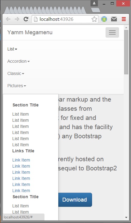
but a new problem happened , the submenus showed in the end of the menus when I shrink the browser showed in the end of the menu , and it's not appropriate :/
Atonality answered 24/11, 2015 at 6:3 Comment(2)
checkout this #8878533Unwritten
I search all the stackoverflow and I don't found it , Thanks a lot @HarshanaSamaranayakaAtonality
A
4

Add this style to your page.

<style>
    li.dropdown:hover .dropdown-menu{display:block}
    li.dropdown:hover .dropdown-toggle{color:#555; background-color:#e5e5e5}
</style>

First one will enable dropdown on mouse hover and second one will change the menu header color (choose the appropriate color for your page).

Affixation answered 24/11, 2015 at 6:29 Comment(2)
Thank you very much , it works perfect :) @AffixationAtonality
it works fine , thanks a lot but , excuse me , when I shrink the browser , submenus shows in end of the menu , can you help me again how I solve it ? @AffixationAtonality
P
1

Try with this HTML, JS and CSS

CSS

$(document).ready(function() {
function navbarSubmenu(width) {
			if (width > 767) {
				$('.navbar-custom .navbar-nav > li.dropdown').hover(function() {
					var MenuLeftOffset  = $('.dropdown-menu', $(this)).offset().left;
					var Menu1LevelWidth = $('.dropdown-menu', $(this)).width();
					if (width - MenuLeftOffset < Menu1LevelWidth * 2) {
						$(this).children('.dropdown-menu').addClass('leftauto');
					} else {
						$(this).children('.dropdown-menu').removeClass('leftauto');
					}
					if ($('.dropdown', $(this)).length > 0) {
						var Menu2LevelWidth = $('.dropdown-menu', $(this)).width();
						if (width - MenuLeftOffset - Menu1LevelWidth < Menu2LevelWidth) {
							$(this).children('.dropdown-menu').addClass('left-side');
						} else {
							$(this).children('.dropdown-menu').removeClass('left-side');
						}
					}
				});
			}
		}
  });
.navbar-custom .dropdown-toggle:after {
position: absolute;
display: block;
right: 0;
top: 50%;
margin-top: -6px;
font: normal normal normal 14px/1 FontAwesome;
font-size: 9px;
content: "\f107";
text-rendering: auto;
-webkit-font-smoothing: antialiased;
-moz-osx-font-smoothing: grayscale;
}

@media (min-width: 768px) {
  .dropdown:hover .dropdown-menu{display:block}
  .navbar-custom .open > .dropdown-menu {
    visibility: visible;
    opacity: 1;
  } 
}
<link href="https://maxcdn.bootstrapcdn.com/bootstrap/3.3.5/css/bootstrap.min.css" rel="stylesheet"/>
<link rel="stylesheet" type="text/css" href="https://maxcdn.bootstrapcdn.com/font-awesome/4.4.0/css/font-awesome.min.css" />
<script src="https://ajax.googleapis.com/ajax/libs/jquery/1.11.1/jquery.min.js"></script>
<script src="https://maxcdn.bootstrapcdn.com/bootstrap/3.3.5/js/bootstrap.min.js"></script>
<nav class="navbar navbar-custom navbar-transparent navbar-fixed-top one-page" role="navigation">
<div class="navbar-collapse collapse in" id="custom-collapse" aria-expanded="true">
			<ul class="nav navbar-nav navbar-right mnCh">

				
					<li class="current">
						<a href="/#" title="Home">Home</a>
						
					</li>
				
					<li class="link">
						<a href="/#" title="About us">About us</a>
						
					</li>
				
					<li class="link dropdown">
						<a href="/#" title="Collection" class="dropdown-toggle binded" data-toggle="dropdown">Collection</a>
						
							<ul class="dropdown-menu">
								
									<li><a href="/#">Collection 1</a></li>
								
									<li><a href="/#">Collection 2</a></li>
								
									<li><a href="/#">Collection 3</a></li>
								
									<li><a href="/#">Collection 4</a></li>
								
							</ul>
						
					</li> 
					<li class="link">
						<a href="/#" title="Store">Store</a>
						
					</li>
				
					<li class="link dropdown">
						<a href="/#" title="Press &amp; News" class="dropdown-toggle binded" data-toggle="dropdown">Press &amp; News</a>
						
							<ul class="dropdown-menu">
								
									<li><a href="/#">Press</a></li>
								
									<li><a href="/#">News</a></li>
								
							</ul>
						
					</li>
				
					<li class="link">
						<a href="/#" title="Download">Download</a>
						
					</li>
				

				<li class="dropdown">
					<a href="/#" class="dropdown-toggle binded" data-toggle="dropdown">
						Languages
					</a>
					<ul class="dropdown-menu">
						 
						<li><a href="/en">English</a></li>
						<li><a href="/it">Italiano</a></li>
						 
					</ul>
				</li>

			</ul>
		</div>
  </nav>
Pifer answered 24/11, 2015 at 8:17 Comment(2)
thanks , it's a cool menu . I correct Hover , but submenus shows in end of the all menus like the picture I posted . I don't know how fix it . @MaGioAtonality
The css is a media query for mobile view, and js replace the bootstrap submenu css option. i've test it and the submenu open inside.Pifer

© 2022 - 2024 — McMap. All rights reserved.