Set major tick labels to be displayed as scientific notation in a Plotly plot in R
Asked Answered
I

2

1

I'm trying to get plotly to put values in scientific notation regardless of their size, i.e. 100 should be 1E02 in the ticks, but it keeps showing numbers below 10.000 as normal annotation.

Setting the format is done through exponentformat = "E""but it only affects larger numbers.

Here is an example code of how I write it:

f2 <- list(family = "Old Standard TT, serif", size = 14, color = "black")

ax <- list(showticklabels = TRUE, tickfont = f2,  showgrid=F,  zeroline=T,  showline=T,  nticks = 4,  exponentformat = "E")
ay <- list(nticks = 4,  showticklabels = TRUE,  tickfont = f2,  showgrid=F,  zeroline=T,  showline=T,  range =c(0,max(mtcars$disp*1.2)),  exponentformat = "E")

plot_ly(x = mtcars$mpg  , y = mtcars$disp) %>%
  add_trace(type = 'scatter', mode = 'markers', 
            marker = list(color = c('black'))) %>%
  add_lines(hoverinfo='none', line = list(color = 'black')) %>%
  layout(title = 'A plot in science',yaxis = ay, xaxis = ax,
         showlegend = FALSE, hovermode = "y")

manipulating the values to be in the 10k plus range gives the desired output though:

 mtcars$disp <- mtcars$disp *100 
Idaho answered 3/4, 2018 at 9:31 Comment(4)
How about mtcars$disp <- format(mtcars$disp, scientific=T)?Opah
I don't think that will help, it should probably be changed in the layout or label of the plot.Shredding
It seems to do really weird things to my data in a multipanel plot. The data plotted is different lines and the range argument fails as well when I apply the format approachIdaho
might be easier with ggplot2 and ggplotly.Jeannettejeannie
F
1

Let's just do it ourselves in JavaScript, if Plotly doesn't provide the needed functionality.

  • let's grab all ticks on the y-axis using d3

    ticks = Plotly.d3.selectAll('g.ytick');
    
  • the raw data is stored in data.x

  • then change the representation of each one to scientific notation

    Plotly.d3
          .selectAll('g.ytick')
          .each(function(data, i) 
            {
               Plotly.d3.select(this)
                        .select('text')
                        .html(formatNumber(data.x, 2));
            }) 
    
    • finally inject all the code using htmlwidgets in our graph

      p <- onRender(p, javascript)

  • now it would be one-time only change, every time a user zooms or modifies the plot the changes would be lost. In order to make sure that changes are applied every time the code is wrapped in a function fix_ticks() and added to Plotly's plotly_afterplot event (el is the htmlwidget element)

    el.on('plotly_afterplot', fix_ticks);
    

Update

If you want to change the format of the scientific notation, you could write your function, e.g.

function formatNumber(num, desiredLength)
{
  num = num.toExponential().toUpperCase();
  var r = /(\\d*)([E][-+])(\\d*)/;
  var fields = r.exec(num);
  if (fields !== null && fields.length > 3)
  {
    return fields[1] + fields[2] + fields[3].padStart(desiredLength, '0');
  }
  else
  {
    return num;
  }   
}

and then call it for each tick

ticks.forEach(function(tick) 
{
  var num = parseInt(tick[0].innerHTML); 
  tick[0].innerHTML = formatNumber(num, 2);
})

Note: this might not work in RStudio but shows up correctly in your browser after saving the output.


Complete code

library(plotly)
library(htmlwidgets)

p <- plot_ly(x = mtcars$mpg  , y = mtcars$disp) %>%
  add_lines()

javascript <- "
function(el, x) 
{
  function fixTicks()
  {

    Plotly.d3
          .selectAll('g.ytick')
          .each(function(data, i) 
            {
               Plotly.d3.select(this)
                        .select('text')
                        .html(formatNumber(data.x, 2));
            }) 
  }

  function formatNumber(num, desiredLength)
  {
    num = num.toExponential().toUpperCase();
    var r = /(\\d*)([E][-+])(\\d*)/;
    var fields = r.exec(num);
    if (fields !== null && fields.length > 3)
    {
      return fields[1] + fields[2] + fields[3].padStart(desiredLength, '0');
    }
    else
    {
      return num;
    }
  }

  el.on('plotly_afterplot', fixTicks);
}"

p <- onRender(p, javascript)  
p
Futrell answered 12/4, 2018 at 13:14 Comment(5)
Hey max thanks for another great solution again. 2 things; can this be adjusted so that the exponentials shows 1 or 2 decimals?Idaho
The second is: I tried to apply this to a subplot structure, both applying onrender on each subplot and on the overall plot, but in the best case it only affected the first panel. I will post a new question for thisIdaho
this code does fascinating things to Plotly's ticks that show up as 10k and 20k etc haha. See comment other question as well. It turns them into 1.00E1 understandably.Idaho
Max, one more little thing, I'm finally getting back around to this issue. Can you show how to apply this to both x and y axes in one go?Idaho
@Maximillian, thanks. There is one more obstacle I just discovered, the current answer in combination with plotly's layout(p, yaxis = list(type = 'log')) creates a horrible mess. Should I write another question for this specific scenario?Idaho
I
1

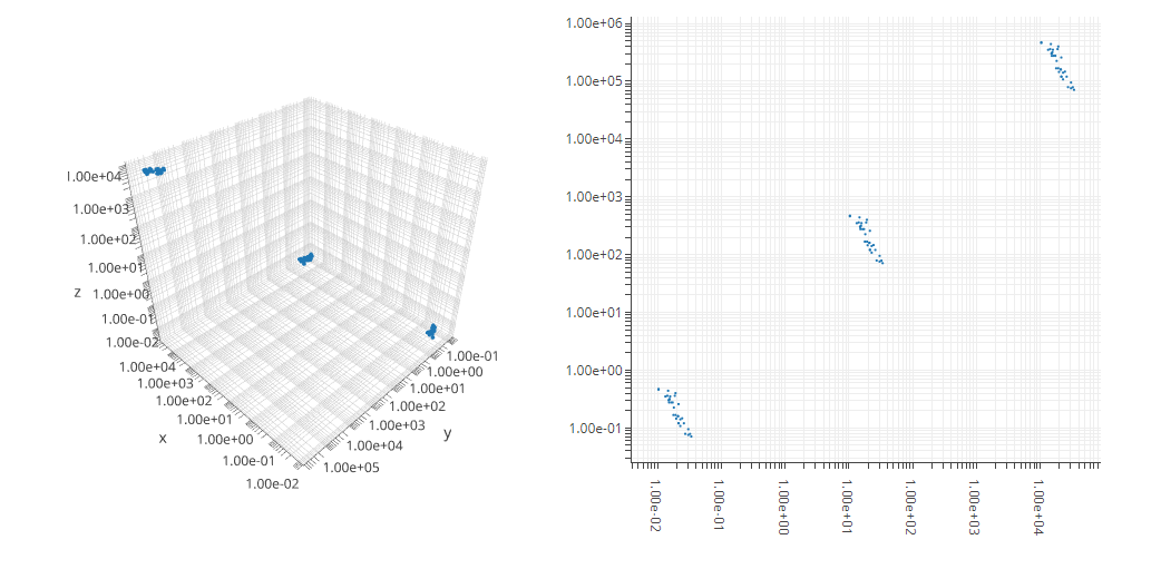
Particularly aimed at plots where log scale is used (which seems to cause problems with the current javascript solution), I found another solution without using javascript. It works based on making a list of tickvalues and one of text labels at the whole exponent numbers and leaving the rest empty, and then inserting the two into the plot through the layout arguments for tickvals and ticktext arguments

depending on whether it is a regular scatter or scatter3d the layout code changes a bit, but the principle is the same.

In scatter3d the axes are set within the scene = list() argument. in scatter it is done directly in layout(). camera, autosize etc are arguments used to make the plots nice and square, and for 3D at the right zoom level, and of a fixed size.

The answer is based on another SO post found: here

    library(shiny)
    library(plotly)

    shinyApp(
      ui = fluidPage( plotlyOutput('plot') ),

      server = function(input, output) {
        output$plot <- renderPlotly ({

          mtcars <- rbind(mtcars, mtcars*1000, mtcars/1000)  #create data with big logarithmic range
          maxlog <- round(log10(max(mtcars[['mpg']][mtcars[['mpg']]>0], mtcars[['disp']][mtcars[['disp']]>0],mtcars[['cyl']][mtcars[['cyl']]>0])), digits = 0) +1 # determine max log needed
          minlog <- round(log10(min(mtcars[['mpg']][mtcars[['mpg']]>0], mtcars[['disp']][mtcars[['disp']]>0],mtcars[['cyl']][mtcars[['cyl']]>0])), digits = 0) -1 # determine min log needed
          logrange <- (maxlog - minlog)*9 +1 # get the distance between smallest and largest log power
          tval <- sort(as.vector(sapply(seq(1,9), function(x) x*10^seq(minlog, maxlog)))) #generates a sequence of numbers in logarithmic divisions
          ttxt <- rep("",length(tval))  # no label at most of the ticks
          ttxt[seq(1,logrange,9)] <- formatC(tval, format = "e", digits = 2)[seq(1,logrange,9)] # every 9th tick is labelled


          p <- plot_ly(source = 'ThresholdScatter')
          p <- add_trace(p, data = mtcars, 
                      x = mtcars[['mpg']], 
                      y = mtcars[['disp']],
                      z = mtcars[['cyl']],
                      type = 'scatter3d', 
                      mode = 'markers',
                      marker = list(size = 2)) 

      p <- layout(p, autosize = F, width = 500, height = 500,
                  scene = list(yaxis = list(type="log",
                                            zeroline=F, showline=T, 
                                            ticks="outside",
                                            tickvals=tval,
                                            ticktext=ttxt),
                               xaxis = list(type="log",
                                            zeroline=F, showline=T, 
                                            ticks="outside",
                                            tickvals=tval,
                                            ticktext=ttxt),
                               zaxis = list(type="log",
                                            zeroline=F, showline=T, 
                                            ticks="outside",
                                            tickvals=tval,
                                            ticktext=ttxt),
                               camera = list(eye = list(x = -1.5, y = 1.5, z = 1.5))))
    })
  }
    )

for a 2D solution:

library(shiny)
library(plotly)

shinyApp(
  ui = fluidPage( plotlyOutput('plot') ),

  server = function(input, output) {
    output$plot <- renderPlotly ({

      mtcars <- rbind(mtcars, mtcars*1000, mtcars/1000)  #create data with big logarithmic range
      maxlog <- round(log10(max(mtcars[['mpg']][mtcars[['mpg']]>0], mtcars[['disp']][mtcars[['disp']]>0])), digits = 0) +1 # determine max log needed
      minlog <- round(log10(min(mtcars[['mpg']][mtcars[['mpg']]>0], mtcars[['disp']][mtcars[['disp']]>0])), digits = 0) -1 # determine min log needed
      logrange <- (maxlog - minlog)*9 +1 # get the distance between smallest and largest log power
      tval <- sort(as.vector(sapply(seq(1,9), function(x) x*10^seq(minlog, maxlog)))) #generates a sequence of numbers in logarithmic divisions
      ttxt <- rep("",length(tval))  # no label at most of the ticks
      ttxt[seq(1,logrange,9)] <- formatC(tval, format = "e", digits = 2)[seq(1,logrange,9)] # every 9th tick is labelled


      p <- plot_ly(source = 'ThresholdScatter')
      p <- add_trace(p, data = mtcars, 
                     x = mtcars[['mpg']], 
                     y = mtcars[['disp']],
                     type = 'scatter', 
                     mode = 'markers',
                     marker = list(size = 2)) 

      p <- layout(p,autosize = F, width = 500, height = 500,
                  yaxis = list(type="log",
                                 zeroline=F, showline=T, 
                                 ticks="outside",
                                 tickvals=tval,
                                 ticktext=ttxt),
                  xaxis = list(type="log",
                               zeroline=F, showline=T, 
                               ticks="outside",
                               tickvals=tval,
                               ticktext=ttxt))
    })
  }
)

enter image description here

Idaho answered 9/2, 2019 at 20:39 Comment(0)

© 2022 - 2024 — McMap. All rights reserved.