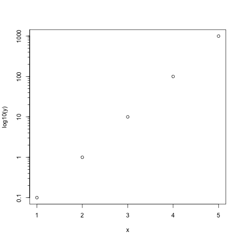
I would like to generate a figure in plotly like the following figure generated with the base R graphics:
The R code for the figure above is the following:
x = c(1,2,3,4,5)
y = c(0.1, 1, 10, 100, 1000)
axseq = y
plot(x, log10(y), yaxt="n")
axis(2, at=log10(axseq), labels=as.character(axseq))
for (i in 1:5){
    bb = 1:10; a = (bb*10^(i-2));   axis(2, at=log10(a), tcl=-0.25, labels=F)
}
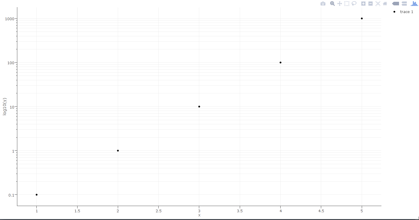
My plotlycode for the same figure so far is the following:
p = plot_ly(x=x, y=log10(y), mode="markers") %>%
layout(yaxis = list(tickmode="array", tickvals=log10(axseq), ticktext=as.character(axseq), zeroline=F, showline=T, ticks="outside"),
       xaxis = list(showline=T, ticks="outside"))
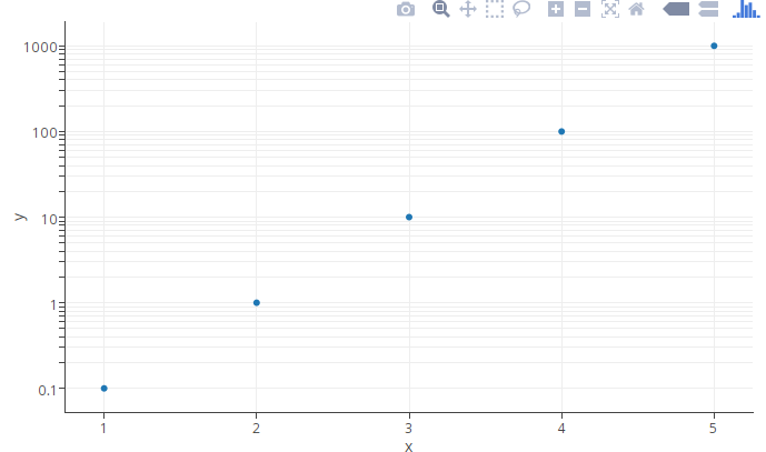
it has the major ticks, but I can't find how to add the minor ticks on the y axis.


ticklenattribute, but I don't think I can control the length of the major and minor ticks separately. – Tokoloshe