How do I change colours of confidence interval lines when using `matlines` for prediction plot?
Asked Answered
T

2

1

I'm plotting a logarithmic regression's line of best fit as well as the confidence intervals around that line. The code I'm using works well enough, except I'd rather that the confidence intervals both be "gray" (rather than the default "red" and "green"). Unfortunately, I'm not seeing a way to isolate them when specifying colour changes. I'd like

  • for the regression line: lty = 1, col = "black";
  • for confidence intervals to have: lty=2, col = "gray".

How can I achieve this? my code is of the sort:

R6cl <- lm(log(R6$y) ~ R6$x)
pR6cl <- predict(R6cl, interval="confidence")
plot(R6$x, log(R6$y), type = "p") 
matlines(x = R6$x, y = log(R6$y), lwd = 2, lty = 1, col = "black")

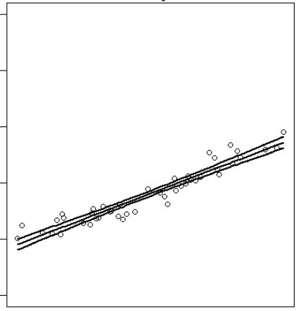
which produces:

enter image description here

Tuning answered 26/11, 2016 at 18:30 Comment(1)
I'm not convinced that the code you've posted actually produces this plot. Can you please include data and/or code that will provide us with a reproducible example ? Also, hint: matlines() can take a col argument that has length > 1 ...Neelyneeoma
C
2

col, lty and lwd are vectorized. You can use

R6cl <- lm(log(y) ~ x, data = R6)  ## don't use $ in formula
pR6cl <- predict(R6cl, interval = "confidence")
plot(log(y) ~ x, data = R6)  ## Read `?plot.formula`
matlines(R6$x, pR6cl, lwd = 2, lty = c(1, 2, 2), col = c(1, 2, 2))

You can check the last figure in Piecewise regression with a quadratic polynomial and a straight line joining smoothly at a break point for what this code would produce.

If you are unclear why I advise against the use of $ in model formula, read Predict() - Maybe I'm not understanding it.


A side notice for other readers

OP has a dataset where x is sorted. If your x is not sorted, make sure you sort it first. See Messy plot when plotting predictions of a polynomial regression using lm() in R for more.

Causative answered 26/11, 2016 at 19:29 Comment(1)
For future users: I tried both answers and both produced the desired plot. I accepted Zheyuan Li's method as it's the most efficient, but both work just fine.Tuning
T
1

How about:

a = 1:10
b = c(2,1,2,4,5,5,3,7,4,10)

R6cl <- lm(log(b)~a)
pR6cl <- predict(R6cl, interval = "confidence")
plot(a, log(b), type = "p") 
lines(a, pR6cl[,1], lty = 1, col = "black")
lines(a, pR6cl[,2], lty = 2, col = "gray")
lines(a, pR6cl[,3], lty = 2, col = "gray")

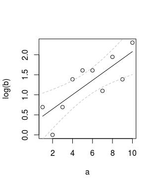
Which gives:

plot

Trigeminal answered 26/11, 2016 at 19:12 Comment(0)

© 2022 - 2024 — McMap. All rights reserved.