SwiftUI - List Divider: Unwanted inset at the start when non-Text component is used at the start of row
Asked Answered
S

6

7

Description

When an HStack'ed list row components start with a non-Text and is followed by a Text component, then line Divider start from the first Text occurrence in the row. What I expect is Divider to stretch through the row. I have tried all the combination of listSyle() on the List but none resolved the problem. As seen in the pic, the divider ignores anything placed before the Text.

enter image description here

Question

Is there any way to force the Divider stretch through the row?

Steps to reproduce

struct ContentView: View {
    var body: some View {
        List {
            HStack{
                Image(systemName: "star")
                    .frame(width: 50, height: 50)
                Text("Chocolate")
            }
            HStack{
                Image(systemName: "star")
                    .frame(width: 50, height: 50)
                Text("Waffles")
            }
        }
    }
}

Environment

  • Xcode version info: Xcode 14.0.1

  • Deployment target: iOS 14.0

Simas answered 8/1, 2023 at 9:35 Comment(3)
Does this answer your question? How to remove/adjust separators in List?Tippet
@Tippet Most of the comments point out that answers are buggySimas
I didn't like the answers that were here so far as they ether didn't fix the Separator's leading spacing or just seemed to add another one over the top so I used a hidden textbox at the start. See: this answerArrogate
H
3

You can convert the system images to text, then the line will start there:

struct ContentView: View {
    var body: some View {
        List {
            HStack{
                Text(Image(systemName: "star")) // here
                Text("Chocolate")
            }
            HStack{
                Text(Image(systemName: "star")) // here
                Text("Waffles")
            }
        }
    }
}
Hulton answered 8/1, 2023 at 11:56 Comment(1)
The Image has more complex content than it is shown in the code. That is why I specifically mentioned non-Text component not just Image. It was just a smaple code to reproduce. Imagine it is another VStack instead of ImageSimas
A
3

Cause

Although I have yet to find any official Apple documentation on this it appears to be by design so the line always starts at the text (see the Settings app).

My reason for wanting this

But I wanted a full width button with centred text and didn't want the seperator starting half way across the list row.

Solution

The way I went about solving this was to just put the text it wanted at the start so iOS knew what I wanted.

I did this by adding an empty 0 width text box before the actual row content and wrapping the whole thing in another HStack with 0 spacing (otherwise it indents it slightly).

While this is still very Hacky it does remove the bugs the other answers up to now have.

Example

enter image description here

// Extra HStack with "hidden" text entry at the start.
HStack(spacing: 0) {
    Text("").frame(maxWidth: 0)
    
    // Original row data here...
    Button {
        // Do something here
    } label: {
        Text("Full Width Button")
            // Make this text entry take up all the row
            .frame(maxWidth: .infinity)
    }
    .buttonStyle(.borderedProminent)
}
// Just to help the separator stand out
.listRowSeparatorTint(.red)

// Second Row so the separator shows up
Button("Another") {}.buttonStyle(.borderedProminent)

Potential side effect

I've tested it with Accessibility - Spoken Content enabled and I can't hear any issues with the extra text box.

Arrogate answered 16/7, 2023 at 14:59 Comment(0)
F
2

Weird behaviour, understandable if using "system images". Work around as described above!

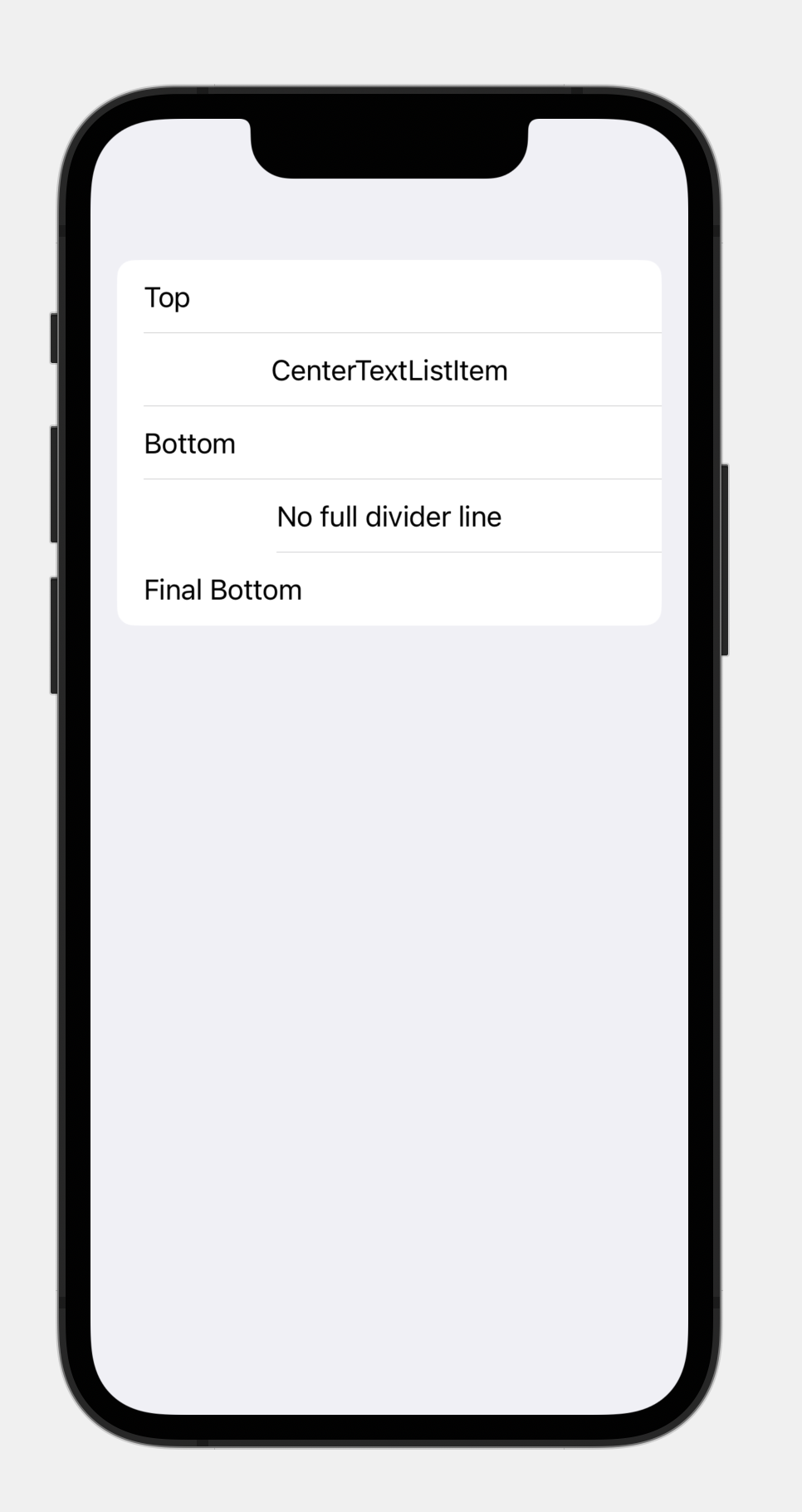
enter image description here

import SwiftUI

struct CenterText: View {
let text: String

init(_ text: String) {
    self.text = text
}

var body: some View {
    HStack {
        Text("").frame(maxWidth: 0)
        Spacer()
        Text(text)
        Spacer()
    }
 }
}

struct CenterText_Previews: PreviewProvider {
    static var previews: some View {
    List {
        Text("Top")
        CenterText("CenterTextListItem")
        Text("Bottom")
        // wrong behaviour
        HStack {
            Spacer()
            Text("No full divider line")
            Spacer()
        }
        Text("Final Bottom")
     }
   }
}
Flameout answered 20/7, 2023 at 15:1 Comment(0)
A
1

Another approach is to hide the separator and manually add a Divider() in between the rows. The divider will appear centered in the list.

var body: some View {
    List {
        HStack{
            Image(systemName: "star")
                .frame(width: 50, height: 50)
            Text("Chocolate")
        }
        .listRowSeparator(.hidden)      // Hide the separator

        // Add a manual divider
        Divider()
        
        HStack{
            Image(systemName: "star")
                .frame(width: 50, height: 50)
            Text("Waffles")
        }
        .listRowSeparator(.hidden)      // Hide the separator
    }
}
Alejandroalejo answered 8/1, 2023 at 12:14 Comment(3)
That API is supported only in iOS 15+Simas
and you say your deployment target is iOS 16Hulton
@Hulton I edited the question. it was mistake, thanks for noticingSimas
S
1

It's a possible. The listRowSeparator has parameter edges. If you call that with .all, the separators stretch through the row. And then, there are three choise hidden, automatic and visible. visible effects force a edge options.

struct ContentView: View {
    var body: some View {
        List {
            HStack{
                Image(systemName: "star")
                    .frame(width: 50, height: 50)
                Text("Chocolate")
            }.listRowSeparator(.visible, edges: .all)
            
            HStack{
                Image(systemName: "star")
                    .frame(width: 50, height: 50)
                Text("Waffles")
            }.listRowSeparator(.visible, edges: .all)
        }
    }
}
Sensor answered 8/1, 2023 at 13:12 Comment(5)
It has a restricted usage. Supported only after iOS 15+Simas
Yes, You are using iOS 16. right?Sensor
It was mistake, I edited it. It is 14Simas
I have no idea. You need to build List like view using ScrollView.Sensor
the .visible forces the divider to go full from edge to edge. the default behavior would be a space between the edge and the divider line, trailing and leading.Flameout
Y
0

Use this in your view inside the List:

.alignmentGuide(.listRowSeparatorLeading) { d in
    -100
}
Yttriferous answered 17/9 at 13:11 Comment(0)

© 2022 - 2024 — McMap. All rights reserved.