Reduce number of gridlines in plotly scatter plots with log scale in R shiny
Asked Answered
S

2

2

I've build the following test app where I solve the issue to get the tick labels as scientific annotation, but I would now like to reduce the number of grid lines to only be placed at the "main" ticks, i.e. the ones that have a text label. This question was posted based on discussion / comment on this previous SO question

I would like to find a way that works for both 2D and 3D plotly scatter plots since I am using both.

Here is the 3D app.

    library(shiny)
    library(plotly)

    shinyApp(
      ui = fluidPage( plotlyOutput('plot') ),

      server = function(input, output) {
        output$plot <- renderPlotly ({

          mtcars <- rbind(mtcars, mtcars*1000, mtcars/1000)  #create data with big logarithmic range
          maxlog <- round(log10(max(mtcars[['mpg']][mtcars[['mpg']]>0], mtcars[['disp']][mtcars[['disp']]>0],mtcars[['cyl']][mtcars[['cyl']]>0])), digits = 0) +1 # determine max log needed
          minlog <- round(log10(min(mtcars[['mpg']][mtcars[['mpg']]>0], mtcars[['disp']][mtcars[['disp']]>0],mtcars[['cyl']][mtcars[['cyl']]>0])), digits = 0) -1 # determine min log needed
          logrange <- (maxlog - minlog)*9 +1 # get the distance between smallest and largest log power
          tval <- sort(as.vector(sapply(seq(1,9), function(x) x*10^seq(minlog, maxlog)))) #generates a sequence of numbers in logarithmic divisions
          ttxt <- rep("",length(tval))  # no label at most of the ticks
          ttxt[seq(1,logrange,9)] <- formatC(tval, format = "e", digits = 2)[seq(1,logrange,9)] # every 9th tick is labelled


          p <- plot_ly(source = 'ThresholdScatter')
          p <- add_trace(p, data = mtcars, 
                      x = mtcars[['mpg']], 
                      y = mtcars[['disp']],
                      z = mtcars[['cyl']],
                      type = 'scatter3d', 
                      mode = 'markers',
                      marker = list(size = 2)) 

      p <- layout(p, autosize = F, width = 500, height = 500,
                  scene = list(yaxis = list(type="log",
                                            zeroline=F, showline=T, 
                                            ticks="outside",
                                            tickvals=tval,
                                            ticktext=ttxt),
                               xaxis = list(type="log",
                                            zeroline=F, showline=T, 
                                            ticks="outside",
                                            tickvals=tval,
                                            ticktext=ttxt),
                               zaxis = list(type="log",
                                            zeroline=F, showline=T, 
                                            ticks="outside",
                                            tickvals=tval,
                                            ticktext=ttxt),
                               camera = list(eye = list(x = -1.5, y = 1.5, z = 1.5))))
    })
  }
    )

and the same but in 2D

        library(shiny)
        library(plotly)

        shinyApp(
          ui = fluidPage( plotlyOutput('plot') ),

          server = function(input, output) {
            output$plot <- renderPlotly ({

                  mtcars <- rbind(mtcars, mtcars*1000, mtcars/1000)  #create data with big logarithmic range
                  maxlog <- round(log10(max(mtcars[['mpg']][mtcars[['mpg']]>0], mtcars[['disp']][mtcars[['disp']]>0])), digits = 0) +1 # determine max log needed
                  minlog <- round(log10(min(mtcars[['mpg']][mtcars[['mpg']]>0], mtcars[['disp']][mtcars[['disp']]>0])), digits = 0) -1 # determine min log needed
                  logrange <- (maxlog - minlog)*9 +1 # get the distance between smallest and largest log power
                  tval <- sort(as.vector(sapply(seq(1,9), function(x) x*10^seq(minlog, 

    maxlog)))) #generates a sequence of numbers in logarithmic divisions
              ttxt <- rep("",length(tval))  # no label at most of the ticks
              ttxt[seq(1,logrange,9)] <- formatC(tval, format = "e", digits = 2)[seq(1,logrange,9)] # every 9th tick is labelled


              p <- plot_ly(source = 'ThresholdScatter')
              p <- add_trace(p, data = mtcars, 
                             x = mtcars[['mpg']], 
                             y = mtcars[['disp']],
                             type = 'scatter', 
                             mode = 'markers',
                             marker = list(size = 2)) 

              p <- layout(p,autosize = F, width = 500, height = 500,
                          yaxis = list(type="log",
                                         zeroline=F, showline=T, 
                                         ticks="outside",
                                         tickvals=tval,
                                         ticktext=ttxt),
                          xaxis = list(type="log",
                                       zeroline=F, showline=T, 
                                       ticks="outside",
                                       tickvals=tval,
                                       ticktext=ttxt))
            })
          }


  )
Spin answered 10/2, 2019 at 0:13 Comment(1)
You need to use a "scene", see my full answer below.Tatary
J
2

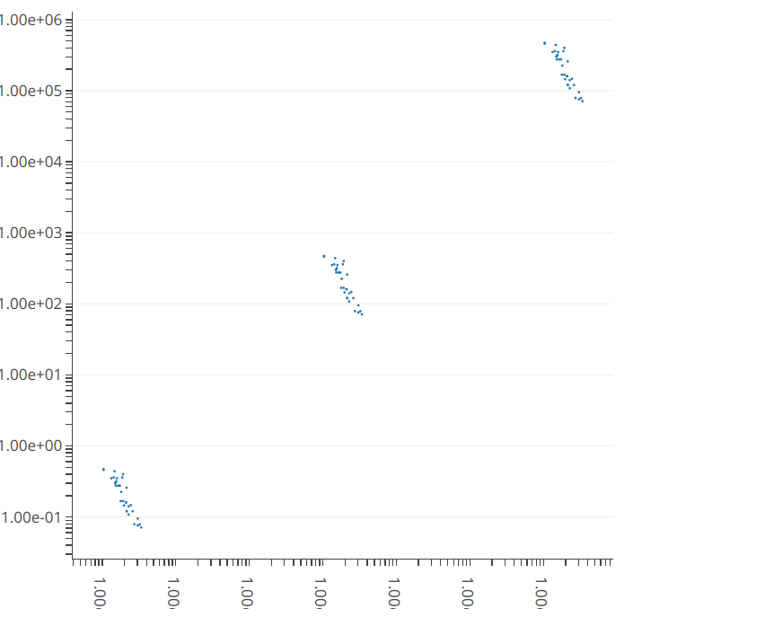
For the 2D scatterplot, you can draw your own grid lines using the shapes option in layout. You also then suppress the gridlines using showgrid = FALSE.

shinyApp(
  ui = fluidPage( plotlyOutput('plot') ),

  server = function(input, output) {

    hline <- function(y = 0, color = "grey", width=0.1) {
      list(type = "line", x0 = 0, x1 = 1, xref = "paper",
        y0 = y, y1 = y, line = list(color = color, width=width))
    }

    output$plot <- renderPlotly ({
      mtcars <- rbind(mtcars, mtcars*1000, mtcars/1000)  #create data with big logarithmic range
      maxlog <- round(log10(max(mtcars[['mpg']][mtcars[['mpg']]>0], mtcars[['disp']][mtcars[['disp']]>0])), digits = 0) +1 # determine max log needed
      minlog <- round(log10(min(mtcars[['mpg']][mtcars[['mpg']]>0], mtcars[['disp']][mtcars[['disp']]>0])), digits = 0) -1 # determine min log needed
      logrange <- (maxlog - minlog)*9 +1 # get the distance between smallest and largest log power
      tval <- sort(as.vector(sapply(seq(1,9), function(x) x*10^seq(minlog, 

        maxlog)))) #generates a sequence of numbers in logarithmic divisions
      ttxt <- rep("",length(tval))  # no label at most of the ticks
      ttxt[seq(1,logrange,9)] <- formatC(tval, format = "e", digits = 2)[seq(1,logrange,9)] # every 9th tick is labelled

      p <- plot_ly(source = 'ThresholdScatter')
      p <- add_trace(p, data = mtcars, 
        x = mtcars[['mpg']], 
        y = mtcars[['disp']],
        type = 'scatter', 
        mode = 'markers',
        marker = list(size = 2)) 

      p <- layout(p,autosize = F, width = 500, height = 500,
        yaxis = list(type="log",
          zeroline=F, showline=T, showgrid=F,
          ticks="outside",
          tickvals=tval,
          ticktext=ttxt),
        xaxis = list(type="log",
          zeroline=F, showline=T, showgrid=F,
          ticks="outside",
          tickvals=tval,
          ticktext=ttxt),
        shapes = lapply(10^(-1:6), hline))
    })
  }
)

enter image description here

Unfortunately, I don't think you can use this approach in the 3d plot, as shapes do not have a z dimension. You could do something similar using add_lines instead of shapes, but this won't be quite as neat.

Joeyjoffre answered 10/2, 2019 at 5:12 Comment(2)
This is redundant if simply using "scene", see other answer.Tatary
No it is not Inon, look at how your scene approach fails to generate scientific annotation, and that was the whole goal of this question.Spin
T
-1

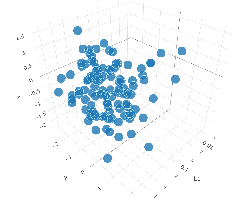
In Python, for the 3D plot, specify all Layout attributes within a scene dict, as following:

layout = go.Layout(
        margin=dict(
        l=0,
        r=0,
        b=0,
        t=0
    ),
    scene=dict(
    xaxis=dict(
        type='log',
               autorange=True,
               title='L1'))
)

I'd assume the same functionality exists in R for the latest version of plotly.

enter image description here

Tatary answered 1/4, 2019 at 4:7 Comment(3)
Inon, I knew this approach, Yes you can set log scale in R Plotly too, but as is also the case in your example, that L1 axis is not a proper scientific way to denote log scale. As soon as you replace it with javascript to do so, you get 9 lines per logarithmic stepSpin
You mean that you wish there to be 10 minor steps from 1 to 0.1, then from 0.1 to 0.01, etc.? If so, maybe this can be controlled with the "autorange" parameter?Tatary
Ideally I would like a line at whole log scale and at half or so, but your solution is incapable of labeling them as 1.00 +01 format. So please remove your downvote from the other answerSpin

© 2022 - 2024 — McMap. All rights reserved.