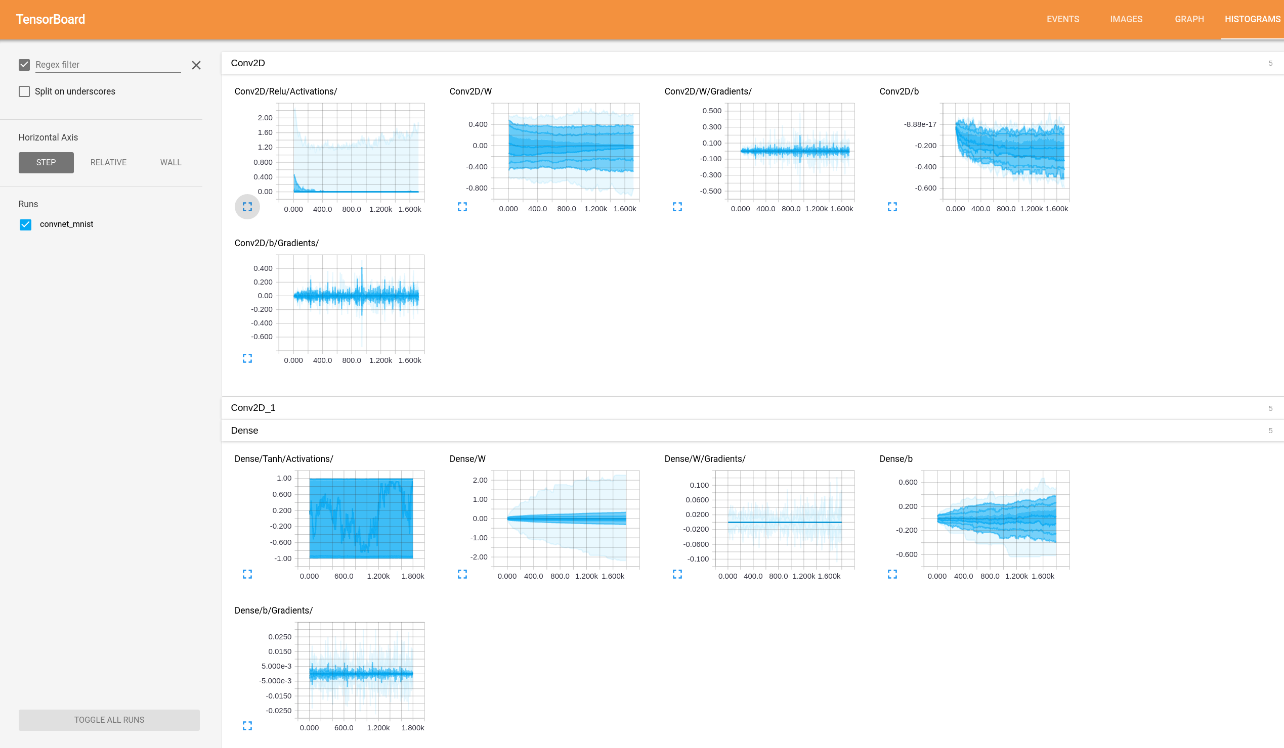
How to make sense of tensorflow tensorboard Histograms?
Asked Answered
T

1

8

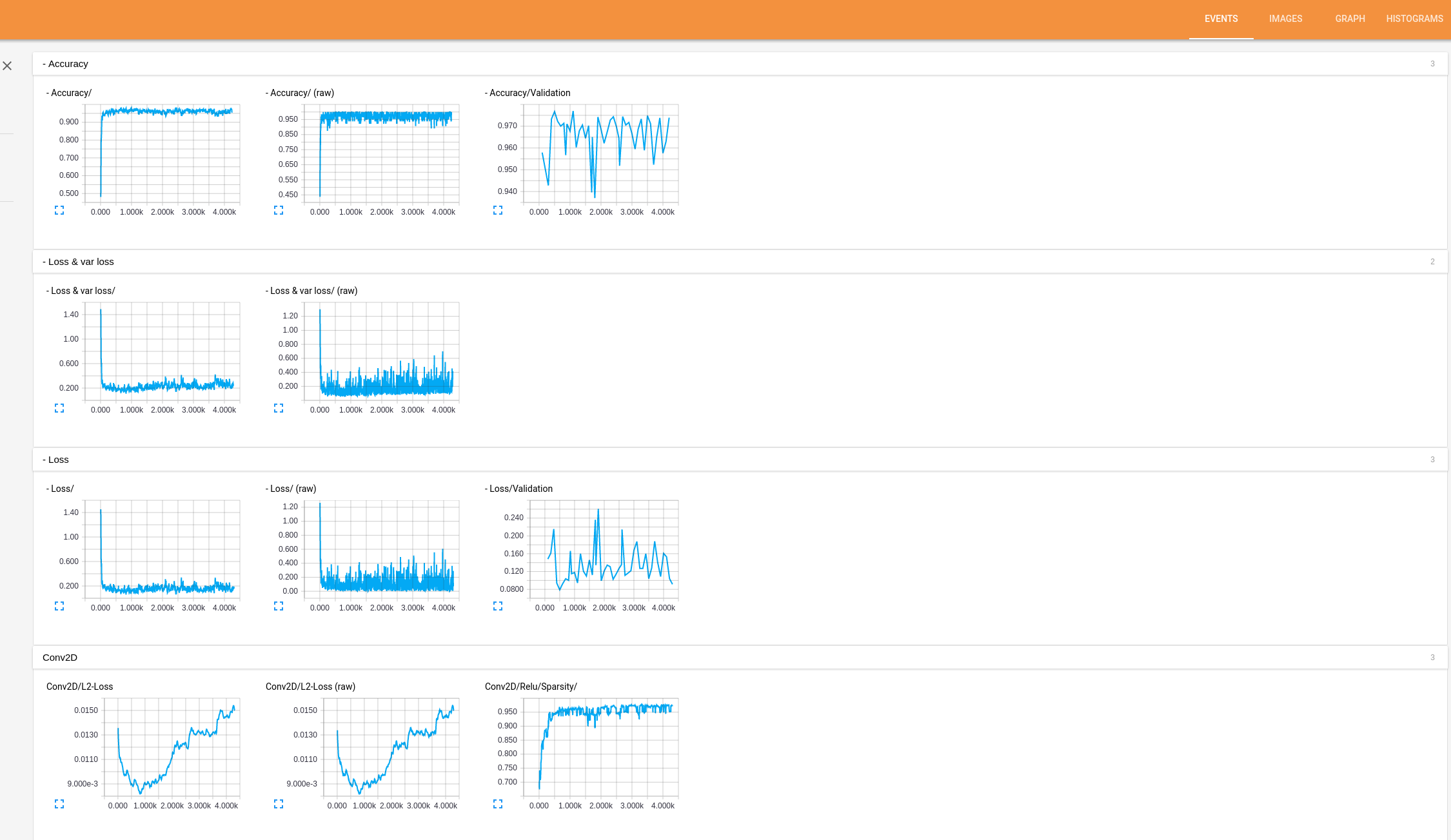
I would like to know how to make sense of the tensor flow graphs/Histograms generated. The code for this can be found here. This graph is easy to understand Accuracy and loss are straight forward to understand.

Accuracy- Accuracy of current state of network for given train data.
Higher is better

Accuracy/Validation -  Accuracy of current state of network for given Validation data which is 
not seen by network before. Higher is better

Loss- Loss of network on train data. Lower is better.
Loss/Valadation - Loss of network on test data. Lower is better.
If loss increases it's a sign of over-fitting.
Conv2d/L2-Loss - Loss of particular layer wrt train data. 

enter image description here

Basically what the graph signifies and how i could use it to understand my network and if possible what changes i can make to improve it.

How Do I interpret the histograms?

enter image description here

Tocharian answered 5/4, 2016 at 14:25 Comment(0)
P
-2

tf.summary.histogram takes an arbitrarily sized and shaped Tensor, and compresses it into a histogram data structure consisting of many bins with widths and counts. For example, let's say we want to organize the numbers [0.5, 1.1, 1.3, 2.2, 2.9, 2.99] into bins. We could make three bins: a bin containing everything from 0 to 1 (it would contain one element, 0.5), a bin containing everything from 1-2 (it would contain two elements, 1.1 and 1.3), * a bin containing everything from 2-3 (it would contain three elements: 2.2, 2.9 and 2.99).

Please follow below links for more details:

sunside answer

Tensorflow documentation

Prolific answered 1/9, 2017 at 9:20 Comment(0)

© 2022 - 2024 — McMap. All rights reserved.