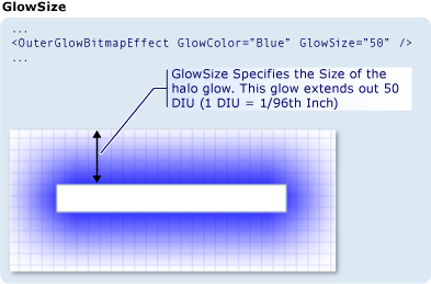
Depending on how large you want the radius of the blur to be and how smooth the result needs to be, you could stack different effects like gradient stops instead of repeatedly stacking the same effect.
Like you pointed out, the DropShadowEffect strength gets weaker as the BlurRadius increases.
![Example of a WPF control]()
<TextBox Text="DropShadowEffect">
    <TextBox.Effect>
        <DropShadowEffect BlurRadius="50"
                          ShadowDepth="0"
                          Color="Blue"
                          Opacity="1"/>
    </TextBox.Effect>
</TextBox>
Additionally, applying effects directly to the TextBox impacts the rendering quality of the text. The proposed solution to the linked question (setting TextOptions.TextFormattingMode="Display" on the Window) also has layout implications. Instead, you can draw a Rectangle with a BlurEffect behind your element.
![Example of a WPF control]()
<Rectangle Fill="Blue"
           Height={Binding ElementName=MyTextBox, Path=ActualHeight}"
           Width={Binding ElementName=MyTextBox, Path=ActualWidth}">
    <Rectangle.Effect>
        <BlurEffect Radius="50"/>
    </Rectangle.Effect>
</Rectangle>
<TextBox x:Name="MyTextBox" Text="Rectangle with BlurEffect"/>
You can then add an additional Rectangle for each gradient stop. Here there are two: one at 50 to define the overall size of the blur, and one at 30 to strengthen the glow around the control.
![Example of a WPF control]()
<Rectangle Fill="Blue"
           Height={Binding ElementName=MyTextBox, Path=ActualHeight}"
           Width={Binding ElementName=MyTextBox, Path=ActualWidth}">
    <Rectangle.Effect>
        <BlurEffect Radius="50"/>
    </Rectangle.Effect>
</Rectangle>
<Rectangle Fill="Blue"
           Height={Binding ElementName=MyTextBox, Path=ActualHeight}"
           Width={Binding ElementName=MyTextBox, Path=ActualWidth}">
    <Rectangle.Effect>
        <BlurEffect Radius="30"/>
    </Rectangle.Effect>
</Rectangle>
<TextBox x:Name="MyTextBox" Text="Two Rectangles with BlurEffect"/>
You asked about the perceived sharpness around the corners of the TextBox and I must admit I don't have a good solution. I initially considered rounding the corners of the blurred elements behind your control by using a Border instead of a Rectangle, but I honestly don't see much of a difference.
![Example of a WPF control]()
<!-- Remove the CornerRadius property for square corners. -->
<Border CornerRadius="10" Background="Blue">
    <Border.Effect>
        <BlurEffect Radius="50"/>
    </Border.Effect>
</Border>
<Border CornerRadius="10" Background="Blue">
    <Border.Effect>
        <BlurEffect Radius="30"/>
    </Border.Effect>
</Border>
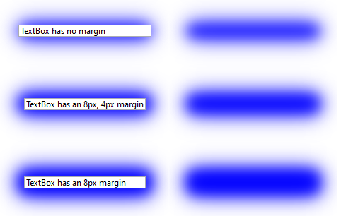
Of course, you could always make the background objects larger than your control. Here they are in the same cell of a Grid but there is extra space for the Border to grow because the TextBox has a Margin. A smaller top/bottom margin and larger left/right margin means the glow will be more uniform around the control.
![Example of a WPF control]()
<!-- These items should be in the same cell of a Grid -->
<Border CornerRadius="10" Background="Blue">
    <Border.Effect>
        <BlurEffect Radius="50"/>
    </Border.Effect>
</Border>
<Border CornerRadius="10" Background="Blue">
    <Border.Effect>
        <BlurEffect Radius="30"/>
    </Border.Effect>
</Border>
<TextBox Text="TextBox has an 8px, 4px margin" Margin="8 4"/>


