I am using the R programming language. I am following a tutorial on data visualization over here: https://plotly.com/r/3d-surface-plots/
I created my own data and made a 3D plot:
library(plotly)

set.seed(123)

#generate data
a = rnorm(100,10,10)
b = rnorm(100,5,5)
c = rnorm(100,5,10)
d = data.frame(a,b,c)

#3d plot
fig <- plot_ly(z = ~as.matrix(d))
fig <- fig %>% add_surface()

#view plot
fig
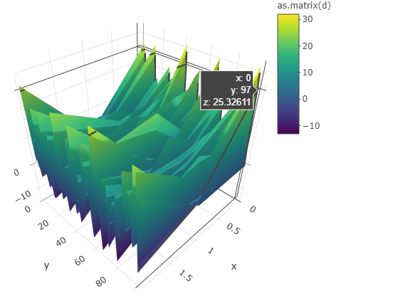
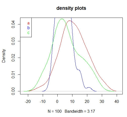
As seen here, there is a point on this 3D plot where "y = 97". I am not sure how this is possible, seeing how none of the values within the original data frame "d" are anywhere close to 97. I made sure of this by looking at the individual distributions of each variable in the original data frame "d":
#plot individual densities

plot(density(d$a), main = "density plots", col = "red")
lines(density(d$b), col = "blue")
lines(density(d$c), col = "green")

legend( "topleft", c("a", "b", "c"),
text.col=c("red", "blue", "green") )
As seen here, none of the variables (a,b,c) from the original data frame "d" have any values that are close to 97.
Thus, my question: can someone please explain how is it possible that the point (x = 0 , y = 97, z =25.326) appears on this 3D plot?
Thanks


