Align views in Picker
Asked Answered
L

2

4

How do I align the Color views in a straight line with the text to the side?

To look like so (text aligned leading):

█  red
█  green
█  blue

Or this (text aligned center):

█    red
█  green
█   blue

Current code:

struct ContentView: View {
    @State private var colorName: Colors = .red
    
    var body: some View {
        Picker("Select color", selection: $colorName) {
            ForEach(Colors.allCases) { color in
                HStack {
                    color.asColor.aspectRatio(contentMode: .fit)
                    
                    Text(color.rawValue)
                }
            }
        }
    }
}


enum Colors: String, CaseIterable, Identifiable {
    case red
    case green
    case blue
    
    var id: String { rawValue }
    var asColor: Color {
        switch self {
        case .red:      return .red
        case .green:    return .green
        case .blue:     return .blue
        }
    }
}

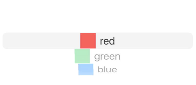
Result (not aligned properly):

Result

Without the Picker, I found it is possible to use alignmentGuide(_:computeValue:) to achieve the result. However, this needs to be in a Picker.

Attempt:

VStack(alignment: .custom) {
    ForEach(Colors.allCases) { color in
        HStack {
            color.asColor.aspectRatio(contentMode: .fit)
                .alignmentGuide(.custom) { d in
                    d[.leading]
                }
            
            Text(color.rawValue)
                .frame(maxWidth: .infinity)
                .fixedSize()
        }
    }
    .frame(height: 50)
}

/* ... */

extension HorizontalAlignment {
    struct CustomAlignment: AlignmentID {
        static func defaultValue(in context: ViewDimensions) -> CGFloat {
            return context[HorizontalAlignment.leading]
        }
    }
    
    static let custom = HorizontalAlignment(CustomAlignment.self)
}

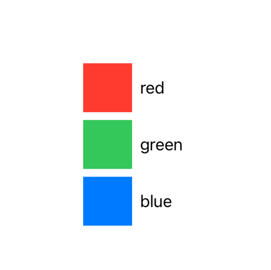
Result of attempt:

Result 2

Lenzi answered 14/6, 2021 at 23:34 Comment(0)
V
4

Possible solution is to use dynamic width for labels applied by max calculated one using view preferences.

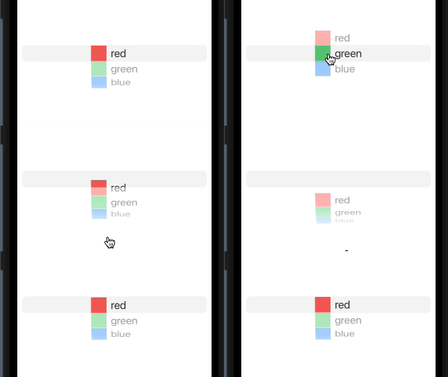
Here is a demo. Tested with Xcode 13beta / iOS15

demo

Note: the ViewWidthKey is taken from my other answer https://mcmap.net/q/814918/-navigationview-in-ipad-popover-does-not-work-properly-in-swiftui

struct ContentView: View {
    @State private var colorName: Colors = .red
    @State private var maxWidth = CGFloat.zero

    var body: some View {
        Picker("Select color", selection: $colorName) {
            ForEach(Colors.allCases) { color in
                HStack {
                    color.asColor.aspectRatio(contentMode: .fit)
                    Text(color.rawValue)
                }
                .background(GeometryReader {
                    Color.clear.preference(key: ViewWidthKey.self, 
                        value: $0.frame(in: .local).size.width)
                })
                .onPreferenceChange(ViewWidthKey.self) {
                    self.maxWidth = max($0, maxWidth)
                }
                .frame(minWidth: maxWidth, alignment: .leading)
            }
        }
    }
}
Veratrine answered 15/6, 2021 at 4:49 Comment(0)
F
0

I think this should align your text and fix your issue.

struct ContentView: View {
    @State private var colorName: Colors = .red
    
    var body: some View {
        Picker("Select color", selection: $colorName) {
            ForEach(Colors.allCases) { color in
                HStack() {
                    color.asColor.aspectRatio(contentMode: .fit)
                    
                    Text(color.rawValue)
                        .frame(width: 100, height: 30, alignment: .leading)
                }
            }
        }
    }
}

A simple .frame modifier will fix these issues, try to frame your text together or use a Label if you don't want to complicate things when it comes to pickers or list views.

If you do go forward with this solution try to experiment with the width and height based on your requirements, and see if you want .leading, or .trailing in the alignment

Fantinlatour answered 15/6, 2021 at 1:8 Comment(4)
The original edit of my question used Label, which I switched because I didn't know how someone might solve the problem. Although this mostly solves the problem, it would be nice to have something centered and uses something like alignment guides so I don't need to hardcode any sizes. In reality I have a lot more items than this, it's just a minimal example. Thank you for answering though! Basically the widest item in the picker would stay, and everything else is aligned to that.Lenzi
if you want centered items instead of leading, use frame, what frame does is it will essentially keep the entirety of text within the height * width space, so what I would do is see what the largest color length you have and based on that set the frame size. I don't use alignment guides much cause I don't need them, but maybe someone else can help you with that.Fantinlatour
Problem is that it should adapt to different font sizes, etc :/Lenzi
Added an attempt with alignmentGuide which works when not using Picker as an example.Lenzi

© 2022 - 2024 — McMap. All rights reserved.