Ribbon chart in R
Asked Answered
P

3

9

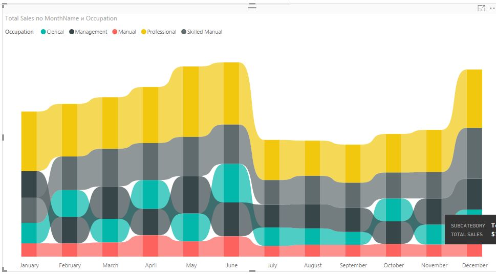
I search in R implementation (may be html widget on java script) a stacked bar chart in ribbon style, which allows you to see the rating change for each category in the dynamics.

It's look like ribbon chart in power bi desktop enter image description here

Search rseek.org gave no results.

Pulvinus answered 1/2, 2018 at 7:58 Comment(3)
Could you use something like a StreamGraph? r-graph-gallery.com/155-interactive-streamgraph-change-offsetCotonou
it's not quite what I need because the position of the ribbon irrespective of its width in any month will be the same as other tapes . Thus, in this example it is impossible to trace the changes in the rating position. Seen just what a ribbon of shrinking/expanding . (a beautiful chart at the link, sorry)Pulvinus
related #66229664 and https://mcmap.net/q/1316153/-connect-stack-bar-charts-with-multiple-groups-with-lines-or-segments-using-ggplot-2/7941188Sclar
Y
2

You may find your answers with ggalluvial package.

https://cran.r-project.org/web/packages/ggalluvial/vignettes/ggalluvial.html

Alluvial Chart with Stratum (image qouted from above link)

Yonder answered 11/1, 2021 at 6:42 Comment(0)
B
4

First off: Not a fan of that ribbon-styled stacked bar chart at all; while colourful and stylish, it's difficult to synthesise the relevant information. But that's just my opinion.

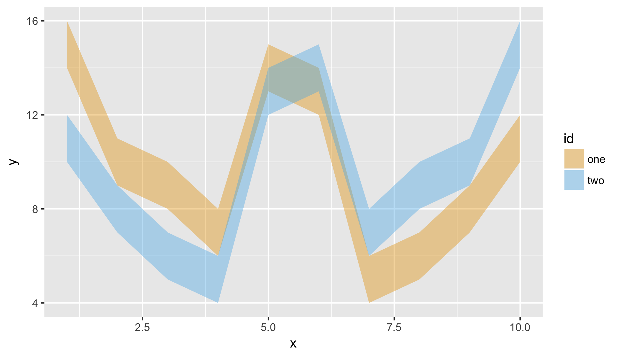
You could try building a similar plot in ggplot2 using geom_ribbon. See below for a minimal example:

# Sample data
set.seed(2017);
one <- sample(5:15, 10);
two <- rev(one);
df <- cbind.data.frame(
    x = rep(1:10, 2),
    y = c(one, two),
    l = c(one - 1, two - 1),
    h = c(one + 1, two + 1),
    id = rep(c("one", "two"), each = 10));


require(ggplot2);
ggplot(df, aes(x = x, y = y)) +
    geom_ribbon(aes(ymin = l, ymax = h, fill = id), alpha = 0.4) +
    scale_fill_manual(values = c("#E69F00", "#56B4E9"));

enter image description here

If you need interactivity, you could wrap it inside plotly::ggplotly.

Barr answered 1/2, 2018 at 8:40 Comment(2)
It's not quite what i need because in this plot two ribbon overlap instead stack. General idea of nedded plot is: 1. Enables to see overall sum of month (stack result) 2. Enables to see size of each group in month (stack result) 3. Enables to see rating and it changes (ribbon result)Pulvinus
@Pulvinus Well, if I were you, I would pre-calculate the upper/lower limits, ensuring that they don't overlap; then use geom_ribbon to plot. It's a work-around, but will give you a lot of flexibility. My example is just meant to get you started. I don't think there exists anything ready-made. R plots are generally more data-scientific, and less info-graphic.Barr
R
4

Using ggsankey package.

In the following you can make use of smooth argument geom_sankey_bump to control the look/feel of the chart as in ribbon chart of Power BI.

df <- data.frame (model  = c("A","B","C","D","E","F","G","H","I","J","A","B","C","D","E","F","G","H","I","J","A","B","C","D","E","F","G","H","I","J","A","B","C","D","E","F","G","H","I","J"),
                  
                  Year = c(2015,2015,2015,2015,2015,2015,2015,2015,2015,2015,2016,2016,2016,2016,2016,2016,2016,2016,2016,2016,2017,2017,2017,2017,2017,2017,2017,2017,2017,2017,2018,2018,2018,2018,2018,2018,2018,2018,2018,2018),
                  sales = c(450,678,456,344,984,456,234,244,655,789,234,567,234,567,232,900,1005,1900,450,345,567,235,456,345,144,333,555,777,111,444,222,223,445,776,331,788,980,1003,456,434))
          

#install.packages("remotes")
#remotes::install_github("davidsjoberg/ggsankey")
library(ggsankey)
library(tidyverse)

ggplot(df, aes(x = Year,
               node = model,
               fill = model,
               value = sales)) +
  geom_sankey_bump(space = 0, type = "alluvial", color = "transparent", smooth = 15) +
  scale_fill_viridis_d(option = "A", alpha = .8) +
  theme_sankey_bump(base_size = 16) +
  labs(x = NULL,
       y = "Sales ($ ths)",
       fill = "Model",
       color = NULL) +
  theme(legend.position = "bottom") +
  labs(title = "Sales per model per year")


On suggestion in comments, I tried replicating some of the features of power BI chart.

# Prepare some data
set.seed(1)
df <- data.frame(
  occupation = rep(c("Clerical", "Management", "Manual", "Professional", "Skilled"), 12),
  Month = factor(rep(month.abb, 5), levels = month.abb, ordered = TRUE),
  Sales = sample(200:1000, 60, replace = TRUE)
)

df %>% 
  group_by(Month) %>% 
  mutate(Max = sum(Sales)) %>% 
  ungroup() %>% 
  mutate(Max = max(Sales)) %>% 
  ggplot(aes(x = Month,
               node = occupation,
               fill = occupation,
               value = Sales)) +
  geom_col(aes(x = Month, y = Max/1.2),
           alpha = 0.5,
           fill = 'grey',
           width = 0.4) +
  geom_sankey_bump(space = 15, 
                   type = "alluvial", 
                   color = "transparent", 
                   smooth = 8,
                   alpha = 0.8) +
  scale_fill_brewer(palette = "Set3") +
  theme_minimal() +
  labs(x = NULL,
       y = "Sales ($ ths)",
       fill = "Occupation",
       color = NULL) +
  theme(legend.position = "top") +
  labs(title = "Sales per occupation per month")

Created on 2022-07-07 by the reprex package (v2.0.1)
Reisfield answered 5/7, 2022 at 11:16 Comment(1)
for future readers, if you use geom_col(aes(x = Month, y = Sales),...), this will come slightly closer to the desired lookSclar
Y
2

You may find your answers with ggalluvial package.

https://cran.r-project.org/web/packages/ggalluvial/vignettes/ggalluvial.html

Alluvial Chart with Stratum (image qouted from above link)

Yonder answered 11/1, 2021 at 6:42 Comment(0)

© 2022 - 2024 — McMap. All rights reserved.