R: Connect bar graphs with lines filled in with matching bar color
Asked Answered
B

2

2

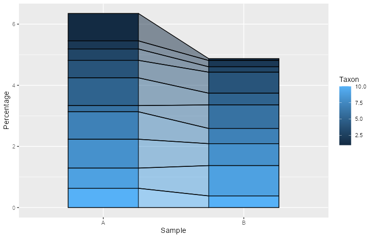
I'm working on recreating the look of a plot found in a recent Economist article. There are two bar graphs connected by lines with the space in between them having the same color, albeit a little opaque.

I've seen this question asked but the examples only have lines connecting the bar graphs. Here's some fake data:

set.seed(0)
data_bar <- data.frame(
  stringsAsFactors = F,
  Sample = rep(c("A", "B"), each = 10),
  Percentage = runif(20),
  Taxon = rep(1:10, by = 2)
)

I've worked on reworking the linked example with no success. Any ideas?

Also in case you can't see the graph here's a screen shot:

enter image description here

Backrest answered 16/2, 2021 at 17:22 Comment(0)
D
4

This took some fiddling adjusting the width of the bars and the x-position of the area, but essentially geom_area(..., position = "fill") could take you pretty far. Alternatively you could also use position = "stack".

library(ggplot2)

set.seed(0)
data_bar <- data.frame(
  stringsAsFactors = F,
  Sample = rep(c("A", "B"), each = 10),
  Percentage = runif(20),
  Taxon = rep(1:10, by = 2)
)


ggplot(data_bar, aes(Sample, Percentage, fill = Taxon, group = Taxon)) +
  geom_col(position = "fill", width = 0.5, colour = "black") +
  geom_area(aes(x = c("A" = 1.25, "B" = 1.75)[Sample]), 
            position = "fill", colour = "black", alpha = 0.5,
            outline.type = "both")

Created on 2021-02-16 by the reprex package (v1.0.0)

Alternative with stacking:

ggplot(data_bar, aes(Sample, Percentage, fill = Taxon, group = Taxon)) +
  geom_col(position = "stack", width = 0.5, colour = "black") +
  geom_area(aes(x = c("A" = 1.25, "B" = 1.75)[Sample]), 
            position = "stack", colour = "black", alpha = 0.5,
            outline.type = "both")

enter image description here

Dessiedessma answered 16/2, 2021 at 17:33 Comment(4)
This is definitely a step in the right direction. How would I go about making the colors within the geom_area match the colors of the bars?Backrest
The colours match, it's just that alpha = 0.5, so they appear lighter. Try setting Taxon = as.factor(rep(1:10, by = 2)) in the data.frame construction, that probably is a clearer example.Dessiedessma
Changing to factor did the trick. Thanks!Backrest
@Dessiedessma this is great, is there a way to adapt it to 3 samples (here: "A", "B", "C")? Because currently it only get's drawn for A->B but not C. Thanks!Scrabble
J
2

This is essentially an alluvial chart, and you can use the ggalluvial package for this.

You will need to use geom_flow, as it creates the geom "in between" the bars (use geom_col for those), and you need to set curve_type = "linear".

library(ggalluvial)
#> Loading required package: ggplot2
library(tidyverse)

set.seed(0)
data_bar <- data.frame(
  stringsAsFactors = F,
  Sample = rep(c("A", "B"), each = 10),
  Percentage = runif(20),
  Taxon = rep(1:10, by = 2)
)

## first need to calcualte the actual percentage by group
data_bar %>%
  group_by(Sample) %>%
  mutate(perc = Percentage* 100/sum(Percentage)) %>%
ggplot(aes(y = perc, x = Sample, fill = as.character(Taxon))) +
  geom_flow(aes(alluvium = Taxon), alpha= .5, color = "white",
            curve_type = "linear", 
            width = .5) +
  geom_col(width = .5, color = "white") +
  scale_fill_brewer(palette = "RdBu")+
  scale_y_continuous(NULL, expand = c(0,0)) +
  cowplot::theme_minimal_hgrid() +
  theme(panel.grid.major = element_blank(), 
        axis.text.y = element_blank(), 
        axis.ticks.y = element_blank())
#> Warning: The `.dots` argument of `group_by()` is deprecated as of dplyr 1.0.0.
#> This warning is displayed once every 8 hours.
#> Call `lifecycle::last_lifecycle_warnings()` to see where this warning was generated.

Created on 2022-01-25 by the reprex package (v2.0.1)

Jenks answered 25/1, 2022 at 12:6 Comment(0)

© 2022 - 2024 — McMap. All rights reserved.