How to set up asymmetrical color gradient for a numerical variable
Asked Answered
P

1

9

I want to have leaflet color palette centered to zero (with Red-white-green diverging). I have tried what has been told in this post. When I tried this manual creation of colors, I got the red green divergence but couldn't able to center it to zero.

My Code

regions@data <- data.frame(region <- c("APAC (excl. China)", "Africa", 
                                       "Americas", "Europe", "Greater China", "Middle East"),
                           change_targeted <- c(36,-21,25,4,173,34))

color = "#666"
weight = 0.5
opacity = 1
fillOpacity = 1
dashArray = ""
hl_color = "black"
hl_weight = 1
hl_dashArray = ""

library(RColorBrewer)
nHalf = nrow(regions@data)/2
Min = min(regions@data[,"change_targeted"])
Max = max(regions@data[,"change_targeted"])
Thresh = 0

## Make vector of colors for values below threshold
rc1 = colorRampPalette(colors = c("red", "white"), space="Lab")(nHalf)    
## Make vector of colors for values above threshold
rc2 = colorRampPalette(colors = c("white", "green"), space="Lab")(nHalf)
rampcols = c(rc1, rc2)
## In your example, this line sets the color for values between 49 and 51. 
rampcols[c(nHalf, nHalf+1)] = rgb(t(col2rgb("white")), maxColorValue=256) 

rb1 = seq(Min, Thresh, length.out=nHalf+1)
rb2 = seq(Thresh, Max, length.out=nHalf+1)[-1]
rampbreaks = c(rb1, rb2)

pal <- colorNumeric(
  palette = rampcols, #"Blues", #YlGnBu,YlOrRd
  domain = regions@data$change_targeted)

leaflet(regions, options = leafletOptions(zoomControl = FALSE, 
attributionControl=FALSE)) %>%
  addPolygons(color = color, 
            weight = weight, #smoothFactor = 0.5,
            opacity = opacity, fillOpacity = fillOpacity,
              dashArray = dashArray,
              fillColor = ~pal(change_targeted),
              highlightOptions = highlightOptions(color = hl_color, 
                                                  weight = hl_weight,
                                                  dashArray = hl_dashArray,
                                                  bringToFront = TRUE),
              label = 
~as.character(paste0(region,"",round(change_targeted,1),"%")),
              labelOptions = labelOptions(noHide = T, textOnly = F, 
direction = "left",
                                          textsize = "12px")) %>%
  setView(35, 36, 0.5) %>%
   addLegend("bottomright", pal = pal, values = ~change_targeted,
            title = NULL,
            labFormat = labelFormat(suffix = "%"), opacity=1)

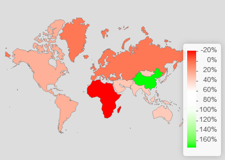
My Map chart

enter image description here

I would ideally want only Africa to have red color and rest of the regions with white to green palette

Pollie answered 6/3, 2018 at 8:32 Comment(0)
O
10

Since I do not have your data, region, I chose to use my dummy data that I have been using for some answers on Stack Overflow. I hope you do not mind that. The answer by Josh is basically giving you the right direction. You perhaps misunderstood his code. In that question, he created and combined two color palettes. Then, he manually set up the midpoint color as green. You want to realize that he created 50 colors in each palette. Your story is another story; you need to twist his answer. You want to create an asymmetrical color range using red, white, and green. You need to create 20 colors between red and white (i.e., between -20 and 0), and 180 colors between white and green (i.e., between 0 and 180). You can change these ranges with your actual data.

Now you want to use the code by Josh. You do not have to utilize all of it. All you need is to create two color palettes and combine them. Once that is done, you are ready to go. In the following code, I skipped your highlight option in order to minimize this case.

library(raster)
library(dplyr)
library(leaflet)
library(RColorBrewer)

### Get UK polygon data
UK <- getData("GADM", country = "GB", level = 2)

### Create dummy data
set.seed(111)
mydf <- data.frame(place = unique(UK$NAME_2),
                   value = sample(x = -20:180, size = n_distinct(UK$NAME_2), replace = TRUE))

### Create an asymmetric color range

## Make vector of colors for values smaller than 0 (20 colors)
rc1 <- colorRampPalette(colors = c("red", "white"), space = "Lab")(20)

## Make vector of colors for values larger than 0 (180 colors)
rc2 <- colorRampPalette(colors = c("white", "green"), space = "Lab")(180)

## Combine the two color palettes
rampcols <- c(rc1, rc2)

mypal <- colorNumeric(palette = rampcols, domain = mydf$value)

## If you want to preview the color range, run the following code
previewColors(colorNumeric(palette = rampcols, domain = NULL), values = -20:180)


leaflet() %>% 
addProviderTiles("OpenStreetMap.Mapnik") %>%
setView(lat = 55, lng = -3, zoom = 6) %>%
addPolygons(data = UK,
            stroke = FALSE, smoothFactor = 0.2, fillOpacity = 0.3,
            fillColor = ~mypal(mydf$value),
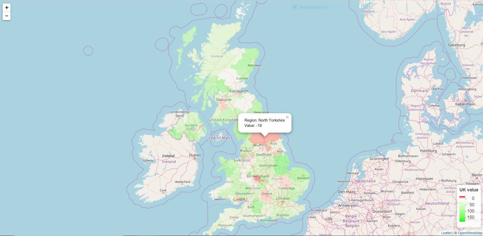
            popup = paste("Region: ", UK$NAME_2, "<br>",
                          "Value: ", mydf$value, "<br>")) %>%
addLegend(position = "bottomright", pal = mypal, values = mydf$value,
          title = "UK value",
          opacity = 1)

enter image description here

Otiose answered 8/3, 2018 at 7:45 Comment(3)
@Pollie I am glad to hear that. :)Otiose
For one of my parameter which is varying from -0.5 to 2.5, the absolute min and max would be 1 to 3. For this the scale is not properly centered at zero. So, I manually multiplied 10 to min and max (created paletted between 10-0 and 0-30). Do you think is there a automatic way to achieve thatPollie
for anyone trying to figure this out with a variable that isn't an integer, see @Otiose updated answer #60321995Juryman

© 2022 - 2024 — McMap. All rights reserved.