merging palettes with colorRampPalette and plotting with leaflet
Asked Answered
A

1

4

I'm trying to merge two colorRampPalette schemes to use in leaflet and have been following this nice example. That example works fine but I can't seem to get it to work for my work, reproducible example below. I'm using RdYlGn palette and I want numbers below the threshold to be dark green and numbers above the threshold to more red (skipping some of the inner colors).

For my example my cut-off is nc$PERIMETER < 1.3 so I want numbers under this value to be green and everything above more red (color #FDAE61 onwards).

library(sf)  
library(leaflet)
library(RColorBrewer)

#palette im using
palette <- rev(brewer.pal(11, "RdYlGn"))
# [1] "#006837" "#1A9850" "#66BD63" "#A6D96A" "#D9EF8B" "#FFFFBF" "#FEE08B" "#FDAE61" "#F46D43" "#D73027" "#A50026"
previewColors(colorNumeric(palette = palette, domain = 0:10), values = 0:10)


# preparing the shapefile
nc <- st_read(system.file("gpkg/nc.gpkg", package="sf"), quiet = TRUE) %>% 
  st_transform(st_crs(4326)) %>% 
  st_cast('POLYGON')
nc

x <- sum(nc$PERIMETER < 1.3)  
x # number of values below threshold = 21


### Create an asymmetric color range
## Make vector of colors for values smaller than 1.3 (21 colors)
rc1 <- colorRampPalette(colors = c("#006837", "#1A9850"), space = "Lab")(x)    #21 

## Make vector of colors for values larger than 1.3 
rc2 <- colorRampPalette(colors = c("#FDAE61", "#A50026"), space = "Lab")(length(nc$PERIMETER) - x)

## Combine the two color palettes
rampcols <- c(rc1, rc2)

mypal <- colorNumeric(palette = rampcols, domain = nc$PERIMETER)
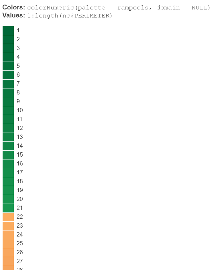
previewColors(colorNumeric(palette = rampcols, domain = NULL), values = 1:length(nc$PERIMETER))

looking at the preview it seems to have worked (21 values under 1.3 should be green):

enter image description here

plotting it:

leaflet() %>%
  addTiles() %>%
  addPolygons(data = nc,
              fillOpacity = 0.7,
              fillColor = ~mypal(PERIMETER),
              popup = paste("PERIMETER: ", nc$PERIMETER) )

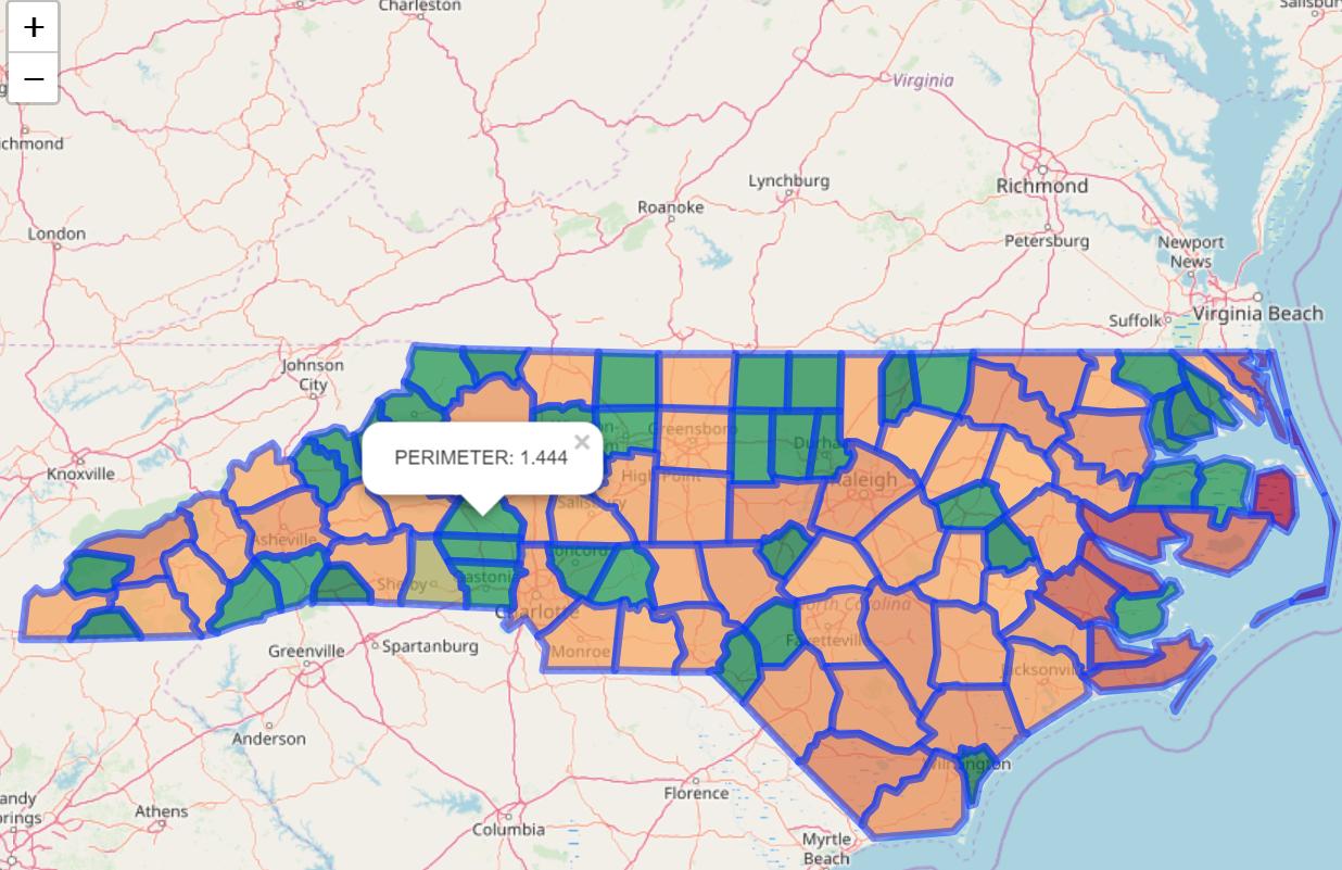
plots ok but doesn't give the right color, the one highlighted is above the threshold (1.3) and so shouldn't be green but it is:

enter image description here

I thought the way I was creating the palettes was wrong but the preview seems to suggest I've done it right?

anyone have any ideas? thanks

Archon answered 20/2, 2020 at 13:50 Comment(0)
E
6

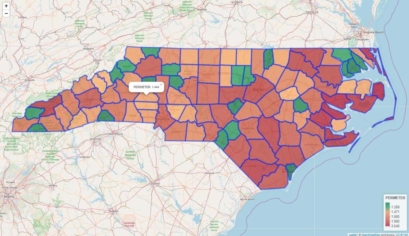
I somewhat feel responsible for this question since I wrote that answer. I cannot tell how leaflet is assigning colors to polygons. But I think we witnessed that your approach is not working. Based on my previous idea, I did the following for you. I created a new continuous variable (i.e., ranking). This information is the order of values in PERIMETER. In this way, the minimum value of PERIMETER (i.e., 0.999) is getting the first color for sure. In my previous answer here, I suggested using colorFactor(), but that gave you a hard time to create a legend. So here is additional information. When I created a legend, I used ranking in colorNumeric() and created a palette, which is mypal2. We are using identical information to fill in polygons and add a legend, but we use different functions (either colorFactor or colorNumeric). Once we have the legend, we gotta change the label format. Hence we use labelFormat(). I am using ranking as indices and getting values in PERIMETER.

library(sf)  
library(leaflet)
library(RColorBrewer)

#palette im using
palette <- rev(brewer.pal(11, "RdYlGn"))
# [1] "#006837" "#1A9850" "#66BD63" "#A6D96A" "#D9EF8B" "#FFFFBF" "#FEE08B" "#FDAE61" "#F46D43" "#D73027" "#A50026"
previewColors(colorNumeric(palette = palette, domain = 0:10), values = 0:10)


# preparing the shapefile
nc2 <- st_read(system.file("gpkg/nc.gpkg", package="sf"), quiet = TRUE) %>% 
       st_transform(st_crs(4326))


# Add sequence information in order to create 108 categories for
# colorFactor(). I sorted the data and added the sequence information.

arrange(nc2, PERIMETER) %>% 
mutate(ranking = 1:n()) -> nc2

x <- sum(nc2$PERIMETER < 1.3)   
x # number of values below threshold = 21


### Create an asymmetric color range
## Make vector of colors for values smaller than 1.3 (21 colors)
rc1 <- colorRampPalette(colors = c("#006837", "#1A9850"), space = "Lab")(x)    #21 

## Make vector of colors for values larger than 1.3 
rc2 <- colorRampPalette(colors = c("#FDAE61", "#A50026"), space = "Lab")(length(nc2$PERIMETER) - x)

## Combine the two color palettes
rampcols <- c(rc1, rc2)

# Create a palette to fill in the polygons
mypal <- colorFactor(palette = rampcols, domain = factor(nc2$ranking))
previewColors(colorNumeric(palette = rampcols, domain = NULL), values = 1:length(nc$PERIMETER))


# Create a palette for a legend with ranking again. But this time with
# colorNumeric()

mypal2 <- colorNumeric(palette = rampcols, domain = nc2$ranking)

leaflet() %>%
addTiles() %>%
addPolygons(data = nc2,
            fillOpacity = 0.7,
            fillColor = ~mypal(nc2$ranking),
            popup = paste("PERIMETER: ", nc2$PERIMETER)) %>% 
addLegend(position = "bottomright", pal = mypal2, values = nc2$ranking,
          title = "PERIMETER",
          opacity = 0.7,
          labFormat = labelFormat(transform = function(x) nc2$PERIMETER[x]))

enter image description here

If I set up the threshold level at 2.3 (less than 2.3), I get this.

enter image description here

Eyelash answered 20/2, 2020 at 14:16 Comment(23)
I am off to bed. If you need further help, please wait till tomorrow.Eyelash
excellent, thank you, so what is my approach mapping exactly? Does it jump to the nearest integer or something? You could plot my way and not realise it was wrong!Archon
another follow up q, if we add %>% addLegend( pal = mypal, values = nc$category) the legend now understandably has 108 categories. I could manually take samples from mypal(nc$category) and add them as colors =c("#EF9656"... and get their associated nc$PERIMETER values but I feel theres a short way to do this if we could do something along the lines of switching nc$category back to continuous? Would you have any suggestions for this? thanksArchon
@Archon I will take time once my work is done today.Eyelash
@Archon I just came home and revising this idea. I will post my update soon.Eyelash
@Archon I just posted my revision. I hope this is enough for you.Eyelash
hmm, this is definitely the kind of thing I had in mind (thank you) but I don't think its working the way we think it is, if we change the cut-off to x <- sum(nc$PERIMETER < 2.5) and rerun - almost all legend is green, when we just want below 2.5 green?Archon
@Archon Did you regenerate color palettes?Eyelash
yes, also when you rerun with the new cut-off (<2.5), the polygon at PERIMETER = 2.365 is not green when it should be, not sure whats happening.Archon
@Archon I think I fixed the issue. Let me post what I got for now. After this I need to go to bed. Hope you understand that.Eyelash
@Archon I receive Warning message:In st_cast.sf(., "POLYGON") : repeating attributes for all sub-geometries for which they may not be constant. When we rerun codes, we may be messing around nc. This is something we want to be aware of.Eyelash
@Archon On my side, when I change the values (1.3, and 2.5), I think I am getting the right outputs now. That is all I can say for now. I will come back here tomorrow and see what is happening on your side.Eyelash
thanks for all your help. Your new plot above is showing the wrong legend though, the criteria is anything below 2.5 is green but the legend says anything under ~ 3.1, thats the issue I'm coming across tooArchon
@Archon I am about to go to bed. One last thing for tonight is that, if you can, you want to create a legend with colorfactor and try to change labels. Or you try to create a legend with colornumeric by twisting the number of colors you creates. That is all I can imagine in a minute now.Eyelash
@Archon If we keep things positive, at least fill colors are working. I will take some time tomorrow and see what I can do for the legend. Meanwhile please try some ideas by yourself. Hope we work together and find a solution.Eyelash
i think the problem is mypal2, plot(rep(1, 108), col = mypal(nc$ranking), pch = 19, cex = 3) and plot(rep(1, 108), col = mypal2(nc$PERIMETER), pch = 19, cex = 3) are different when they should be the same. i think you need to create a rc3, rc4 for a separate rampcols to use in mypal2. The problem then is I dont know what value to use for x because its no longer x <- sum(nc$PERIMETER < 2.5). The answer seems to be a number representing a proportion along diff(range(nc$PERIMETER))....this seems hacky but maybe a possible way to do it? but would prefer a repeatable approach..Archon
@Archon I think the most straightforward and clean way would be to use the same palette in both. If we can find a way to change labels in the legend from 1-100 to actual numbers in PERIMETER, I think we could solve this issue. I will study labelFormat in addLenend() today.Eyelash
@Archon I got an idea. Let me play around a bit.Eyelash
@Archon I will edit my text a bit later since I got things to do. But I hope you can try the code.Eyelash
@Archon I think this is the best I can do. If you need more complicated things, I think you want to create another question. There are some SO users who can control leaflet better than me.Eyelash
this is so helpful, thank you very much. I'll be interested to see how it works on my own data on monday. As a matter of interest when you say "I am using ranking as indices", what are the indices or how are they chosen? If we remove duplicate PERIMETERs (nc2 <- nc2 %>% group_by(PERIMETER) %>% filter(row_number() == 1)), we get a much more evenly distributed legend!Archon
@Archon I do not fully understand the source code, but addLegend is creating break points. We used 1-100. If the first value is chosen for the break, PERIMETER[1] is the first value. So I tried to extract values that are used for the breaks using ranking as indices in square brackets. I hope I am making sense to you. I proposed this idea in the linked question. Now I think I can say this is the completion of the proposal. This was pretty intense. But I am glad that things are working now.Eyelash
for anyone looking for the equivalent of this using ggplot: #60327658Archon

© 2022 - 2024 — McMap. All rights reserved.